Chapter 6 Analysing spatial patterns
6.1 Learning outcomes
By the end of this practical you should be able to:
- Describe and evaluate methods for analysing spatial patterns
- Execute data cleaning and manipulation appropairte for analysis
- Determine the locations of spatial clusters using point pattern analysis methods
- Investigate the degree to which values at spatial points are similar (or different) to each other
6.2 Homework
Outside of our schedulded sessions you should be doing around 12 hours of extra study per week. Feel free to follow your own GIS interests, but good places to start include the following:
Assignment
From weeks 6-9, learn and practice analysis from the course and identify appropriate techniques (from wider research) that might be applicable/relevant to your data. Conduct an extensive methodological review – this could include analysis from within academic literature and/or government departments (or any reputable source).
Reading
This week:
Chapter 11 “Point Pattern Analysis” and Chapter 13 “Spatial Autocorrelation” from Intro to GIS and Spatial Analysis by Gimond (2019).
Chapter 9 “Hypothesis testing” from Modern Dive by Ismay and Kim (2019) if you have not already done so.
Remember this is just a starting point, explore the reading list, practical and lecture for more ideas.
6.3 Recommended listening 🎧
Some of these practicals are long, take regular breaks and have a listen to some of our fav tunes each week.
Adam This week it’s the head honcho himself, the man, the legend that is Tony Colman, CEO and founder of Hospital Records — his new album Building Better Worlds is a masterpiece! Enjoy!
6.4 Introduction
In this practical you will learn how to begin to analyse patterns in spatial data. Using data you are already familiar with, in the first part of the practical, you will explore some techniques for analysing patterns of point data in R. Then, in the second part of the practial, you will explore spatial autocorrelation using R or ArcGIS…or both if you wish.
In this analysis we will analyse the patterns of Blue Plaques — you will see these placed on around the UK linking the buildings of the present to people of the past.
The question we want to answer is: “For any given London Borough, are the Blue Plaques within that borough distributed randomly or do they exhibit some kind of dispersed or clustered pattern?”
Before we progress, take a minute to go back and refelct on Grolemund and Wickham’s typical workflow of a data science (or GIS) project from workshop 1
To answer this question, we will make use of some of the Point Pattern Analysis functions found in the spatstat package.
#first library a few packages that we will use during the practical
#note you may need to install them first...
library(spatstat)
library(here)
library(sp)
library(rgeos)
library(maptools)
library(GISTools)
library(tmap)
library(sf)
library(geojson)
library(geojsonio)
library(tmaptools)6.5 Setting up your data
Now, assuming that you’ve got a copy of your London Boroughs shapefile (from week 1) in your new week 6 folder, along with a shapefile of your Blue Plaques. If not.. read in the data from the ONS geoportal
##First, get the London Borough Boundaries
LondonBoroughs <- st_read(here::here("Prac1_data", "statistical-gis-boundaries-london", "ESRI", "London_Borough_Excluding_MHW.shp"))## Reading layer `London_Borough_Excluding_MHW' from data source `C:\Users\Andy\OneDrive - University College London\Teaching\CASA0005\2020_2021\CASA0005repo\Prac1_data\statistical-gis-boundaries-london\ESRI\London_Borough_Excluding_MHW.shp' using driver `ESRI Shapefile'
## Simple feature collection with 33 features and 7 fields
## geometry type: MULTIPOLYGON
## dimension: XY
## bbox: xmin: 503568.2 ymin: 155850.8 xmax: 561957.5 ymax: 200933.9
## projected CRS: OSGB 1936 / British National Grid# Or use this to read in directly.
#LondonBoroughs <- st_read("https://opendata.arcgis.com/datasets/8edafbe3276d4b56aec60991cbddda50_4.geojson")Pull out London using the str_detect() function from the stringr package in combination with filter() from dplyr (again!). We will look for the bit of the district code that relates to London (E09) from the ‘lad15cd’ column data frame of our sf object.
library(stringr)
BoroughMap <- LondonBoroughs %>%
dplyr::filter(str_detect(GSS_CODE, "^E09"))%>%
st_transform(., 27700)
qtm(BoroughMap)summary(BoroughMap)## NAME GSS_CODE HECTARES NONLD_AREA
## Barking and Dagenham: 1 E09000001: 1 Min. : 314.9 Min. : 0.00
## Barnet : 1 E09000002: 1 1st Qu.: 2724.9 1st Qu.: 0.00
## Bexley : 1 E09000003: 1 Median : 3857.8 Median : 2.30
## Brent : 1 E09000004: 1 Mean : 4832.4 Mean : 64.22
## Bromley : 1 E09000005: 1 3rd Qu.: 5658.5 3rd Qu.: 95.60
## Camden : 1 E09000006: 1 Max. :15013.5 Max. :370.62
## (Other) :27 (Other) :27
## ONS_INNER SUB_2009 SUB_2006 geometry
## F:19 NA's:33 NA's:33 MULTIPOLYGON :33
## T:14 epsg:27700 : 0
## +proj=tmer...: 0
##
##
##
## Now get the location of all Blue Plaques in the City
##Now get the location of all Blue Plaques in the City
BluePlaques <- st_read("https://s3.eu-west-2.amazonaws.com/openplaques/open-plaques-london-2018-04-08.geojson")BluePlaques <- st_read(here::here("prac6_data",
"open-plaques-london-2018-04-08.geojson")) %>%
st_transform(.,27700)## Reading layer `open-plaques-london-2018-04-08' from data source `C:\Users\Andy\OneDrive - University College London\Teaching\CASA0005\2020_2021\CASA0005repo\prac6_data\open-plaques-london-2018-04-08.geojson' using driver `GeoJSON'
## Simple feature collection with 2812 features and 2 fields
## Geometry type: POINT
## Dimension: XY
## Bounding box: xmin: -0.477 ymin: 0 xmax: 0.21903 ymax: 51.6783
## Geodetic CRS: WGS 84summary(BluePlaques)## id inscription geometry
## Min. : 1.0 Length:2812 POINT :2812
## 1st Qu.: 711.8 Class :character epsg:27700 : 0
## Median : 6089.0 Mode :character +proj=tmer...: 0
## Mean :10622.0
## 3rd Qu.:10358.2
## Max. :49190.0#plot the blue plaques in the city
tmap_mode("view")## tmap mode set to interactive viewingtm_shape(BoroughMap) +
tm_polygons(col = NA, alpha = 0.5) +
tm_shape(BluePlaques) +
tm_dots(col = "blue")6.5.1 Data cleaning
Now, you might have noticed that there is at least one Blue Plaque that falls outside of the Borough boundaries. Errant plaques will cause problems with our analysis, so we need to clip the plaques to the boundaries…First we’ll remove any Plaques with the same grid reference as this will cause problems later on in the analysis..
#remove duplicates
library(tidyverse)
library(sf)
BluePlaques <- distinct(BluePlaques)Now just select the points inside London - thanks to Robin Lovelace for posting how to do this one, very useful!
BluePlaquesSub <- BluePlaques[BoroughMap,]
#check to see that they've been removed
tmap_mode("view")
tm_shape(BoroughMap) +
tm_polygons(col = NA, alpha = 0.5) +
tm_shape(BluePlaquesSub) +
tm_dots(col = "blue")6.5.2 Study area
From this point, we could try and carry out our analysis on the whole of London, but you might be waiting until next week for Ripley’s K to be calculated for this many points. Therefore to speed things up and to enable us to compare areas within London, we will select some individual boroughs. First we need to subset our SpatialPolygonsDataFrame to pull out a borough we are interested in. I’m going to choose Harrow as I know there are few enough points for the analysis to definitely work. If you wish, feel free to choose another borough in London and run the same analysis, but beware that if it happens that there are a lot of blue plaques in your borough, the analysis could fall over!!
#extract the borough
Harrow <- BoroughMap %>%
filter(., NAME=="Harrow")
#Check to see that the correct borough has been pulled out
tm_shape(Harrow) +
tm_polygons(col = NA, alpha = 0.5)Next we need to clip our Blue Plaques so that we have a subset of just those that fall within the borough or interest
#clip the data to our single borough
BluePlaquesSub <- BluePlaques[Harrow,]
#check that it's worked
tmap_mode("view")## tmap mode set to interactive viewingtm_shape(Harrow) +
tm_polygons(col = NA, alpha = 0.5) +
tm_shape(BluePlaquesSub) +
tm_dots(col = "blue")We now have all of our data set up so that we can start the analysis using spatstat. The first thing we need to do is create an observation window for spatstat to carry out its analysis within — we’ll set this to the extent of the Harrow boundary
#now set a window as the borough boundary
window <- as.owin(Harrow)
plot(window)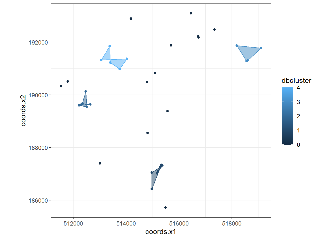
spatstat has its own set of spatial objects that it works with (one of the delights of R is that different packages are written by different people and many have developed their own data types) — it does not work directly with the SpatialPolygonsDataFrames, SpatialPointsDataFrames or sf objects that we are used to. For point pattern analysis, we need to create a point pattern (ppp) object.
#create a ppp object
BluePlaquesSub<- BluePlaquesSub %>%
as(., 'Spatial')
BluePlaquesSub.ppp <- ppp(x=BluePlaquesSub@coords[,1],
y=BluePlaquesSub@coords[,2],
window=window)Try to understand what the different elements in command above is doing. If you are unsure, you can run elements of the code, for example:
BluePlaquesSub@coords[,1]## [1] 516451.0 518560.0 514177.1 515166.2 513053.6 515093.1 515210.7 516746.3
## [9] 513371.5 514971.1 517339.4 512215.1 515300.0 514966.0 512639.2 515561.8
## [17] 511539.4 516725.5 512335.7 515370.2 518598.3 511792.6 515694.1 513008.4
## [25] 514805.8 513392.3 518187.5 513750.4 512466.7 515491.4 514789.8 514022.4
## [33] 519099.9 514183.4 512343.1 512508.2 512346.3 512269.5 515333.7Have a look at the new ppp object
BluePlaquesSub.ppp %>%
plot(.,pch=16,cex=0.5,
main="Blue Plaques Harrow")
6.6 Point pattern analysis
6.6.1 Kernel Density Estimation
One way to summarise your point data is to plot the density of your points under a window called a ‘Kernel.’ The size and shape of the Kernel affects the density pattern produced, but it is very easy to produce a Kernel Density Estimation (KDE) map from a ppp object using the density() function.
BluePlaquesSub.ppp %>%
density(., sigma=500) %>%
plot()
The sigma value sets the diameter of the Kernel (in the units your map is in — in this case, as we are in British National Grid the units are in metres). Try experimenting with different values of sigma to see how that affects the density estimate.
BluePlaquesSub.ppp %>%
density(., sigma=1000) %>%
plot()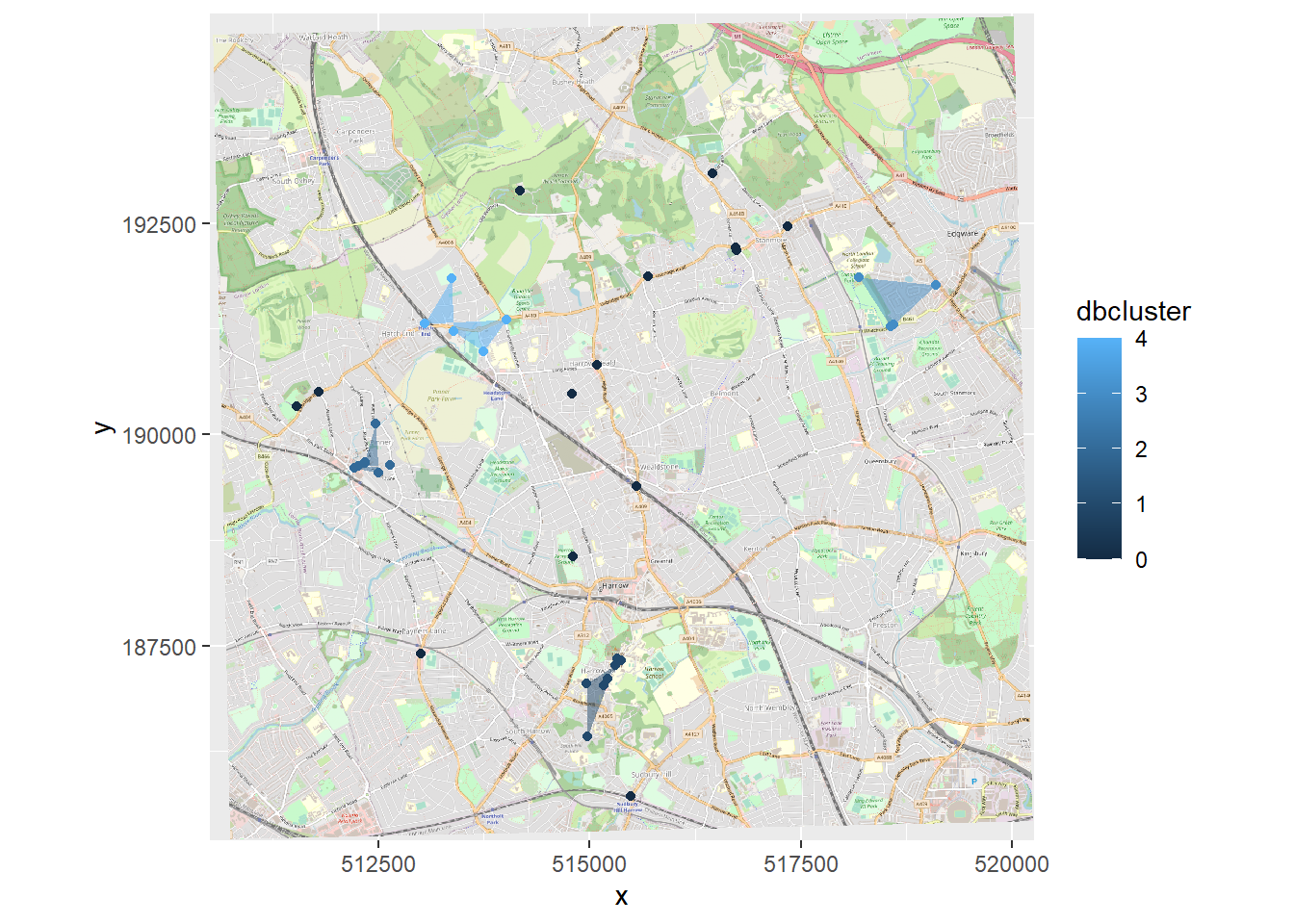
6.6.2 Quadrat Analysis
So as you saw in the lecture, we are interesting in knowing whether the distribution of points in our study area differs from ‘complete spatial randomness’ — CSR. That’s different from a CRS! Be careful!
The most basic test of CSR is a quadrat analysis. We can carry out a simple quadrat analysis on our data using the quadrat count function in spatstat. Note, I wouldn’t recommend doing a quadrat analysis in any real piece of analysis you conduct, but it is useful for starting to understand the Poisson distribution…
#First plot the points
plot(BluePlaquesSub.ppp,
pch=16,
cex=0.5,
main="Blue Plaques in Harrow")
#now count the points in that fall in a 6 x 6
#grid overlaid across the windowBluePlaquesSub.ppp2<-BluePlaquesSub.ppp %>%
BluePlaquesSub.ppp %>%
quadratcount(.,nx = 6, ny = 6)%>%
plot(., add=T, col="red")
In our case here, want to know whether or not there is any kind of spatial patterning associated with the Blue Plaques in areas of London. If you recall from the lecture, this means comparing our observed distribution of points with a statistically likely (Complete Spatial Random) distibution, based on the Poisson distribution.
Using the same quadratcount() function again (for the same sized grid) we can save the results into a table:
#run the quadrat count
Qcount <- BluePlaquesSub.ppp %>%
quadratcount(.,nx = 6, ny = 6) %>%
as.data.frame() %>%
dplyr::count(Var1=Freq)%>%
dplyr::rename(Freqquadratcount=n)Check the data type in the first column — if it is factor, we will need to convert it to numeric
Qcount %>%
summarise_all(class)## Var1 Freqquadratcount
## 1 integer integerOK, so we now have a frequency table — next we need to calculate our expected values. The formula for calculating expected probabilities based on the Poisson distribution is:
\[Pr= (X =k) = \frac{\lambda^{k}e^{-\lambda}}{k!}\] where:
xis the number of occurrencesλis the mean number of occurrenceseis a constant- 2.718
sums <- Qcount %>%
#calculate the total blue plaques (Var * Freq)
mutate(total = Var1 * Freqquadratcount) %>%
dplyr::summarise(across(everything(), sum))%>%
dplyr::select(-Var1)
lambda<- Qcount%>%
#calculate lambda
mutate(total = Var1 * Freqquadratcount)%>%
dplyr::summarise(across(everything(), sum)) %>%
mutate(lambda=total/Freqquadratcount) %>%
dplyr::select(lambda)%>%
pull(lambda)Calculate expected using the Poisson formula from above \(k\) is the number of blue plaques counted in a square and is found in the first column of our table…
QCountTable <- Qcount %>%
mutate(Pr=((lambda^Var1)*exp(-lambda))/factorial(Var1))%>%
#now calculate the expected counts based on our total number of plaques
#and save them to the table
mutate(Expected= (round(Pr * sums$Freqquadratcount, 0)))
#Compare the frequency distributions of the observed and expected point patterns
plot(c(1,5),c(0,14), type="n",
xlab="Number of Blue Plaques (Red=Observed,Blue=Expected)",
ylab="Frequency of Occurances")
points(QCountTable$Freqquadratcount,
col="Red",
type="o",
lwd=3)
points(QCountTable$Expected, col="Blue",
type="o",
lwd=3)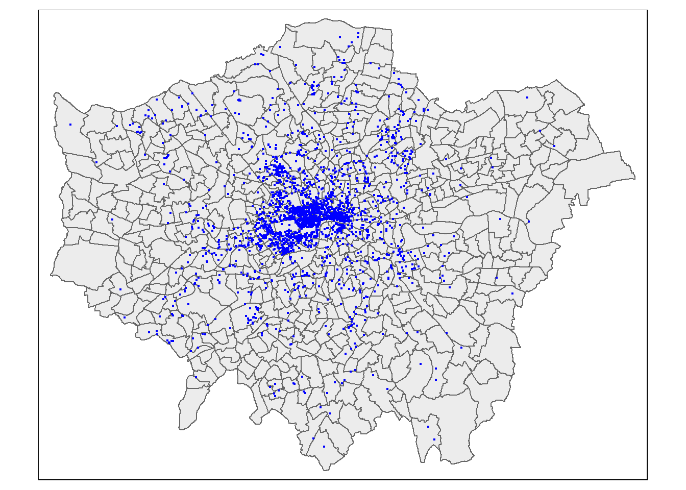 Comparing the observed and expected frequencies for our quadrant counts, we can observe that they both have higher frequency counts at the lower end — something reminiscent of a Poisson distribution. This could indicate that for this particular set of quadrants, our pattern is close to Complete Spatial Randomness (i.e. no clustering or dispersal of points). But how do we confirm this?
To check for sure, we can use the quadrat.test() function, built into spatstat. This uses a Chi Squared test to compare the observed and expected frequencies for each quadrant (rather than for quadrant bins, as we have just computed above).
A Chi-Squared test determines if there is an association between two categorical variables. The higher the Chi-Squared value, the greater the difference.
If the p-value of our Chi-Squared test is > 0.05, then we can reject a null hypothesis that says “there is no complete spatial randomness in our data” (think of a null-hypothesis as the opposite of a hypothesis that says our data exhibit complete spatial randomness). What we need to look for is a value for p > 0.05. If our p-value is > 0.05 then this indicates that we have CSR and there is no pattern in our points. If it is < 0.05, this indicates that we do have clustering in our points.
teststats <- quadrat.test(BluePlaquesSub.ppp, nx = 6, ny = 6)
plot(BluePlaquesSub.ppp,pch=16,cex=0.5, main="Blue Plaques in Harrow")
plot(teststats, add=T, col = "red")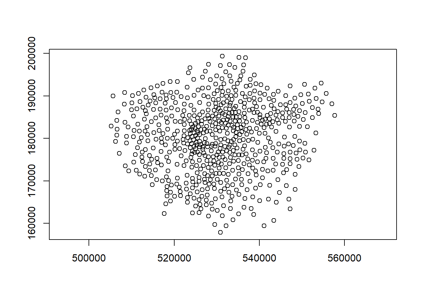
So we can see that the indications are there is no spatial patterning for Blue Plaques in Harrow — at least for this particular grid. Note the warning message — some of the observed counts are very small (0) and this may affect the accuracy of the quadrant test. Recall that the Poisson distribution only describes observed occurrances that are counted in integers — where our occurrences = 0 (i.e. not observed), this can be an issue. We also know that there are various other problems that might affect our quadrat analysis, such as the modifiable areal unit problem.
In the new plot, we can see three figures for each quadrant. The top-left figure is the observed count of points; the top-right is the Poisson expected number of points; the bottom value is the residual value (also known as Pearson residual value), or (Observed - Expected) / Sqrt(Expected).
This is the first mention of the mathematician Karl Pearson who founded the world’s first university statistics department here at UCL. Pearson was a eugenicist and the Unversity’s first Chair of Eugenics that was established on the request of Galton (who coined the term eugenics and Pearson studied under) for the residue of his estate. Throuhgout research you may encounter Pearson’s name as it is used to identify certain techniques, for example, Pearson’s product-moment coefficient (alternatively just product-moment coefficient). Where possible within this book I have removed references to Pearson, although as you will see later on some arguments in functions still require the value “pearson” and certain output messages default to include his name. UCL recently denamed spaces and buildings named after Pearson and Galton.
6.6.3 Try experimenting…
Try running a quadrant analysis for different grid arrangements (2 x 2, 3 x 3, 10 x 10 etc.) — how does this affect your results?
6.6.4 Ripley’s K
One way of getting around the limitations of quadrat analysis is to compare the observed distribution of points with the Poisson random model for a whole range of different distance radii. This is what Ripley’s K function computes.
We can conduct a Ripley’s K test on our data very simply with the spatstat package using the kest() function.
K <- BluePlaquesSub.ppp %>%
Kest(., correction="border") %>%
plot()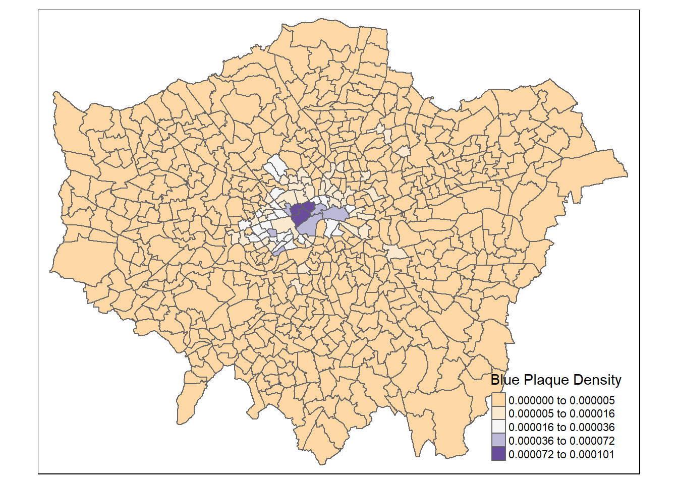
The plot for K has a number of elements that are worth explaining. First, the Kpois(r) line in Red is the theoretical value of K for each distance window (r) under a Poisson assumption of Complete Spatial Randomness. The Black line is the estimated values of K accounting for the effects of the edge of the study area.
Where the value of K falls above the line, the data appear to be clustered at that distance. Where the value of K is below the line, the data are dispersed. From the graph, we can see that up until distances of around 1300 metres, Blue Plaques appear to be clustered in Harrow, however, at around 1500 m, the distribution appears random and then dispersed between about 1600 and 2100 metres.
6.6.5 Alternatives to Ripley’s K
There are a number of alternative measures of spatial clustering which can be computed in spatstat such as the G and the L functions — I won’t go into them now, but if you are interested, you should delve into the following references:
Bivand, R. S., Pebesma, E. J., & Gómez-Rubio, V. (2008). “Applied spatial data analysis with R.” New York: Springer.
Brundson, C., Comber, L., (2015) “An Introduction to R for Spatial Analysis & Mapping.” Sage.
6.7 Density-based spatial clustering of applications with noise: DBSCAN
Quadrat and Ripley’s K analysis are useful exploratory techniques for telling us if we have spatial clusters present in our point data, but they are not able to tell us WHERE in our area of interest the clusters are occurring. To discover this we need to use alternative techniques. One popular technique for discovering clusters in space (be this physical space or variable space) is DBSCAN. For the complete overview of the DBSCAN algorithm, read the original paper by Ester et al. (1996) or consult the wikipedia page
library(raster)
library(fpc)We will now carry out a DBSCAN analysis of blue plaques in my borough to see if there are any clusters present.
#first check the coordinate reference system of the Harrow spatial polygon:
st_geometry(BoroughMap)## Geometry set for 33 features
## geometry type: MULTIPOLYGON
## dimension: XY
## bbox: xmin: 503568.2 ymin: 155850.8 xmax: 561957.5 ymax: 200933.9
## projected CRS: OSGB 1936 / British National Grid
## First 5 geometries:## MULTIPOLYGON (((516401.6 160201.8, 516407.3 160...## MULTIPOLYGON (((535009.2 159504.7, 535005.5 159...## MULTIPOLYGON (((540373.6 157530.4, 540361.2 157...## MULTIPOLYGON (((521975.8 178100, 521967.7 17809...## MULTIPOLYGON (((510253.5 182881.6, 510249.9 182...DBSCAN requires you to input two parameters: 1. Epsilon - this is the radius within which the algorithm with search for clusters 2. MinPts - this is the minimum number of points that should be considered a cluster
Based on the results of the Ripley’s K analysis earlier, we can see that we are getting clustering up to a radius of around 1200m, with the largest bulge in the graph at around 700m. Therefore, 700m is probably a good place to start and we will begin by searching for clusters of at least 4 points…
#first extract the points from the spatial points data frame
BluePlaquesSubPoints <- BluePlaquesSub %>%
coordinates(.)%>%
as.data.frame()
#now run the dbscan analysis
db <- BluePlaquesSubPoints %>%
fpc::dbscan(.,eps = 700, MinPts = 4)
#now plot the results
plot(db, BluePlaquesSubPoints, main = "DBSCAN Output", frame = F)
plot(BoroughMap$geometry, add=T) You could also use
 kNNdistplot() from the dbscan pacakge to find a suitable eps value based on the ‘knee’ in the plot…
# used to find suitable eps value based on the knee in plot
# k is no of nearest neighbours used, use min points
library(dbscan)
BluePlaquesSubPoints%>%
dbscan::kNNdistplot(.,k=4)So the DBSCAN analysis shows that for these values of eps and MinPts there are three clusters in the area I am analysing. Try varying eps and MinPts to see what difference it makes to the output.
Now of course the plot above is a little basic and doesn’t look very aesthetically pleasing. As this is R and R is brilliant, we can always produce a much nicer plot by extracting the useful information from the DBSCAN output and use ggplot2 to produce a much cooler map…
library(ggplot2)Our new db object contains lots of info including the cluster each set of point coordinates belongs to, whether the point is a seed point or a border point etc. We can get a summary by just calling the object
db## dbscan Pts=39 MinPts=4 eps=700
## 0 1 2 3 4
## border 15 1 0 3 4
## seed 0 6 8 1 1
## total 15 7 8 4 5If you open up the object in the environment window in RStudio, you will also see the various slots in the object, including cluster
db$cluster## [1] 0 3 0 1 4 0 1 0 4 1 0 2 1 1 2 0 0 0 2 1 3 0 0 0 0 4 3 4 2 0 0 4 3 0 2 2 2 2
## [39] 1We can now add this cluster membership info back into our dataframe
BluePlaquesSubPoints<- BluePlaquesSubPoints %>%
mutate(dbcluster=db$cluster)Next we are going to create some convex hull polygons to wrap around the points in our clusters. Use the ddply() function in the plyr package to get the convex hull coordinates from the cluster groups in our dataframe
chulls <- BluePlaquesSubPoints %>%
group_by(dbcluster) %>%
dplyr::mutate(hull = 1:n(),
hull = factor(hull, chull(coords.x1, coords.x2)))%>%
arrange(hull)
#chulls2 <- ddply(BluePlaquesSubPoints, .(dbcluster),
# function(df) df[chull(df$coords.x1, df$coords.x2), ])As 0 isn’t actually a cluster (it’s all points that aren’t in a cluster) drop it from the dataframe
chulls <- chulls %>%
filter(dbcluster >=1)Now create a ggplot2 object from our data
dbplot <- ggplot(data=BluePlaquesSubPoints,
aes(coords.x1,coords.x2, colour=dbcluster, fill=dbcluster))
#add the points in
dbplot <- dbplot + geom_point()
#now the convex hulls
dbplot <- dbplot + geom_polygon(data = chulls,
aes(coords.x1,coords.x2, group=dbcluster),
alpha = 0.5)
#now plot, setting the coordinates to scale correctly and as a black and white plot
#(just for the hell of it)...
dbplot + theme_bw() + coord_equal()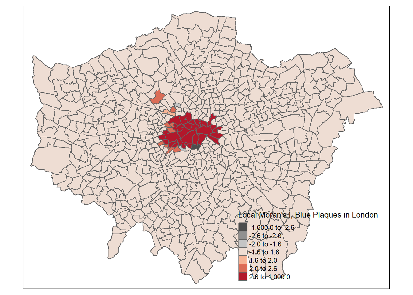
Now we are getting there, but wouldn’t it be better to add a basemap?!
###add a basemap
##First get the bbox in lat long for Harrow
HarrowWGSbb <- Harrow %>%
st_transform(., 4326)%>%
st_bbox()Now convert the basemap to British National Grid
library(OpenStreetMap)
basemap <- OpenStreetMap::openmap(c(51.5549876,-0.4040502),c(51.6405356,-0.2671315),
zoom=NULL,
"stamen-toner")
# convert the basemap to British National Grid
basemap_bng <- openproj(basemap, projection="+init=epsg:27700")Now we can plot our fancy map with the clusters on…
autoplot(basemap_bng) +
geom_point(data=BluePlaquesSubPoints,
aes(coords.x1,coords.x2,
colour=dbcluster,
fill=dbcluster)) +
geom_polygon(data = chulls,
aes(coords.x1,coords.x2,
group=dbcluster,
fill=dbcluster),
alpha = 0.5) 
# if error with autoplot try
# autoplot.OpenStreetMap(basemap_bng) 6.8 Point pattern analysis summary
This is end of the point pattern analysis section of the practical. You have been introduced to the basics of Point Pattern Analysis examining the distribution of Blue Plaques in a London Borough. At this point, you may wish to try running similar analyses on different boroughs (or indeed the whole city) and playing with some of the outputs — although you will find that Ripley’s K will fall over very quickly if you try to run the analysis on that many points) This how you might make use of these techniques in another context or with different point data…
6.9 Analysing Spatial Autocorrelation with Moran’s I, LISA and friends
In this section we are going to explore patterns of spatially referenced continuous observations using various measures of spatial autocorrelation. Spatial autocorrelation is a measure of similarity between nearby data. Check out the various references in the reading list for more information about the methods we will explore today. There are also useful links in the help file of the spdep package which we will be using here.
6.9.1 Data download
Before we get any further, let’s get some ward boundaries read in to R — download LondonWardData from the London Data store and read it in…
library(here)
#read the ward data in
LondonWards <- st_read(here::here("prac6_data", "LondonWards.shp"))## Reading layer `LondonWards' from data source `C:\Users\Andy\OneDrive - University College London\Teaching\CASA0005\2020_2021\CASA0005repo\prac6_data\LondonWards.shp' using driver `ESRI Shapefile'
## Simple feature collection with 625 features and 77 fields
## geometry type: POLYGON
## dimension: XY
## bbox: xmin: 503568.2 ymin: 155850.8 xmax: 561957.5 ymax: 200933.9
## projected CRS: OSGB 1936 / British National GridLondonWardsMerged <- st_read(here::here("prac6_data",
"statistical-gis-boundaries-london",
"statistical-gis-boundaries-london",
"ESRI",
"London_Ward_CityMerged.shp"))%>%
st_transform(.,27700)## Reading layer `London_Ward_CityMerged' from data source `C:\Users\Andy\OneDrive - University College London\Teaching\CASA0005\2020_2021\CASA0005repo\prac6_data\statistical-gis-boundaries-london\statistical-gis-boundaries-london\ESRI\London_Ward_CityMerged.shp' using driver `ESRI Shapefile'
## Simple feature collection with 625 features and 7 fields
## geometry type: POLYGON
## dimension: XY
## bbox: xmin: 503568.2 ymin: 155850.8 xmax: 561957.5 ymax: 200933.9
## projected CRS: OSGB 1936 / British National GridWardData <- read_csv("https://data.london.gov.uk/download/ward-profiles-and-atlas/772d2d64-e8c6-46cb-86f9-e52b4c7851bc/ward-profiles-excel-version.csv",
na = c("NA", "n/a")) %>%
clean_names()## Parsed with column specification:
## cols(
## .default = col_double(),
## `Ward name` = col_character(),
## `Old code` = col_character(),
## `New code` = col_character()
## )## See spec(...) for full column specifications.LondonWardsMerged <- LondonWardsMerged %>%
left_join(WardData,
by = c("GSS_CODE" = "new_code"))%>%
distinct(GSS_CODE, ward_name, average_gcse_capped_point_scores_2014)It’s probably projected correctly, but in case it isn’t give it a projection using the st_crs() function in the sf package
#have a look to check that it's
#in the right projection
st_crs(LondonWardsMerged)## Coordinate Reference System:
## User input: EPSG:27700
## wkt:
## PROJCRS["OSGB 1936 / British National Grid",
## BASEGEOGCRS["OSGB 1936",
## DATUM["OSGB 1936",
## ELLIPSOID["Airy 1830",6377563.396,299.3249646,
## LENGTHUNIT["metre",1]]],
## PRIMEM["Greenwich",0,
## ANGLEUNIT["degree",0.0174532925199433]],
## ID["EPSG",4277]],
## CONVERSION["British National Grid",
## METHOD["Transverse Mercator",
## ID["EPSG",9807]],
## PARAMETER["Latitude of natural origin",49,
## ANGLEUNIT["degree",0.0174532925199433],
## ID["EPSG",8801]],
## PARAMETER["Longitude of natural origin",-2,
## ANGLEUNIT["degree",0.0174532925199433],
## ID["EPSG",8802]],
## PARAMETER["Scale factor at natural origin",0.9996012717,
## SCALEUNIT["unity",1],
## ID["EPSG",8805]],
## PARAMETER["False easting",400000,
## LENGTHUNIT["metre",1],
## ID["EPSG",8806]],
## PARAMETER["False northing",-100000,
## LENGTHUNIT["metre",1],
## ID["EPSG",8807]]],
## CS[Cartesian,2],
## AXIS["(E)",east,
## ORDER[1],
## LENGTHUNIT["metre",1]],
## AXIS["(N)",north,
## ORDER[2],
## LENGTHUNIT["metre",1]],
## USAGE[
## SCOPE["unknown"],
## AREA["UK - Britain and UKCS 49°46'N to 61°01'N, 7°33'W to 3°33'E"],
## BBOX[49.75,-9.2,61.14,2.88]],
## ID["EPSG",27700]]tmap_mode("view")
tm_shape(LondonWardsMerged) +
tm_polygons(col = NA, alpha = 0.5) +
tm_shape(BluePlaques) +
tm_dots(col = "blue")6.9.2 Data cleaning
Ah yes, we might need to lose the blue plaques that fall outside of London
summary(BluePlaques)## geometry
## POINT :2711
## epsg:27700 : 0
## +proj=tmer...: 0BluePlaquesSub <- BluePlaques[LondonWardsMerged,]
tm_shape(LondonWardsMerged) +
tm_polygons(col = NA, alpha = 0.5) +
tm_shape(BluePlaquesSub) +
tm_dots(col = "blue")6.9.3 Data manipulation
The measures of spatial autocorrelation that we will be using require continuous observations (counts of blue plaques, average GCSE scores, average incomes etc.) to be spatially referenced (i.e. attached to a spatial unit like a ward or a borough). The file you have already has the various obervations associated with the London Ward data file already attached to it, but let’s continue with our blue plaques example for now.
To create a continuous observation from the blue plaques data we need to count all of the blue plaques that fall within each Ward in the City. Luckily, we can do this using the st_join() function from the sf package.
library(sf)
points_sf_joined <- LondonWardsMerged%>%
st_join(BluePlaquesSub)%>%
add_count(ward_name)%>%
janitor::clean_names()%>%
#calculate area
mutate(area=st_area(.))%>%
#then density of the points per ward
mutate(density=n/area)%>%
#select density and some other variables
dplyr::select(density, ward_name, gss_code, n, average_gcse_capped_point_scores_2014)How about a quick choropleth map to see how we are getting on…
points_sf_joined<- points_sf_joined %>%
group_by(gss_code) %>%
summarise(density = first(density),
wardname= first(ward_name),
plaquecount= first(n))
tm_shape(points_sf_joined) +
tm_polygons("density",
style="jenks",
palette="PuOr",
midpoint=NA,
popup.vars=c("wardname", "density"),
title="Blue Plaque Density")So, from the map, it looks as though we might have some clustering of blue plaques in the centre of London so let’s check this with Moran’s I and some other statistics.
Before being able to calculate Moran’s I and any similar statistics, we need to first define a \(W_{ij}\) spatial weights matrix
library(spdep)First calculate the centroids of all Wards in London
#First calculate the centroids of all Wards in London
coordsW <- points_sf_joined%>%
st_centroid()%>%
st_geometry()
plot(coordsW,axes=TRUE)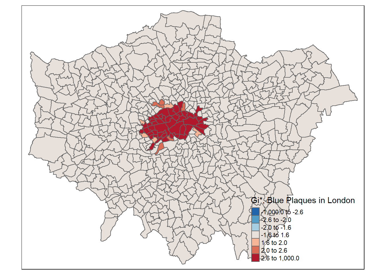
Now we need to generate a spatial weights matrix (remember from the lecture). We’ll start with a simple binary matrix of queen’s case neighbours (otherwise known as Contiguity edges corners). Thie method means that polygons with a shared edge or a corner will be included in computations for the target polygon…
#create a neighbours list
LWard_nb <- points_sf_joined %>%
poly2nb(., queen=T)
#plot them
plot(LWard_nb, st_geometry(coordsW), col="red")
#add a map underneath
plot(points_sf_joined$geometry, add=T)
#create a spatial weights object from these weights
Lward.lw <- LWard_nb %>%
nb2listw(., style="C")
head(Lward.lw$neighbours)## [[1]]
## [1] 6 7 10 462 468 482
##
## [[2]]
## [1] 5 8 9 11 12 13 16
##
## [[3]]
## [1] 10 11 12 15 480 483
##
## [[4]]
## [1] 17 281 291 470 473 481
##
## [[5]]
## [1] 2 9 16 281 283 290
##
## [[6]]
## [1] 1 7 8 10 11 146.9.4 Spatial autocorrelation
Now we have defined our \(W_{ij}\) matrix, we can calculate the Moran’s I and other associated statistics
Moran’s I test tells us whether we have clustered values (close to 1) or dispersed values (close to -1), we will calculate for the densities rather than raw values
I_LWard_Global_Density <- points_sf_joined %>%
pull(density) %>%
as.vector()%>%
moran.test(., Lward.lw)
I_LWard_Global_Density##
## Moran I test under randomisation
##
## data: .
## weights: Lward.lw
##
## Moran I statistic standard deviate = 30.267, p-value < 2.2e-16
## alternative hypothesis: greater
## sample estimates:
## Moran I statistic Expectation Variance
## 0.6736393909 -0.0016025641 0.0004977127Geary’s C as well..? This tells us whether similar values or dissimilar values are clusering
C_LWard_Global_Density <-
points_sf_joined %>%
pull(density) %>%
as.vector()%>%
geary.test(., Lward.lw)
C_LWard_Global_Density##
## Geary C test under randomisation
##
## data: .
## weights: Lward.lw
##
## Geary C statistic standard deviate = 8.2741, p-value < 2.2e-16
## alternative hypothesis: Expectation greater than statistic
## sample estimates:
## Geary C statistic Expectation Variance
## 0.404474357 1.000000000 0.005180378Getis Ord General G…? This tells us whether high or low values are clustering. If G > Expected = High values clustering; if G < expected = low values clustering
G_LWard_Global_Density <-
points_sf_joined %>%
pull(density) %>%
as.vector()%>%
globalG.test(., Lward.lw)
G_LWard_Global_Density##
## Getis-Ord global G statistic
##
## data: .
## weights: Lward.lw
##
## standard deviate = 29.401, p-value < 2.2e-16
## alternative hypothesis: greater
## sample estimates:
## Global G statistic Expectation Variance
## 1.003808e-02 1.602564e-03 8.232054e-08So the global statistics are indicating that we have spatial autocorrelation of Blue Plaques in London:
The Moran’s I statistic = 0.67 (remember 1 = clustered, 0 = no pattern, -1 = dispersed) which shows that we have some distinctive clustering
The Geary’s C statistic = 0.41 (remember Geary’s C falls between 0 and 2; 1 means no spatial autocorrelation, <1 - positive spatial autocorrelation or similar values clustering, >1 - negative spatial autocorreation or dissimilar values clustering) which shows that similar values are clustering
The General G statistic = G > expected, so high values are tending to cluster.
We can now also calculate local versions of the Moran’s I statistic (for each Ward) and a Getis Ord \(G_{i}^{*}\) statistic to see where we have hot-spots…
#use the localmoran function to generate I for each ward in the city
I_LWard_Local_count <- points_sf_joined %>%
pull(plaquecount) %>%
as.vector()%>%
localmoran(., Lward.lw)%>%
as_tibble()
I_LWard_Local_Density <- points_sf_joined %>%
pull(density) %>%
as.vector()%>%
localmoran(., Lward.lw)%>%
as_tibble()
#what does the output (the localMoran object) look like?
slice_head(I_LWard_Local_Density, n=5)## # A tibble: 5 x 5
## Ii E.Ii Var.Ii Z.Ii `Pr(z > 0)`
## <localmrn> <localmrn> <localmrn> <localmrn> <localmrn>
## 1 0.08212520 -0.001633048 0.1585280 0.2103656 0.4166912
## 2 0.10401756 -0.001905222 0.1846752 0.2464819 0.4026546
## 3 0.08398725 -0.001633048 0.1585280 0.2150423 0.4148672
## 4 0.10977974 -0.001633048 0.1585280 0.2798222 0.3898070
## 5 0.10761794 -0.001633048 0.1585280 0.2743926 0.3918915There are 5 columns of data. We want to copy some of the columns (the I score (column 1) and the z-score standard deviation (column 4)) back into the LondonWards spatialPolygonsDataframe
points_sf_joined <- points_sf_joined %>%
mutate(plaque_count_I = as.numeric(I_LWard_Local_count$Ii))%>%
mutate(plaque_count_Iz =as.numeric(I_LWard_Local_count$Z.Ii))%>%
mutate(density_I =as.numeric(I_LWard_Local_Density$Ii))%>%
mutate(density_Iz =as.numeric(I_LWard_Local_Density$Z.Ii))6.9.5 Mapping outputs
No we can plot a map of the local Moran’s I outputs…
We’ll set the breaks manually based on the rule that data points >2.58 or <-2.58 standard deviations away from the mean are significant at the 99% level (<1% chance that autocorrelation not present); >1.96 - <2.58 or <-1.96 to >-2.58 standard deviations are significant at the 95% level (<5% change that autocorrelation not present). >1.65 = 90% etc.
breaks1<-c(-1000,-2.58,-1.96,-1.65,1.65,1.96,2.58,1000)Now create a new diverging colour brewer palette and reverse the order using rev() (reverse) so higher values correspond to red
MoranColours<- rev(brewer.pal(8, "RdGy"))Plot on an interactive map
tm_shape(points_sf_joined) +
tm_polygons("plaque_count_Iz",
style="fixed",
breaks=breaks1,
palette=MoranColours,
midpoint=NA,
title="Local Moran's I, Blue Plaques in London")This map shows some areas in the centre of London that have relatively high scores, indicating areas with lots of blue plaques neighbouring other areas with lots of blue plaques.
What about the Getis Ord \(G_{i}^{*}\) statisic for hot and cold spots?
Gi_LWard_Local_Density <- points_sf_joined %>%
pull(density) %>%
as.vector()%>%
localG(., Lward.lw)
head(Gi_LWard_Local_Density)## [1] -0.7091272 -0.8175268 -0.7243146 -0.7993873 -0.7822360 -0.7310152Check the help file (?localG) to see what a localG object looks like - it is a bit different from a localMoran object as it only contains just a single value - the z-score (standardised value relating to whether high values or low values are clustering together) And map the outputs…
points_sf_joined <- points_sf_joined %>%
mutate(density_G = as.numeric(Gi_LWard_Local_Density))And map the outputs…
GIColours<- rev(brewer.pal(8, "RdBu"))
#now plot on an interactive map
tm_shape(points_sf_joined) +
tm_polygons("density_G",
style="fixed",
breaks=breaks1,
palette=GIColours,
midpoint=NA,
title="Gi*, Blue Plaques in London")6.9.6 Other variables
The local Moran’s I and \(G_{i}^{*}\) statistics for wards clearly show that the density of blue plaques in the centre of the city exhibits strong (and postitive) spatial autocorrelation, but neither of these maps are very interesting. Why not try some alternative variables and see what patterns emerge… here I’m going to have a look at Average GSCE scores…
#use head to see what other variables are in the data file
slice_head(points_sf_joined, n=2)## Simple feature collection with 2 features and 9 fields
## geometry type: POLYGON
## dimension: XY
## bbox: xmin: 543417.3 ymin: 183674.3 xmax: 549991.5 ymax: 185809.7
## projected CRS: OSGB 1936 / British National Grid
## # A tibble: 2 x 10
## gss_code density wardname plaquecount geometry
## <chr> [1/m^2] <chr> <int> <POLYGON [m]>
## 1 E050000~ 7.79468~ Barking~ 1 ((543595.5 184832.8, 543~
## 2 E050000~ 7.32900~ Barking~ 1 ((547932.4 184916.6, 547~
## # ... with 5 more variables: plaque_count_I <dbl>, plaque_count_Iz <dbl>,
## # density_I <dbl>, density_Iz <dbl>, density_G <dbl>Or print out the class of each column like we did in week 2, although we need to drop the geometry.
Datatypelist <- LondonWardsMerged %>%
st_drop_geometry()%>%
summarise_all(class) %>%
pivot_longer(everything(),
names_to="All_variables",
values_to="Variable_class")
Datatypelist## # A tibble: 3 x 2
## All_variables Variable_class
## <chr> <chr>
## 1 GSS_CODE character
## 2 ward_name character
## 3 average_gcse_capped_point_scores_2014 numericI_LWard_Local_GCSE <- LondonWardsMerged %>%
arrange(GSS_CODE)%>%
pull(average_gcse_capped_point_scores_2014) %>%
as.vector()%>%
localmoran(., Lward.lw)%>%
as_tibble()
points_sf_joined <- points_sf_joined %>%
arrange(gss_code)%>%
mutate(GCSE_LocIz = as.numeric(I_LWard_Local_GCSE$Z.Ii))
tm_shape(points_sf_joined) +
tm_polygons("GCSE_LocIz",
style="fixed",
breaks=breaks1,
palette=MoranColours,
midpoint=NA,
title="Local Moran's I, GCSE Scores")Now the Gi* statistic to look at clusters of high and low scores…
G_LWard_Local_GCSE <- LondonWardsMerged %>%
dplyr::arrange(GSS_CODE)%>%
dplyr::pull(average_gcse_capped_point_scores_2014) %>%
as.vector()%>%
localG(., Lward.lw)
points_sf_joined <- points_sf_joined %>%
dplyr::arrange(gss_code)%>%
dplyr::mutate(GCSE_LocGiz = as.numeric(G_LWard_Local_GCSE))
tm_shape(points_sf_joined) +
tm_polygons("GCSE_LocGiz",
style="fixed",
breaks=breaks1,
palette=GIColours,
midpoint=NA,
title="Gi*, GCSE Scores")So this is the end of the practical. Hopefully you have learned a lot about the different methods we can employ to analyse patterns in spatial data.
This practical was deliberately designed as a walk through, but this may have given you ideas about where you could perhaps take these techniques in your coursework if this is something you wanted to explore further with different data or in different contexts.
6.10 Extension
Already a pro with point pattern and spatial autocorrelation analysis?
Then try the following out:
We have used
spobjects in this practical (because I wrote it beforesfbecame the defacto spatial data type in R). Can you convert some of this so it works withsf?Could you automate any of the functions so that you could quickly produce maps of any of the variables in the LondonWards dataset?
Could you get these outputs into a faceted
ggplot2map?Make an interactive map with selectable layers for Gi* and Moran’s I like we did in the [Maps with extra features] or Advanced interactive map sections…
6.11 Feedback
Was anything that we explained unclear this week or was something really clear…let us know using the feedback form. It’s anonymous and we’ll use the responses to clear any issues up in the future / adapt the material.