Chapter 3 Rasters, descriptive statistics and interpolation
3.1 Learning outcomes
By the end of this practical you should be able to:
- Load, manipulate and interpret raster layers
- Observe and critique different descriptive data manipulation methods and outputs
3.2 Homework
Outside of our scheduled sessions you should be doing around 12 hours of extra study per week. Feel free to follow your own GIS interests, but good places to start include the following:
Assignment
This week you need to
Assess the validity of your topic in terms of data suitability, then sketch out an introduction and literature review including academic and policy documents (or any reputable source) — it’s the same as last week!
Go through the assignment examples on Moodle and mark them with the mark scheme.
Reading
This week:
- Chapter 5 “Descriptive statistics” from Learning statistics with R: A tutorial for psychology students and other beginners by Navarro (2019)
Watching
Hadley Wickham’s Keynote from the European Molecular Biology Laboratory (EMBL). This will be the same for a few weeks.
Remember this is just a starting point, explore the reading list, practical and lecture for more ideas.
3.3 Recommended listening 🎧
Some of these practicals are long, take regular breaks and have a listen to some of our fav tunes each week.
Andy. Oh Wonder, from London, an alt-pop duo according to Wikipedia. I just really like their music. Was due to see them in December in London, but it’s been postponed. Ultralife is their first album and the one i prefer, tracks 2-4 are where it’s at!
Adam OK, this week it’s the 21st Century’s answer to Shakespear - the man who provided the soundtrack to countless post-club ‘back-to-your-house?’ early mornings in my youth. Yes, straight outta Brum (via Brixton), he’s only gone and penned a bunch of awesome new tracks almost 20 years after he first burst out of his bedroom studio. It’s only flippin’ Mike Skinner. You’re listening to the Streets!
3.4 Introduction
This practical is composed of three parts. To start with we’re going to explore projection systems in more detail. In the second part we will load some global raster data into R. In the final part we extract data points (cities and towns) from this data and generate some descriptive statistics and histograms.
3.5 Part 1 projections
Projections systems are mathematical formulas that specify how our data is represented on a map. These can either be call geographic coordiate reference systems or projected coordinate reference systems. The former treats data as a sphere and the latter as a flat object. You might come across phrases such as a resolution of 5 minutes or a resolution of 30 metres, which can be used to establish what kind of projection system has been used. Let me explain…
A minute type of resolution (e.g. 5 minute resolution) is a geographic reference system that treats the globe as if it was a sphere divided into 360 equal parts called degrees (which are angular units). Each degree has 60 minutes and each minute has 60 seconds. Arc-seconds of latitude (horizontal lines in the globe figure below) remain almost constant whilst arc-seconds of longitude (vertical lines in the globe figure below) decrease in a trigonometric cosine-based fashion as you move towards the Earth’s poles. This causes problems as you increase or decrease latitude the longitudial lengths alter…For example at the equator (0°, such as Quito) a degree is 111.3 km whereas at 60° (such as Saint Petersburg) a degree is 55.80 km …In contrast a projected coordinate system is defined on a flat, two-dimensional plane (through projecting a spheriod onto a 2D surface) giving it constant lengths, angles and areas…
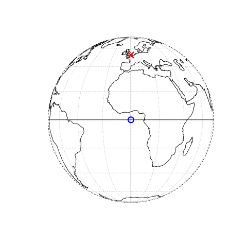
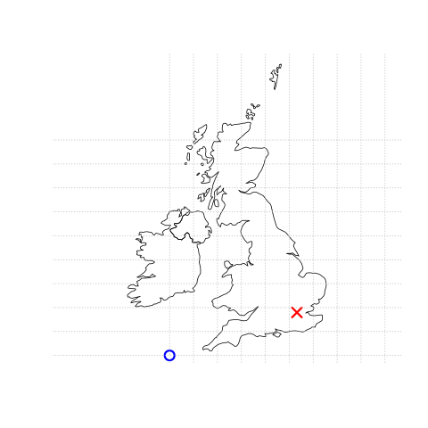
Figure 3.1: This figure is taken directly from Lovelace et al. (2019) section 2.2. Illustration of vector (point) data in which location of London (the red X) is represented with reference to an origin (the blue circle). The left plot represents a geographic CRS with an origin at 0° longitude and latitude. The right plot represents a projected CRS with an origin located in the sea west of the South West Peninsula.
Knowing this, if we want to conduct analysis locally (e.g. at a national level) or use metric (e.g. kilometres) measurements we need to be able to change the projection of our data or “reproject” it. Most countries and even states have their own projected coordinate reference system such as British National Grid in the above example…Note how the origin (0,0) is has moved from the centre of the Earth to the bottom South West corner of the UK, which has now been ironed (or flattened) out.
Projection rules
Units are angular (e.g. degrees, latitude and longitude) or the data is global = Geographic coordinate reference system
Units are linear (e.g. feet, metres) or data is at a local level (e.g. national, well the last one is not always true, but likely) = Projected coordinate reference system.
You might hear some key words about projections that could terrify you! Let’s break them down:
- Ellipsoid (or spheriod) = size of shape of the Earth (3d)
- Datum = contains the point relationship (where the origin (0,0) of the map is) between a Cartesian coordinates (flat surface) and Earth’s surface. They can be local or geocentric. They set the origin, the scale and orientation of the Coordiante Reference System (CRS).
- Local datum = changes the Ellispoid to align with a certain location on the surface (e.g. BNG that uses the OSGB36 datum). A local datum is anything that isn’t the centre of the Earth.
- Geocentric datum = the centre is equal to the Earth’s centre of gravity (e.g. WGS84).
- Coordinate reference system (CRS) = Formula that defines how the 2D map (e.g. on your screen or a paper map) relates to the 3D Earth. Also sometimes called a spatial Reference System (SRS). It also stores the datum information.
Take home message
When you do analysis on multiple datasets make sure they are all use the same Coordiante Reference System.
If it’s local (e.g. city of country analysis) then use a local projected CRS where possible.
3.5.1 Changing projections
3.5.1.1 Vector
Until now, we’ve not really considered how our maps have been printed to the screen. Later on in the practical we will explore gridded temperature in Australia, as we will need an outline of Australia let’s use that as an example here:
First, we need to source and load a vector of Australia. Go to: https://gadm.org/download_country_v3.html and download the GeoPackage
Once we’ve downloaded the
.gpkglet’s see what is inside it withst_layers()…
library(sf)
library(here)
st_layers(here("prac3_data", "gadm36_AUS.gpkg"))## Driver: GPKG
## Available layers:
## layer_name geometry_type features fields
## 1 gadm36_AUS_0 Multi Polygon 1 2
## 2 gadm36_AUS_1 Multi Polygon 11 10
## 3 gadm36_AUS_2 Multi Polygon 569 13- Then read in the GeoPackage layer for the whole of Australia (layer ending in 0)
library(sf)
Ausoutline <- st_read(here("prac3_data", "gadm36_AUS.gpkg"),
layer='gadm36_AUS_0')## Reading layer `gadm36_AUS_0' from data source `C:\Users\Andy\OneDrive - University College London\Teaching\CASA0005\2020_2021\CASA0005repo\prac3_data\gadm36_AUS.gpkg' using driver `GPKG'
## Simple feature collection with 1 feature and 2 fields
## Geometry type: MULTIPOLYGON
## Dimension: XY
## Bounding box: xmin: 112.9211 ymin: -55.11694 xmax: 159.1092 ymax: -9.142176
## Geodetic CRS: WGS 84You can check that the coordinate reference systems of sf or sp objects using the print function:
print(Ausoutline)## Simple feature collection with 1 feature and 2 fields
## Geometry type: MULTIPOLYGON
## Dimension: XY
## Bounding box: xmin: 112.9211 ymin: -55.11694 xmax: 159.1092 ymax: -9.142176
## Geodetic CRS: WGS 84
## GID_0 NAME_0 geom
## 1 AUS Australia MULTIPOLYGON (((158.6928 -5...The coordinates stored in the geometry column of your sf object contain the information to enable points, lines or polygons to be drawn on the screen. You can see that our Ausoutline is a multipolygon and every point within the polygon will have coordinates that are in a certain reference system, here WGS 84.
3.5.1.2 Proj4
WGS84 is one of the most common global projection systems, used in nearly all GPS devices. Whilst we were able to identify the CRS of our layer using print another alternative is to find the proj4 string. A proj4 string is meant to be a compact way of identifying a coordinate reference system. Let’s extract ours…
library(sf)
st_crs(Ausoutline)$proj4string## [1] "+proj=longlat +datum=WGS84 +no_defs"“Well that’s clear as mud!” I hear you cry! Yes, not obvious is it!. The proj4-string basically tells the computer where on the earth to locate the coordinates that make up the geometries in your file and what distortions to apply (i.e. if to flatten it out completely etc.) It’s composed of a list of parameters seperated by a +. Here are projection proj uses latitude and longitude (so it’s a geographic not projected CRS). The datum is WGS84 that uses Earth’s centre mass as the coordinate origin (0,0).
The Coordiante systems in R chapter by Gimond (2019) provides much more information on Proj4. However, i’d advise trying to use EPSG codes, which we come onto next.
- Sometimes you can download data from the web and it doesn’t have a CRS. If any boundary data you download does not have a coordinate reference system attached to it (NA is displayed in the coord. ref section), this is not a huge problem — it can be added afterwards by adding the proj4string to the file or just assigning an EPSG code.
To find the proj4-strings for a whole range of different geographic projections, use the search facility at http://spatialreference.org/ or http://epsg.io/.
3.5.1.3 EPSG
Now, if you can store a whole proj4-string in your mind, you must be some kind of savant (why are you doing this course? you could make your fortune as a card-counting poker player or something!). The rest of us need something a little bit more easy to remember and for coordinate reference systems, the saviour is the European Petroleum Survey Group (EPSG) — (naturally!). Now managed and maintained by the International Association of Oil and Gas producers — EPSG codes are short numbers represent all coordinate reference systems in the world and link directly to proj4 strings. We saw these last week in the [Making some maps] section.
The EPSG code for the WGS84 World Geodetic System (usually the default CRS for most spatial data) is 4326 — http://epsg.io/4326
- If our Australian outline didn’t have a spatial reference system, we could have just set it using
st_set_crs()
Ausoutline <- Ausoutline %>%
st_set_crs(., 4326)Or, more concisely…but remember this is only useful if there is no CRS when you load the data.
#or more concisely
Ausoutline <- st_read(here("prac3_data", "gadm36_AUS.gpkg"),
layer='gadm36_AUS_0') %>%
st_set_crs(4326)## Reading layer `gadm36_AUS_0' from data source `C:\Users\Andy\OneDrive - University College London\Teaching\CASA0005\2020_2021\CASA0005repo\prac3_data\gadm36_AUS.gpkg' using driver `GPKG'
## Simple feature collection with 1 feature and 2 fields
## Geometry type: MULTIPOLYGON
## Dimension: XY
## Bounding box: xmin: 112.9211 ymin: -55.11694 xmax: 159.1092 ymax: -9.142176
## Geodetic CRS: WGS 84Normally if a layer has a missing CRS, it’s WGS84. But check for any metadata that might list it.
3.5.1.4 Reprojecting your spatial data
Reprojecting your data is something that you might have to (or want to) do, on occasion. Why? Well, one example might be if you want to measure the distance of a line object, or the distance between two polygons. This can be done far more easily in a projected coordinate system (where the units are measured in metres) than it can a geographic coordinate system such as WGS84 (where the units are degrees).
However for generating maps in packages like leaflet, your maps will need to be in WGS84, rather than a projected (flat) reference system .
- So once your data has a coordinates system to work with, we can re-project or transform to anything we like. For SF objects, like our outline of Australia it’s carried out using
st_transform. Here we are changing from WGS84 to GDA94, which is a local CRS for Australia and has the EPSG code 3112….
AusoutlinePROJECTED <- Ausoutline %>%
st_transform(.,3112)
print(AusoutlinePROJECTED)## Simple feature collection with 1 feature and 2 fields
## Geometry type: MULTIPOLYGON
## Dimension: XY
## Bounding box: xmin: -2083066 ymin: -6460625 xmax: 2346599 ymax: -1115948
## Projected CRS: GDA94 / Geoscience Australia Lambert
## GID_0 NAME_0 geom
## 1 AUS Australia MULTIPOLYGON (((1775780 -64...In the SF object, you can compare the values in the geometry column with those in the original file to look at how they have changed…
You might also encounter an SP object from the sp package. In this case i’d advise just transforming the sp object to sf and changing the projection….this was covered last week..but it’s here too…
#From sf to sp
AusoutlineSP <- Ausoutline %>%
as(., "Spatial")
#From sp to sf
AusoutlineSF <- AusoutlineSP %>%
st_as_sf()If you are still a bit confused by coordiate reference systems then stop and take some time to have a look at the resources listed here. It is very important to understand projection systems.
This is the best resources i’ve come across explaining coordiate reference systems are:
3.5.2 WorldClim data
So far we’ve only really considered vector data. Within the rest of this practical we will explore some raster data sources and processing techniques. If you recall rasters are grids of cell with individual values. There are many, many possible sources to obtain raster data from as it is the data type used for the majority (basically all) of remote sensing data.
We are going to use WorldClim data — this is a dataset of free global climate layers (rasters) with a spatial resolution of between 1\(km^2\) and 240\(km^2\).
Download the data from: https://www.worldclim.org/data/worldclim21.html
Select any variable you want at the 5 minute second resolution.
Unzip and move the data to your project folder. Now load the data. We could do this individually….
library(raster)
jan<-raster(here("prac3_data", "wc2.0_5m_tavg_01.tif"))
# have a look at the raster layer jan
jan## class : RasterLayer
## dimensions : 2160, 4320, 9331200 (nrow, ncol, ncell)
## resolution : 0.08333333, 0.08333333 (x, y)
## extent : -180, 180, -90, 90 (xmin, xmax, ymin, ymax)
## crs : +proj=longlat +datum=WGS84 +no_defs
## source : C:/Users/Andy/OneDrive - University College London/Teaching/CASA0005/2020_2021/CASA0005repo/prac3_data/wc2.0_5m_tavg_01.tif
## names : wc2.0_5m_tavg_01
## values : -46.697, 34.291 (min, max)- Then have a quick look at the data, we can see it’s again in the geographic projection of WGS84.
plot(jan)
To reproject a raster the whole grid must be recomputed (for a vector is was just the individual coordinates of the shapes), and the attributes then reestimated to the new grid. To do this we have to use projectRaster() from the Raster package. However, sadly it only accepts PROJ4 strings.
Now we can actually see some data…here is a quick example of using the Mollweide projection saved to a new object. The Mollweide projection retains area proportions whilst compromising accuracy of angle and shape
# set the proj 4 to a new object
newproj<-"+proj=moll +lon_0=0 +x_0=0 +y_0=0 +ellps=WGS84 +datum=WGS84 +units=m +no_defs"
# get the jan raster and give it the new proj4
pr1 <- jan %>%
projectRaster(., crs=newproj)
plot(pr1)
It is possible to use only an EPSG code within a PROJ4 string, however, certain projections don’t have an EPSG code. For example, if we just wanted to go back from Mollweide to WGS84 we can simply set the crs to "+init=epsg:4326"
pr1 <- pr1 %>%
projectRaster(., crs="+init=epsg:4326")
plot(pr1)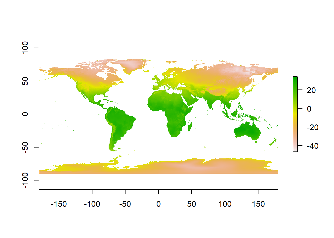
3.5.3 WorldClim data loading efficiently
Ok, projections over. Let’s move forward with the practical…
A better and more efficient way is to firstly list all the files stored within our directory with
dir_info()from thefspacakge, then usedplyrin conjunction withstr_detect()fromstringrto search for filenames containingtif. Finally just select the paths.But let’s firstly explore what
dir_info()does…
# look in our folder, find the files that end with .tif and
library(fs)
dir_info("prac3_data/") ## # A tibble: 16 x 18
## path type size permissions modification_time user group
## <fs::path> <fct> <fs::by> <fs::perms> <dttm> <chr> <chr>
## 1 prac3_data/gadm3~ file 83.57M rw- 2020-04-08 12:04:37 <NA> <NA>
## 2 prac3_data/gadm3~ direc~ 0 rw- 2020-06-05 17:57:56 <NA> <NA>
## 3 prac3_data/licen~ file 300 rw- 2020-04-08 12:04:37 <NA> <NA>
## 4 prac3_data/readm~ file 256 rw- 2020-04-08 12:04:37 <NA> <NA>
## 5 prac3_data/wc2.0~ file 8.78M rw- 2020-04-08 12:04:38 <NA> <NA>
## 6 prac3_data/wc2.0~ file 8.92M rw- 2020-04-08 12:04:38 <NA> <NA>
## 7 prac3_data/wc2.0~ file 9.03M rw- 2020-04-08 12:04:38 <NA> <NA>
## 8 prac3_data/wc2.0~ file 9.09M rw- 2020-04-08 12:04:38 <NA> <NA>
## 9 prac3_data/wc2.0~ file 9.12M rw- 2020-04-08 12:04:38 <NA> <NA>
## 10 prac3_data/wc2.0~ file 9.04M rw- 2020-04-08 12:04:38 <NA> <NA>
## 11 prac3_data/wc2.0~ file 8.98M rw- 2020-04-08 12:04:38 <NA> <NA>
## 12 prac3_data/wc2.0~ file 8.95M rw- 2020-04-08 12:04:38 <NA> <NA>
## 13 prac3_data/wc2.0~ file 9.02M rw- 2020-04-08 12:04:38 <NA> <NA>
## 14 prac3_data/wc2.0~ file 8.99M rw- 2020-04-08 12:04:38 <NA> <NA>
## 15 prac3_data/wc2.0~ file 8.86M rw- 2020-04-08 12:04:38 <NA> <NA>
## 16 prac3_data/wc2.0~ file 8.77M rw- 2020-04-08 12:04:38 <NA> <NA>
## # ... with 11 more variables: device_id <dbl>, hard_links <dbl>,
## # special_device_id <dbl>, inode <dbl>, block_size <dbl>, blocks <dbl>,
## # flags <int>, generation <dbl>, access_time <dttm>, change_time <dttm>,
## # birth_time <dttm>Essentailly it just gets the details you would normally see in the file explorer..however, we can use this data with dplyr to select the data we actually want. Now be careful! the function select() exists both within the dplyr and raster package so to make sure you use the right one dplyr::select forces select from dplyr.
library(tidyverse)
listfiles<-dir_info("prac3_data/") %>%
filter(str_detect(path, ".tif")) %>%
dplyr::select(path)%>%
pull()
#have a look at the file names
listfiles## prac3_data/wc2.0_5m_tavg_01.tif prac3_data/wc2.0_5m_tavg_02.tif
## prac3_data/wc2.0_5m_tavg_03.tif prac3_data/wc2.0_5m_tavg_04.tif
## prac3_data/wc2.0_5m_tavg_05.tif prac3_data/wc2.0_5m_tavg_06.tif
## prac3_data/wc2.0_5m_tavg_07.tif prac3_data/wc2.0_5m_tavg_08.tif
## prac3_data/wc2.0_5m_tavg_09.tif prac3_data/wc2.0_5m_tavg_10.tif
## prac3_data/wc2.0_5m_tavg_11.tif prac3_data/wc2.0_5m_tavg_12.tifHere, we’re also using pull() from dplyr which is the same as the $ often used to extract columns as in the next stage the input must be filenames as characters (nothing else like a column name).
- Then load all of the data straight into a raster stack. A raster stack is a collection of raster layers with the same spatial extent and resolution.
worldclimtemp <- listfiles %>%
stack()
#have a look at the raster stack
worldclimtemp## class : RasterStack
## dimensions : 2160, 4320, 9331200, 12 (nrow, ncol, ncell, nlayers)
## resolution : 0.08333333, 0.08333333 (x, y)
## extent : -180, 180, -90, 90 (xmin, xmax, ymin, ymax)
## crs : +proj=longlat +datum=WGS84 +no_defs
## names : wc2.0_5m_tavg_01, wc2.0_5m_tavg_02, wc2.0_5m_tavg_03, wc2.0_5m_tavg_04, wc2.0_5m_tavg_05, wc2.0_5m_tavg_06, wc2.0_5m_tavg_07, wc2.0_5m_tavg_08, wc2.0_5m_tavg_09, wc2.0_5m_tavg_10, wc2.0_5m_tavg_11, wc2.0_5m_tavg_12
## min values : -46.697, -44.559, -57.107, -62.996, -63.541, -63.096, -66.785, -64.600, -62.600, -54.400, -42.000, -45.340
## max values : 34.291, 33.174, 33.904, 34.629, 36.312, 38.400, 43.036, 41.073, 36.389, 33.869, 33.518, 33.667In the raster stack you’ll notice that under dimensions there are 12 layers (nlayers). The stack has loaded the 12 months of average temperature data for us in order.
- To access single layers within the stack:
# access the january layer
worldclimtemp[[1]]## class : RasterLayer
## dimensions : 2160, 4320, 9331200 (nrow, ncol, ncell)
## resolution : 0.08333333, 0.08333333 (x, y)
## extent : -180, 180, -90, 90 (xmin, xmax, ymin, ymax)
## crs : +proj=longlat +datum=WGS84 +no_defs
## source : C:/Users/Andy/OneDrive - University College London/Teaching/CASA0005/2020_2021/CASA0005repo/prac3_data/wc2.0_5m_tavg_01.tif
## names : wc2.0_5m_tavg_01
## values : -46.697, 34.291 (min, max)- We can also rename our layers within the stack:
month <- c("Jan", "Feb", "Mar", "Apr", "May", "Jun",
"Jul", "Aug", "Sep", "Oct", "Nov", "Dec")
names(worldclimtemp) <- monthLast week we used rename() from the dplyr package, however, this isn’t yet available for raster data ☹️
- Now to get data for just January use our new layer name
worldclimtemp$Jan## class : RasterLayer
## dimensions : 2160, 4320, 9331200 (nrow, ncol, ncell)
## resolution : 0.08333333, 0.08333333 (x, y)
## extent : -180, 180, -90, 90 (xmin, xmax, ymin, ymax)
## crs : +proj=longlat +datum=WGS84 +no_defs
## source : C:/Users/Andy/OneDrive - University College London/Teaching/CASA0005/2020_2021/CASA0005repo/prac3_data/wc2.0_5m_tavg_01.tif
## names : Jan
## values : -46.697, 34.291 (min, max)3.5.4 Location data from a raster
- Using a raster stack we can extract data with a single command!! For example let’s make a dataframe of some sample sites — Australian cities/towns.
site <- c("Brisbane", "Melbourne", "Perth", "Sydney", "Broome", "Darwin", "Orange",
"Bunbury", "Cairns", "Adelaide", "Gold Coast", "Canberra", "Newcastle",
"Wollongong", "Logan City" )
lon <- c(153.03, 144.96, 115.86, 151.21, 122.23, 130.84, 149.10, 115.64, 145.77,
138.6, 153.43, 149.13, 151.78, 150.89, 153.12)
lat <- c(-27.47, -37.91, -31.95, -33.87, 17.96, -12.46, -33.28, -33.33, -16.92,
-34.93, -28, -35.28, -32.93, -34.42, -27.64)
#Put all of this inforamtion into one list
samples <- data.frame(site, lon, lat, row.names="site")
# Extract the data from the Rasterstack for all points
AUcitytemp<- raster::extract(worldclimtemp, samples)- Add the city names to the rows of AUcitytemp
Aucitytemp2 <- AUcitytemp %>%
as_tibble()%>%
add_column(Site = site, .before = "Jan")3.6 Part 2 descriptive statistics
Descriptive (or summary) statistics provide a summary of our data, often forming the base of quantitative analysis leading to inferential statistics which we use to make inferences about our data (e.g. judegements of the probability that the observed difference between two data sets is not by chance)

3.6.1 Data preparation
- Let’s take Perth as an example. We can subset our data either using the row name:
Perthtemp <- Aucitytemp2 %>%
filter(site=="Perth")- Or the row location:
Perthtemp <- Aucitytemp2[3,]3.6.2 Histogram
A histogram lets us see the frequency of distribution of our data. This will vary based on the data that you have downloaded.
- Make a histogram of Perth’s temperature. The tibble stored the data as double and the base
hist()function needs it as numeric..
hist(as.numeric(Perthtemp))## Warning in hist(as.numeric(Perthtemp)): NAs introduced by coercion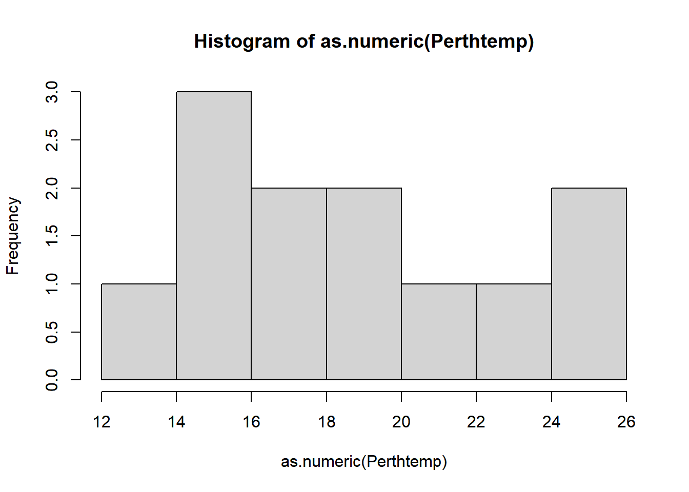
Remember what we’re looking at here. The x axis is the temperature and the y is the frequency of occurrence.
- That’s a pretty simple histogram, let’s improve the aesthetics a bit.
#define where you want the breaks in the historgram
userbreak<-c(8,10,12,14,16,18,20,22,24,26)
hist(as.numeric(Perthtemp),
breaks=userbreak,
col="red",
main="Histogram of Perth Temperature",
xlab="Temperature",
ylab="Frequency")## Warning in hist(as.numeric(Perthtemp), breaks = userbreak, col = "red", : NAs
## introduced by coercion
- Check out the histogram information R generated
histinfo <- Perthtemp %>%
as.numeric()%>%
hist(.)histinfo## $breaks
## [1] 12 14 16 18 20 22 24 26
##
## $counts
## [1] 1 3 2 2 1 1 2
##
## $density
## [1] 0.04166667 0.12500000 0.08333333 0.08333333 0.04166667 0.04166667 0.08333333
##
## $mids
## [1] 13 15 17 19 21 23 25
##
## $xname
## [1] "."
##
## $equidist
## [1] TRUE
##
## attr(,"class")
## [1] "histogram"Here we have:
- breaks — the cut off points for the bins (or bars), we just specified these
- counts — the number of cells in each bin
- midpoints — the middle value for each bin
- density — the density of data per bin
3.6.3 Using more data
This was still a rather basic histogram, what if we wanted to see the distribution of temperatures for the whole of Australia in Jan (from averaged WorldClim data) as opposed to just our point for Perth. Here, we will use the outline of Australia we loaded earlier..
Check the layer by plotting the geometry…we could do this through…
plot(Ausoutline$geom)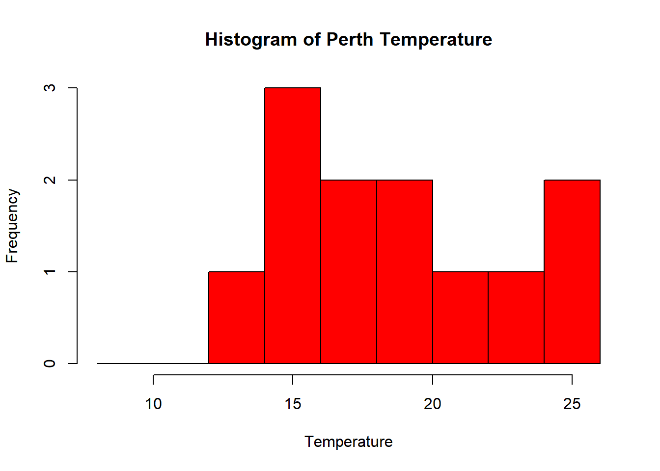
But as the .shp is quite complex (i.e. lots of points) we can simplify it first with the rmapshaper package — install that now..if it doesn’t load (or crashes your PC) this isn’t an issue. It’s just good practice that when you load data into R you check to see what it looks like…
#load the rmapshaper package
library(rmapshaper)
#simplify the shapefile
#keep specifies the % of points
#to keep
AusoutSIMPLE<-Ausoutline %>%
ms_simplify(.,keep=0.05)
plot(AusoutSIMPLE$geom)
This should load quicker, but for ‘publication’ or ‘best’ analysis (i.e. not just demonstrating or testing) i’d recommend using the real file to ensure you don’t simply a potentially important variable.
Check out the rmapshaper vignette for more information
- Next, set our map extent (where we want to clip the data to) to the outline of Australia then crop our WorldClim dataset to it.
HOWEVER, we need to make sure that both of our layers are in the same coordinate reference system when we combine them…so..
print(Ausoutline)## Simple feature collection with 1 feature and 2 fields
## Geometry type: MULTIPOLYGON
## Dimension: XY
## Bounding box: xmin: 112.9211 ymin: -55.11694 xmax: 159.1092 ymax: -9.142176
## Geodetic CRS: WGS 84
## GID_0 NAME_0 geom
## 1 AUS Australia MULTIPOLYGON (((158.6928 -5...#this works nicely for rasters
crs(worldclimtemp)## CRS arguments: +proj=longlat +datum=WGS84 +no_defsPerfect! Now let’s contiune…
Austemp <- Ausoutline %>%
# now crop our temp data to the extent
crop(worldclimtemp,.)
# plot the output
plot(Austemp)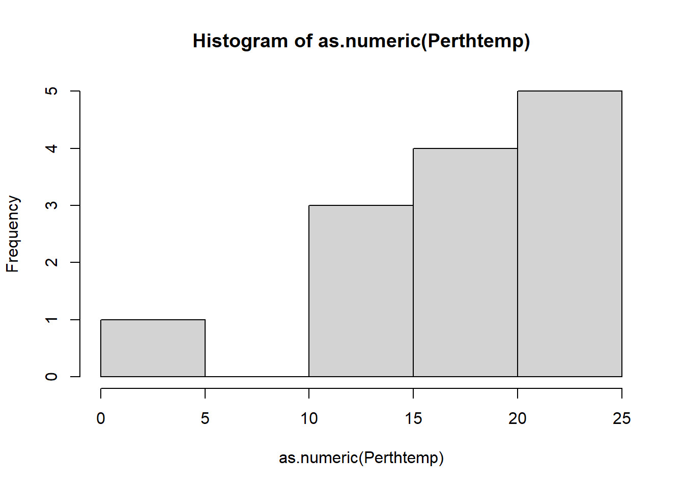
You’ll notice that whilst we have the whole of Australia the raster hasn’t been perfectly clipped to the exact outline….the extent just specifies an extent box that will cover the whole of the shape.
- If want to just get raster data within the outline of the shape:
exactAus <- Austemp %>%
mask(.,Ausoutline, na.rm=TRUE)You could also run this using the original worldclimtemp raster, however, it may take some time. I’d recommend cropping to the extent first.
Both our Austemp and exactAus are raster bricks. A brick is similar to a stack except it is now stored as one file instead of a collection.
- Let’s re-compute our histogram for Australia in March. We could just use hist like we have done before. We can either subset using the location (we know March is third in the RasterBrick).
#subset using the known location of the raster
hist(exactAus[[3]], col="red", main ="March temperature")
We can also subset based on the name of the Brick, sadly we can’t apply filter() from dplyr (like we did earlier when filtering Perth) yet to rasters…
#OR
#subset with the word Mar
hist(raster::subset(exactAus, "Mar"), col="red", main ="March temperature")
However we have a bit more control with ggplot()…
3.6.4 Histogram with ggplot
- We need to make our raster into a data.frame to be compatible with
ggplot2, using a dataframe or tibble
exactAusdf <- exactAus %>%
as.data.frame()library(ggplot2)
# set up the basic histogram
gghist <- ggplot(exactAusdf,
aes(x=Mar)) +
geom_histogram(color="black",
fill="white")+
labs(title="Ggplot2 histogram of Australian March temperatures",
x="Temperature",
y="Frequency")
# add a vertical line to the hisogram showing mean tempearture
gghist + geom_vline(aes(xintercept=mean(Mar,
na.rm=TRUE)),
color="blue",
linetype="dashed",
size=1)+
theme(plot.title = element_text(hjust = 0.5))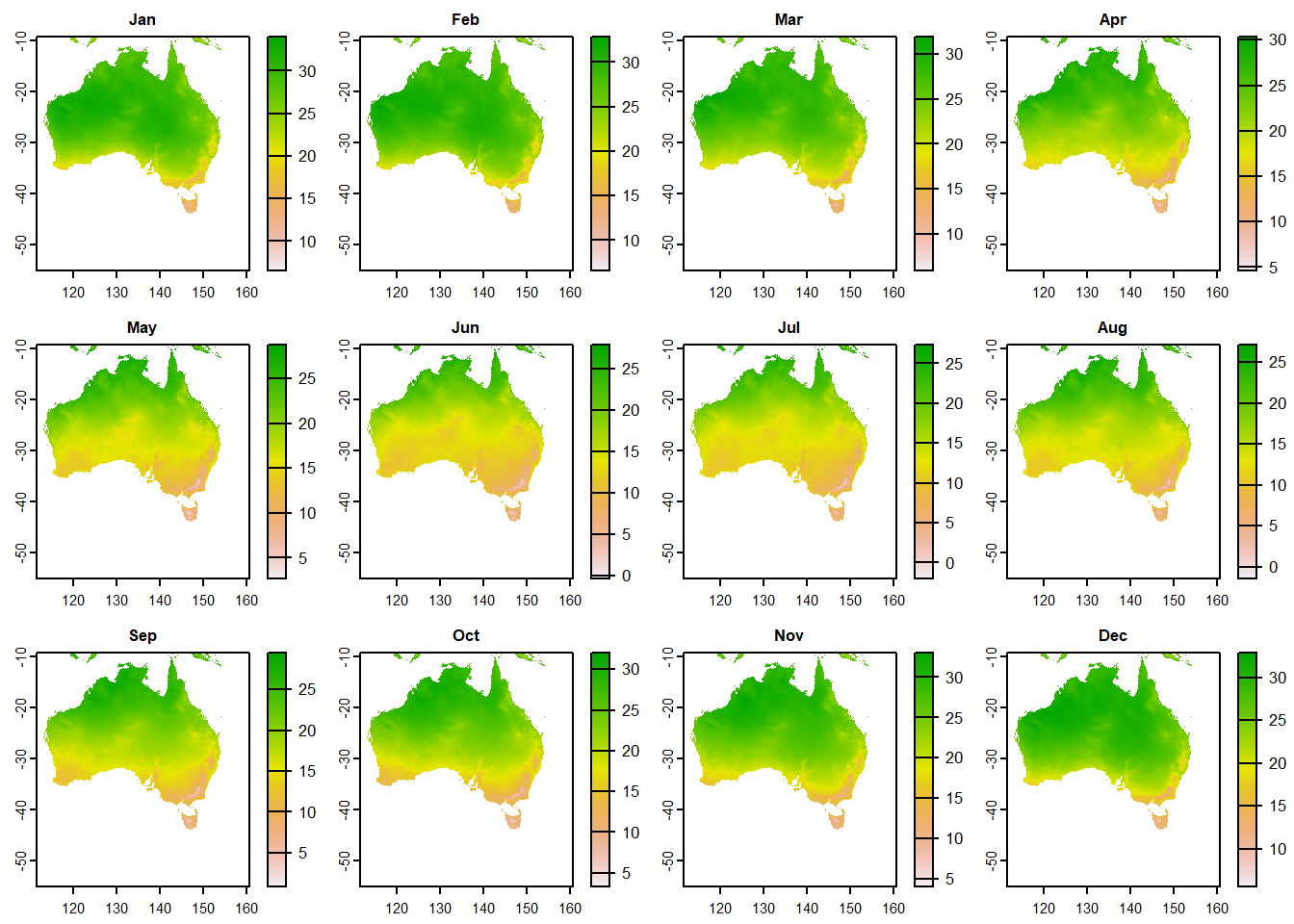
How about plotting multiple months of temperature data on the same histogram
- As we did in practical 2, we need to put our variable (months) into a one column using
pivot_longer(). Here, we are saying select columns 1-12 (all the months) and place them in a new column calledMonthand their values in another calledTemp
squishdata<-exactAusdf%>%
pivot_longer(
cols = 1:12,
names_to = "Month",
values_to = "Temp"
)- Then subset the data, selecting two months using
filter()fromdplyr
twomonths <- squishdata %>%
# | = OR
filter(., Month=="Jan" | Month=="Jun")- Get the mean for each month we selected, remember
group_by()andsummarise()from last week?
meantwomonths <- twomonths %>%
group_by(Month) %>%
summarise(mean=mean(Temp, na.rm=TRUE))
meantwomonths## # A tibble: 2 x 2
## Month mean
## <chr> <dbl>
## 1 Jan 28.1
## 2 Jun 15.0- Select the colour and fill based on the variable (which is our month). The intercept is the mean we just calculated, with the lines also based on the coloumn variable.
ggplot(twomonths, aes(x=Temp, color=Month, fill=Month)) +
geom_histogram(position="identity", alpha=0.5)+
geom_vline(data=meantwomonths,
aes(xintercept=mean,
color=Month),
linetype="dashed")+
labs(title="Ggplot2 histogram of Australian Jan and Jun
temperatures",
x="Temperature",
y="Frequency")+
theme_classic()+
theme(plot.title = element_text(hjust = 0.5))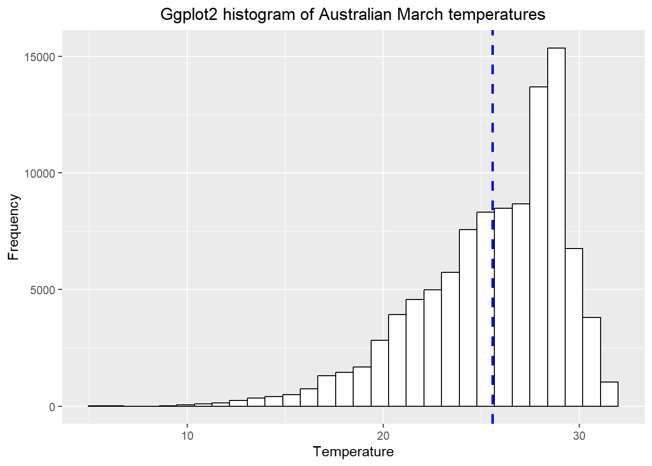
Note how i adjusted the title after i selected the theme, if i had done this before the theme defaults would have overwritten my command.
- Have you been getting an annoying error message about bin size and non-finate values? Me too!…Bin size defaults to 30 in
ggplot2and the non-finate values is referring to lots of NAs (no data) that we have in our dataset. In the code below i’ve:
dropped all the NAs with
drop_na()made sure that the Month column has the levels specified, which will map in descending order (e.g. Jan, Feb, March..)
selected a bin width of 5 and produced a faceted plot…
data_complete_cases <- squishdata %>%
drop_na()%>%
mutate(Month = factor(Month, levels = c("Jan","Feb","Mar",
"Apr","May","Jun",
"Jul","Aug","Sep",
"Oct","Nov","Dec")))
# Plot faceted histogram
ggplot(data_complete_cases, aes(x=Temp, na.rm=TRUE))+
geom_histogram(color="black", binwidth = 5)+
labs(title="Ggplot2 faceted histogram of Australian temperatures",
x="Temperature",
y="Frequency")+
facet_grid(Month ~ .)+
theme(plot.title = element_text(hjust = 0.5))
Does this seem right to you? Well…yes. It shows that the distribution of temperature is higher (or warmer) in the Australian summer (Dec-Feb) than the rest of the year, which makes perfect sense.
How about an interactive histogram using plotly…
- See if you can understand what is going on in the code below. Run each line separately.
library(plotly)
# split the data for plotly based on month
jan <- squishdata %>%
drop_na() %>%
filter(., Month=="Jan")
jun <- squishdata %>%
drop_na() %>%
filter(., Month=="Jun")
# give axis titles
x <- list (title = "Temperature")
y <- list (title = "Frequency")
# set the bin width
xbinsno<-list(start=0, end=40, size = 2.5)
# plot the histogram calling all the variables we just set
ihist<-plot_ly(alpha = 0.6) %>%
add_histogram(x = jan$Temp,
xbins=xbinsno, name="January") %>%
add_histogram(x = jun$Temp,
xbins=xbinsno, name="June") %>%
layout(barmode = "overlay", xaxis=x, yaxis=y)
ihistThis format of code where you set lots of varaibles then call them within a plot, package or fuction is sometihng you should become more familiar with as it’s considerd good practice. If you were to go on and produce multiple plots using the same legends / aesthetics you only ahve to set them once.
Ok so enough with the histograms…the point is to think about how to best display your data both effectively and efficiently.
- Let’s change the pace a bit and do a quickfire of other descrptive statistics you might want to use…
# mean per month
meanofall <- squishdata %>%
group_by(Month) %>%
summarise(mean = mean(Temp, na.rm=TRUE))
# print the top 1
head(meanofall, n=1)## # A tibble: 1 x 2
## Month mean
## <chr> <dbl>
## 1 Apr 22.2# standard deviation per month
sdofall <- squishdata %>%
group_by(Month) %>%
summarize(sd = sd(Temp, na.rm=TRUE))
# maximum per month
maxofall <- squishdata %>%
group_by(Month) %>%
summarize(max = max(Temp, na.rm=TRUE))
# minimum per month
minofall <- squishdata %>%
group_by(Month) %>%
summarize(min = min(Temp, na.rm=TRUE))
# Interquartlie range per month
IQRofall <- squishdata %>%
group_by(Month) %>%
summarize(IQR = IQR(Temp, na.rm=TRUE))
# perhaps you want to store multiple outputs in one list..
lotsofstats <- squishdata %>%
group_by(Month) %>%
summarize(IQR = IQR(Temp, na.rm=TRUE),
max=max(Temp, na.rm=T))
# or you want to know the mean (or some other stat)
#for the whole year as opposed to each month...
meanwholeyear=squishdata %>%
summarize(meanyear = mean(Temp, na.rm=TRUE))3.7 Advanced analysis
Are you already competent with raster analysis and R, then have a go at completing this task in the practical session.
- Select a different city and create a histogram for average summer and average winter temperatures
- Summarise the data with a box or violin plot, data-to-viz will help.
3.8 Feedback
Was anything that we explained unclear this week or was something really clear…let us know using the feedback form. It’s anonymous and we’ll use the responses to clear any issues up in the future / adapt the material.