Chapter 7 Advanced raster analysis
7.1 Learning objectives
By the end of this practical you should be able to:
- Explain and execute appropraite pre-proessing steps of raster data
- Replicate published methodologies using raster data
- Design new R code to undertake further analysis
7.2 Homework
Outside of our schedulded sessions you should be doing around 12 hours of extra study per week. Feel free to follow your own GIS interests, but good places to start include the following:
Assignment
From weeks 6-9, learn and practice analysis from the course and identify appropriate techniques (from wider research) that might be applicable/relevant to your data. Conduct an extensive methodological review – this could include analysis from within academic literature and/or government departments (or any reputable source).
Reading
This week:
Appendix “Raster operations in R” from Intro to GIS and Spatial Analysis by Gimond (2019)
Raster manipulation" from Spatial data science by Hijmans (2016). This last one is another tutoiral — it seems there aren’t any decent free raster textbook chapters, let me know if you find one.
Remember this is just a starting point, explore the reading list, practical and lecture for more ideas.
7.3 Recommended listening
Some of these practicals are long, take regular breaks and have a listen to some of our fav tunes each week.
Adam This week, it’s DJ Shadow. Yes, you heard correctly! DJ Shadow is back with an epic double-album. Disc 1 is fully instrumental and, some may say, a little less immediate. Disc 2 will be more reminiscent some of his classic collaborations from earlier albums. It’s hip hop Jim, but not as we know it.
7.4 Introduction
Within this practical we are going to be using data from the Landsat satellite series provided for free by the United States Geological Survey (USGS) to replicate published methods. Landsat imagery is the longest free temporal image repository of consistent medium resolution data. It collects data at each point on Earth each every 16 days (temporal resolution) in a raster grid composed of 30 by 30 m cells (spatial resolution). Geographical analysis and concepts are becoming ever more entwined with remote sensing and Earth observation. Back when I was an undergraduate there was specific software for undertaking certain analysis, now you can basically use any GIS. I see remote sensing as the science behind collecting the data with spatial data analysis then taking that data and providing meaning. So whilst i’ll give a background to Landsat data and remote sensing, this practical will focus on more advanced methods for analysing and extracting meaning from raster data.
7.5 .gitignore
If you are using Git with your project and have large data it’s best to set up a .gitignore file. This file tells git to ignore certain files so they aren’t in your local repository that is then pushed to GitHub. If you try and push large files to GitHub you will get an error and could run into lots of problems, trust me, i’ve been there. Look at my .gitignore for this repository and you will notice:
/prac7_data/Lsatdata/*
/prac7_data/exampleGoogleDrivedata/*
This means igore all files within these folders, all is denoted by the *. The .gitignore has to be in your main project folder, if you have made a a git repo for your project then you should have a .gitignore so all you have to do is open it and add the folder or file paths you wish to ignore.
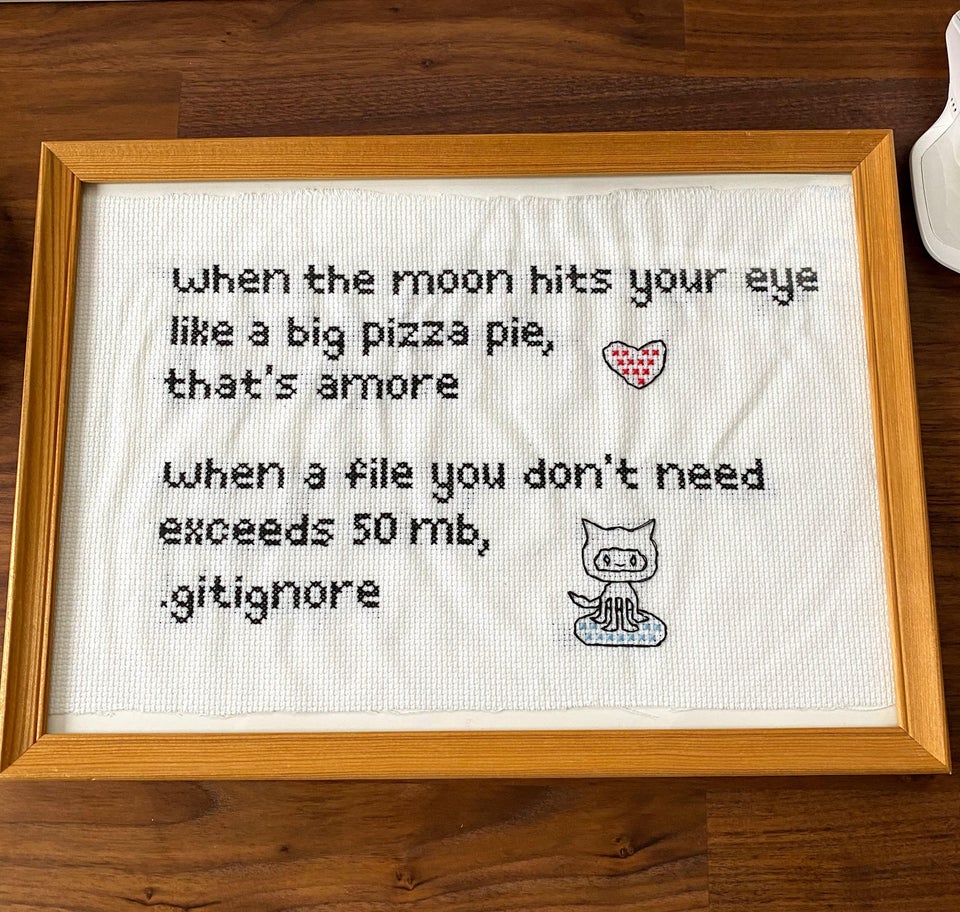
GitHub has a maximum file upload size of 50mb….image credit reddit r/ProgrammerHumor
7.5.1 Remote sensing background (required)
- Landsat is raster data
- It has pixels of 30 by 30m collected every 16 days with global coverage
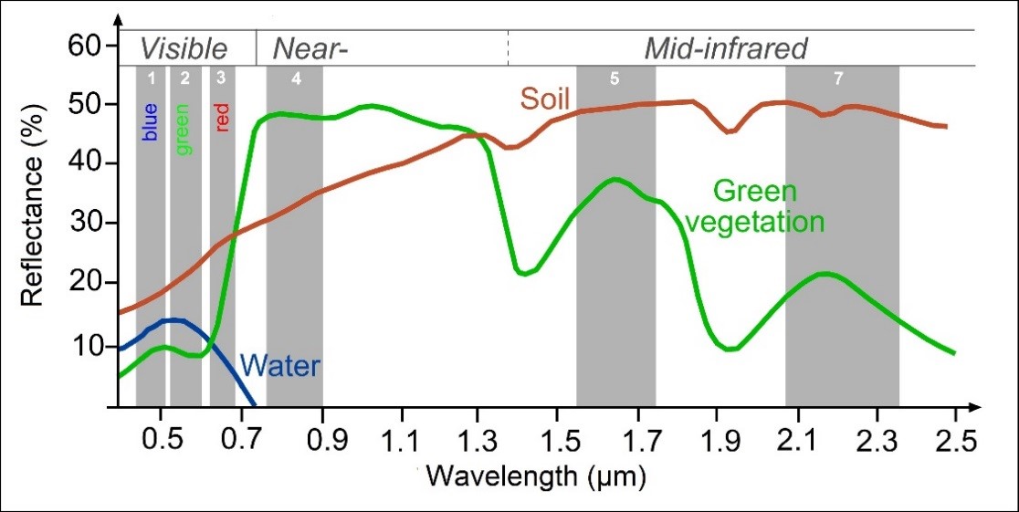
- As humans we see in the visible part of the electromagnetic spectrum (red-green-blue) Landsat takes samples in these bands and several more to make a spectral sigature for each pixel (see image below)
- Each band is provided as a seperate
.TIFFraster layer
Later on we will compute temperature from the Landsat data, whilst i refer to and explain each varaiable created don’t get overwhelmed by it, take away the process of loading and manipulating raster data in R to extract meaningful information. An optional remote sensing background containing additional information can be found at the end of this practical should you wish to explore this further.
7.6 Data
7.6.1 Shapefile
The shapefile of Manchester is available from the data folder for this week on GitHub
7.6.2 Raster data (Landsat)
To access the Landsat data we will use in this practical you can either:
- Sign up for a free account at: https://earthexplorer.usgs.gov/.
- Use the Landsat data provided on Moodle — this will be available only if the earth explorer website is down (e.g. in the case of US government shutdowns)
To download the data:
- Search for Manchester in the address/place box and select it.
- Select the date range between the 12/5/2019 and 14/5/2019 — it’s a US website so check the dates are correct.
- Click dataset and select Landsat, then Landsat Collection 1 Level-1, check Landsat 8 (level 2 is surface reflectance — see Remote sensing background (optional)
- Click results, there should be one image, download it..it might take a while
- Landsat data comes zipped twice as a
.tar.gz. Use 7Zip or another file extractor, extract it once to get to a.tarthen extract again and files should appear.
7.6.2.1 Alternative raster data
Occasionally the earth explorer website can go down for maintenance or during government shutdowns. If possible I strongly advise you to learn how to use it’s interface as multiple other data providers have similar interfaces. GitHub also place a strict size limit on files of 100MB. However, in order to account for situations like this I’ve placed the zipped file on GoogleDrive and will demonstrate how to access this from R using the new googledrive package.
This could be a great option for you to gain reproducibility points if you have large files that you can’t upload to GitHub.
In GoogleDrive you need to ensure your file is shareable with others — right click on it > Share > then copy the link. I have done this for my file in the example below, but if you try and replicate this, make sure you’ve done it otherwise it might not work when other people try and run your code, as they won’t have access to the file on your GoogleDrive.
Depending on your internet speed this example might take some time…
Be sure to change the path to your practical 7 folder but make sure you include the filename within it and set overwrite to T (or TRUE) if you are going to run this again.
library("googledrive")

o<-drive_download("https://drive.google.com/open?id=1MV7ym_LW3Pz3MxHrk-qErN1c_nR0NWXy",
                  path="prac7_data/exampleGoogleDrivedata/LC08_L1TP_203023_20190513_20190521_01_T1.tar.gz",
                  overwrite=T)
Next we need to uncompress and unzip the file with untar(), first list the files that end in the extension .gz then pass that to untar with the pipe %>% remember this basically means after this function… then…do this other function with that data
listgoogledriveGZ <- list.files("prac7_data/exampleGoogleDrive",pattern="\\.gz$",
                          ignore.case=TRUE, full.names=TRUE) %>%
  untar(exdir="prac7_data/exampleGoogleDrivedata")
Alternatively instead of the pipe you could write…
listgoogledriveGZ <- list.files("prac7_data/exampleGoogleDrive",pattern="\\.gz$",
                          ignore.case=TRUE, full.names=TRUE)

untar(listgoogledriveGZ, exdir="prac7_data/exampleGoogleDrive")
The only difference is that our list of files (or just one file) has been passed to untar manually as i’ve used the untar() function like this…
Where:
tarfile is pathname of the .tar file and
exdir is the directory to extract files to
7.7 Processing raster data
7.7.1 Loading
Today, we are going to be using a Landsat 8 raster of Manchester. The vector shape file for Manchester has been taken from an ESRI repository.
- Let’s load the majority of packages we will need here.
## listing all possible libraries that all presenters may need following each practical
library(sp)
library(raster)
library(rgeos)
library(rgdal)
library(rasterVis)
library(ggplot2)- Now let’s list all our Landsat bands except band 8 (i’ll explain why next) along with our study area shapefile. Each band is a seperate
.TIFfile.
# List your raster files excluding band 8 using the patter argument
listlandsat <- list.files("prac7_data/Lsatdata",pattern=".*[B123456790]\\.tif$",
                          ignore.case=TRUE, full.names=TRUE)

# Load the manchester boundary
manchester_boundary <- readOGR('prac7_data/manchester_boundary.shp')
## OGR data source with driver: ESRI Shapefile
## Source: "C:\Users\Andy\OneDrive - University College London\Teaching\CASA0005repo\prac7_data\manchester_boundary.shp", layer: "manchester_boundary"
## with 1 features
## It has 5 fields
## Integer64 fields read as strings: OBJECTID# Load our raster layers into a stack
stacklandsat <- stack(listlandsat)
#check they have the same Coordinate Reference System (CRS)
crs(manchester_boundary)## CRS arguments:
## +proj=utm +zone=30 +datum=WGS84 +units=m +no_defs +ellps=WGS84
## +towgs84=0,0,0## CRS arguments:
## +proj=utm +zone=30 +datum=WGS84 +units=m +no_defs +ellps=WGS84
## +towgs84=0,0,07.7.2 Resampling
- There is an error with this dataset as band 8 does not fully align with the extent of the other raster layers. There are several ways to fix this, but in this tutorial we will resample the band 8 layer with the extent of band 1. Resampling takes awhile, so please be patient…
# get band 8
b8list <- list.files("prac7_data/Lsatdata",pattern=".*B[8]\\.tif$",
                     ignore.case=TRUE, full.names=TRUE)
b8 <- raster(b8list)

## ngb is a nearest neighbour sampling method
b8<-resample(b8,
             stacklandsat$LC08_L1TP_203023_20190513_20190521_01_T1_B1,
             method = "ngb")

# Write out the raster
writeRaster(b8, names(b8), format='GTiff', overwrite=TRUE)- Load band 8 and add it to our raster stack
b8list2 <- list.files("prac7_data/Lsatdata",pattern=".*B[8]\\.tif$", ignore.case=TRUE,
                      full.names = TRUE)

# Read in band 8
b8backin <- raster(b8list2)

stacklandsat <- addLayer(stacklandsat, b8backin)- We can compare it to see if both rasters have the same extent, number of rows and columns, projection, resolution and origin
compareRaster(stacklandsat$LC08_L1TP_203023_20190513_20190521_01_T1_B1,
              stacklandsat$LC08_L1TP_203023_20190513_20190521_01_T1_B8)
## [1] TRUE7.7.3 Clipping
- Our raster is currently the size of the scene which satellite data is distributed in, to clip it to our study area it’s best to first crop it to the extent of the shapefile and then mask it as we have done in previous practicals…
e <- extent(manchester_boundary)
lsatcrop <- crop(stacklandsat, e)
lsatmask <- mask(lsatcrop, manchester_boundary)- If all we wanted to do was clip our data, we could now change our filenames in the raster stack and write the
.TIFFfiles out again…
# add mask to the filenames within the raster stack
names(lsatmask)<-paste(names(lsatmask), "mask", sep="")

# I need to write mine out in another location
outputfilenames <- paste("prac7_data/Lsatdata/", names(lsatmask), sep="")
In the first line of code i’m taking the original names of the raster layers and adding “mask” to the end of them. This is done using paste() and the arguments
names(lsatmask): original raster layer names"mask": what i want to add to the namessep="": how the names and “mask” should be seperated — "" means no spaces
As i can’t upload my Landsat files to GitHub i’m storing them in a folder that is not linked (remember this is all sotred on GitHub) – so you won’t find prac7_data/Lsatdata on there. If you want to store your clipped Landsat files in your project directory just use:
For me though it’s:
Here i write out each raster layer individually though specifying bylayer=TRUE.
7.8 Data exploration
7.8.1 More loading and manipulating
- For the next stage of analysis we are only interested in bands 1-7, we can either load them back in from the files we just saved or take them directly from the original raster stack.
# either read them back in from the saved file:
manc_files<-list.files("prac7_data/Lsatdata/",pattern=".*B[1234567]\\mask.tif$",
                       ignore.case=TRUE, full.names=TRUE)
manc <- stack(manc_files)

# or extract them from the original stack
manc<-stack(lsatmask$LC08_L1TP_203023_20190513_20190521_01_T1_B1mask,
                   lsatmask$LC08_L1TP_203023_20190513_20190521_01_T1_B2mask,
                   lsatmask$LC08_L1TP_203023_20190513_20190521_01_T1_B3mask,
                   lsatmask$LC08_L1TP_203023_20190513_20190521_01_T1_B4mask,
                   lsatmask$LC08_L1TP_203023_20190513_20190521_01_T1_B5mask,
                   lsatmask$LC08_L1TP_203023_20190513_20190521_01_T1_B6mask,
                   lsatmask$LC08_L1TP_203023_20190513_20190521_01_T1_B7mask)

# Name the Bands based on where they sample the electromagentic spectrum
names(manc) <- c('ultra-blue', 'blue', 'green', 'red', 'NIR', 'SWIR1', 'SWIR2') - If you want to extract specific information from a raster stack use:
7.8.2 Plotting data
- Let’s actually have a look at our raster data, first in true colour (how humans see the world) and then false colour composites (using any other bands but not the combination of red, green and blue).
# true colour composite
manc_rgb <- stack(manc$red, manc$green, manc$blue)
# false colour composite
manc_false <- stack(manc$NIR, manc$red, manc$green)

plotRGB(manc_rgb, axes=TRUE, stretch="lin")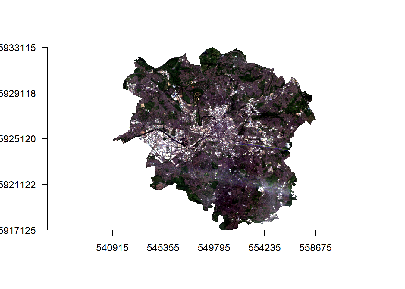

7.8.3 Data similarity
- What if you wanted to look at signle bands and also check the similarity between bands?
## How are these bands different?

#set the plot window size (2 by 2)
par(mfrow = c(2,2))
#plot the bands
plot(manc$blue, main = "Blue")
plot(manc$green, main = "Green")
plot(manc$red, main = "Red")
plot(manc$NIR, main = "NIR")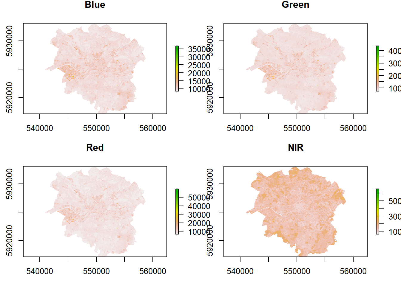
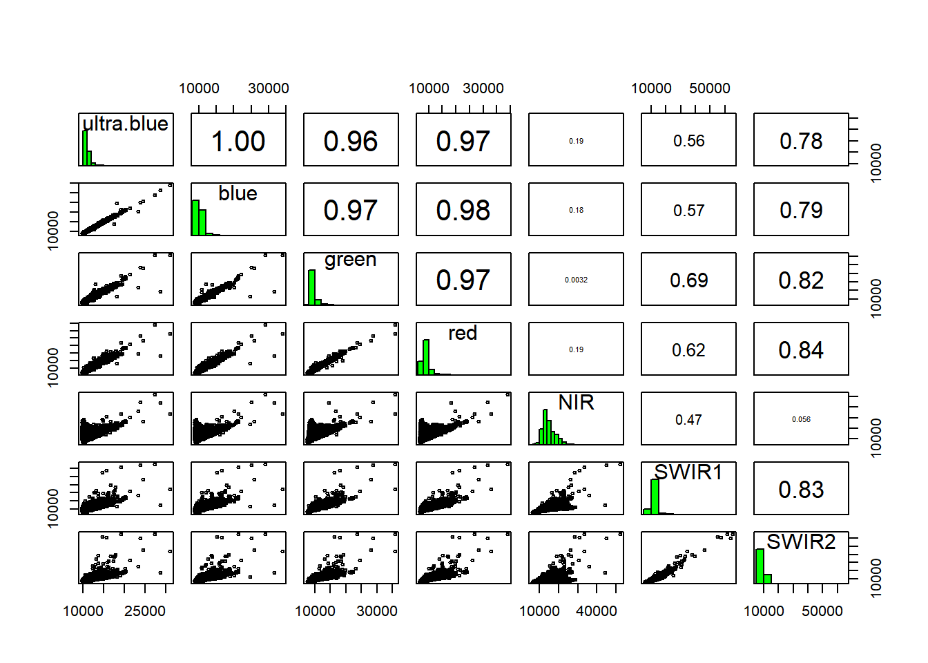
Low statistical significance means that the bands are sufficiently different enough in their wavelength reflectance to show different things in the image. We can also make this look a bit nicer with ggplot2 and GGally
library(ggplot2)
library(GGally)
mancdataframe=as.data.frame(manc[[1:7]], na.rm=TRUE)
randomsample<-mancdataframe[sample(nrow(mancdataframe), 100), ]
ggpairs(randomsample, axisLabels="none") 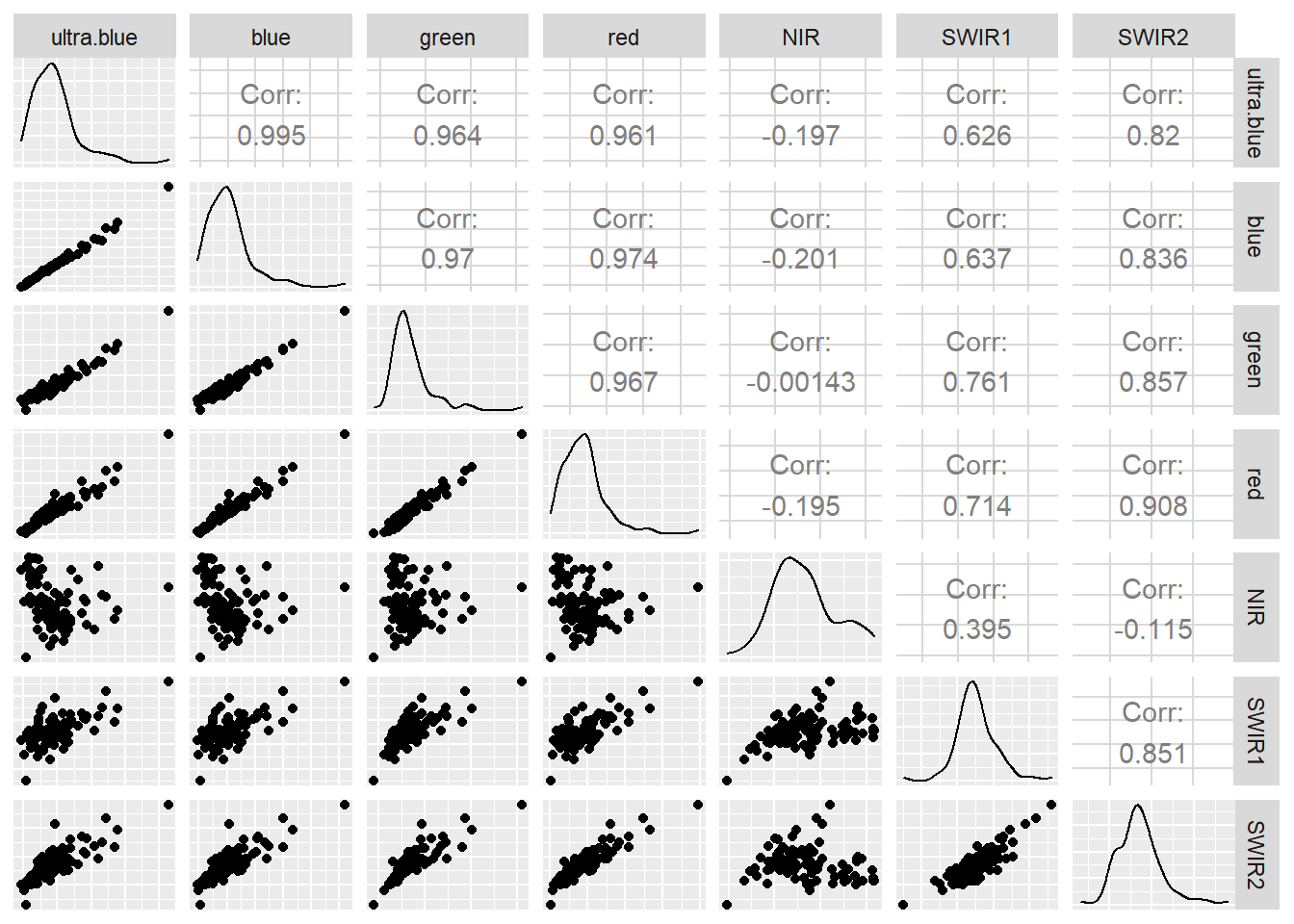
You can do much more using GGally have a look at the great documentation
7.9 Basic raster calculations
Now we will move on to some basic advanced raster analysis to compute temperature from this raster data. To do so we need to generate additional raster layers, the first of which is NDVI
7.9.1 NDVI
Live green vegetation can be represented with the NIR and Red Bands through the normalised difference vegetation index (NDVI) as chlorophyll reflects in the NIR wavelength, but absorbs in the Red wavelength.
\[NDVI= \frac{NIR-Red}{NIR+Red}\]
7.9.2 NDVI function
In R we can write functions to logically break our code into simpler sections. We can use NDVI as an example…
- Let’s make a function called
NDVIfun
Here we have said our function needs two arguments NIR and Red, the next line calcualtes NDVI based on the formula and returns it. To be able to use this function throughout our analysis either copy it into the console or make a new R script, save it in your project then call it within this code using the source() function e.g…
- To use the function do so through…
Here we call the function NDVIfun() and then provide the NIR and Red band.
- Check the output
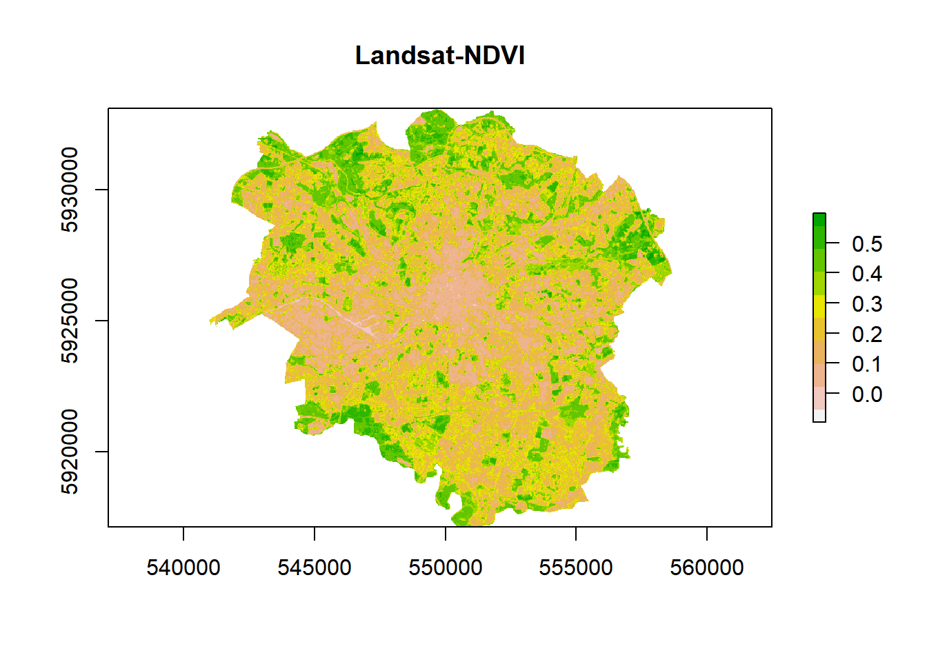
# Let's look at the histogram for this dataset
hist(ndvi, breaks = 40, main = "NDVI Histogram", xlim = c(-.3,.8))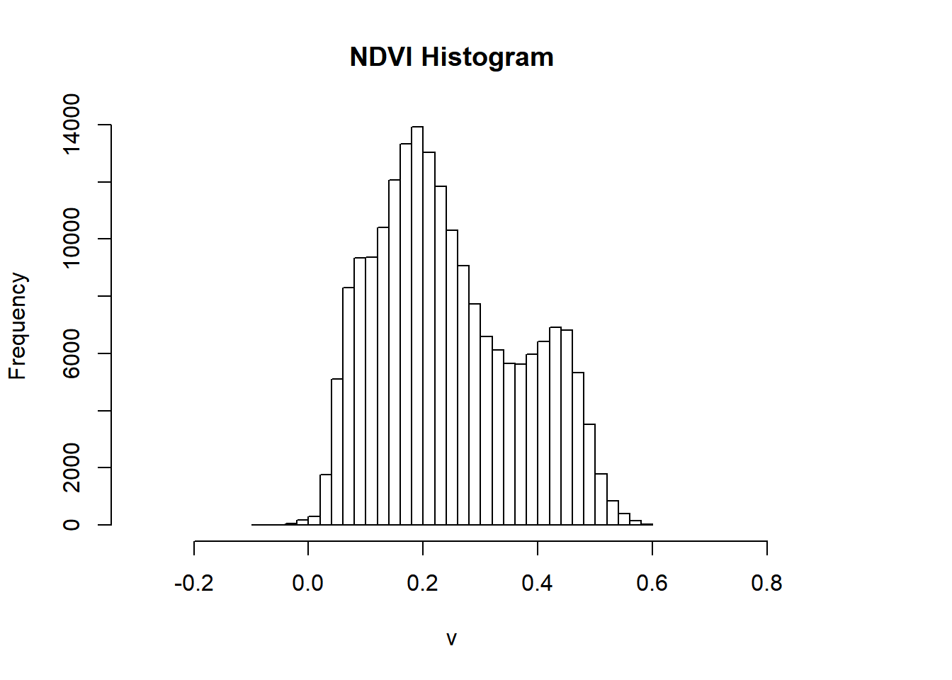
- We can reclassify to the raster to show use what is most likely going to vegetation based on the histogram using the 3rd quartile — anything above the 3rd quartile we assume is vegetation.
Note, this is an assumption for demonstration purposes, if you were to do something similar in your assignment be sure to provide reasoning with linkage to literature (e.g. policy or academic)

- Let’s look at this in relation to Manchester as a whole
plotRGB(manc_rgb, axes = TRUE, stretch = "lin", main = "Landsat True Color Composite")
plot(veg, add=TRUE, legend=FALSE)
7.10 Advanced raster calculations
The goal of this final section is to set up a mini investigation to see if there is a relationship between urban area and temperature. If our hypothesis is that there is a relationship then our null is that there is not a relationship…
7.10.1 Calucating tempearture from Landsat data
Here we are going to compute temperature from Landsat data — there are many methods that can be found within literature to do so but we will use the one originally developed by Artis & Carnahan (1982), recently summarised by Guha et al. 2018 and and Avdan and Jovanovska (2016).
Some of the terms used our outlined in the remote sensing background section at the end of the document, so check back there if you get confused.
- Calcualte the Top of Atmopshere (TOA) spectral radiance from the Digital Number (DN) using:
\[\lambda= Grescale * QCAL + Brescale\]
TOA spectral radiance is light reflected off the Earth as seen from the satellite measure in radiance units.
In this equation Grescale and Brescale represent the gain and bias of the image, with QCAL the Digital Number (DN) — how the raw Landsat image is captured.
Grescale and Brescale are available from the .MTL file provided when you downloaded the Landsat data. Either open this file in notepad and extract the required values for band 10 gain (MULT_BAND) and bias (ADD_BAND)
…Or we can automate it using the MTL() function within the RStoolbox package
library(RStoolbox)
MTL <- list.files("prac7_data/Lsatdata/",pattern="*MTL.txt", ignore.case=TRUE, full.names = TRUE)

readMTL<-readMeta(MTL)
#To see all the attributes
readMTL- Now let’s extract the values from the readMTL variable for Band 10…
- Run the calculation using the band 10 raster layer
TOA <-  offsetandgain$gain *
  lsatmask$LC08_L1TP_203023_20190513_20190521_01_T1_B10mask +
offsetandgain$offset- Next convert the TOA to Brightness Temperature \(T_b\) using the following equation:
\[T_b=\frac{K_2}{ln((K_1/\lambda)+1)}\]
Brightness temperature is the radiance travelling upward from the top of the atmosphere to the satellite in units of the temperature of an equivalent black body.
K1 (774.8853) and K2 (1321.0789) are pre launch calibration constants provided by USGS.
Check the handbook for these values
- Instead of hardcoding these values…yep, you guessed it… we can extract them from our
MTL
Calidata <- as.data.frame(readMTL$CALBT)

# subet the rows
Calidata <- subset(Calidata, rownames(Calidata) %in% "B10_dn")

# subset the columns
K1<-subset(Calidata, select=(K1))
K2<-subset(Calidata, select=(K2))

# get just the values out
K1<-K1$K1
K2<-K2$K2

# this would also work for K1
K1<-readMTL$CALBT$K1[1]

#for K2
K2<-readMTL$CALBT$K2[1]

Brighttemp<-(K2 / log((K1 / TOA) + 1))
Earlier we calcualted NDVI, let’s use that to determine emissivity of each pixel.
- First we need to calcualte the fractional vegetation of each pixel, through the equation:
\[F_v= \left( \frac{NDVI - NDVI_{min}}{NDVI_{max}-NDVI_{min}} \right)^2\]
Fractional vegetation cover is the ratio of vertically projected area of vegetation to the total surface extent.
Here, \(NDVI_{min}\) is the minimum NDVI value (0.2) where pixels are considered bare earth and \(NDVI_{max}\) is the value at which pixels are considered healthy vegetation (0.5)
- Now compute the emissivity using:
\[\varepsilon = 0.004*F_v+0.986\]
Emissivity is the ratio absorbed radiation engery to total incoming radiation engery compared to a blackbody (which would absorb everything), being ameasure of absoptivity.
- Great, we’re nearly there… get our LST following the equation from Weng et al. 2004 (also summarised in Guja et al. (2018) and Avdan and Jovanovska (2016)):
\[LST= \frac{T_b}{1+(\lambda \varrho T_b / (p))ln\varepsilon}\]
Where:
\[p= h\frac{c}{\varrho}\]
Ok, don’t freak out….let’s start with calculating \(p\)
Here we have:
\(h\) which is Plank’s constant \(6.626 × 10^-34 Js\)
\(c\) which is the velocity of light in a vaccum \(2.998 × 10^8 m/sec\)
\(\varrho\) which is the Boltzmann constant of \(1.38 × 10^-23 J/K\)
Now for the rest of the equation….we have the values for:
\(\lambda\) which is the effective wavelength of our data (10.9 for Landsat 8 band 10)
\(\varepsilon\) emissivity
\(T_b\) Brightness Temperature
- Run the equation with our data
#define remaining varaibles
lambda=1.09e-5
#run the LST calculation
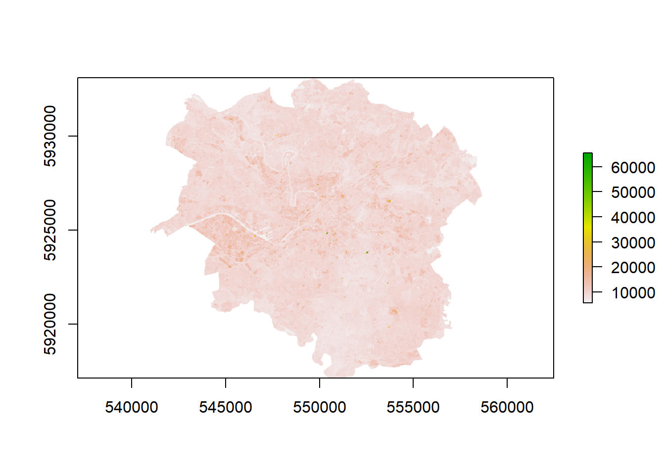
LST <-Brighttemp/(1 +(lambda*Brighttemp/p)*log(emiss))
# check the values
LST## class : RasterLayer
## dimensions : 533, 592, 315536 (nrow, ncol, ncell)
## resolution : 30, 30 (x, y)
## extent : 540915, 558675, 5917125, 5933115 (xmin, xmax, ymin, ymax)
## crs : +proj=utm +zone=30 +datum=WGS84 +units=m +no_defs +ellps=WGS84 +towgs84=0,0,0
## source : memory
## names : layer
## values : 281.4855, 305.9571 (min, max)- Are the values very high?… That’s because we are in Kevlin not degrees Celcius…let’s fix that and plot the map
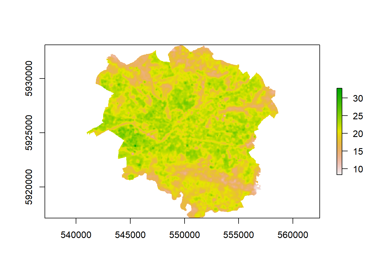
Nice that’s our temperature data sorted.
7.11 Calucating urban area from Landsat data
How about we extract some urban area using another index and then see how our temperature data is related?
We will use the Normalized Difference Built-up Index (NDBI) algorithm for identification of built up regions using the reflective bands: Red, Near-Infrared (NIR) and Mid-Infrared (MIR) originally proposed by Zha et al. (2003).
It is very similar to our earlier NDVI calculation but using different bands…
\[NDBI= \frac{Short-wave Infrared (SWIR)-Near Infrared (NIR)}{Short-wave Infrared (SWIR)+Near Infrared (NIR)}\]
In Landsat 8 data the SWIR is band 6 and the NIR band 5
- Let’s compute this index now…
NDBI=((lsatmask$LC08_L1TP_203023_20190513_20190521_01_T1_B6mask-
         lsatmask$LC08_L1TP_203023_20190513_20190521_01_T1_B5mask)/
        (lsatmask$LC08_L1TP_203023_20190513_20190521_01_T1_B6mask+
        lsatmask$LC08_L1TP_203023_20190513_20190521_01_T1_B5mask))
But do you remember our function? …Well this is the same calculation we used there just with different raster layers (or bands) so we could reuse it…
7.12 Urban area and temperature relationship
- We could plot the varaibles agaisnt each other but there are a lot of data points
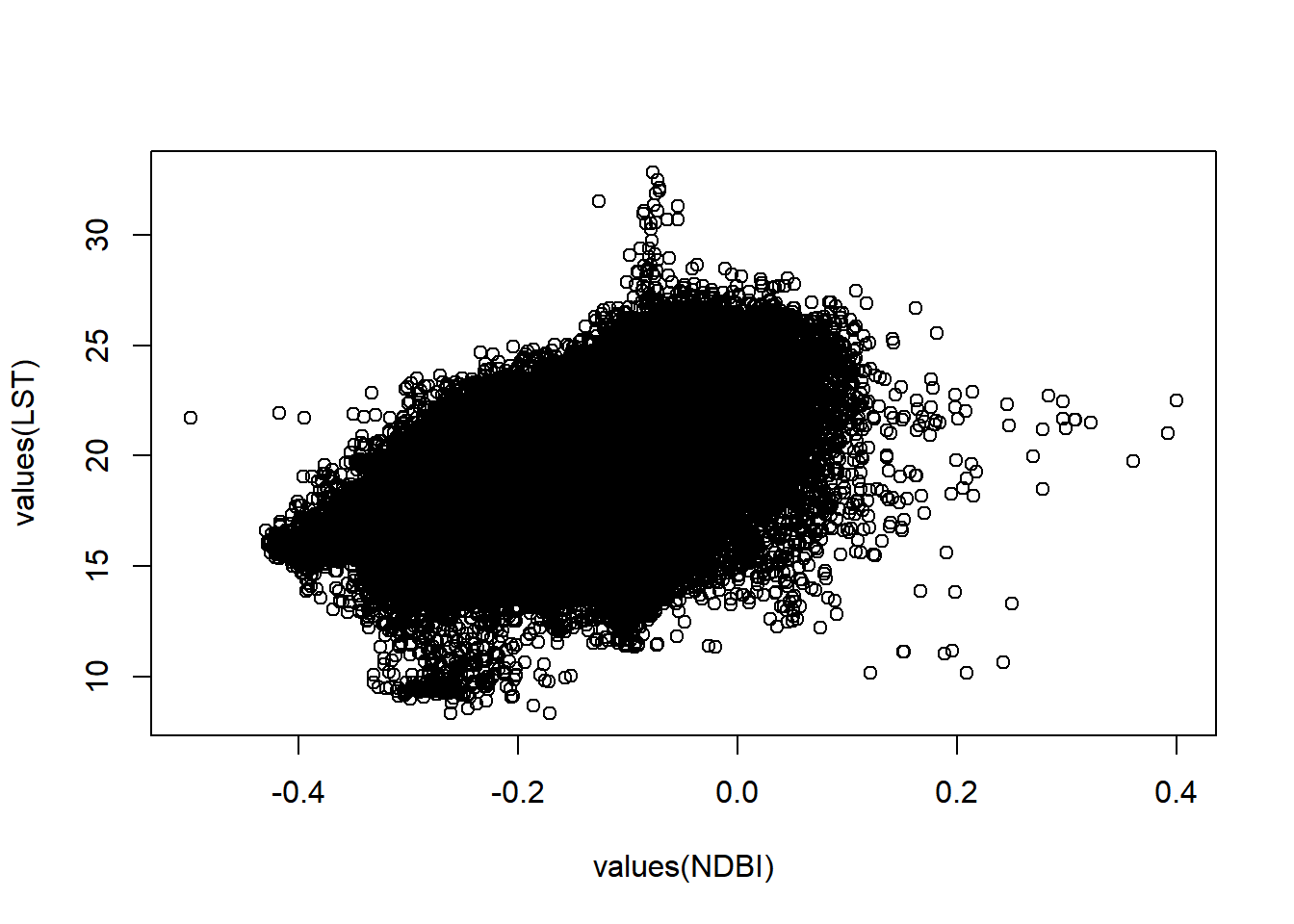
This is termed the overplotting problem. So, let’s just take a random subset of the same pixels from both raster layers.
- To do so we need to again stack our layers
# stack the layers
computeddata=stack(LST,NDBI)

# take a random subset
random=sampleRandom(computeddata, 500, cells=TRUE)

# check the output
plot(random[,2], random[,3])
- Let’s jazz things up, load some more packages
- Transfrom the data to a data.frame to work with
ggplot, then plot
#convert to a data frame
randomdf=as.data.frame(random)

#rename the coloumns
names(randomdf)<-c("cell", "Temperature", "Urban")

heat<-ggplot(randomdf, aes(x = Urban, y = Temperature))+
  geom_point(alpha=2, colour = "#51A0D5")+
  labs(x = "Temperature",
       y = "Urban index",
       title = "Manchester urban and temperature relationship")+
   geom_smooth(method='lm', se=FALSE)+
  theme_classic()+
  theme(plot.title = element_text(hjust = 0.5))

# interactive plot
ggplotly(heat)
## `geom_smooth()` using formula 'y ~ x'It’s a masterpiece!
- How about plotting the whole dataset rather than a random subset…
7.13 Statistical summary
- To see if our varaibles are related let’s run some basic correlation
stat.sig=cor.test(computeddatadf$Temperature, computeddatadf$Urban, use = "complete.obs",
    method = c("pearson"))
stat.sig
##
## Pearson's product-moment correlation
##
## data: computeddatadf$Temperature and computeddatadf$Urban
## t = 393.67, df = 198268, p-value < 2.2e-16
## alternative hypothesis: true correlation is not equal to 0
## 95 percent confidence interval:
## 0.6598805 0.6648217
## sample estimates:
## cor
## 0.6623583Let’s walk through the results here…
- t: is the t-test statistic value, we can work out the critical t value using:
## [1] 1.959976As our t values is > than the critial value we can say that there is a relationship between the datasets. However, we would normally report the p-value…
- df: is the number of values we have -2…
## [1] 315536## [1] 198270## [1] 198270p-value: tells us wheather there is a statistically significant correlation between the datasets and if that we can reject the null hypothesis if p<0.05 (there is a 95% chance that the relationship is real).
cor: Pearon’s correlation coefficient
95 percent confidence interval: 95% confident that the population correlation coeffieicent is within this interval
As p<0.05 is shows that are variables are have a statistically significant correlation… so as urban area (assuming the index in representative) per pixel increases so does temperature…therefore we can reject our null hypothesis… but remember that this does not imply causation!!
If you want more information on statistics in R go and read YaRrr! A Pirate’s Guide to R, chapter 13 on hypothesis tests.
7.14 Considerations
If you wanted to explore this type of analysis further then you would need to consider the following:
- Other methods for extracting temperature from Landsat data
- Validation of your temperature layer (e.g. weather station data)
- The formula used to calculate emissivity — there are many
- The use of raw satellite data as opposed to remove the effects of the atmosphere. Within this practical we have only used relative spatial indexes (e.g. NDVI). However, if you were to use alternative methods it might be more appropraite to use surface reflectance data (also provided by USGS).
7.15 Extension
Already an expert with raster data and R? Here we have just looked at one temperature image and concluded that urban area and temperature are realted, but does that hold true for other time periods?
If you found this practical straightforward source some Landsat data for an area of interest and create some R code to explore the temporal relationship between urban area and temperature.
…Or run the analysis with different data and methods.
Data:
MODIS daily LST: https://modis.gsfc.nasa.gov/data/dataprod/mod11.php
MODIS imagery: https://modis.gsfc.nasa.gov/
Methods:
Supervised or unsupervised landcover classificaiton: https://rspatial.org/rs/5-supclassification.html#
Here you could classify an image into several landcover classes and explore their relationship with temperature
7.16 References
Thanks to CASA gradaute student Matt Ng for providing the outline to the start of this practical
Avdan, U. and Jovanovska, G., 2016. Algorithm for automated mapping of land surface temperature using LANDSAT 8 satellite data. Journal of Sensors, 2016.
Guha, S., Govil, H., Dey, A. and Gill, N., 2018. Analytical study of land surface temperature with NDVI and NDBI using Landsat 8 OLI and TIRS data in Florence and Naples city, Italy. European Journal of Remote Sensing, 51(1), pp.667-678.
Weng, Q., Lu, D. and Schubring, J., 2004. Estimation of land surface temperature–vegetation abundance relationship for urban heat island studies. Remote sensing of Environment, 89(4), pp.467-483.
Young, N.E., Anderson, R.S., Chignell, S.M., Vorster, A.G., Lawrence, R. and Evangelista, P.H., 2017. A survival guide to Landsat preprocessing. Ecology, 98(4), pp.920-932.
Zha, Y., Gao, J. and Ni, S., 2003. Use of normalized difference built-up index in automatically mapping urban areas from TM imagery. International journal of remote sensing, 24(3), pp.583-594.
7.17 Remote sensing background (optional)
Landsat sensors capture reflected solar energy, convert these data to radiance, then rescale this data into a Digital Number (DN), the latter representing the intensity of the electromagnetic radiation per pixel. The range of possible DN values depends on the sensor radiometric resolution. For example Landsat Thematic Mapper 5 (TM) measures between 0 and 255 (termed 8 bit), whilst Landsat 8 OLI measures between 0 and 65536 (termed 12 bit). These DN values can then be converted into Top of Atmosphere (TOA) radiance and TOA reflectance through available equations and known constants (https://landsat.usgs.gov/landsat-8-l8-data-users-handbook-section-5¬) that are preloaded into certain software. The former is how much light the instrument sees in meaningful units whilst the latter removes the effects of the light source. However, TOA reflectance is still influenced by atmospheric effects. These atmospheric effects can be removed through atmospheric correction achievable in software such as ENVI and QGIS to give surface reflectance representing a ratio of the amount of light leaving a target to the amount of light striking it.
We must also consider the spectral resolution of satellite imagery, Landsat 8 OLI has 11 spectral bands and as a result is a multi-spectral sensor. As humans we see in the visible part of the electromagnetic spectrum (red-green-blue) — this would be three bands of satellite imagery — however satellites can take advantage of the rest of the spectrum. Each band of Landsat measures in a certain part of the spectrum to produce a DN value. We can then combine these values to produce ‘colour composites’. So a ‘true’ colour composite is where red, green and blue Landsat bands are displayed (the visible spectrum). Based on the differing DN values obtained, we can pick out the unique signatures (values of all spectral bands) of each land cover type, termed spectral signature.
For more information read Young et al. (2017) A survival guide to Landsat preprocessing: https://esajournals.onlinelibrary.wiley.com/doi/pdf/10.1002/ecy.1730
7.18 Feedback
Was anything that we explained unclear this week or was something really clear…let us know using the feedback form. It’s anonymous and we’ll use the responses to clear any issues up in the future / adapt the material.