3 Point patterns and autocorrelation
Reading
Point patterns
Point Pattern Analysis (Chapter 11) + Chapter 13 Spatial Autocorrelation (Chapter 13), Intro to GIS and Spatial Analysis by Gimond (2023)
What Problem? Spatial Autocorrelation and Geographic Information Science by Goodchild (2009).
3.1 Learning outcomes
By the end of this practical you should be able to:
- Describe and evaluate methods for analysing spatial patterns
- Execute data cleaning and manipulation appropriate for analysis
- Determine the locations of spatial clusters using point pattern analysis methods
- Investigate the degree to which values at spatial points are similar (or different) to each other
- Interpret the meaning of spatial autocorrleation in spatial data
Today’s lecture is available online…at this URL: https://andrewmaclachlan.github.io/Spatial-analysis-of-public-health-data-24-points-and-autocorrelation/#1
3.2 Introduction
Today you will learn how to begin to analyse patterns in spatial data with points and spatially continuous observations.
The questions we want to answer are:
For any given London Ward, are Pharmacies distributed randomly or do they exhibit some kind of dispersed or clustered pattern
Are the values (in this case the density of pharmacies) similar (or dissimilar) across the wards of London.
3.3 Data
Load our packages
library(spatstat)
library(tidyverse)
library(tmap)
library(here)
library(sp)
library(sf)
library(RColorBrewer)
library(spdep)
Get the pharmacy data: https://datashare.ed.ac.uk/handle/10283/2501 and load it
pharmacy <- st_read("prac3_data/PharmacyEW/PharmacyEW.shp")%>%
  #remove any duplicates
  distinct()
Reading layer `PharmacyEW' from data source
`C:\Users\Andy\OneDrive - University College London\Teaching\Guest\Oxford_24\Spatial analysis of public health data\prac3_data\PharmacyEW\PharmacyEW.shp'
using driver `ESRI Shapefile'
Simple feature collection with 10589 features and 11 fields
Geometry type: POINT
Dimension: XY
Bounding box: xmin: 137070 ymin: 19187 xmax: 655138 ymax: 653253
Projected CRS: OSGB 1936 / British National Grid#check CRS
st_crs(pharmacy)Coordinate Reference System:
User input: OSGB 1936 / British National Grid
wkt:
PROJCRS["OSGB 1936 / British National Grid",
BASEGEOGCRS["OSGB 1936",
DATUM["OSGB 1936",
ELLIPSOID["Airy 1830",6377563.396,299.3249646,
LENGTHUNIT["metre",1]]],
PRIMEM["Greenwich",0,
ANGLEUNIT["degree",0.0174532925199433]],
ID["EPSG",4277]],
CONVERSION["British National Grid",
METHOD["Transverse Mercator",
ID["EPSG",9807]],
PARAMETER["Latitude of natural origin",49,
ANGLEUNIT["degree",0.0174532925199433],
ID["EPSG",8801]],
PARAMETER["Longitude of natural origin",-2,
ANGLEUNIT["degree",0.0174532925199433],
ID["EPSG",8802]],
PARAMETER["Scale factor at natural origin",0.9996012717,
SCALEUNIT["unity",1],
ID["EPSG",8805]],
PARAMETER["False easting",400000,
LENGTHUNIT["metre",1],
ID["EPSG",8806]],
PARAMETER["False northing",-100000,
LENGTHUNIT["metre",1],
ID["EPSG",8807]]],
CS[Cartesian,2],
AXIS["(E)",east,
ORDER[1],
LENGTHUNIT["metre",1]],
AXIS["(N)",north,
ORDER[2],
LENGTHUNIT["metre",1]],
USAGE[
SCOPE["Engineering survey, topographic mapping."],
AREA["United Kingdom (UK) - offshore to boundary of UKCS within 49°45'N to 61°N and 9°W to 2°E; onshore Great Britain (England, Wales and Scotland). Isle of Man onshore."],
BBOX[49.75,-9,61.01,2.01]],
ID["EPSG",27700]]#check with a plot
tm_shape(pharmacy) +
tm_dots(col = "blue")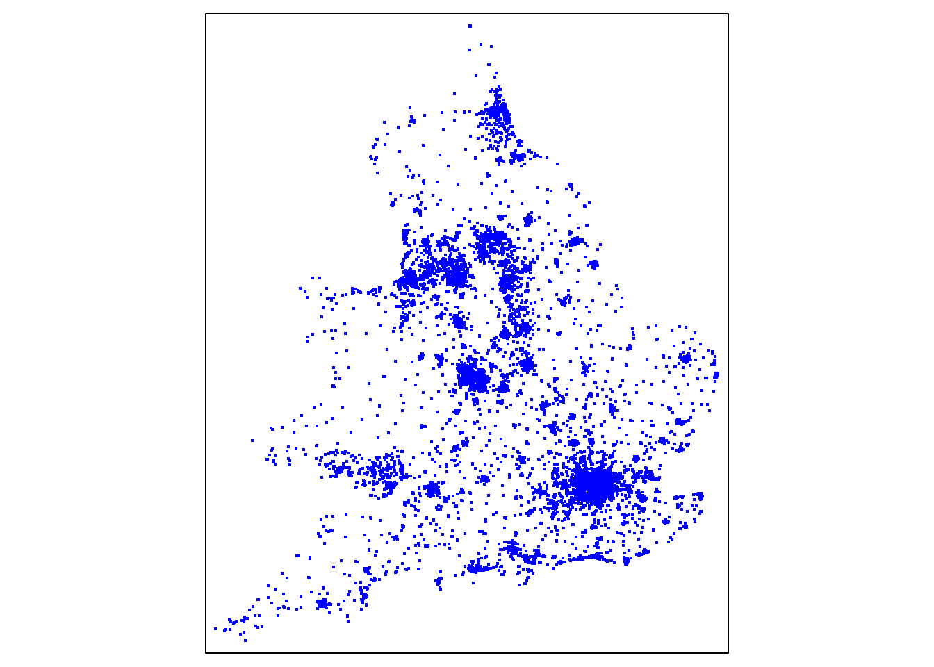
Get the London ward data and load it https://data.london.gov.uk/dataset/statistical-gis-boundary-files-london
wards<- st_read("prac3_data/statistical-gis-boundaries-london/statistical-gis-boundaries-london/ESRI/London_Ward_CityMerged.shp")%>%
  st_transform(.,27700)
Reading layer `London_Ward_CityMerged' from data source
`C:\Users\Andy\OneDrive - University College London\Teaching\Guest\Oxford_24\Spatial analysis of public health data\prac3_data\statistical-gis-boundaries-london\statistical-gis-boundaries-london\ESRI\London_Ward_CityMerged.shp'
using driver `ESRI Shapefile'
Simple feature collection with 625 features and 7 fields
Geometry type: POLYGON
Dimension: XY
Bounding box: xmin: 503568.2 ymin: 155850.8 xmax: 561957.5 ymax: 200933.9
Projected CRS: OSGB 1936 / British National Grid#check CRS
#st_crs(wards)Check the data
#check with a plot
tm_shape(wards) +
  tm_polygons(col = NA)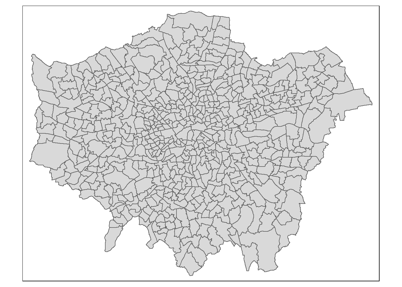
3.3.1 Wrangle data
As we can see above the pharmacy data is for the whole of the UK and we are just interested in London. So, we need to spatially subset our points within our study area…
Here, the second operator is blank , , - this controls which attributes are kept, although I’d rather keep all of them and manipulate with the tidyverse.
pharmacysub <- pharmacy[wards, , op=st_within]

#check with a plot
tm_shape(wards) +
  tm_polygons(col = NA, alpha=0.5)+
tm_shape(pharmacysub) +
  tm_dots(col="blue")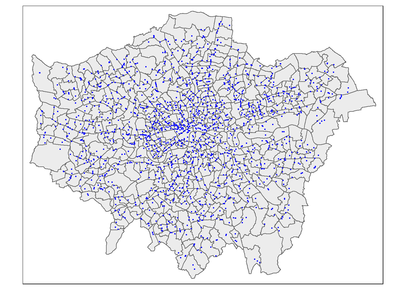
When we spatial subset data like this there are different topological relations we can specify. The default is intersects, but we could also use BluePlaquesSub <- BluePlaques[BoroughMap, , op = st_within], with the operator or op set to st_within, to identify points completely within the borough outline, or a variety of other options such as st_overlaps, st_touches, st_contains, st_disjoint. Any possible topological relationship you can think of a function will exist for it…visually this looks like…where each tick denotes the relations that apply to the polygons. Note, that in several cases multiple topological relations would work.
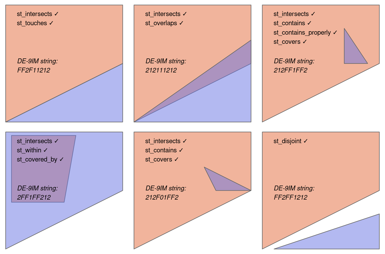
We can also just use the function which will have the indices of where they intersect.
# add sparse=false to get the complete matrix.
intersect_indices <-st_intersects(wards, pharmacy)
If you have used a graphic user interface GIS before, this is the same as select by location (e.g. select by location in QGIS), and as using filter from dplyr is the same as select by attribute.
3.4 Point patterns
For point pattern analysis we need a point pattern object (ppp)…within an observation window. This is specific to the spatstat package as we can’t do this with sf, SpatialPolygonsDataFrames or SpatialPointsDataFrames.
For this example i will set the boundary to London so we can see the points
boroughs <- st_read("prac3_data/statistical-gis-boundaries-london/statistical-gis-boundaries-london/ESRI/London_Borough_Excluding_MHW.shp")%>%
  st_transform(.,27700)
Reading layer `London_Borough_Excluding_MHW' from data source
`C:\Users\Andy\OneDrive - University College London\Teaching\Guest\Oxford_24\Spatial analysis of public health data\prac3_data\statistical-gis-boundaries-london\statistical-gis-boundaries-london\ESRI\London_Borough_Excluding_MHW.shp'
using driver `ESRI Shapefile'
Simple feature collection with 33 features and 7 fields
Geometry type: MULTIPOLYGON
Dimension: XY
Bounding box: xmin: 503568.2 ymin: 155850.8 xmax: 561957.5 ymax: 200933.9
Projected CRS: OSGB 1936 / British National Grid#now set a window as the borough boundary
window <- as.owin(boroughs)
plot(window)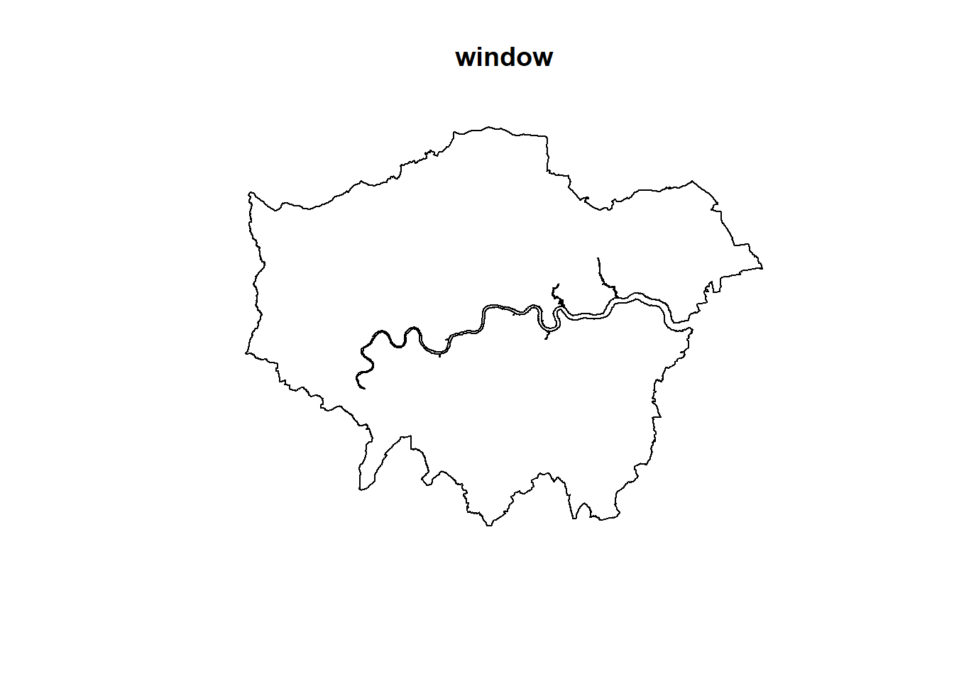
#create a sp object
pharmacysubsp<- pharmacysub %>%
  as(., 'Spatial')
#create a ppp object
pharmacysubsp.ppp <- ppp(x=pharmacysubsp@coords[,1],
                          y=pharmacysubsp@coords[,2],
                          window=window)

pharmacysubsp.ppp %>%
  plot(.,pch=16,cex=0.5,
              main="Pharmacies in London")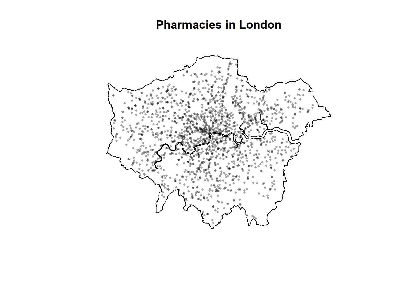
3.4.1 Quadrat analysis
So as you saw in the lecture, we are interesting in knowing whether the distribution of points in our study area differs from ‘complete spatial randomness’ — CSR. That’s different from a CRS! Be careful!
The most basic test of CSR is a quadrat analysis. We can carry out a simple quadrat analysis on our data using the quadrat count() function in spatstat. Note, I wouldn’t recommend doing a quadrat analysis in any real piece of analysis you conduct, but it is useful for starting to understand the Poisson distribution…
#First plot the points

plot(pharmacysubsp.ppp,
     pch=16,
     cex=0.5,
     main="Pharmacies")

#now count the points in that fall in a 20 x 20
#must be run all together otherwise there is a plot issue

pharmacysubsp.ppp %>%
  quadratcount(.,nx = 20, ny = 20)%>%
    plot(., add=T, col="red")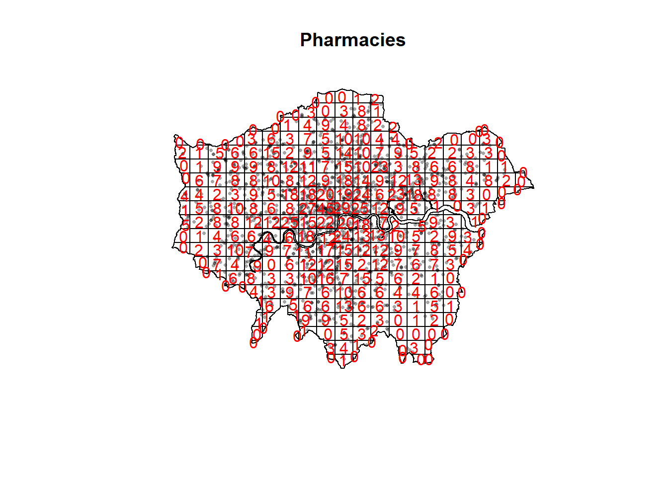
We want to know whether or not there is any kind of spatial patterning associated with pharmacies in areas of London. If you recall from the lecture, this means comparing our observed distribution of points with a statistically likely (Complete Spatial Random) distribution, based on the Poisson distribution.
Using the same quadratcount() function again (for the same sized grid) we can save the results into a table:
#run the quadrat count
qcount <- pharmacysubsp.ppp %>%
  quadratcount(.,nx = 20, ny = 20) %>%
  as.data.frame() %>%
  dplyr::count(var1=Freq)%>%
  dplyr::rename(freqquadratcount=n)
OK, so we now have a frequency table — next we need to calculate our expected values. The formula for calculating expected probabilities based on the Poisson distribution is:
\[Pr= (X =k) = \frac{\lambda^{k}e^{-\lambda}}{k!}\] where:
xis the number of occurrencesλis the mean number of occurrenceseis a constant- 2.718
sums <- qcount %>%
  #calculate the total blue plaques (Var * Freq)
  mutate(total = var1 * freqquadratcount) %>%
  # then the sums
  dplyr::summarise(across(everything(), sum))%>%
  dplyr::select(-var1)

lambda<- qcount%>%
  #calculate lambda - sum of freq count / sum of total plaques
  mutate(total = var1 * freqquadratcount)%>%
  dplyr::summarise(across(everything(), sum)) %>%
  mutate(lambda=total/freqquadratcount) %>%
  dplyr::select(lambda)%>%
  pull(lambda)
Calculate expected using the Poisson formula from above \(k\) is the number of pharmacies counted in a square and is found in the first column of our table…
qcounttable <- qcount %>%
  #Probability of number of plaques in quadrant using the formula
  mutate(pr=((lambda^var1)*exp(-lambda))/factorial(var1))%>%
  #now calculate the expected counts based on our total number of plaques
  #and save them to the table
  mutate(expected= (round(pr * sums$freqquadratcount, 0)))
Plot them
qcounttable_long <- qcounttable %>%
  pivot_longer(c("freqquadratcount", "expected"),
               names_to="countvs_expected",
               values_to="value")

ggplot(qcounttable_long, aes(var1, value)) +
  geom_line(aes(colour = countvs_expected ))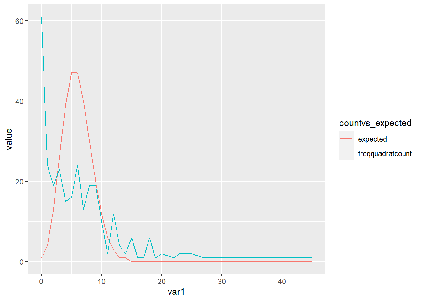
Check for association between two categorical variables - we are looking to see if our freqneucy is similar to the expected (which is random)
To check for sure, we can use the quadrat.test() function, built into spatstat. This uses a Chi Squared test to compare the observed and expected frequencies for each quadrant (rather than for quadrant bins, as we have just computed above).
A Chi-Squared test determines if there is an association between two categorical variables. The higher the Chi-Squared value, the greater the difference.
If the p-value of our Chi-Squared test is < 0.05, then we can reject a null hypothesis that says “there is no pattern - i.e. complete spatial randomness - in our data” (think of a null-hypothesis as the opposite of a hypothesis that says our data exhibit a pattern). What we need to look for is a value for p > 0.05. If our p-value is > 0.05 then this indicates that we have CSR and there is no pattern in our points. If it is < 0.05, this indicates that we do have clustering in our points.
teststats <- quadrat.test(pharmacysubsp.ppp, nx = 20, ny = 20)Warning: Some expected counts are small; chi^2 approximation may be inaccurateChi square with a p value < 0.05 therefore some clustering…but from the plot, this was expected
3.4.2 Ripley K
One way of getting around the limitations of quadrat analysis is to compare the observed distribution of points with the Poisson random model for a whole range of different distance radii. This is what Ripley’s K function computes. We can conduct a Ripley’s K test on our data very simply with the spatstat package using the kest() function.
Ripley’s K is defined as…
\[K(r) = \lambda^{-1} \sum{i}\sum{j}\frac{I(d_ij<r)}{n}\]
In English: Ripley’s K value for any circle radius \(r\) =
The average density of points for the entire study region (of all locations) \(\lambda = (n/ \Pi r^2))\)
Multiplied by the sum of the distances \(d_ij\) between all points within that search radius, see Dixon page 2 and Amgad et al. 2015
Divided by the total number of points, n
I = 1 or 0 depending if \(d_ij < r\)
The plot for K has a number of elements that are worth explaining. First, the Kpois(r) line in Red is the theoretical value of K for each distance window (r) under a Poisson assumption of Complete Spatial Randomness. The Black line is the estimated values of K accounting for the effects of the edge of the study area.
Here, the correction specifies how points towards the edge are dealt with, in this case, border means that points towards the edge are ignored for the calculation but are included for the central points. Section 2.1, here explains the different options.
Where the value of K falls above the line, the data appear to be clustered at that distance. Where the value of K is below the line, the data are dispersed…
K <- pharmacysubsp.ppp %>%
  Kest(., correction="border") %>%
  plot()
This was sort of expected too due to our previous analysis - suggesting that there is clustering throughout the points.
3.4.3 DBSCAN
Quadrat and Ripley’s K analysis are useful exploratory techniques for telling us if we have spatial clusters present in our point data, but they are not able to tell us WHERE in our area of interest the clusters are occurring. To discover this we need to use alternative techniques. One popular technique for discovering clusters in space (be this physical space or variable space) is DBSCAN. For the complete overview of the DBSCAN algorithm, read the original paper by Ester et al. (1996) or consult the wikipedia page
DBSCAN requires you to input two parameters: 1. Epsilon - this is the radius within which the algorithm with search for clusters 2. MinPts - this is the minimum number of points that should be considered a cluster
We could use the output of Ripley’s K to inform Epsilon or alternatively we can use kNNdistplot() from the dbscan package to find a suitable eps value based on the ‘knee’ in the plot…For MinPts we typically start with 4. But, try increasing the value of k in kNNdistplot you will notice as you increase it the knee becomes less obvious.
If we have MinPts too low we have a massive cluster
If we have MinPts too high we have a small single cluster
#first extract the points from the spatial points data frame
pharmacysub_coords <- pharmacysub %>%
  st_coordinates(.)%>%
  as.data.frame()

pharmacysub_coords%>%
  dbscan::kNNdistplot(.,k=20)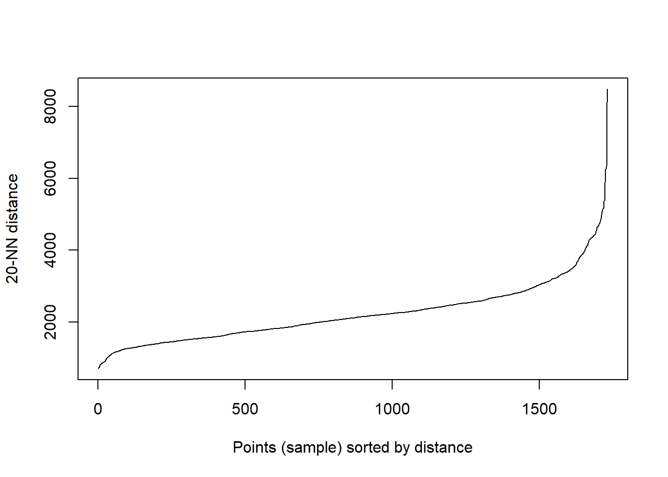
I started with an eps of 1600 and a minpts of 20..however…the large eps means that the city centre has a massive cluster…this isn’t exactly what i wanted to pull out. Instead i want to identify local clusters of pharmacies so try reducing the eps to 500 and the minpts to 5
OPTICS will let us remove the eps parameter but running every possible value, however, minpts is always meant to be domain knowledge
Depending on your points it might be possible to filter the values you aren’t interested in - this isn’t the case here, but for example stop and search data or flytipping could be filtered (well, depending on the extra data within the columns)
#now run the dbscan analysis
db <- pharmacysub_coords %>%
  fpc::dbscan(.,eps = 500, MinPts = 5)

#now plot the results
plot(db, pharmacysub_coords, main = "DBSCAN Output", frame = F)
plot(wards$geometry, add=T)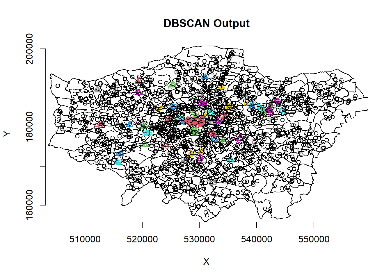
Our new db object contains lots of info including the cluster each set of point coordinates belongs to, whether the point is a seed point or a border point etc. We can get a summary by just calling the object. We can now add this cluster membership info back into our dataframe
pharmacysub_coords<- pharmacysub_coords %>%
  mutate(dbcluster=db$cluster)
Now create a ggplot2 object from our data
pharmacysub_coordsgt0 <- pharmacysub_coords %>%
  filter(dbcluster>0)

dbplot <- ggplot(data=wards)+
  geom_sf()+
  geom_point(data=pharmacysub_coordsgt0,
                 aes(X,Y, colour=dbcluster, fill=dbcluster))
#add the points in

dbplot + theme_bw() + coord_sf()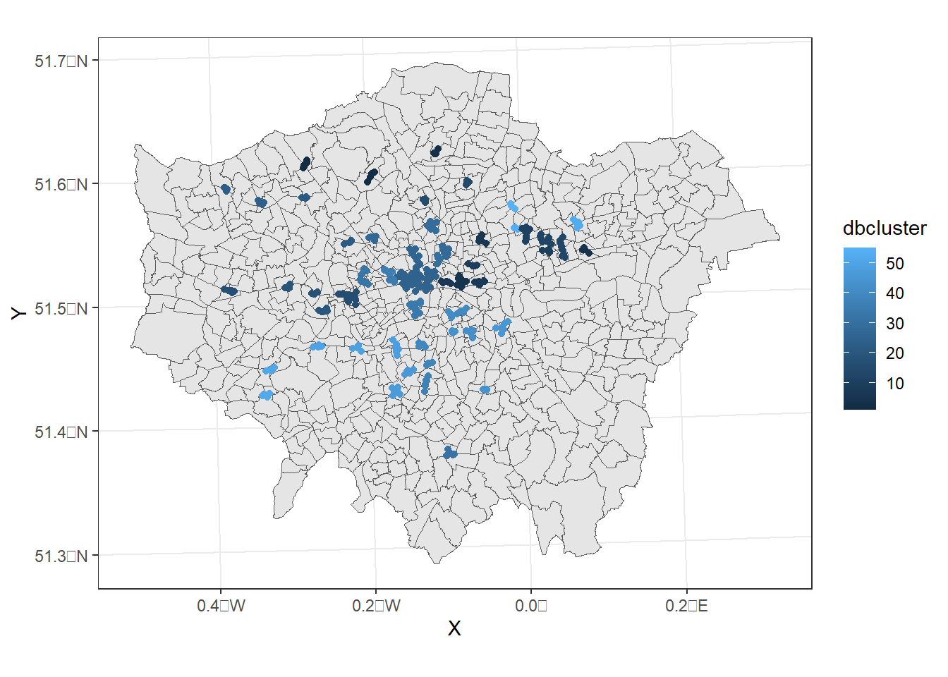
Now, this identifies where we have clustering based on our criteria but it doesn’t show where we have similar densities of pharmacies.
3.5 Spatial Autocorrelation
In this section we are going to explore patterns of spatially referenced continuous observations using various measures of spatial autocorrelation. Spatial autocorrelation is a measure of similarity between nearby data. We need to add all the points to the London wards then compute a density per ward could also use population here too! or some other data that can give us meaningful comparisons for our variable of interest.
3.5.1 Wrangle data
To do so we need to use a spatial join!
This is similar to the the joins (e.g. left joins) we explored with attribute data but here we just want to join datasets together based on their geometry and keep all their attribute data, this is useful in the code below where i want to join the pharmacies to the LSOA data
The output will be a massive dataset where each pharmacy will be a new row and will retain the attributes of the pharmacy data but also append the attribute of the LSOA st_join() defaults to a left join, so in this case the LSOA data is the left dataset and all the right data has been appended to it. If the left data (LSOA) had no matches (so no pharmacies) it would still appear in the final dataset. The default argument for this is st_intersects but we could also use other topological relationship functions such as st_within() instead…
example<-st_intersects(wards, pharmacysub)

example
Sparse geometry binary predicate list of length 625, where the
predicate was `intersects'
first 10 elements:
1: (empty)
2: 61, 65
3: 53, 59
4: 45, 54, 68
5: 44, 48, 49, 62
6: (empty)
7: 60, 66
8: 57
9: 55
10: 43, 56Here the polygon with the ID of 7 Chessington North and Hook has two pharmacies within it…we can check this with st_join (or using QGIS by opening the data).
But note the ID column added is different to the ID of the data…open pharmacysub from the environment window and you will see the IDs that were returned in st_intersects(). The new IDs above take the data and apply 1 to n, where n is the end of the data. So if we subset our pharmacies on row 60 and 66 it will match our result here.
check_example <- wards%>%
  st_join(pharmacysub)%>%
  filter(GSS_CODE=="E05000404")

check_example
Simple feature collection with 2 features and 18 fields
Geometry type: POLYGON
Dimension: XY
Bounding box: xmin: 517153.7 ymin: 164037.4 xmax: 519553 ymax: 165447.1
Projected CRS: OSGB 1936 / British National Grid
NAME GSS_CODE HECTARES NONLD_AREA LB_GSS_CD
7 Chessington North and Hook E05000404 192.98 0 E09000021
7.1 Chessington North and Hook E05000404 192.98 0 E09000021
BOROUGH POLY_ID ID PCTName NamePharm
7 Kingston upon Thames 50530 130 Kingston PCT Alliance Pharmacy
7.1 Kingston upon Thames 50530 136 Kingston PCT Alliance Pharmacy
Address1 Address2 Address3 Address4 PostCode LSOAName Easting
7 11 North Parade Chessington Surrey <NA> KT9 1QL <NA> 518483
7.1 4 Arcade Parade Hook Chessington Surrey KT9 1AB <NA> 518015
Northing geometry
7 164147 POLYGON ((517175.3 164077.3...
7.1 164508 POLYGON ((517175.3 164077.3...Now we just take the length of each list per polygon and add this as new column…
points_sf_joined <- wards%>%
  mutate(n = lengths(st_intersects(., pharmacysub)))%>%
  janitor::clean_names()%>%
  #calculate area
  mutate(area=st_area(.))%>%
  #then density of the points per ward
  mutate(density=n/area)
Now map density
points_sf_joined<- points_sf_joined %>%
  group_by(gss_code) %>%
  summarise(density = first(density),
          name  = first(gss_code))

tm_shape(points_sf_joined) +
    tm_polygons("density",
        style="jenks",
        palette="PuOr",
        midpoint=NA)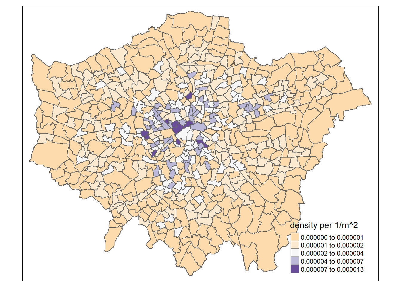
So, from the map, it looks as though we might have some clustering of pharmacies in the centre of London and a few other places, so let’s check this with Moran’s I and some other statistics.
As we saw in the session we need to create a spatial weight matrix…to do so we need centroid points first…to then compute the neighbours of each centroid…
coordsW <- points_sf_joined%>%
  st_centroid()%>%
  st_geometry()
Warning in st_centroid.sf(.): st_centroid assumes attributes are constant over
geometries of x#check, alpha is transparency
tm_shape(points_sf_joined) +
tm_polygons(alpha=0.1)+
tm_shape(coordsW) +
tm_dots(col = "blue")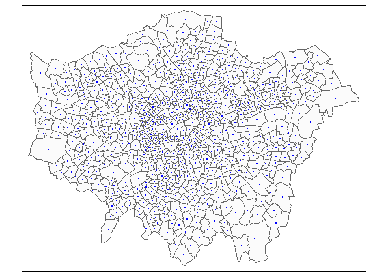
3.5.2 Weight matrix
Now we need to generate a spatial weights matrix (remember from the lecture). We’ll start with a simple binary matrix of queen’s case neighbours (otherwise known as Contiguity edges corners). This method means that polygons with a shared edge or a corner will be included in computations for the target polygon…A spatial weight matrix represents the spatial element of our data, this means we are trying to conceptualize and model how parts of the data are linked (or not linked) to each other spatially, using rules that we will set.
If the features share a boundary they are contiguous, this can also be classed as only common boundaries — a rook (like chess a rook can move forwards or side wards) or any point in common (e.g. corners / other boundaries) — a queen (like chess a queen can move forwards, backwards or on a diagonal).
Alternatively instead of using contiguous relationships you can use distance based relationships. This is frequently done with k nearest neighbours in which k is set to the closest observations. e.g. K=3 means the three closest observations.
In the first instance we must create a neighbours list — which is a list of all the neighbours. To do so we will use poly2nb() with the argument queen=T saying we want a to use Queens case. Let’s see a summary of the output
#create a neighbours list
lward_nb <- points_sf_joined %>%
  poly2nb(., queen=T)
Have a look at the summary of neighbours - average is 5.88
summary(lward_nb)Neighbour list object:
Number of regions: 625
Number of nonzero links: 3680
Percentage nonzero weights: 0.94208
Average number of links: 5.888
Link number distribution:
1 2 3 4 5 6 7 8 9 10 11 12
1 4 15 72 162 182 112 55 14 4 2 2
1 least connected region:
380 with 1 link
2 most connected regions:
313 612 with 12 linksplot them - we can’t use tmap as it isn’t class of sf, starts, spatial raster not spatraster…
plot(lward_nb, st_geometry(coordsW), col="red")
#add a map underneath
plot(points_sf_joined$geometry, add=T)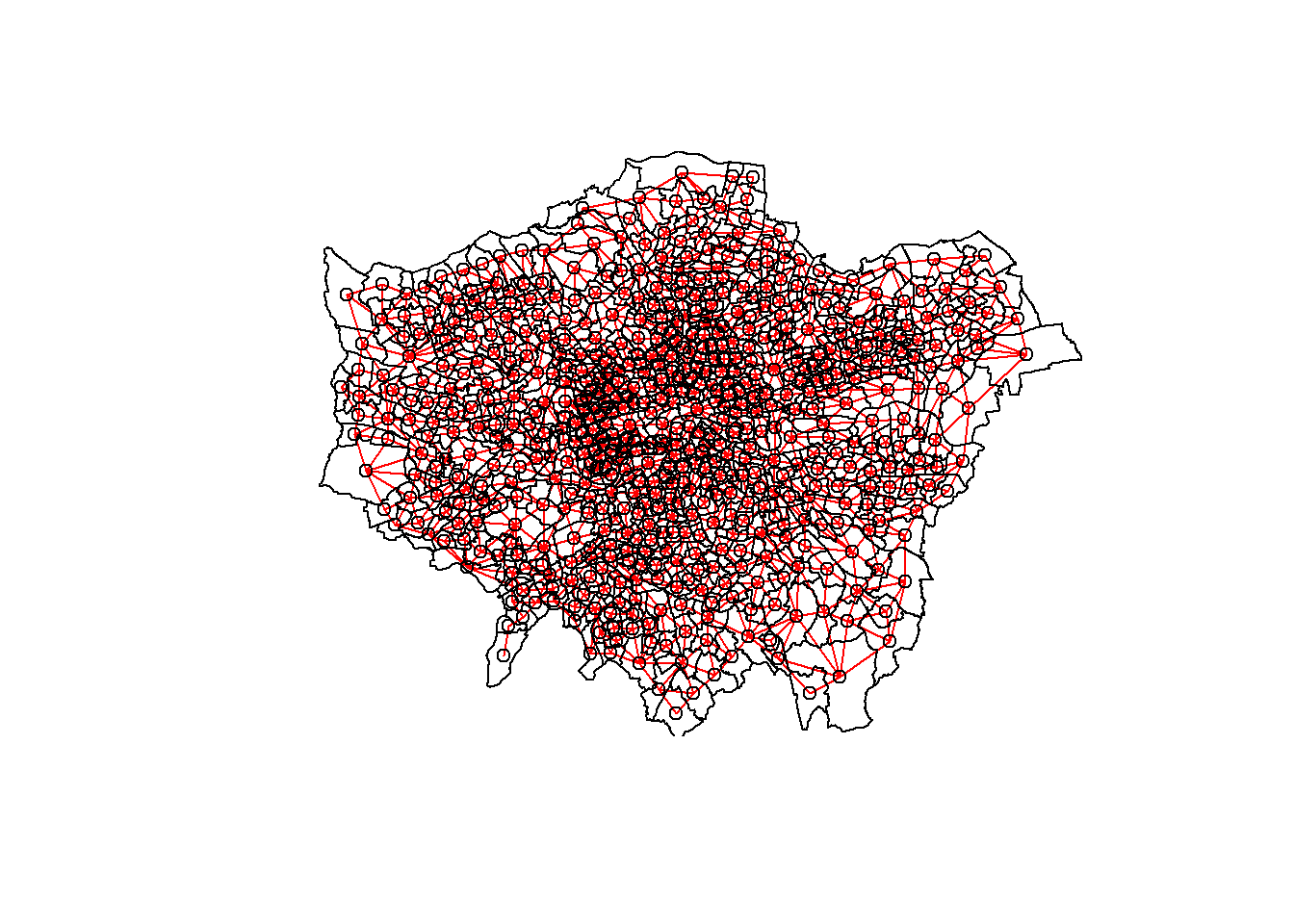
Next take our weight list and make it into a matrix …style here denotes the weight type:
- B is the basic binary coding (1/0)
- W is row standardised (sums over all links to n)
- C is globally standardised (sums over all links to n)
- U is equal to C divided by the number of neighbours (sums over all links to unity)
- S is the variance-stabilizing coding scheme proposed by Tiefelsdorf et al. 1999, p. 167-168 (sums over all links to n).
#create a spatial weights matrix from these weights
lward_lw <- lward_nb %>%
  nb2mat(., style="W",  zero.policy=TRUE)
I have used row…based on the lecture what should the value of the weights sum to?
sum(lward_lw)[1] 6253.5.3 Moran’s I
Moran’s I requires a spatial weight list type object as opposed to matrix, this is simply…
lward_lw <- lward_nb %>%
  nb2listw(., style="W",  zero.policy=TRUE)
Now let’s run Moran’s I - test tells us whether the values at neighbouring sites are similar to the target site (giving a Moran’s I close to 1) or the value of the taget is different to the neighbours (close to -1)
i_lWard_global_density <- points_sf_joined %>%
  pull(density) %>%
  as.vector()%>%
  moran.test(., lward_lw, zero.policy = TRUE)
3.5.4 Geary’s C
Geary’s C - tells us whether similar values or dissimilar values are clustering - Geary’s C falls between 0 and 2; 1 means no spatial autocorrelation, <1 - positive spatial autocorrelation or similar values clustering, >1 - negative spatial autocorreation or dissimilar values clustering)
c_lward_global_density <-
  points_sf_joined %>%
  pull(density) %>%
  as.vector()%>%
  geary.test(., lward_lw, zero.policy = TRUE)
3.5.5 Getis Ord General G
Getis Ord General G…? This tells us whether high or low values are clustering. If G > Expected = High values clustering; if G < expected = low values clustering
g_lward_global_density <-
  points_sf_joined %>%
  pull(density) %>%
  as.vector()%>%
  globalG.test(., lward_lw, zero.policy = TRUE)
Warning in globalG.test(., lward_lw, zero.policy = TRUE): Binary weights
recommended (sepecially for distance bands)Based on the results write down what you can conclude here….
3.6 Local Indicies of Spatial Autocorrelation
3.6.1 Moran’s I
We can now also calculate local versions of the Moran’s I statistic (for each Ward) and a Getis Ord (G_{i}^{}) statistic to see where* we have hot-spots…
Local Moran’s I is:
- The difference between a value and neighbours * the sum of differences between neighbours and the mean
- Where the the difference between a value and neighbours is divided by the standard deviation (how much values in neighbourhood vary about the mean)
It returns several columns, of most interest is the Z score. A Z-score is how many standard deviations a value is away (above or below) from the mean. This allows us to state if our value is significantly different than expected value at this location considering the neighours.
We are comparing our value of Moran’s I to that of an expected value (computed from a separate equation that uses the spatial weight matrix, and therefore considers the neighbouring values). We are expecting our value of Moran’s I to be in the middle of the distribution of the expected values. These expected values follow a normal distribution, with the middle part representing complete spatial randomness. This is typically between < -1.65 or > +1.65 standard deviations from the mean
The null hypothesis is always there is complete spatial randomness. A null hypothesis means:
no statistical significance exists in a set of given observations
If our value is towards the tails of the distribution then it is unlikely that the value is completely spatially random and we can reject the null hypothesis…as it is not what we expect at this location.
In the example where we use a z-score of >2.58 or <-2.58 we interpret this as…
…> 2.58 or <-2.58 standard deviations away from the mean are significant at the 99% level…this means there is a <1% chance that autocorrelation is not present
The Global vs location spatial autocorrelation resource goes through the specific formulas here, but the most important parts are knowing
- What we are comparing values to in Local Moran’s I
- What the results mean
- Why the results could be important
i_lward_local_density <- points_sf_joined %>%
  pull(density) %>%
  as.vector()%>%
  localmoran(., lward_lw, zero.policy = TRUE)%>%
  as_tibble()
This outputs a table, so we need to append that back to our sf of the wards to make a map…
points_sf_joined <- points_sf_joined %>%
    mutate(density_i =as.numeric(i_lward_local_density$Ii))%>%
    mutate(density_iz =as.numeric(i_lward_local_density$Z.Ii))%>%
    mutate(p =as.numeric(i_lward_local_density$`Pr(z != E(Ii))`))
We’ll set the breaks manually based on the rule that data points:>2.58 or <-2.58 standard deviations away from the mean are significant at the 99% level (<1% chance that autocorrelation not present); >1.96 - <2.58 or <-1.96 to >-2.58 standard deviations are significant at the 95% level (<5% change that autocorrelation not present). >1.65 = 90% etc…like we saw in the lecture…
breaks1<-c(-1,-0.5,0,0.5,1)

breaks2<-c(-1000,-2.58,-1.96,-1.65,1.65,1.96,2.58,1000)
Now create a new diverging colour brewer palette and reverse the order using rev() (reverse) so higher values correspond to red - see https://www.r-graph-gallery.com/38-rcolorbrewers-palettes.html
MoranColours<- rev(brewer.pal(8, "RdGy"))Remember Moran’s I - test tells us whether we have clustered values (close to 1) or dispersed values (close to -1) of similar values based on the spatial weight matrix that identifies the neighoburs
But… the z-score shows were this is unlikely because of complete spatial randomness and so we have spatial clustering (either clustering of similar or dissimilar values depending on the Moran’s I value) within these locations…
tm_shape(points_sf_joined) +
    tm_polygons("density_i",
        style="fixed",
        breaks=breaks1,
        palette=MoranColours,
        midpoint=NA,
        title="Local Moran's I")
Warning: Values have found that are less than the lowest breakWarning: Values have found that are higher than the highest break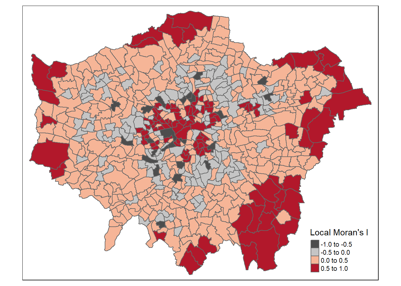
tm_shape(points_sf_joined) +
    tm_polygons("density_iz",
        style="fixed",
        breaks=breaks2,
        palette=MoranColours,
        midpoint=NA,
        title="Local Moran's I Z-score")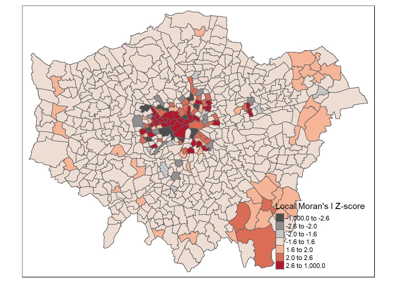
3.6.2 Getis Ord (G_{i}^{*})
What about the Getis Ord (G_{i}^{*}) statistic for hot and cold spots…
This is a very similar concept to Local Moran’s I except it just returns a z-score…remember that a z-score shows how many standard deviations a value (our value) is away (above or below) from the mean (of the expected values)
Ultimately a z-score is defined as:
\[Z = \frac{x-\mu}{\sigma}\] Where:
- \(x\) = the observed value
- \(\mu\) = the mean of the sample
- \(\sigma\) = standard deviation of sample
Note, consult the Global vs location spatial autocorrelation resource for how this is computed in Local Moran’s I if you are interested, although interpretation is the most important part here.
However, in the case of Getis Ord (G_{i}^{*}) this is the local sum (of the neighbourhood) compared to the sum of all features
In Moran’s I this is just the value of the spatial unit (e.g. polygon of the ward) compared to the neighbouring units.
Here, to be significant (or a hot spot) we will have a high value surrounded by high values. The local sum of these values will be different to the expected sum (think of this as all the values in the area) then where this difference is large we can consider it to be not by chance…
The same z-score criteria then applies as before..
This summary from L3 Harris nicely summaries the Getis Ord (G_{i}^{*}) output…
The result of Getis Ord (G_{i}^{*}) analysis is an array of Z-scores, one for each pixel [or polygon], which is the number of standard deviations that the pixel [or polygon] and its neighbors are from the global mean. High Z-scores indicate more intense clustering of high pixel values, indicating hot spots. Low Z-scores indicate more intense clustering of low values, indicating cold spots. Individual pixels with high or low values by themselves might be interesting but not necessarily significant.
gi_lward_local_density <- points_sf_joined %>%
  pull(density) %>%
  as.vector()%>%
  localG(., lward_lw)

points_sf_joined <- points_sf_joined %>%
  mutate(density_G = as.numeric(gi_lward_local_density))
Note that because of the differences in Moran’s I and Getis Ord (G_{i}^{*}) there will be differences between polygons that are classed as significant.
And map the outputs…
gicolours<- rev(brewer.pal(8, "RdBu"))

#now plot on an interactive map
tm_shape(points_sf_joined) +
    tm_polygons("density_G",
        style="fixed",
        breaks=breaks2,
        palette=gicolours,
        midpoint=NA,
        title="Gi* Z score")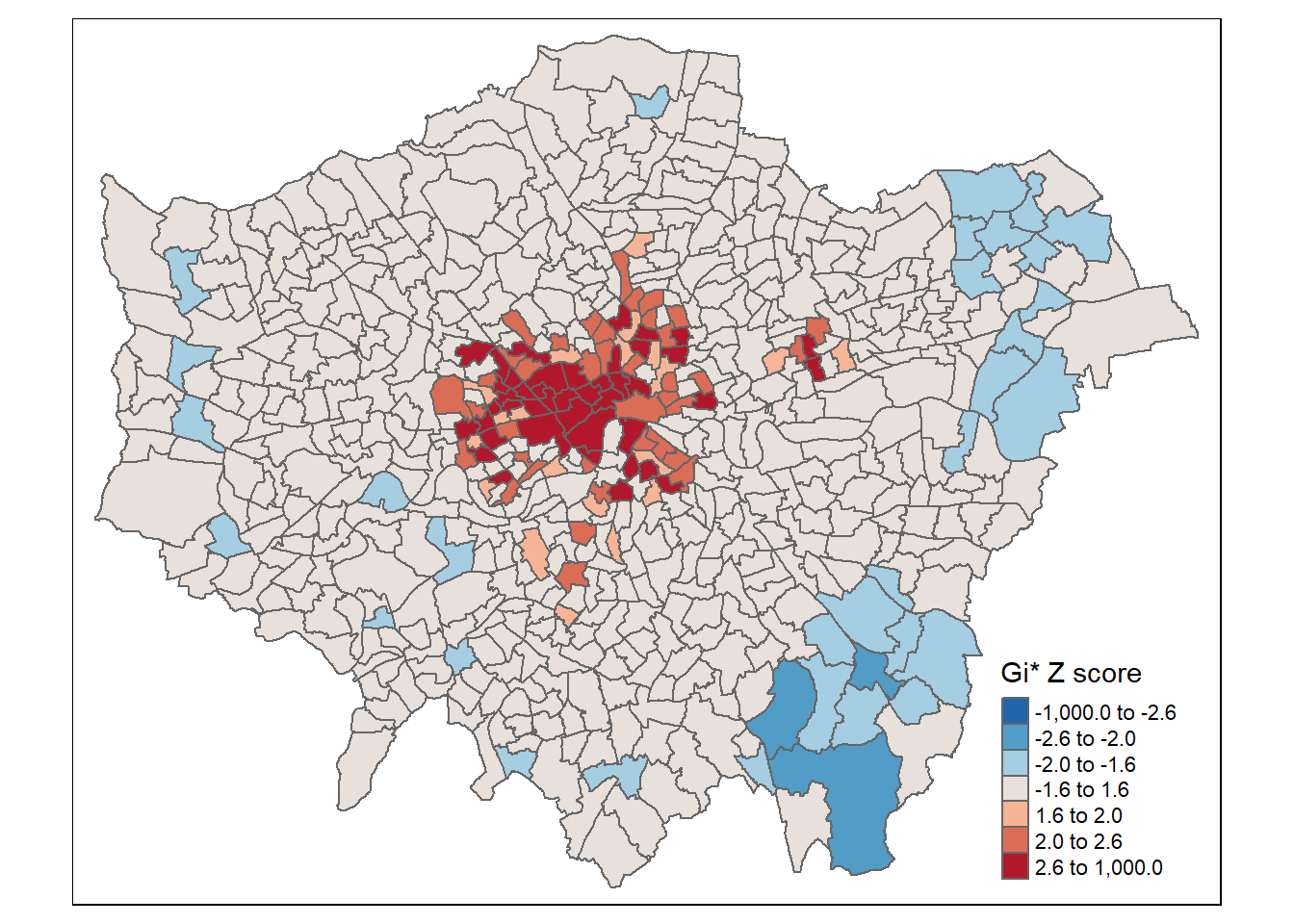
3.7 Note
In the analysis you might see a Moran plot where the values of our variable (density of pharmacies) and plotted against (on the y axis) the spatially lagged version (the average value of the same attribute at neighboring locations). However this plot below shows the value of density in relation to the spatial weight matrix…
This is useful as we can express the level of spatial association of each observation with its neighboring ones. Points in the upper right (or high-high) and lower left (or low-low) quadrants indicate positive spatial association of values that are higher and lower than the sample mean, respectively. The lower right (or high-low) and upper left (or low-high) quadrants include observations that exhibit negative spatial association; that is, these observed values carry little similarity to their neighboring ones. Source: https://documentation.sas.com/doc/en/pgmsascdc/9.4_3.4/statug/statug_variogram_details31.htm#:~:text=The%20Moran%20scatter%20plot%20(Anselin,known%20as%20the%20response%20axis.
moran_plot_lward_global_density <- points_sf_joined %>%
  pull(density)%>%
  as.vector()%>%
  moran.plot(., lward_lw)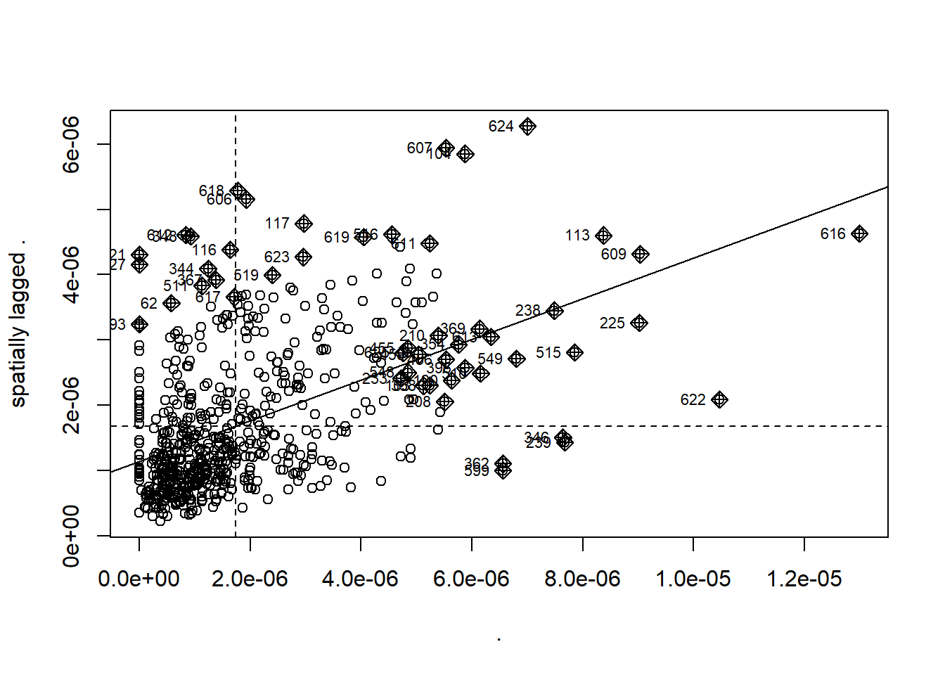
When you see Moran’s I out in the wild you will come across maps with:
- high values surrounded by high values (HH)
- low values nearby other low values (LL)
- low values among high values (LH)
- high values among low values (HL)
Here, we use the values we have, of density and Moran’s I, compared to the mean of density and Moran’s I (termed centering). Where the:
value of density is greater than 0 and the value of Moran’s I is greater than 0 then high values (of density) are surrounded by other high values (from Moran’s I)= HH
value of density is lower than 0 and the value of Moran’s I is lower than 0 then low values (of density) are surrounded by other low values (from Moran’s I) = LL
value of density is lower than 0 and the value of Moran’s I is higher than 0 then low values (of density) are surrounded by high values (from Moran’s I) = LH
value of density is higher than 0 and the value of Moran’s I is lower than 0 then high values (of density) are surrounded by high values (from Moran’s I) =HL
signif <- 0.1


# centers the variable of interest around its mean
points_sf_joined2 <- points_sf_joined %>%
  mutate(mean_density = density- mean(density))%>%
  mutate(mean_density = as.vector(mean_density))%>%
  mutate(mean_densityI= density_i - mean(density_i))%>%
  mutate(quadrant = case_when(mean_density>0 & mean_densityI >0 ~ 4,
         mean_density<0 & mean_densityI <0 ~ 1,
         mean_density<0 & mean_densityI >0 ~ 2,
         mean_density>0 & mean_densityI <0 ~ 3))%>%
  mutate(quadrant=case_when(p > signif ~ 0, TRUE ~ quadrant))

brks <- c(0,1,2,3,4,5)
colors <- c("white","blue","skyblue","pink","red")


tm_shape(points_sf_joined2) +
    tm_polygons("quadrant",
        style="fixed",
        breaks=brks,
        labels = c("insignificant","low-low","low-high","high-low","high-high"),
        palette=colors,
        title="Moran's I HH etc")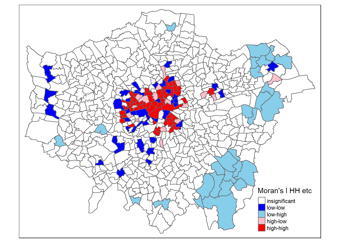
Source: https://rpubs.com/quarcs-lab/spatial-autocorrelation
This might seem somewhat confusing as if we look in the South East we have low values of Getis Ord (G_{i}^{*}) yet we have shown that these are low (density) and high Moran’s I. But as Matthew Peeples concisely summarises remember…
Moran’s I is a measure of the degree to which the value at a target site is similar to values at adjacent sites. Moran’s I is large and positive when the value for a given target (or for all locations in the global case) is similar to adjacent values and negative when the value at a target is dissimilar to adjacent values.
Getis Ord \(G_{i}^{*}\) identifies areas where high or low values cluster in space. It is high where the sum of values within a neighborhood of a given radius or configuration is high relative to the global average and negative where the sum of values within a neighborhood are small relative to the global average and approaches 0 at intermediate values.
So here we have a high Moran’s I as the values around it are similar (probably all low) but a low Getis Ord as the values within the local area are low relative to the global average.
3.7.1 Consider what this all means
- Do you think Pharmacies take into account the ward they are in when they open?
- Do you think people only go to pharmacies within their ward?
- Pharmacies don’t exhibit complete spatial randomness and there seems to be clustering in certain locations….
- Another question we could move onto is now are pharmacies locating around a need (e.g. health outcomes) and does that mean some of the population in London have poor access or choice.
- For example….we could now look to see if there is clustering of “Deaths from causes considered preventable, under 75 years, standardised mortality ratio” and if that aligns with (or can be explained by) access / clusters of pharmacies.
- If you wanted to do this (e.g. see if the ratio was clustered), the data is in a somewhat unfriendly format so you’d need to:
- Download the data for ward from here: https://fingertips.phe.org.uk/profile/local-health/data#page/9/gid/1938133184/ati/8/iid/93227/age/1/sex/4/cat/-1/ctp/-1/yrr/5/cid/4/tbm/1
- Read the Indicator definitions for the last row, specifically column G which tells us how it’s created.
- Filter the data based on the indicator value of 93480 (from the Indicator definitions)
- Filter out the London wards - as we did here and join it to our spatial feature.
- Run a Moran’s I or some other spatial autocorrelation
- Join this back to our spatial feature that has the Moran’s I for pharmacy density
- Decide what to plot - does dispersion of pharmacies occur in the same spatial units as clustering of deaths considered preventable? This could simply be two maps and a table.
- Should it be a requirement to have access…well if we consult the “2022 Pharmacy Access Scheme: guidance” then yes it appears so but…“Pharmacies in areas with dense provision of pharmacies remain excluded from the scheme”
3.7.2 Extensions
- The use of OPTICS
- We have spatial autocorrelation now can we try and model local differences in density of pharmacies - i.e. what factors might (or might not) explain the difference here — https://andrewmaclachlan.github.io/CASA0005repo/explaining-spatial-patterns.html.
- Or perhaps does the distance to pharmacies assist in explaining deaths from causes considered preventable, under 75 years. Similarly, we could even use this as a dummy variable (yes/no the areas is / is not in a cluster of pharmacies) in a regression model.