1 Geographic information
Reading
Each session there will be some reading to support the taught content. You are not constrained to this reading list and i encourage you to read widely!
GIS and Cartography by Goodchild (2009)
Chapter 2 “Geographic data in R” from Geocomputation with R by Lovelace, Nowosad and Muenchow (2020).
Opening practice: supporting reproducibility and critical spatial data science by Brunsdon and Comber (2020)
Watching
The task is to join some non spatial data to some spatial data and make a map
Go to the New Zealand spatial data portal and download the file Territorial Authority 2018 (generalised), these are city or district councils. Make sure it’s the Territorial Authority 2018 data not SA1.
Go to the Stats NZ website and download the Statistical area 1 dataset for 2018 for the whole of New Zealand. Download the excel file this week, not the
.csv.Unzip the downloaded census file and open 2018-SA1-dataset-individual-part-2-total-NZ_updated_16-7-20, you will see a tab for Territorial authority. Join a 2018 health related (see point below) field to the spatial data and make a basic map. Hint, you may need to make a new
.csvfile from the data, we will use the raw data later in the week.Make a map of health related data (e.g. smoking, glasses, hearing aid)
By the end of this practical you should be able to:
- Describe and explain GIS data formats and databases
- Source and pre-process spatial data
- Load and undertaken some basic manipulation of spatial data
- Create some maps
1.1 The Basics of geographic information
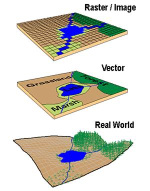
Geographic data, geospatial data or geographic information is data that identifies the location of features on Earth. There are two main types of data which are used in GIS applications to represent the real world. Vectors that are composed of points, lines and polygons and rasters that are grids of cells with individual values…
In the above example the features in the real world (e.g. lake, forest, marsh and grassland) have been represented by points, lines and polygons (vector) or discrete grid cells (raster) of a certain size (e.g. 1 x 1m) specifying land cover type.
1.1.1 Data types in statistics
Before we go any further let’s just quick go over the different types of data you might encounter
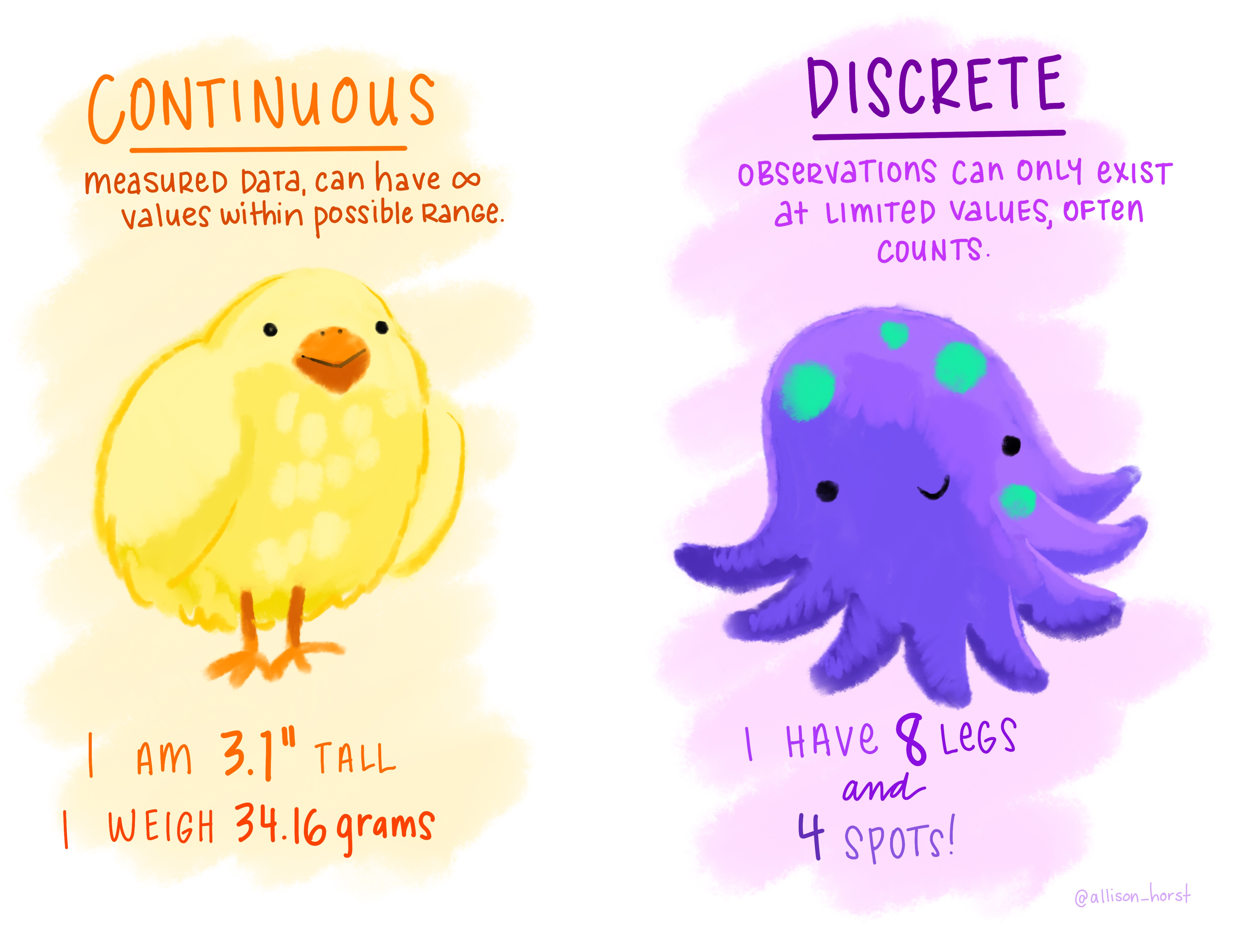
Continuous data can be measured on some sort of scale and can have any value on it such as height and weight.
Discrete data have finite values (meaning you can finish counting something). It is numeric and countable such as number of shoes or the number of computers within the classroom.
Foot length would be continuous data but shoe size would be discrete data.
Nominal (also called categorical) data has labels without any quantitative value such as hair colour or type of animal. Think names or categories - there are no numbers here.
Ordinal, similar to categorical but the data has an order or scale, for example if you have ever seen the chilli rating system on food labels or filled a happiness survey with a range between 1 and 10 — that’s ordinal. Here the order matters, but not the difference between them.
Binary data is that that can have only two possible outcomes, yes and no or shark and not shark.

1.1.2 Important GIS data formats
There are a number of commonly used geographic data formats that store vector and raster data that you will come across during this course and it’s important to understand what they are, how they represent data and how you can use them.
1.1.2.1 Shapefiles
Perhaps the most commonly used GIS data format is the shapefile. Shapefiles were developed by ESRI, one of the first and now certainly the largest commercial GIS company in the world. Despite being developed by a commercial company, they are mostly an open format and can be used (read and written) by a host of GIS Software applications.
A shapefile is actually a collection of files —- at least three of which are needed for the shapefile to be displayed by GIS software. They are:
.shp- the file which contains the feature geometry.shx- an index file which stores the position of the feature IDs in the.shpfile.dbf- the file that stores all of the attribute information associated with the coordinates – this might be the name of the shape or some other information associated with the feature.prj- the file which contains all of the coordinate system information (the location of the shape on Earth’s surface). Data can be displayed without a projection, but the.prjfile allows software to display the data correctly where data with different projections might be being used
On Twitter and want to see the love for shapefiles….have a look at the shapefile account
1.1.2.2 GeoJSON
GeoJSON Geospatial Data Interchange format for JavaScript Object Notation is becoming an increasingly popular spatial data format, particularly for web-based mapping as it is based on JavaScript Object Notation. Unlike a shapefile in a GeoJSON, the attributes, boundaries and projection information are all contained in the same file.
1.1.2.3 Raster data
Most raster data is now provided in GeoTIFF (.tiff) format, which stands for Geostarionary Earth Orbit Tagged Image File. The GeoTIFF data format was created by NASA and is a standard public domain format. All necesary information to establish the location of the data on Earth’s surface is embedded into the image. This includes: map projection, coordinate system, ellipsoid and datum type.
1.1.2.4 Geodatabase
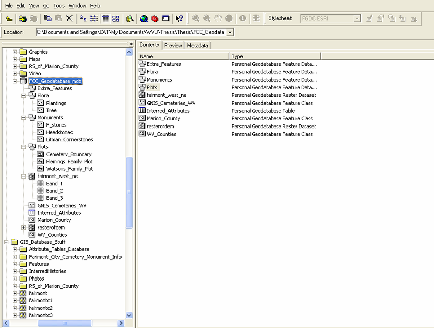
A geodatabase is a collection of geographic data held within a database. Geodatabases were developed by ESRI to overcome some of the limitations of shapefiles. They come in two main types: Personal (up to 1 TB) and File (limited to 250 - 500 MB), with Personal Geodatabases storing everything in a Microsoft Access database (.mdb) file and File Geodatabases offering more flexibility, storing everything as a series of folders in a file system. In the example below we can see that the FCC_Geodatabase (left hand pane) holds multiple points, lines, polygons, tables and raster layers in the contents tab.
1.1.2.5 GeoPackage

A GeoPackage is an open, standards-based, platform-independent, portable, self-describing, compact format for transferring geospatial data. It stores spatial data layers (vector and raster) as a single file, and is based upon an SQLite database, a widely used relational database management system, permitting code based, reproducible and transparent workflows. As it stores data in a single file it is very easy to share, copy or move.
1.1.2.6 SpatiaLite
SpatialLite is an open-source library that extends SQLite core. Support is fairly limited and most software that supports SpatiaLite also supports GeoPackage, as they both build upon SQLite. It doesn’t have any clear advantage over GeoPackage, however it is unable to support raster data.
1.1.2.7 PostGIS

PostGIS is an opensource database extender for PostrgeSQL. Essentially PostgreSQL is a database and PostGIS is an add on which permits spatial functions. The advantages of using PostGIS over a GeoPackage are that it allows users to access the data at the same time, can handle large data more efficiently and reduces processing time. In this example calculating the number of bars per neighbourhood in Leon, Mexico the processing time reduced from 1.443 seconds (SQLite) to 0.08 seconds in PostGIS. However, data stored in PostGIS is much harder to share, move or copy.
1.1.2.8 What will I use
The variety of data formats can see a bit overwhelming. I still have to check how to load some of these data formats that I don’t use frequently. But don’t worry, most of the time you’ll be using shapefiles, GeoPackages or raster data.
1.2 General data flow
As Grolemund and Wickham state in R for Data Science…
“Data science is a huge field, and there’s no way you can master it by reading a single book.”
However, a nice place to start is looking at the typical workflow of a data science (or GIS) project which you will see throughout these practicals, which is summarised nicely in this diagram produced by Dr. Julia Lowndes adapted from Grolemund and Wickham.

To begin you have to import your data (not necessarily environmental) into R or some other kind of GIS to actually be able to do any kind of analysis on it.
Once imported you might need to tidy the data. This really depends on what kind of data it is and we cover this later on in the course. However, putting all of your data into a consistent structure will be very beneficial when you have to do analysis on it — as you can treat it all in the same way. Grolemund and Wickham state that data is tidy when “each column is a variable, and each row is an observation”, we cover this more in next week in the [Tidying data] section.
When you have (or haven’t) tidied data you then will most likely want to transform it. Grolemund and Wickham define this as “narrowing in on observations of interest (like all people in one city, or all data from the last year), creating new variables that are functions of existing variables (like computing speed from distance and time), and calculating a set of summary statistics (like counts or means)”. However, from a GIS point of view I would also include putting all of your data into a similar projection, covered next week in [Changing projections] and any other basic process you might do before the core analysis. Arguably these processes could include things such as: clipping (cookie cutting your study area), buffering (making areas within a distance of a point) and intersecting (where two datasets overlap).
Tidying and transform = data wrangling. Remember from the introduction this could be 50-80% of a data science job!

After you have transformed the data the next best thing to do is visualise it — even with some basic summary statistics. This simple step will often let you look at your data in a different way and select more appropriate analysis.
Next up is modelling. Personally within GIS i’d say a better term is processing as the very data itself is usually a computer model of reality. The modelling or processing section is where you conduct the core analysis (more than the basic analysis already mentioned) and try to provide an answer to your research question.
Finally you have to communicate your study and outputs, it doesn’t matter how good your data wrangling, modelling or processing is, if your intended audience can’t interpret it, well, it’s pretty much useless.
1.3 UK spatial geography
In this practical we are going to take some regular data (without any geometry) and join it to a spatial data set so we can map it!
Firstly we need spatial data. It can be quite a daunting task to attempt to understand all of the boundaries that are in use in England and Wales….briefly:
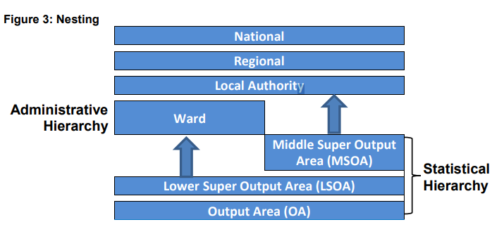
Statistical hierarchy
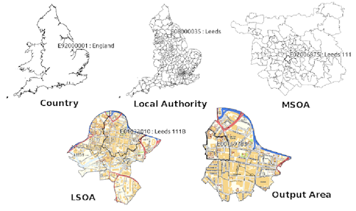
Statistical hierarchy are units that census data is collected, the smallest being an output area with around 100 residents.
Output areas can be aggregated to Lower Super Output Areas (LSOAs) with between 1,000 and 3,000 residents. These can be further aggregated to Middle Super Output Areas (MSOAs).
Output areas and LSOAs typically fit within administrative electoral wards (below)…
Wards and MSOAs fit within local authority areas
- Note that all the boundaries can change (e.g. Some LSOAs between the 2011 census and 2021 census moved). To account for this we can use lookup tables to match the new areas with the old ones.
Administarive hierarchy
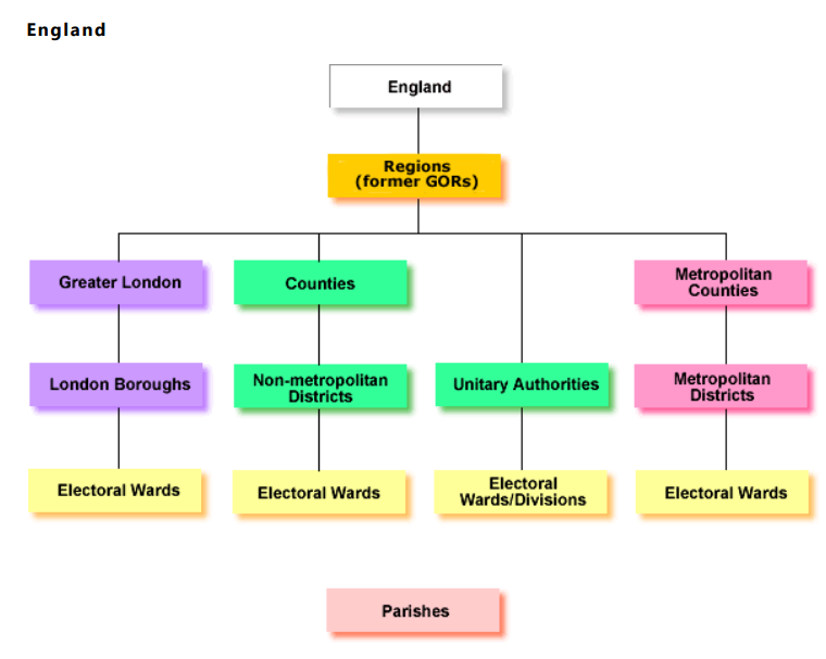
- Administrative areas are based on government areas and this depends on where you are in England….
Some parts of England have a two tier structure. Counties take on expensive services - such as education and transport. Whilst local authority districts took on smaller services - such as planning permission, markets and local roads. Under all of this are electoral wards that have local Councillors…
In 1974 a two tier system of counties and districts was enacted across England and Wales. In urban areas these were metropolitan counties and metropolitan districts..
But in 1986 the metropolitan counties were removed (although still recognised) and the metropolitan districts were left as a single authority.
From 1990 many of the tier structures (not in metropolitan areas) were combined into a single structure called Unitary Authorities, especially in medium-sized urban areas. However, some still retained the two tier structure.
An easy to read guide on census / administrative geography was produced by the London Borough of Tower Hamlets - skip to page 2 for a visual summary.
1.4 R Spatial data intro
R has a very well developed ecosystem of packages for working with Spatial Data. Early pioneers like Roger Bivand and Edzer Pebesma along with various colleagues were instrumental in writing packages to interface with some powerful open source libraries for working with spatial data, such as GDAL and GEOS. These were accessed via the rgdal and rgeos packages. The maptools package by Roger Bivand, amongst other things, allowed Shapefiles to be read into R. The sp package (along with spdep) by Edzer Pebesma was very important for defining a series of classes and methods for spatial data natively in R which then allowed others to write software to work with these formats. Many these original packages were retired (and superseded by the ones we will use today) at the end of 2023 as their maintainer Roger Bivand also retired. Other packages like raster advanced the analysis of gridded spatial data, while packages like classInt and RColorbrewer facilitated the binning of data and colouring of choropleth maps.
Whilst these packages were extremely important for advancing spatial data analysis in R, they were not always the most straightforward to use — making a map in R could take quite a lot of effort and they were static and visually basic. However, more recently new packages have arrived to change this. Now leaflet enables R to interface with the leaflet javascript library for online, dynamic maps. ggplot2 which was developed by Hadley Wickham and colleagues radically changed the way that people thought about and created graphical objects in R, including maps, and introduced a graphical style which has been the envy of other software to the extent that there are now libraries in Python which copy the ggplot2 style!
Building on all of these, the new tmap (Thematic Map) package has changed the game completely and now enables us to read, write and manipulate spatial data and produce visually impressive and interactive maps, very easily. In parallel, the sf (Simple Features) package is helping us re-think the way that spatial data can be stored and manipulated. It’s exciting times for geographic information / spatial data science!
1.4.1 Spatial data projections
Spatial data must be located somewhere on Earth and we need to represent this! We do this with Coordinate Reference Systems, shortened to CRS or often sometimes projections (although a projection is just one part of a coordinate reference system).
Projections systems are mathematical formulas that specify how our data is represented on a map. These can either be call geographic coordiate reference systems or projected coordinate reference systems. The former treats data as a sphere and the latter as a flat object. You might come across phrases such as a resolution of 5 minutes or a resolution of 30 metres, which can be used to establish what kind of projection system has been used. Let me explain…
A minute type of resolution (e.g. 5 minute resolution) is a geographic reference system that treats the globe as if it was a sphere divided into 360 equal parts called degrees (which are angular units). Each degree has 60 minutes and each minute has 60 seconds. Arc-seconds of latitude (horizontal lines in the globe figure below) remain almost constant whilst arc-seconds of longitude (vertical lines in the globe figure below) decrease in a trigonometric cosine-based fashion as you move towards the Earth’s poles…
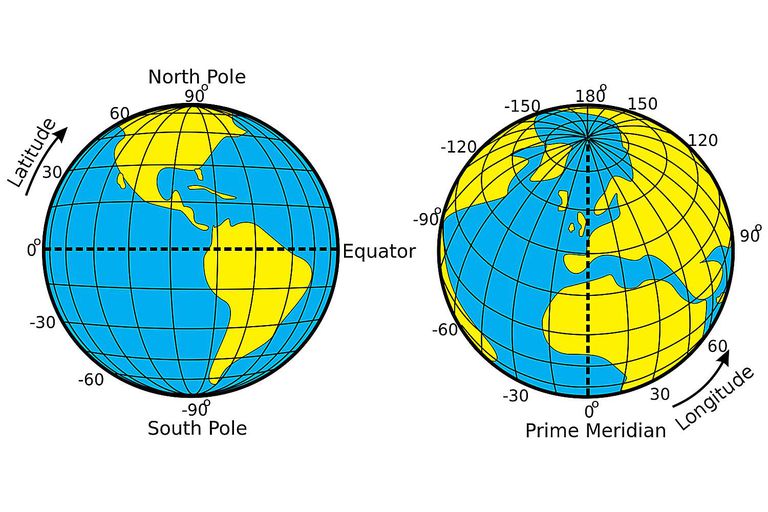
This causes problems as you increase or decrease latitude the longitudinal lengths alter…For example at the equator (0°, such as Quito) a degree is 111.3 km whereas at 60° (such as Saint Petersburg) a degree is 55.80 km …
In contrast a projected coordinate system is defined on a flat, two-dimensional plane (through projecting a spheroid onto a 2D surface) giving it constant lengths, angles and areas…
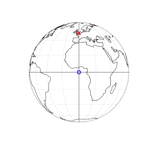
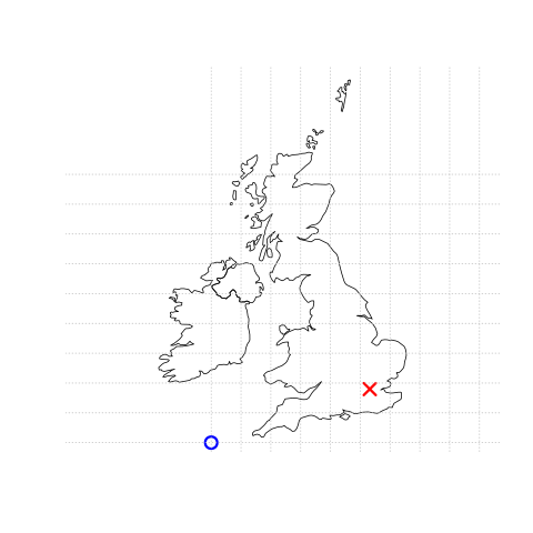
Knowing this, if we want to conduct analysis locally (e.g. at a national level) or use metric (e.g. kilometres) measurements we need to be able to change the projection of our data or “reproject” it. Most countries and even states have their own projected coordinate reference system such as British National Grid in the above example…Note how the origin (0,0) is has moved from the centre of the Earth to the bottom South West corner of the UK, which has now been ironed (or flattened) out.
Projection rules
Units are angular (e.g. degrees, latitude and longitude) or the data is global = Geographic coordinate reference system
Units are linear (e.g. feet, metres) or data is at a local level (e.g. national, well the last one is not always true, but likely) = Projected coordinate reference system.
You might hear some key words about projections that could terrify you! Let’s break them down:
- Ellipsoid (or spheroid) = size of shape of the Earth (3d)
- Datum = contains the point relationship (where the origin (0,0) of the map is) between a Cartesian coordinates (flat surface) and Earth’s surface. They can be local or geocentric (see below). They set the origin, the scale and orientation of the Coordiante Reference System (CRS).
- Local datum = changes the Ellipsoid to align with a certain location on the surface (e.g. BNG that uses the OSGB36 datum). A local datum is anything that isn’t the centre of the Earth.
- Geocentric datum = the centre is equal to the Earth’s centre of gravity (e.g. WGS84).
- Geodetic datum = global datum (see above for datum meaning) for representing features (e.g. points and polygons) on earth
- Geodesy (from which we get Geodetic) = measuring Earth’s shape and features (e.g. gravity field).
- Coordinate reference system (CRS) = Formula that defines how the 2D map (e.g. on your screen or a paper map) relates to the 3D Earth. Sometimes called a spatial Reference System (SRS). It also stores the datum information.
Take home message
When you do analysis on multiple datasets make sure they are all use the same Coordinate Reference System.
If it’s local (e.g. city of country analysis) then use a local projected CRS where possible.
1.4.2 Data download
Ok, after all that theory we can start downloading data! In this case we will be joining the “health in general” question from the 2021 census to LSOAs in London (although you could select any area).
Make a new R project and put this data into a data folder
The health data be accessed either from:
The ONS. Note make sure you have selected the right area (in our case LSOA).
The London data store. Note this is excel data and the function we would need is
read_excel(excel document, sheet number)
Our spatial data can also be accessed from either:
In this example i will use the health data from the ONS and spatial data from the London Datastore.
First, load the packages we need:
library(sf)
library(tidyverse)
Then our data…
# spatial data

LSOAs <- sf::st_read("prac1_data/statistical-gis-boundaries-london/ESRI/LSOA_2011_London_gen_MHW.shp")

# health data

health <- readr::read_csv("prac1_data/TS037-2021-3-filtered-2024-01-24T17_28_55Z.csv")
To check our spatial data let’s make a quick map with the thematic maps pacakge (tmap) this works on the grammar of graphics (famous from ggplots), similar to the grammar of data manipulation (tidyverse) it works on a layered approach. Here we specify the dataset and then how we want to style it..In the most basic form…
library(tmap)Warning: package 'tmap' was built under R version 4.2.3Breaking News: tmap 3.x is retiring. Please test v4, e.g. with
remotes::install_github('r-tmap/tmap')# plot or view - view will make it interactive
tmap_mode("plot")tmap mode set to plotting# load the sf object
tm_shape(LSOAs) +
# style it with polygons.
tm_polygons(col = NA, alpha = 0.5)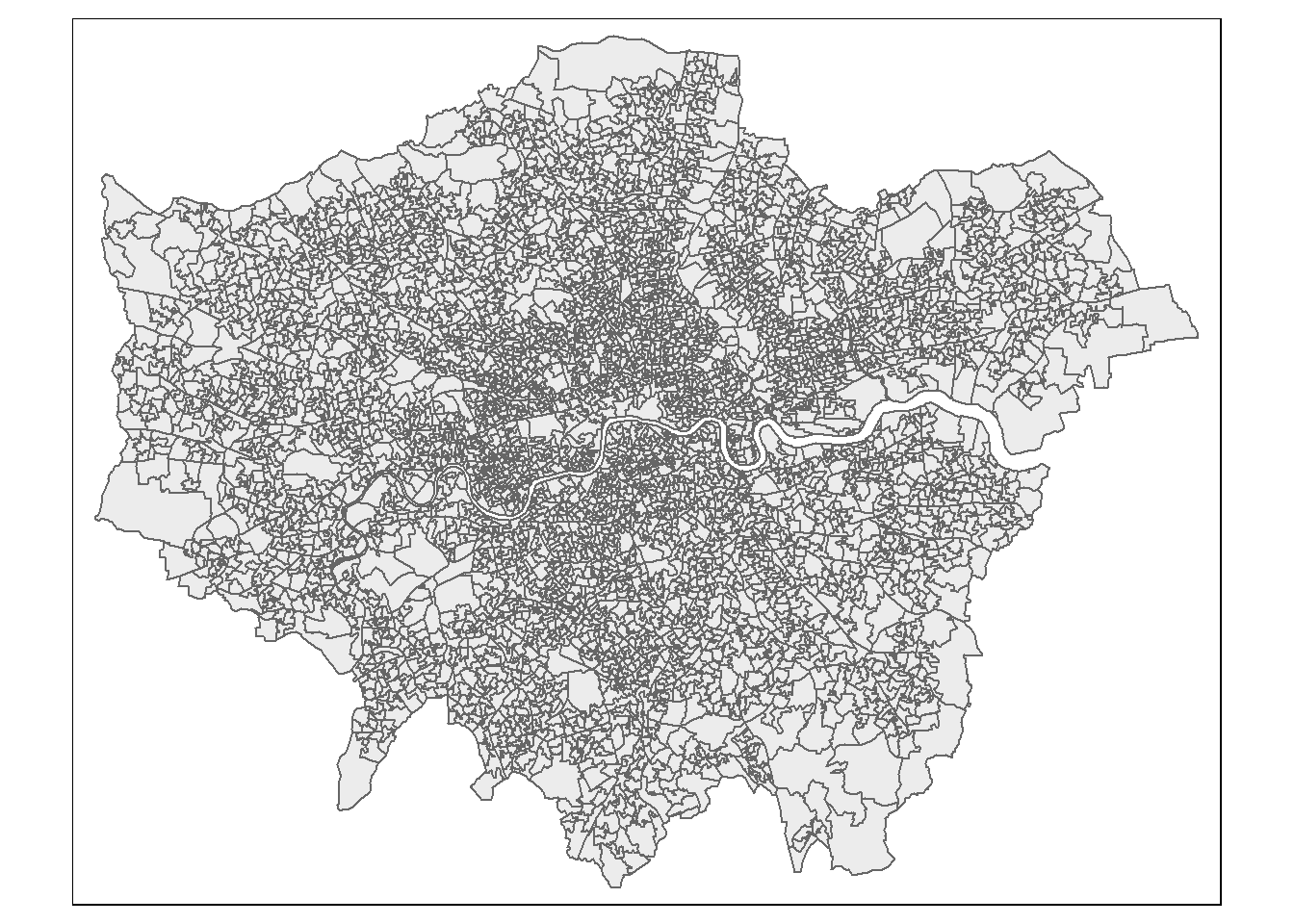
1.4.3 Wrangle
Before progressing it’s also good practice to standardise our column names…we can do so with the janitor package…

library(janitor)

LSOAs <- janitor::clean_names(LSOAs)

health <- janitor::clean_names(health)
Next we need to join the health data to the spatial data…to do so need to identify a unique column in each dataset to perform the join on, such as a code for the LSOAs (e.g. lsoa11cd and lower layer super output areas code ).
Once we have the code we can select a join type…

Typically in spatial analysis we use a left join - this retains everything in th left data (which is our spatial data set) and joins data from the right only where there are matches
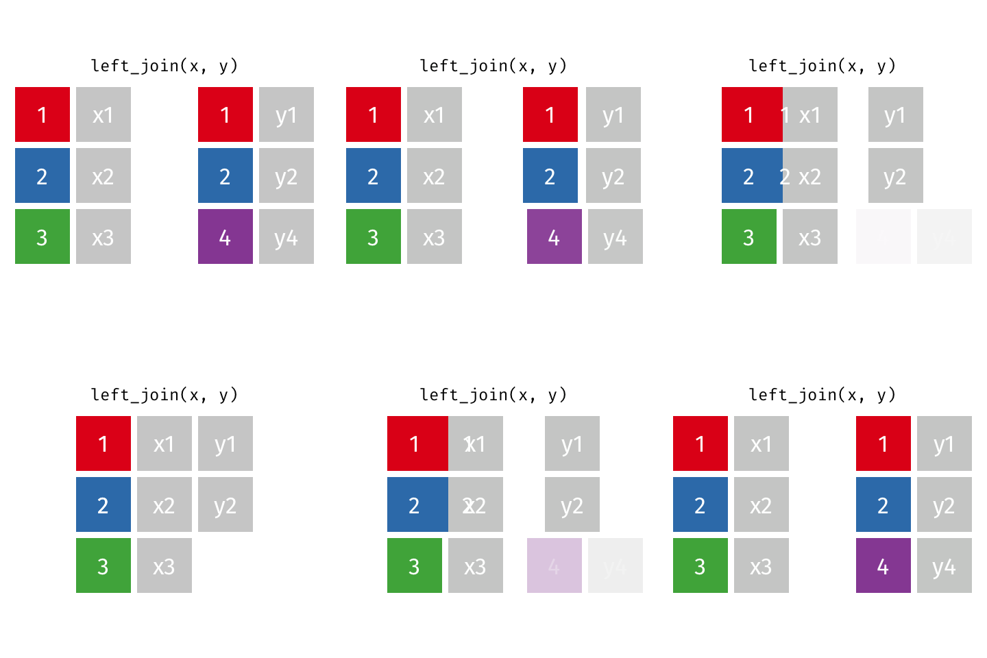
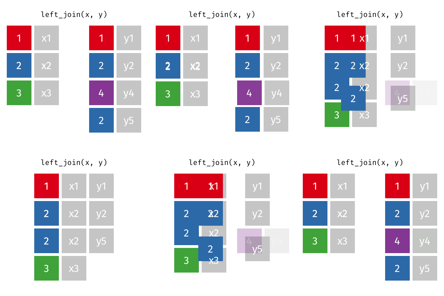
If there are multiple matches then a new row is created (e.g. If there were two health rows for a single LSOA)
If there are no matches then the data is dropped (e.g. the LSOAs not in London), but the polygons (the left dataset) are retained.
Note, if this were the case i could filter out the London LSOAs based on the
lad11cdcolumn starting with E09, something like..filter(str_detect(lad11cd, "^E09"))or join the data and then filter based on NAs
joined_data <- LSOAs %>%
  left_join(.,
            health,
            by = c("lsoa11cd" = "lower_layer_super_output_areas_code"))
1.4.4 Long vs wide data
You will get a warning saying that each row in x (the spatial data) was expected to match just 1 y row. However, our health data is long data (also called tidy data). This differs from “regular” wide data as…
Each variable (all values that have the same attribute, e.g. height, temperature, duration, weeks) must form its own column.
Each observation must have its own row.
Each value must have its own cell.
Note, see Wickham’s paper for worked examples and definition of variables, from page 3.
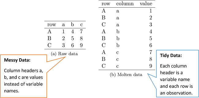
Typically in GIS we need our data messy (or wide) where the variables have their own column and each row is an area.
To so do first we must make the data into a tibble..
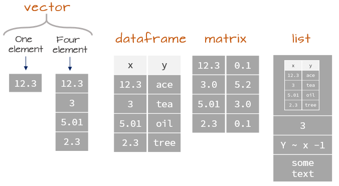
We should reflect on data types in R, which will influence the structure we select. Note a tibble is very similar (the same!) to a dataframe, expect you are provided with additional information when printing.
library(tidyr)

joined_data_wide <- joined_data %>%
  as_tibble(.)%>%
  select(lsoa11cd, general_health_6_categories, observation, usualres, hholdres, popden)%>%
  tidyr::pivot_wider(.,
#    id_cols=1:8,
    names_from = general_health_6_categories,
    values_from = observation)%>%
    clean_names(.)
When we make the tibble we lose the geometry column and so our data becomes non spatial again…really we could have done our wrangling first and then conducted a join! This will create a bit of a mess with columns too (as we already have some), so we will need to select the ones we want…
joined_data_wide_joined <- LSOAs %>%
  left_join(.,
            joined_data_wide,
            by = c("lsoa11cd" = "lsoa11cd"))%>%
    select(lsoa11cd, msoa11cd, usualres.x, hholdres.x, popden.x, does_not_apply, very_good_health, good_health, fair_health, bad_health, very_bad_health)
1.4.5 Map
Once we have the wide data we can compute other metrics - this is especially important for mapping as we must never map count data, unless the spatial units are the same size (e.g. hexagons). Instead we should normalise our data using some kind of common denominator….for example percent of usual residents with bad health…where the number of usual residents will vary across the spatial units.
joined_data_wide_joined_map <- joined_data_wide_joined%>%
  mutate(percent_very_bad = (very_bad_health/usualres.x)*100)%>%
  mutate(percent_very_bad = round(percent_very_bad, digits=2))
Make a basic map!
# select the sf object to map
tm1 <- tm_shape(joined_data_wide_joined_map) +
  # select what column to map
  tm_polygons("percent_very_bad",
              # set a palette
              palette="PuBu")

tm1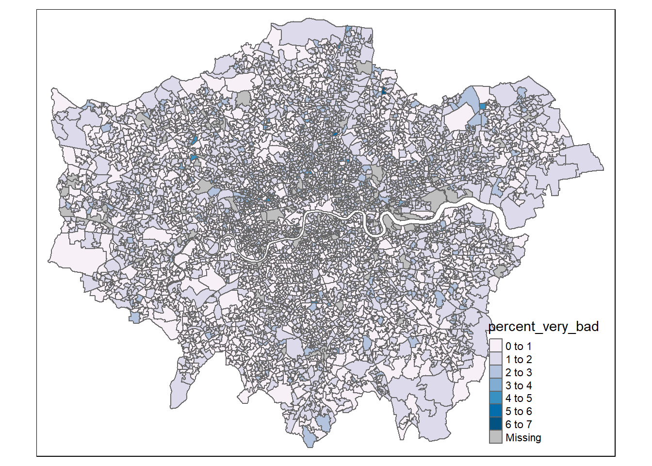
There are some basic issues with our map that we can resolve…
- The legend is covering the data and is using the object name (with underscores)
- No scale bar
- The LSOAs are fairly small and so it can be challenging to interpret them
library(tmap)

tm1 <- tm_shape(joined_data_wide_joined_map) +
  # select what column to map
  tm_polygons("percent_very_bad",
              # set a palette
              palette="PuBu",
              # how the data should be divided
              style="jenks",
              # legend title
              title = "")+

  tm_compass(position = c("left", "top"), size = 2)+

  tm_layout(main.title="% of population with very bad health",
          legend.outside=FALSE,
          frame = TRUE,
          legend.position = c(0.8,0),
          legend.text.size = 1)+

  # tm_layout(legend.outside.size = FALSE,
  #            legend.position= c("right", "top"))+
  tm_scale_bar(position=c(0,0.03), text.size = 1) +

  tm_credits("Data source: ONS and London Data store",
          position=c(0,0),
          size = 0.8,
          align="left")


tm1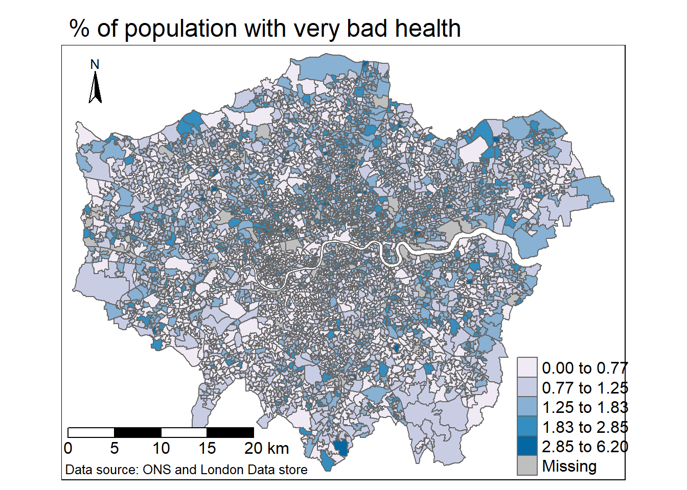
To export the map…
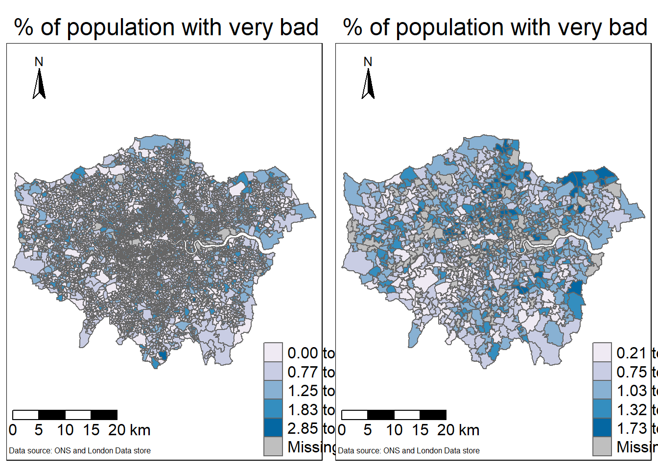
tmap_save(tm1, 'very bad health.png')This hasn’t solved the LSOA issue - whereby the map is challenging to read due to the spatial units used. We can consider aggregating our units to MSOA as that column is provided within the LSOA data…
To do so we’d need to:
- Aggregate our current data
- Load the MSOA spatial data, then join and map as above.
To aggregate the data we use a function called group_by() which is always followed by summarise(). Group by places our data into groups based on a selected column (e.g. MSOA) and then summarises the data for each group (e.g. number of people with very bad health)
MSOA_data <- joined_data_wide_joined_map %>%
  as_tibble(.)%>%
  select(-lsoa11cd, -geometry, -percent_very_bad)%>%
  group_by(msoa11cd)%>%
  summarise_all(sum)
In the above code select(-variable) means drop that variable, this has allowed me to use the summarise_all() function as opposed to just summarise(). Now each column is aggregated to MSOA!
Calculate the percentages
MSOA_data_percent <- MSOA_data%>%
  mutate(percent_very_bad = (very_bad_health/usualres.x)*100)%>%
  mutate(percent_very_bad = round(percent_very_bad, digits=2))
Read in the MSOA spatial data
MSOAs <- sf::st_read("prac1_data/statistical-gis-boundaries-london/ESRI/MSOA_2011_London_gen_MHW.shp")%>%
  clean_names(.)
Reading layer `MSOA_2011_London_gen_MHW' from data source
`C:\Users\Andy\OneDrive - University College London\Teaching\Guest\Oxford_24\Spatial analysis of public health data\prac1_data\statistical-gis-boundaries-london\ESRI\MSOA_2011_London_gen_MHW.shp'
using driver `ESRI Shapefile'
Simple feature collection with 983 features and 12 fields
Geometry type: MULTIPOLYGON
Dimension: XY
Bounding box: xmin: 503574.2 ymin: 155850.8 xmax: 561956.7 ymax: 200933.6
Projected CRS: OSGB 1936 / British National GridJoin…
MSOA_joined <- MSOAs %>%
  left_join(.,
            MSOA_data_percent,
            by = c("msoa11cd" = "msoa11cd"))%>%
    select(msoa11cd, msoa11cd, usualres, hholdres, popden, does_not_apply, very_good_health, good_health, fair_health, bad_health, very_bad_health, percent_very_bad)
Map the MSOAs
tm2 <- tm_shape(MSOA_joined) +
  # select what column to map
  tm_polygons("percent_very_bad",
              # set a palette
              palette="PuBu",
              # how the data should be divided
              style="jenks",
              # legend title
              title = "")+

  tm_compass(position = c("left", "top"), size = 2)+

  tm_layout(main.title="% of population with very bad health",
          legend.outside=FALSE,
          frame = TRUE,
          legend.position = c(0.8,0),
          legend.text.size = 1)+

  # tm_layout(legend.outside.size = FALSE,
  #            legend.position= c("right", "top"))+
  tm_scale_bar(position=c(0,0.03), text.size = 1) +

  tm_credits("Data source: ONS and London Data store",
          position=c(0,0),
          size = 0.8,
          align="left")


tm2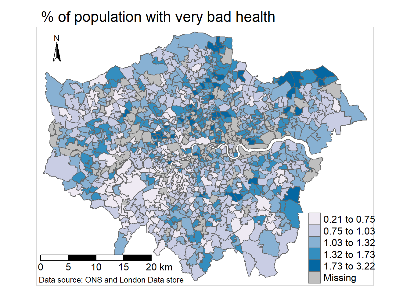
Plot them together…
t=tmap_arrange(tm1, tm2, ncol=2)

t