Chapter 9 GWR and spatially lagged regression
9.1 Learning objectives
By the end of this practical you should be able to:
- Explain hypothesis testing
- Execute regression in R
- Descrbie the assumptions associated with regression models
- Explain steps to deal with spatially autocorrelated (spatial similarlity of nearby observations) residuals.
9.2 Homework
Outside of our schedulded sessions you should be doing around 12 hours of extra study per week. Feel free to follow your own GIS interests, but good places to start include the following:
Assignment
From weeks 6-9, learn and practice analysis from the course and identify appropriate techniques (from wider research) that might be applicable/relevant to your data. Conduct an extensive methodological review – this could include analysis from within academic literature and/or government departments (or any reputable source).
Reading This week:
Chapter 2 “Linear Regression” from Hands-On Machine Learning with R by Boehmke & Greenwell (2020).
Chapter 5 and 6 “Basic Regression and”Multiple Regression” from Modern Dive by Ismay and Kim (2019).
Chapter 9 Spatial regression models from Crime Mapping in R by Juanjo Medina and Reka Solymosi (2019).
Remember this is just a starting point, explore the reading list, practical and lecture for more ideas.
9.3 Recommended listening 🎧
Some of these practicals are long, take regular breaks and have a listen to some of our fav tunes each week.
Andy Haim. Can all play loads of instuments and just switch during live sets.
Adam Music this week - time for some big, dirty rock and roll. The Wildhearts have only gone and released a massive live album - oh yes!
9.4 Introduction
In this practical you will be introduced to a suite of different models that will allow you to test a variety of research questions and hypotheses through modelling the associations between two or more spatially reference variables.
In the worked example, we will explore the factors that might affect the average exam scores of 16 year-old across London. GSCEs are the exams taken at the end of secondary education and here have been aggregated for all pupils at their home addresses across the City for Ward geographies.
The London Data Store collates a range of other variables for each Ward and so we will see if any of these are able to help explain the patterns of exam performance that we see.
This practical will walk you through the common steps that you should go through when building a regression model using spatial data to test a stated research hypothsis; from carrying out some descriptive visualisation and summary statistics, to interpreting the results and using the outputs of the model to inform your next steps.
9.4.1 Setting up your Data
First, let’s set up R and read in some data to enable us to carry out our analysis.
#library a bunch of packages we may (or may not) use - install them first if not installed already.
library(tidyverse)
library(tmap)
library(geojsonio)
library(plotly)
library(rgdal)
library(broom)
library(mapview)
library(crosstalk)
library(sf)
library(sp)
library(spdep)
library(car)
library(fs)
library(janitor)Read some ward data in
#download a zip file containing some boundaries we want to use
download.file("https://data.london.gov.uk/download/statistical-gis-boundary-files-london/9ba8c833-6370-4b11-abdc-314aa020d5e0/statistical-gis-boundaries-london.zip",
destfile="prac9_data/statistical-gis-boundaries-london.zip")Get the zip file and extract it
listfiles<-dir_info(here::here("prac9_data")) %>%
dplyr::filter(str_detect(path, ".zip")) %>%
dplyr::select(path)%>%
pull()%>%
#print out the .gz file
print()%>%
as.character()%>%
utils::unzip(exdir=here::here("prac9_data"))Look inside the zip and read in the .shp
#look what is inside the zip
Londonwards<-dir_info(here::here("prac9_data",
"statistical-gis-boundaries-london",
"ESRI"))%>%
#$ means exact match
dplyr::filter(str_detect(path,
"London_Ward_CityMerged.shp$"))%>%
dplyr::select(path)%>%
pull()%>%
#read in the file in
st_read()## Reading layer `London_Ward_CityMerged' from data source
## `C:\Users\Andy\OneDrive - University College London\Teaching\CASA0005\2020_2021\CASA0005repo\prac9_data\statistical-gis-boundaries-london\ESRI\London_Ward_CityMerged.shp'
## using driver `ESRI Shapefile'
## Simple feature collection with 625 features and 7 fields
## Geometry type: POLYGON
## Dimension: XY
## Bounding box: xmin: 503568.2 ymin: 155850.8 xmax: 561957.5 ymax: 200933.9
## Projected CRS: OSGB 1936 / British National Grid#check the data
qtm(Londonwards)Now we are going to read in some data from the London Data Store
#read in some attribute data
LondonWardProfiles <- read_csv("https://data.london.gov.uk/download/ward-profiles-and-atlas/772d2d64-e8c6-46cb-86f9-e52b4c7851bc/ward-profiles-excel-version.csv",
col_names = TRUE,
locale = locale(encoding = 'Latin1'))#check all of the columns have been read in correctly
Datatypelist <- LondonWardProfiles %>%
summarise_all(class) %>%
pivot_longer(everything(),
names_to="All_variables",
values_to="Variable_class")
Datatypelist9.4.1.1 Cleaning the data as you read it in
Examining the dataset as it is read in above, you can see that a number of fields in the dataset that should have been read in as numeric data, have actually been read in as character (text) data.
If you examine your data file, you will see why. In a number of columns where data are missing, rather than a blank cell, the values ‘n/a’ have been entered in instead. Where these text values appear amongst numbers, the software will automatically assume the whole column is text.
To deal with these errors, we can force read_csv to ignore these values by telling it what values to look out for that indicate missing data
#We can use readr to deal with the issues in this dataset - which are to do with text values being stored in columns containing numeric values
#read in some data - couple of things here. Read in specifying a load of likely 'n/a' values, also specify Latin1 as encoding as there is a pound sign (£) in one of the column headers - just to make things fun!
LondonWardProfiles <- read_csv("https://data.london.gov.uk/download/ward-profiles-and-atlas/772d2d64-e8c6-46cb-86f9-e52b4c7851bc/ward-profiles-excel-version.csv",
na = c("", "NA", "n/a"),
locale = locale(encoding = 'Latin1'),
col_names = TRUE)#check all of the columns have been read in correctly
Datatypelist <- LondonWardProfiles %>%
summarise_all(class) %>%
pivot_longer(everything(),
names_to="All_variables",
values_to="Variable_class")
DatatypelistNow you have read in both your boundary data and your attribute data, you need to merge the two together using a common ID. In this case, we can use the ward codes to achieve the join
#merge boundaries and data
LonWardProfiles <- Londonwards%>%
left_join(.,
LondonWardProfiles,
by = c("GSS_CODE" = "New code"))
#let's map our dependent variable to see if the join has worked:
tmap_mode("view")
qtm(LonWardProfiles,
fill = "Average GCSE capped point scores - 2014",
borders = NULL,
fill.palette = "Blues")9.4.1.2 Additional Data
In addition to our main datasets, it might also be useful to add some contextual data. While our exam results have been recorded at the home address of students, most students would have attended one of the schools in the City.
Let’s add some schools data as well.
#might be a good idea to see where the secondary schools are in London too
london_schools <- read_csv("https://data.london.gov.uk/download/london-schools-atlas/57046151-39a0-45d9-8dc0-27ea7fd02de8/all_schools_xy_2016.csv")
#from the coordinate values stored in the x and y columns, which look like they are latitude and longitude values, create a new points dataset
lon_schools_sf <- st_as_sf(london_schools,
coords = c("x","y"),
crs = 4326)
lond_sec_schools_sf <- lon_schools_sf %>%
filter(PHASE=="Secondary")
tmap_mode("view")
qtm(lond_sec_schools_sf)9.5 Analysing GCSE exam performance - testing a research hypothesis
To explore the factors that might influence GCSE exam performance in London, we are going to run a series of different regression models. A regression model is simply the expression of a linear relationship between our outcome variable (Average GCSE score in each Ward in London) and another variable or several variables that might explain this outcome.
9.5.1 Research Question and Hypothesis
Examining the spatial distribution of GSCE point scores in the map above, it is clear that there is variation across the city. My research question is:
What are the factors that might lead to variation in Average GCSE point scores across the city?
My research hypothesis that I am going to test is that there are other observable factors occurring in Wards in London that might affect the average GCSE scores of students living in those areas.
In inferential statistics, we cannot definitively prove a hypothesis is true, but we can seek to disprove that there is absolutely nothing of interest occurring or no association between variables. The null hypothesis that I am going to test empirically with some models is that there is no relationship between exam scores and other observed variables across London.
9.5.2 Regression Basics
For those of you who know a bit about regression, you might want to skip down to the next section. However, if you are new to regression or would like a refresher, read on…
The linear relationship in a regression model is probably most easily explained using a scatter plot…
q <- qplot(x = `Unauthorised Absence in All Schools (%) - 2013`,
y = `Average GCSE capped point scores - 2014`,
data=LonWardProfiles)
#plot with a regression line - note, I've added some jitter here as the x-scale is rounded
q + stat_smooth(method="lm", se=FALSE, size=1) +
geom_jitter()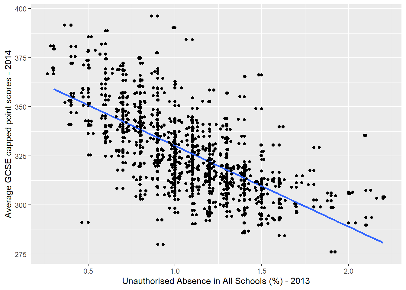
Here, I have plotted the average GCSE point score for each Ward in London against another variable in the dataset that I think might be influential: the % of school days lost to unauthorised absences in each ward.
Remember that my null hypothesis would be that there is no relationship between GCSE scores and unauthorised absence from school. If this null hypothesis was true, then I would not expect to see any pattern in the cloud of points plotted above.
As it is, the scatter plot shows that, generally, as the \(x\) axis independent variable (unauthorised absence) goes up, our \(y\) axis dependent variable (GCSE point score) goes down. This is not a random cloud of points, but something that indicates there could be a relationshp here and so I might be looking to reject my null hypothesis.
Some conventions - In a regression equation, the dependent variable is always labelled \(y\) and shown on the \(y\) axis of a graph, the predictor or independent variable(s) is(are) always shown on the \(x\) axis.
I have added a blue line of best-fit - this is the line that can be drawn by minimising the sum of the squared differences between the line and the residuals. The residuals are all of the dots not falling exactly on the blue line. An algorithm known as ‘ordinary least squares’ (OLS) is used to draw this line and it simply tries a selection of different lines until the sum of the squared divations between all of the residuals and the blue line is minimised, leaving the final solution.
As a general rule, the better the blue line is at summarising the relationship between \(y\) and \(x\), the better the model.
The equation for the blue line in the graph above can be written:
(1)\[y_i = \beta_0 + \beta_1x_i + \epsilon_i\]
where:
\(\beta_0\) is the intercept (the value of \(y\) when \(x = 0\) - somewhere around 370 on the graph above);
\(\beta_1\) is sometimes referred to as the ‘slope’ parameter and is simply the change in the value of \(y\) for a 1 unit change in the value of \(x\) (the slope of the blue line) - reading the graph above, the change in the value of \(y\) reading between 1.0 and 2.0 on the \(x\) axis looks to be around -40.
\(\epsilon_i\) is a random error term (positive or negative) that should sum to 0 - esentially, if you add all of the vertical differences between the blue line and all of the residuals, it should sum to 0.
Any value of \(y\) along the blue line can be modelled using the corresponding value of \(x\) and these parameter values. Examining the graph above we would expect the average GCSE point score for a student living in a Ward where 0.5% of school days per year were missed, to equal around 350, but we can confirm this by plugging the \(\beta\) parameter values and the value of \(x\) into equation (1):
370 + (-40*0.5) + 0## [1] 3509.5.3 Running a Regression Model in R
In the graph above, I used a method called ‘lm’ in the stat_smooth() function in ggplot2 to draw the regression line. ‘lm’ stands for ‘linear model’ and is a standard function in R for running linear regression models. Use the help system to find out more about lm - ?lm
Below is the code that could be used to draw the blue line in our scatter plot. Note, the tilde ~ symbol means “is modelled by”.
First though, we’re going to clean up all our data names with Janitor then select what we want.
#run the linear regression model and store its outputs in an object called model1
Regressiondata<- LonWardProfiles%>%
clean_names()%>%
dplyr::select(average_gcse_capped_point_scores_2014,
unauthorised_absence_in_all_schools_percent_2013)
#now model
model1 <- Regressiondata %>%
lm(average_gcse_capped_point_scores_2014 ~
unauthorised_absence_in_all_schools_percent_2013,
data=.)Let’s have a closer look at our model…
#show the summary of those outputs
summary(model1)##
## Call:
## lm(formula = average_gcse_capped_point_scores_2014 ~ unauthorised_absence_in_all_schools_percent_2013,
## data = .)
##
## Residuals:
## Min 1Q Median 3Q Max
## -59.753 -10.223 -1.063 8.547 61.842
##
## Coefficients:
## Estimate Std. Error t value
## (Intercept) 371.471 2.165 171.6
## unauthorised_absence_in_all_schools_percent_2013 -41.237 1.927 -21.4
## Pr(>|t|)
## (Intercept) <2e-16 ***
## unauthorised_absence_in_all_schools_percent_2013 <2e-16 ***
## ---
## Signif. codes: 0 '***' 0.001 '**' 0.01 '*' 0.05 '.' 0.1 ' ' 1
##
## Residual standard error: 16.39 on 624 degrees of freedom
## Multiple R-squared: 0.4233, Adjusted R-squared: 0.4224
## F-statistic: 458 on 1 and 624 DF, p-value: < 2.2e-169.5.3.1 Interpreting and using the model outputs
In running a regression model, we are effectively trying to test (disprove) our null hypothesis. If our null hypothsis was true, then we would expect our coefficients to = 0.
In the output summary of the model above, there are a number of features you should pay attention to:
Coefficient Estimates - these are the \(\beta_0\) (intercept) and \(\beta_1\) (slope) parameter estimates from Equation 1. You will notice that at \(\beta_0 = 371.471\) and \(\beta_1 = -41.237\) they are pretty close to the estimates of 370 and -40 that we read from the graph earlier, but more precise.
Coefficient Standard Errors - these represent the average amount the coefficient varies from the average value of the dependent variable (its standard deviation). So, for a 1% increase in unauthorised absence from school, while the model says we might expect GSCE scores to drop by -41.2 points, this might vary, on average, by about 1.9 points. As a rule of thumb, we are looking for a lower value in the standard error relative to the size of the coefficient.
Coefficient t-value - this is the value of the coefficient divided by the standard error and so can be thought of as a kind of standardised coefficient value. The larger (either positive or negative) the value the greater the relative effect that particular independent variable is having on the dependent variable (this is perhaps more useful when we have several independent variables in the model) .
Coefficient p-value - Pr(>|t|) - the p-value is a measure of significance. There is lots of debate about p-values which I won’t go into here, but essentially it refers to the probability of getting a coefficient as large as the one observed in a set of random data. p-values can be thought of as percentages, so if we have a p-value of 0.5, then there is a 5% chance that our coefficient could have occurred in some random data, or put another way, a 95% chance that out coefficient could have only occurred in our data. As a rule of thumb, the smaller the p-value, the more significant that variable is in the story and the smaller the chance that the relationship being observed is just random. Generally, statisticians use 5% or 0.05 as the acceptable cut-off for statistical significance - anything greater than that we should be a little sceptical about.
In r the codes ***, **, **, . are used to indicate significance. We generally want at least a single * next to our coefficient for it to be worth considering.
R-Squared - This can be thought of as an indication of how good your model is - a measure of ‘goodness-of-fit’ (of which there are a number of others). \(r^2\) is quite an intuitite measure of fit as it ranges between 0 and 1 and can be thought of as the % of variation in the dependent variable (in our case GCSE score) explained by variation in the independent variable(s). In our example, an \(r^2\) value of 0.42 indicates that around 42% of the variation in GCSE scores can be explained by variation in unathorised absence from school. In other words, this is quite a good model. The \(r^2\) value will increase as more independent explanatory variables are added into the model, so where this might be an issue, the adjusted r-squared value can be used to account for this affect
9.5.3.2 broom
The output from the linear regression model is messy and like all things R mess can be tidied, in this case with a broom! Or the package broom which is also party of the package tidymodels.
Here let’s load broom and tidy our output…you will need to either install tidymodels or broom. The tidy() function will just make a tibble or the statistical findings from the model!
library(broom)
tidy(model1)## # A tibble: 2 × 5
## term estimate std.error statistic p.value
## <chr> <dbl> <dbl> <dbl> <dbl>
## 1 (Intercept) 371. 2.16 172. 0
## 2 unauthorised_absence_in_all_schools_per… -41.2 1.93 -21.4 1.27e-76We can also use glance() from broom to get a bit more summary information, such as \(r^2\) and the adjusted r-squared value.
glance(model1)## # A tibble: 1 × 12
## r.squared adj.r.squared sigma statistic p.value df logLik AIC BIC
## <dbl> <dbl> <dbl> <dbl> <dbl> <dbl> <dbl> <dbl> <dbl>
## 1 0.423 0.422 16.4 458. 1.27e-76 1 -2638. 5282. 5296.
## # … with 3 more variables: deviance <dbl>, df.residual <int>, nobs <int>But wait? Didn’t we try to model our GCSE values based on our unauthorised absence variable? Can we see those predictions for each point, yes, yes we can…with the tidypredict_to_column() function from tidypredict, which adds the fit column in the following code.
library(tidypredict)
Regressiondata %>%
tidypredict_to_column(model1)## Simple feature collection with 626 features and 3 fields
## Geometry type: POLYGON
## Dimension: XY
## Bounding box: xmin: 503568.2 ymin: 155850.8 xmax: 561957.5 ymax: 200933.9
## Projected CRS: OSGB 1936 / British National Grid
## First 10 features:
## average_gcse_capped_point_scores_2014
## 1 321.3
## 2 337.5
## 3 342.7
## 4 353.3
## 5 372.3
## 6 339.8
## 7 307.1
## 8 361.6
## 9 347.0
## 10 336.4
## unauthorised_absence_in_all_schools_percent_2013
## 1 0.8
## 2 0.7
## 3 0.5
## 4 0.4
## 5 0.7
## 6 0.9
## 7 0.8
## 8 0.6
## 9 0.7
## 10 0.5
## geometry fit
## 1 POLYGON ((516401.6 160201.8... 338.4815
## 2 POLYGON ((517829.6 165447.1... 342.6052
## 3 POLYGON ((518107.5 167303.4... 350.8525
## 4 POLYGON ((520480 166909.8, ... 354.9762
## 5 POLYGON ((522071 168144.9, ... 342.6052
## 6 POLYGON ((522007.6 169297.3... 334.3579
## 7 POLYGON ((517175.3 164077.3... 338.4815
## 8 POLYGON ((517469.3 166878.5... 346.7289
## 9 POLYGON ((522231.1 166015, ... 342.6052
## 10 POLYGON ((517460.6 167802.9... 350.85259.5.4 Bootstrap resampling
If we only fit our model once, how can we be confident about that estiamte? Bootstrap resampling is where we take the original dataset and select random data points from within it, but in order to keep it the same size as the original dataset some records are duplicated. This is known as bootstrap resampling by replacement.
So first let’s again get rid of all the coloumns we aren’t using in this model using as they will just slow us down. At the moment we only care about average GCSE scores and unauthorised absecne in schools.
Bootstrapdata<- LonWardProfiles%>%
clean_names()%>%
dplyr::select(average_gcse_capped_point_scores_2014,
unauthorised_absence_in_all_schools_percent_2013)Next we are going to create our samples using the function bootstraps(). First we set the seed (to any number), which just means are results will be the same if we are to re-run this analysis, if we don’t then as we are randomly replacing data the next time we do run the code the results could change.
Here we have created 1000 versions of our original data (times=1000). apparent means we are using our entire dataset and the full dataset will be kept in our GSCE_boot variable. set.seed(number) just makes sure we get the same result here each time as it could vary.
library(rsample)
set.seed(99)
GCSE_boot <-st_drop_geometry(Bootstrapdata) %>%
bootstraps(times = 1000, apparent = TRUE)
slice_tail(GCSE_boot, n=5)## # A tibble: 5 × 2
## splits id
## <list> <chr>
## 1 <split [626/215]> Bootstrap0997
## 2 <split [626/215]> Bootstrap0998
## 3 <split [626/233]> Bootstrap0999
## 4 <split [626/234]> Bootstrap1000
## 5 <split [626/626]> ApparentSo when we look in GSCE_boot we have 1000 rows, plus our apparent data.
Here we are now going to run the linear regression model for each of our bootstrap resampled instances. To do this we are going to use the map() function from the purrr package that is also part of the tidyverse. This lets us apply a function (so our regression formula) to a list (so our splits that we calculated from bootstrap resampling)
We need to map over and then given the function to what we are mapping over. So we are mapping (or changing) our splits (from the bootstrap resampled) then apply our regression formula to each split. To make sure we can save the output we will create a new column called model with the mutate() function, remember this just lets us add a column to an existing table.
GCSE_models <- GCSE_boot %>%
#make new column
mutate(
#column name is model that contains...
model = map(splits, ~ lm(average_gcse_capped_point_scores_2014 ~ unauthorised_absence_in_all_schools_percent_2013,
data = .)))
# let's look at the first model results
GCSE_models$model[[1]]##
## Call:
## lm(formula = average_gcse_capped_point_scores_2014 ~ unauthorised_absence_in_all_schools_percent_2013,
## data = .)
##
## Coefficients:
## (Intercept)
## 372.53
## unauthorised_absence_in_all_schools_percent_2013
## -41.48#if you wanted all of them it's
#GCSE_models$modelHowever, this is a very ugly output and pretty hard to understand. Now remember when we just went through the magic of broom? You might have thought that it didn’t do very much! This is where it can really be of use. We want to tidy up our models results so we can actually use them. Firstly let’s add a new coloumn with mutate (coef_info) then take our model coloumn and using the map() function again tidy the outputs (saving the result into that new coef_info column).
GCSE_models_tidy <- GCSE_models %>%
mutate(
coef_info = map(model, tidy))So this has just added the information about our coefficents to a new column in the original table, but what if we actually want to extract this information, well we can just use unnest() from the tidyr package (also part of the tidyverse) that takes a list-column and makes each element its own row. I know it’s a list column as if you just explore GCSE_models_tidy (just run that in the console) you will see that under coef_info column title it says list.
GCSE_coef <- GCSE_models_tidy %>%
unnest(coef_info)
GCSE_coef## # A tibble: 2,002 × 8
## splits id model term estimate std.error statistic p.value
## <list> <chr> <lis> <chr> <dbl> <dbl> <dbl> <dbl>
## 1 <split [626/234]> Bootstra… <lm> (Int… 373. 1.92 194. 0
## 2 <split [626/234]> Bootstra… <lm> unau… -41.5 1.70 -24.4 4.72e-93
## 3 <split [626/230]> Bootstra… <lm> (Int… 374. 2.17 173. 0
## 4 <split [626/230]> Bootstra… <lm> unau… -42.5 1.96 -21.6 7.17e-78
## 5 <split [626/220]> Bootstra… <lm> (Int… 372. 2.16 172. 0
## 6 <split [626/220]> Bootstra… <lm> unau… -42.3 1.91 -22.1 1.39e-80
## 7 <split [626/243]> Bootstra… <lm> (Int… 372. 2.08 179. 0
## 8 <split [626/243]> Bootstra… <lm> unau… -42.6 1.86 -22.9 9.17e-85
## 9 <split [626/222]> Bootstra… <lm> (Int… 370. 2.27 163. 0
## 10 <split [626/222]> Bootstra… <lm> unau… -39.7 2.00 -19.8 2.45e-68
## # … with 1,992 more rowsIf you look in the tibble GCSE_coef you will notice under the column heading term that we have intercept and unathorised absence values, here we just want to see the variance of coefficients for unauthorised absence, so let’s filter it…
coef <- GCSE_coef %>%
filter(term == "unauthorised_absence_in_all_schools_percent_2013")
coef## # A tibble: 1,001 × 8
## splits id model term estimate std.error statistic p.value
## <list> <chr> <lis> <chr> <dbl> <dbl> <dbl> <dbl>
## 1 <split [626/234]> Bootstra… <lm> unau… -41.5 1.70 -24.4 4.72e-93
## 2 <split [626/230]> Bootstra… <lm> unau… -42.5 1.96 -21.6 7.17e-78
## 3 <split [626/220]> Bootstra… <lm> unau… -42.3 1.91 -22.1 1.39e-80
## 4 <split [626/243]> Bootstra… <lm> unau… -42.6 1.86 -22.9 9.17e-85
## 5 <split [626/222]> Bootstra… <lm> unau… -39.7 2.00 -19.8 2.45e-68
## 6 <split [626/224]> Bootstra… <lm> unau… -40.2 1.89 -21.3 3.20e-76
## 7 <split [626/226]> Bootstra… <lm> unau… -45.1 1.89 -23.9 5.59e-90
## 8 <split [626/223]> Bootstra… <lm> unau… -41.5 1.84 -22.6 4.60e-83
## 9 <split [626/226]> Bootstra… <lm> unau… -40.1 1.94 -20.7 4.59e-73
## 10 <split [626/232]> Bootstra… <lm> unau… -41.1 2.07 -19.8 4.02e-68
## # … with 991 more rowsNow let’d have a look at the histogram of our coefficients to see the distribution….
coef %>%
ggplot(aes(x=estimate)) +
geom_histogram(position="identity",
alpha=0.5,
bins=15,
fill="lightblue2", col="lightblue3")+
geom_vline(aes(xintercept=mean(estimate)),
color="blue",
linetype="dashed")+
labs(title="Bootstrap resample estimates",
x="Coefficient estimates",
y="Frequency")+
theme_classic()+
theme(plot.title = element_text(hjust = 0.5))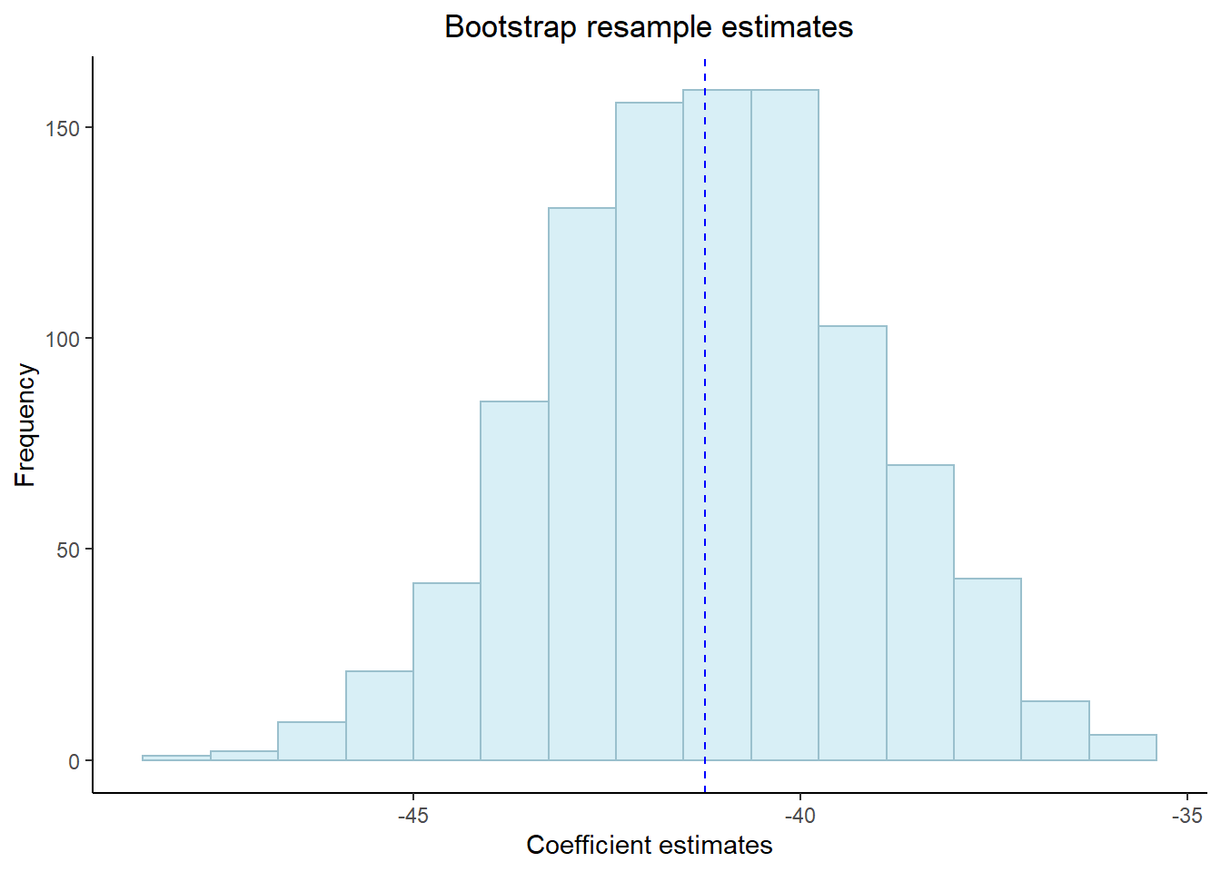
Now, wouldn’t it be useful to get some confidence intervals based on our bootstrap resample. Well! we can using the int_pctl() from the rsample package, which is also part of tidymodels.
Here, we give the function our models (GCSE_models_tidy), tell it what column the statstics are in (coef_info), specify the level of significance (alpha). Now if you recall we set the apparent argument to true earlier on and this is because this is a requirement of int_pctl()
library(rsample)
int_pctl(GCSE_models_tidy, coef_info, alpha = 0.05)## # A tibble: 2 × 6
## term .lower .estimate .upper .alpha .method
## <chr> <dbl> <dbl> <dbl> <dbl> <chr>
## 1 (Intercept) 367. 371. 376. 0.05 percen…
## 2 unauthorised_absence_in_all_schools_pe… -45.2 -41.2 -37.3 0.05 percen…A change in 1% of unathorised absence reduces the average GCSE point score between between 37.1 and 45.2 points (this is our confidence interval) with a 95% confidence level.
we can also change alpha to 0.01, which would be the 99% confidence level, but you’d expect the confidence interval range to be greater.
Here our confidence level means that if we ran the same regression model again with different sample data we could be 95% sure that those values would be within our range here.
Confidence interval = the range of values that a future estimate will be betweeen
Confidence level = the perctange certainty that a future value will be between our confidence interval values
Now lets add our predictions to our original data for a visual comparison, we will do this using the augment() function from the package broom, again we will need to use unnest() too.
GCSE_aug <- GCSE_models_tidy %>%
#sample_n(5) %>%
mutate(augmented = map(model, augment))%>%
unnest(augmented)There are so many rows in this tibble as the statistics are produced for each point within our original dataset and then added as an additional row. However, note that the statistics are the same within each bootstrap, we will have a quick look into this now.
So we know from our London Ward Profiles layer that we have 626 data points, check this with:
length(LonWardProfiles$`Average GCSE capped point scores - 2014`)## [1] 626Now, let’s have a look at our first bootstrap…
firstboot<-filter(GCSE_aug,id=="Bootstrap0001")
firstbootlength <- firstboot %>%
dplyr::select(average_gcse_capped_point_scores_2014)%>%
pull()%>%
length()
#nrow(firstboot)Ok, so how do we know that our coefficient is the same for all 626 points within our first bootstrap? Well we can check all of them, but this would just print the coefficent info for all 262….
firstboot$coef_infoAnother way is just to ask what are the unique values within our coefficient info?
uniquecoefficent <- firstboot %>%
#select(average_gcse_capped_point_scores_2014) %>%
dplyr::select(coef_info)%>%
unnest(coef_info)%>%
distinct()
uniquecoefficent## # A tibble: 2 × 5
## term estimate std.error statistic p.value
## <chr> <dbl> <dbl> <dbl> <dbl>
## 1 (Intercept) 373. 1.92 194. 0
## 2 unauthorised_absence_in_all_schools_per… -41.5 1.70 -24.4 4.72e-93#or also this would work
#unique(firstboot$coef_info)Right, now it would be really useful if we could plot our original data, but instead of fitting a line of best fit between it we use all the lines from the bootstrap resamples to show the possible variance.
ggplot(GCSE_aug, aes(unauthorised_absence_in_all_schools_percent_2013,
average_gcse_capped_point_scores_2014))+
# we want our lines to be from the fitted column grouped by our bootstrap id
geom_line(aes(y = .fitted, group = id), alpha = .2, col = "cyan3") +
# remember out apparent data is the original within the bootstrap
geom_point(data=filter(GCSE_aug,id=="Apparent"))+
#add some labels to x and y
labs(x="unauthorised absence in all schools 2013 (%)",
y="Average GCSE capped point scores 2014")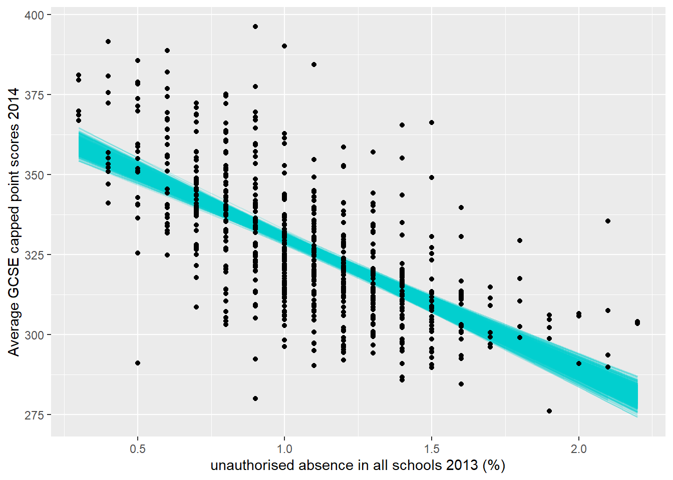
#save the file if you need to
#ggsave("insert_filepath and name")You’ll notice that this plot is slightly different to the one we first produced in Regression Basics as we’ve used geom_point() not geom_jitter() the latter adds a small amount of random variation to the points (not the data). If change in to geom_point() you will get the same plot as we just produced (apart from the bootstrap fitted lines obviously).
9.5.6 Assumption 1 - There is a linear relationship between the dependent and independent variables
The best way to test for this assumption is to plot a scatter plot similar to the one created earlier. It may not always be practical to create a series of scatter plots, so one quick way to check that a linear relationship is probable is to look at the frequency distributions of the variables. If they are normally distributed, then there is a good chance that if the two variables are in some way correlated, this will be a linear relationship.
For example, look at the frequency distributions of our two variables earlier:
# use Janitor to clean up the names.
LonWardProfiles <- LonWardProfiles %>%
clean_names()
#let's check the distribution of these variables first
ggplot(LonWardProfiles, aes(x=average_gcse_capped_point_scores_2014)) +
geom_histogram(aes(y = ..density..),
binwidth = 5) +
geom_density(colour="red",
size=1,
adjust=1)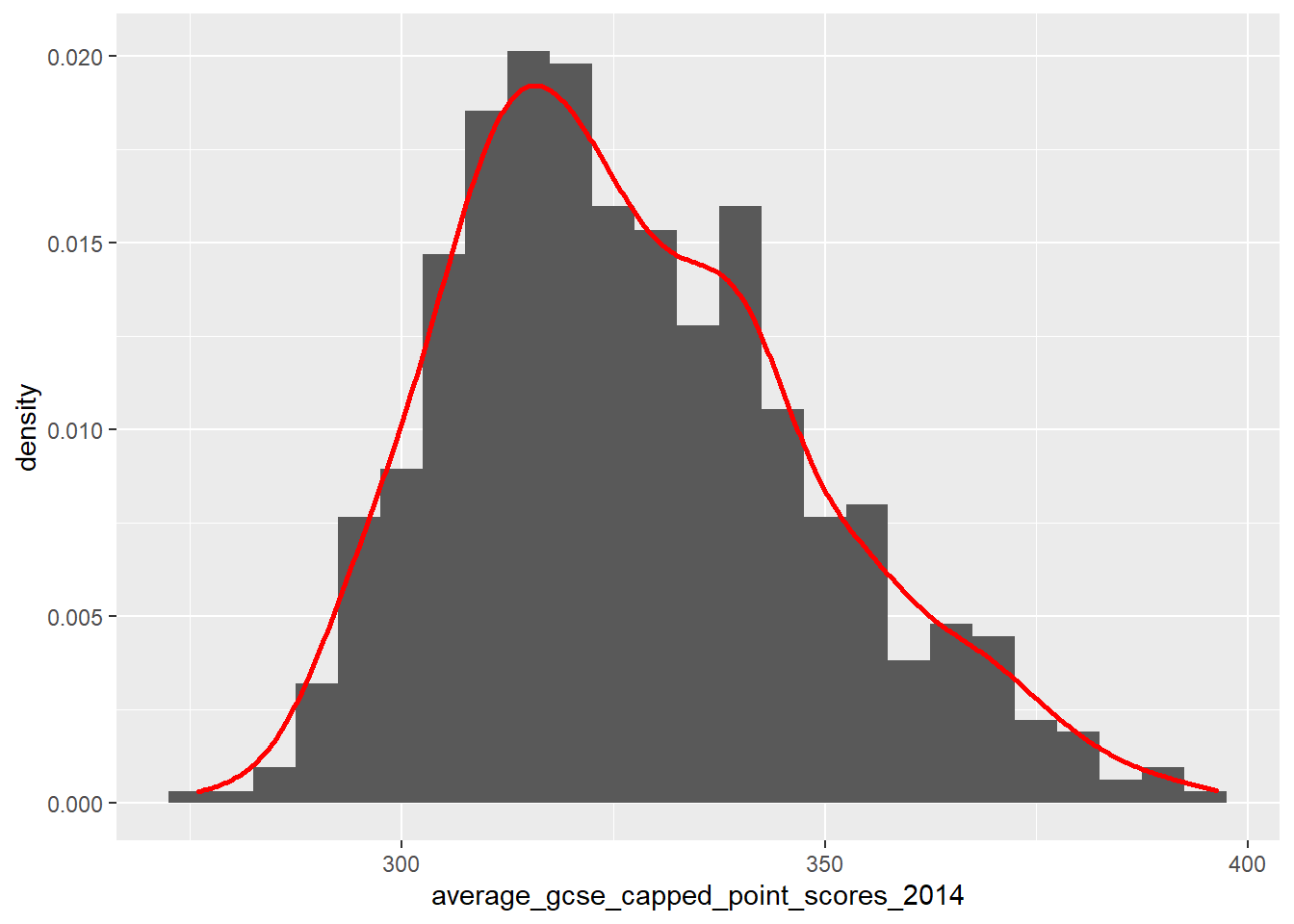
ggplot(LonWardProfiles, aes(x=unauthorised_absence_in_all_schools_percent_2013)) +
geom_histogram(aes(y = ..density..),
binwidth = 0.1) +
geom_density(colour="red",
size=1,
adjust=1)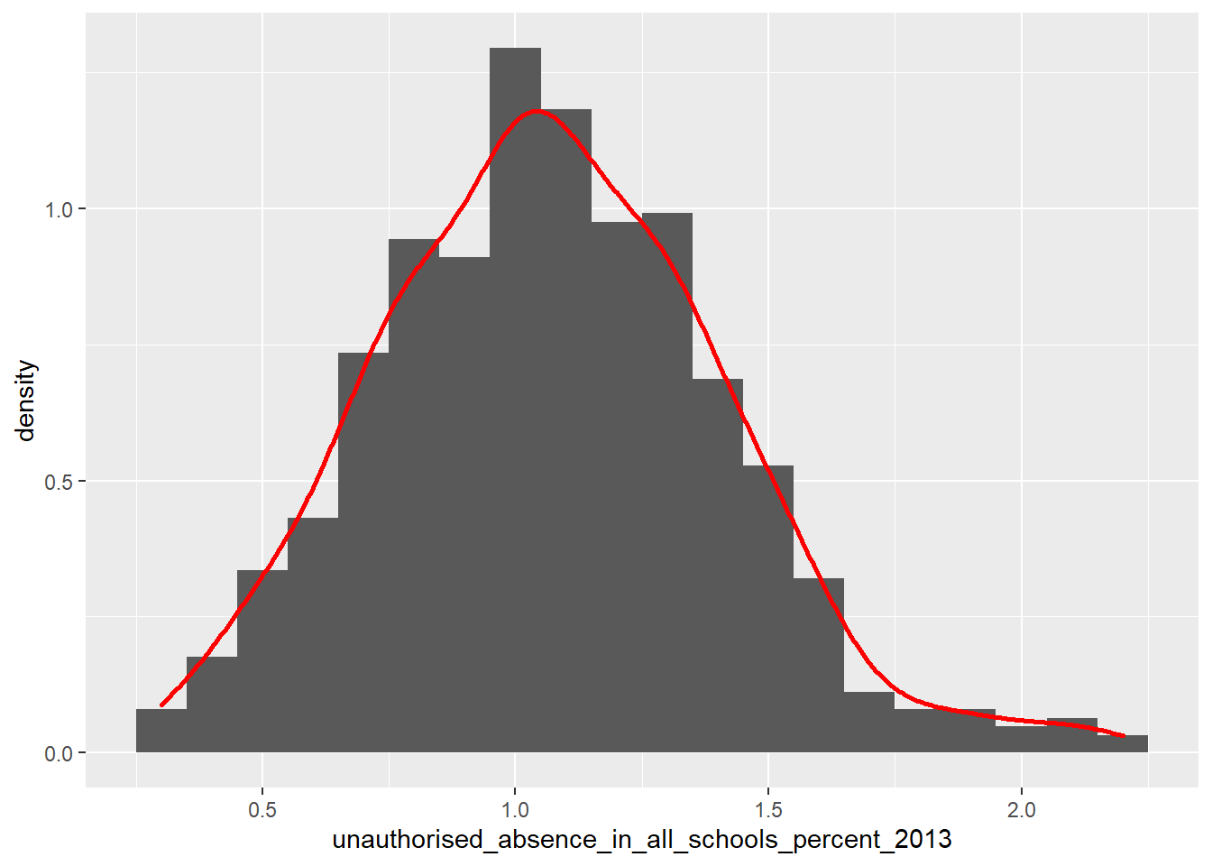
We would describe both of these distribution as being relatively ‘normally’ or gaussian disributed, and thus more likely to have a linear correlation (if they are indeed associated).
Contrast this with the median house price variable:
ggplot(LonWardProfiles, aes(x=median_house_price_2014)) +
geom_histogram()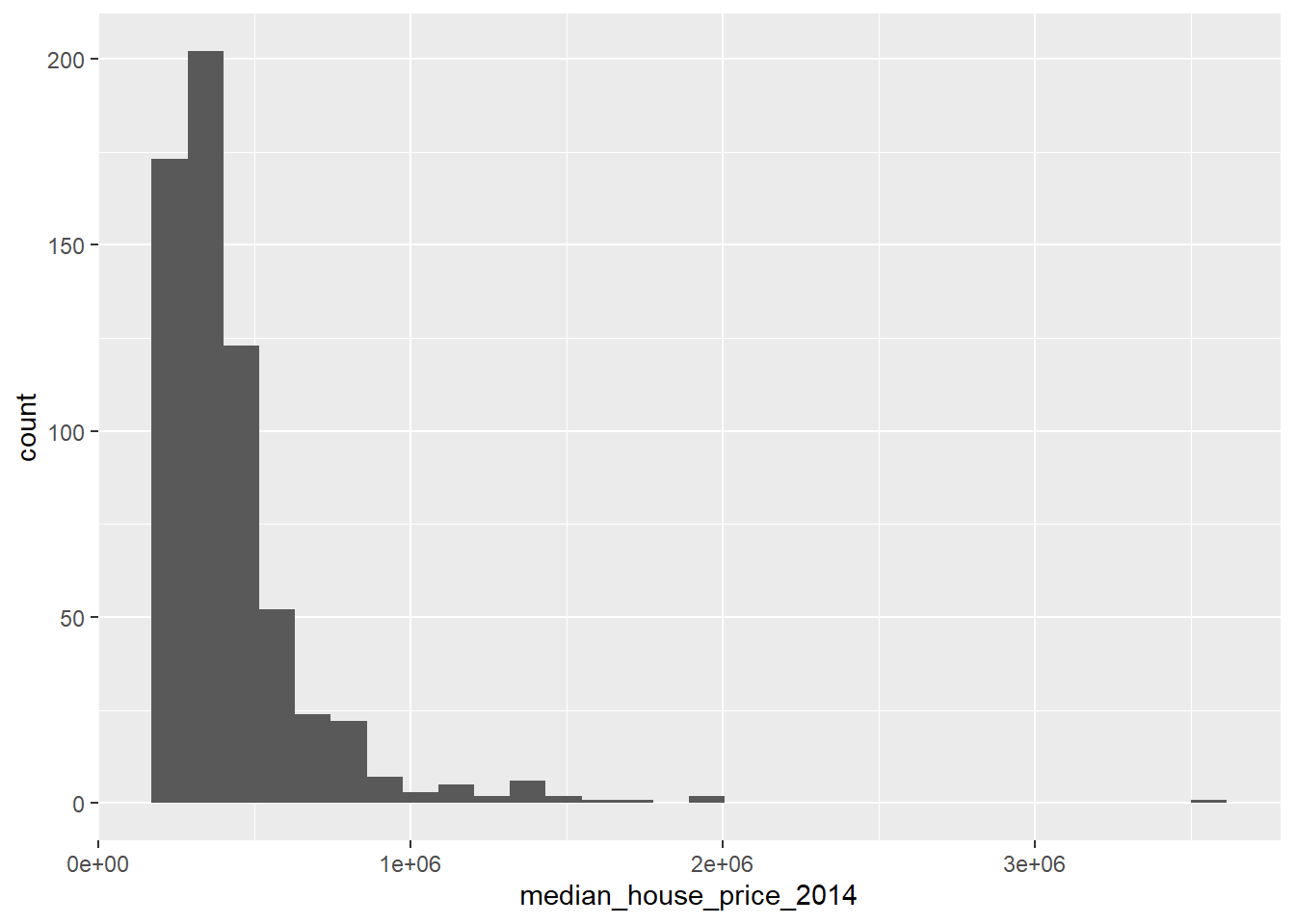
We would describe this as a not normal and/or positively ‘skewed’ distribution, i.e. there are more observations towards the lower end of the average house prices observed in the city, however there is a long tail to the distribution, i.e. there are a small number of wards where the average house price is very large indeed.
If we plot the raw house price variable against GCSE scores, we get the following scatter plot:
qplot(x = median_house_price_2014,
y = average_gcse_capped_point_scores_2014,
data=LonWardProfiles)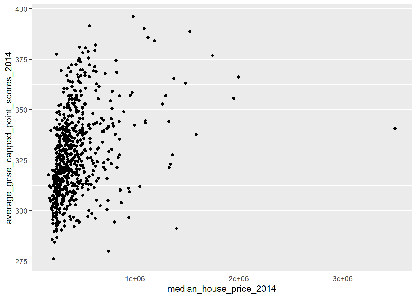
This indicates that we do not have a linear relationship, indeed it suggests that this might be a curvilinear relationship.
9.5.6.1 Transforming variables
One way that we might be able to achieve a linear relationship between our two variables is to transform the non-normally distributed variable so that it is more normally distributed.
There is some debate as to whether this is a wise thing to do as, amongst other things, the coefficients for transformed variables are much harder to interpret, however, we will have a go here to see if it makes a difference.
Tukey’s ladder of transformations
You might be asking how we could go about transforming our variables. In 1977, Tukey described a series of power transformations that could be applied to a variable to alter its frequency distribution.
In regression analysis, you analysts will frequently take the log of a variable to change its distribution, but this is a little crude and may not result in a completely normal distribution. For example, we can take the log of the house price variable:
ggplot(LonWardProfiles, aes(x=log(median_house_price_2014))) +
geom_histogram()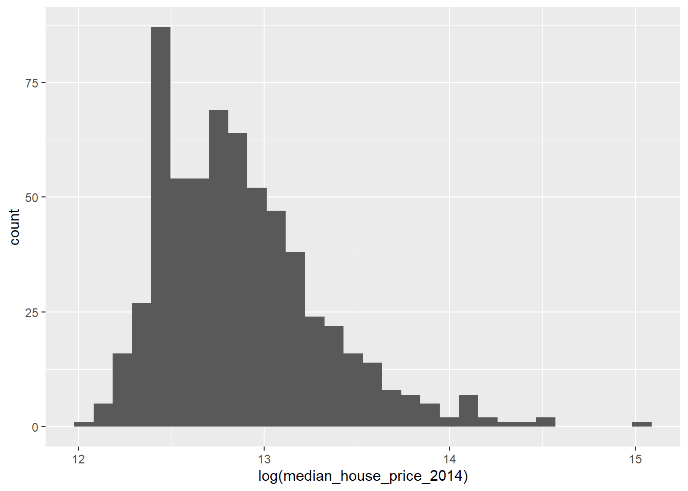
This looks a little more like a normal distribution, but it is still a little skewed.
Fortunately in R, we can use the symbox() function in the car package to try a range of transfomations along Tukey’s ladder:
symbox(~median_house_price_2014,
LonWardProfiles,
na.rm=T,
powers=seq(-3,3,by=.5))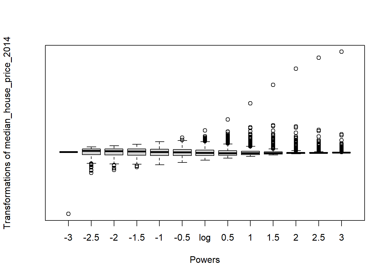
Observing the plot above, it appears that raising our house price variable to the power of -1 should lead to a more normal distribution:
ggplot(LonWardProfiles, aes(x=(median_house_price_2014)^-1)) +
geom_histogram()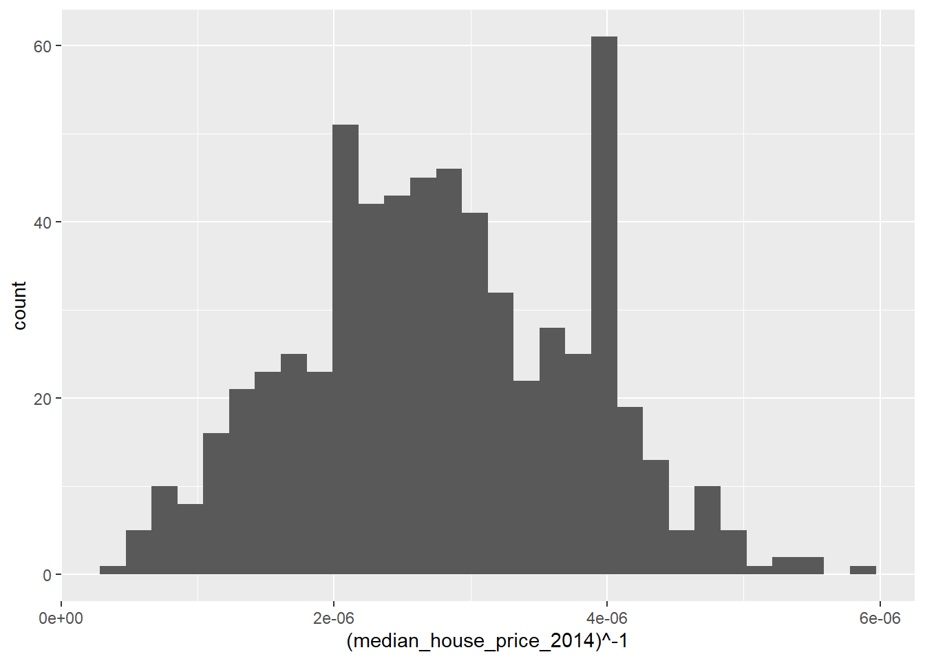
qplot(x = (median_house_price_2014)^-1,
y = average_gcse_capped_point_scores_2014,
data=LonWardProfiles)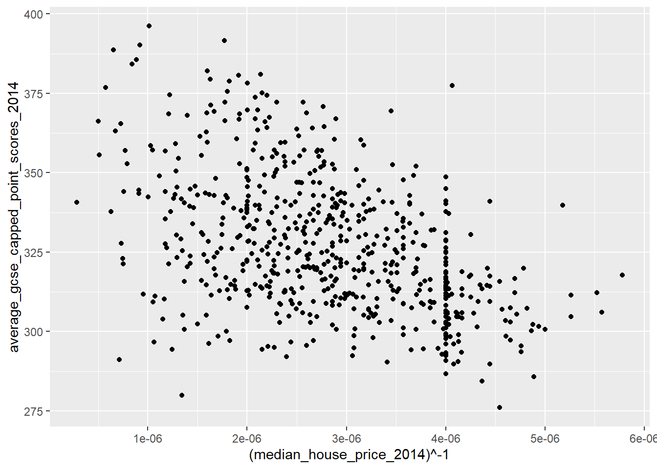
Compare this with the logged transformation:
qplot(x = log(median_house_price_2014),
y = average_gcse_capped_point_scores_2014,
data=LonWardProfiles)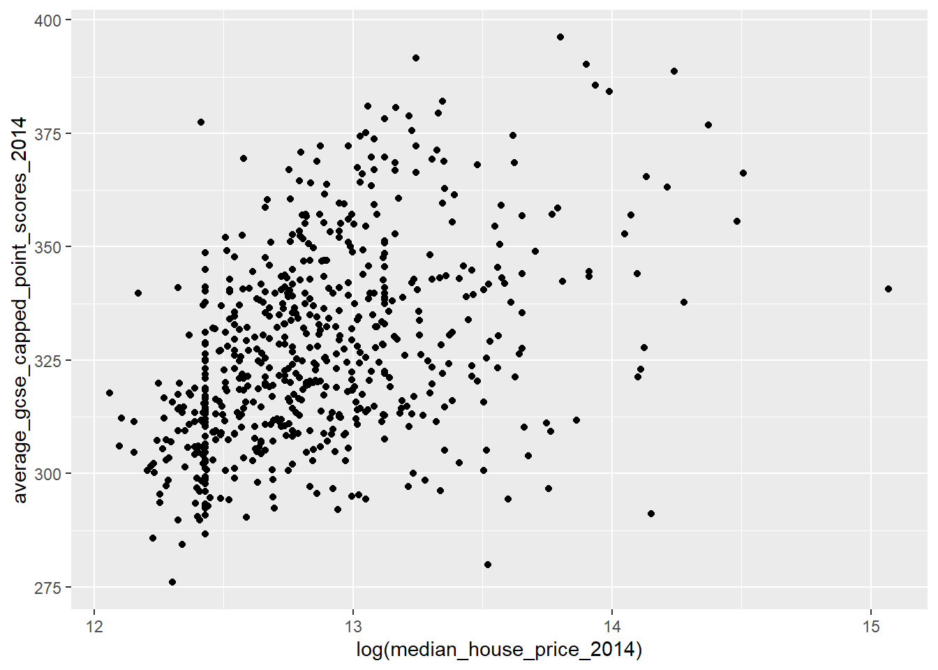
9.5.6.2 Should I transform my variables?
The decision is down to you as the modeller - it might be that a transformation doesn’t succeed in normalising the distribtuion of your data or that the interpretation after the transformation is problematic, however it is important not to violate the assumptions underpinning the regression model or your conclusions may be on shaky ground.
9.5.7 Assumption 2 - The residuals in your model should be normally distributed
This assumption is easy to check. When we ran our Model1 earlier, one of the outputs stored in our Model 1 object is the residual value for each case (Ward) in your dataset. We can access these values using augment() from broom which will add model output to the original GCSE data…
We can plot these as a histogram and see if there is a normal distribution:
#save the residuals into your dataframe
model_data <- model1 %>%
augment(., Regressiondata)
#plot residuals
model_data%>%
dplyr::select(.resid)%>%
pull()%>%
qplot()+
geom_histogram() 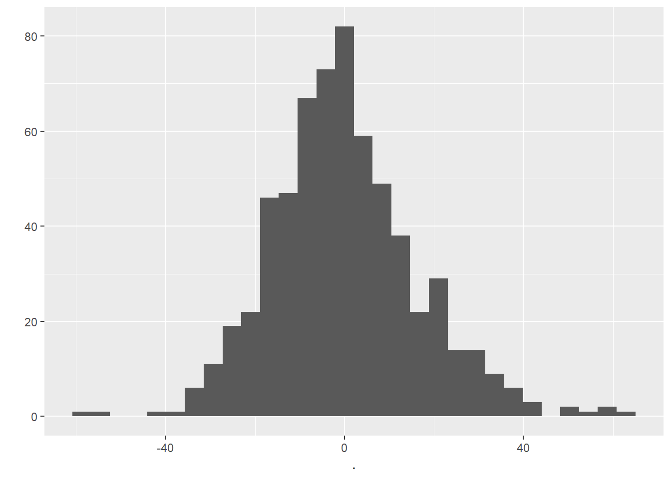
Examining the histogram above, we can be happy that our residuals look to be relatively normally distributed.
9.5.8 Assumption 3 - No Multicolinearity in the independent variables
Now, the regression model we have be experimenting with so far is a simple bivariate (two variable) model. One of the nice things about regression modelling is while we can only easily visualise linear relationships in a two (or maximum 3) dimension scatter plot, mathematically, we can have as many dimensions / variables as we like.
As such, we could extend model 1 into a multiple regression model by adding some more explanatory variables that we think could affect GSCE scores. Let’s try the log or ^-1 transformed house price variable from earlier (the rationalle being that higher house prices indicate more affluence and therefore, potentially, more engagement with education):
Regressiondata2<- LonWardProfiles%>%
clean_names()%>%
dplyr::select(average_gcse_capped_point_scores_2014,
unauthorised_absence_in_all_schools_percent_2013,
median_house_price_2014)
model2 <- lm(average_gcse_capped_point_scores_2014 ~ unauthorised_absence_in_all_schools_percent_2013 +
log(median_house_price_2014), data = Regressiondata2)
#show the summary of those outputs
tidy(model2)## # A tibble: 3 × 5
## term estimate std.error statistic p.value
## <chr> <dbl> <dbl> <dbl> <dbl>
## 1 (Intercept) 202. 20.1 10.0 4.79e-22
## 2 unauthorised_absence_in_all_schools_per… -36.2 1.92 -18.9 3.71e-63
## 3 log(median_house_price_2014) 12.8 1.50 8.50 1.37e-16glance(model2)## # A tibble: 1 × 12
## r.squared adj.r.squared sigma statistic p.value df logLik AIC BIC
## <dbl> <dbl> <dbl> <dbl> <dbl> <dbl> <dbl> <dbl> <dbl>
## 1 0.483 0.482 15.5 291. 4.78e-90 2 -2604. 5215. 5233.
## # … with 3 more variables: deviance <dbl>, df.residual <int>, nobs <int>#and for future use, write the residuals out
model_data2 <- model2 %>%
augment(., Regressiondata2)
# also add them to the shapelayer
LonWardProfiles <- LonWardProfiles %>%
mutate(model2resids = residuals(model2))Examining the output above, it is clear that including median house price into our model improves the fit from an \(r^2\) of around 42% to an \(r^2\) of 48%. Median house price is also a statistically significant variable.
But do our two explanatory variables satisfy the no-multicoliniarity assumption? If not and the variables are highly correlated, then we are effectively double counting the influence of these variables and overstating their explanatory power.
To check this, we can compute the product moment correlation coefficient between the variables, using the corrr() pacakge, that’s part of tidymodels. In an ideal world, we would be looking for something less than a 0.8 correlation
library(corrr)
Correlation <- LonWardProfiles %>%
st_drop_geometry()%>%
dplyr::select(average_gcse_capped_point_scores_2014,
unauthorised_absence_in_all_schools_percent_2013,
median_house_price_2014) %>%
mutate(median_house_price_2014 =log(median_house_price_2014))%>%
correlate() %>%
# just focus on GCSE and house prices
focus(-average_gcse_capped_point_scores_2014, mirror = TRUE)
#visualise the correlation matrix
rplot(Correlation)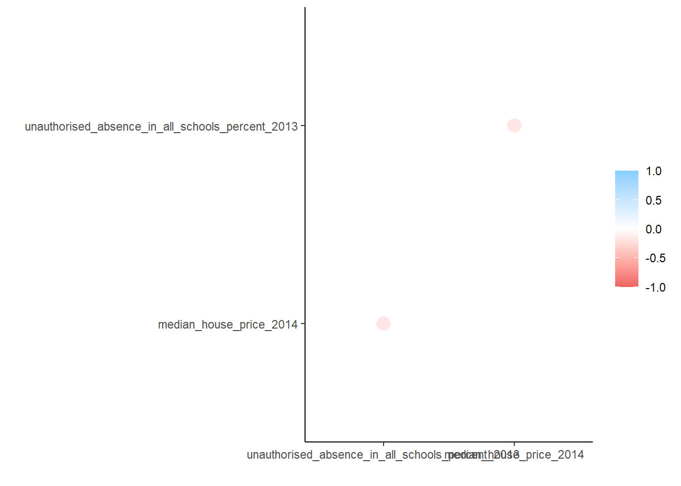
Looking at either the correlation matrix or the correlation plot of that matrix, it’s easy to see that there is a low correlation (around 30%) between our two independent variables.
Multiple linear regression can be explained nicely with this example from allison_horst.
Let’s meet our Multiple Linear Regression teaching assistants:

Here my reseach question might be
What are the factors that might lead to variation in dragon weight?
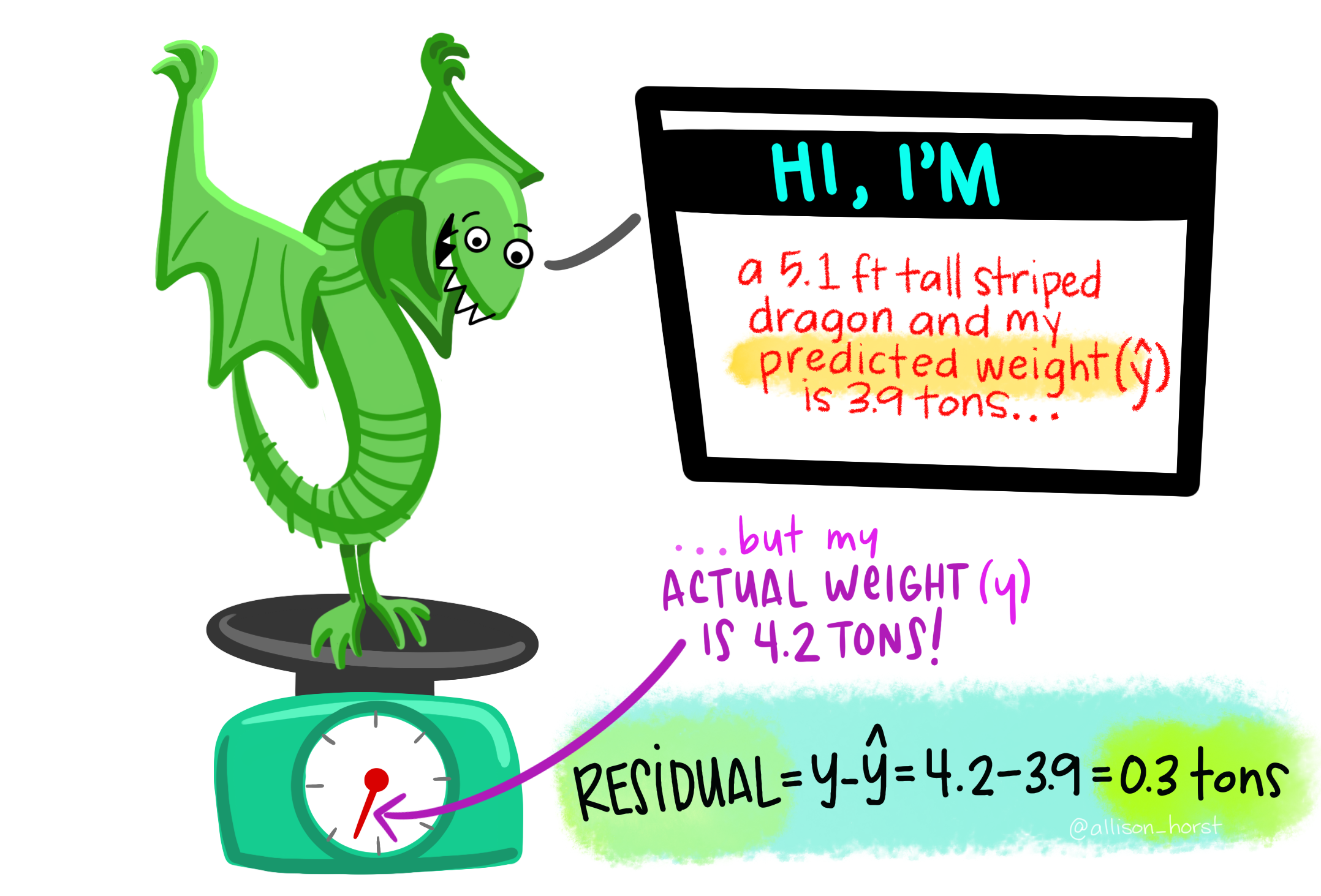
We might have both cateogrical predictor variaibles such as if the dragon is spotted then they might weight 0.6 more tons than on average…So if the dragon is not spotted then in the equation bellow 0.6 x (0) — 0 as it’s not spotted, it would be 1 if spotted is 0 so the weight would be 2.4 tonnes.
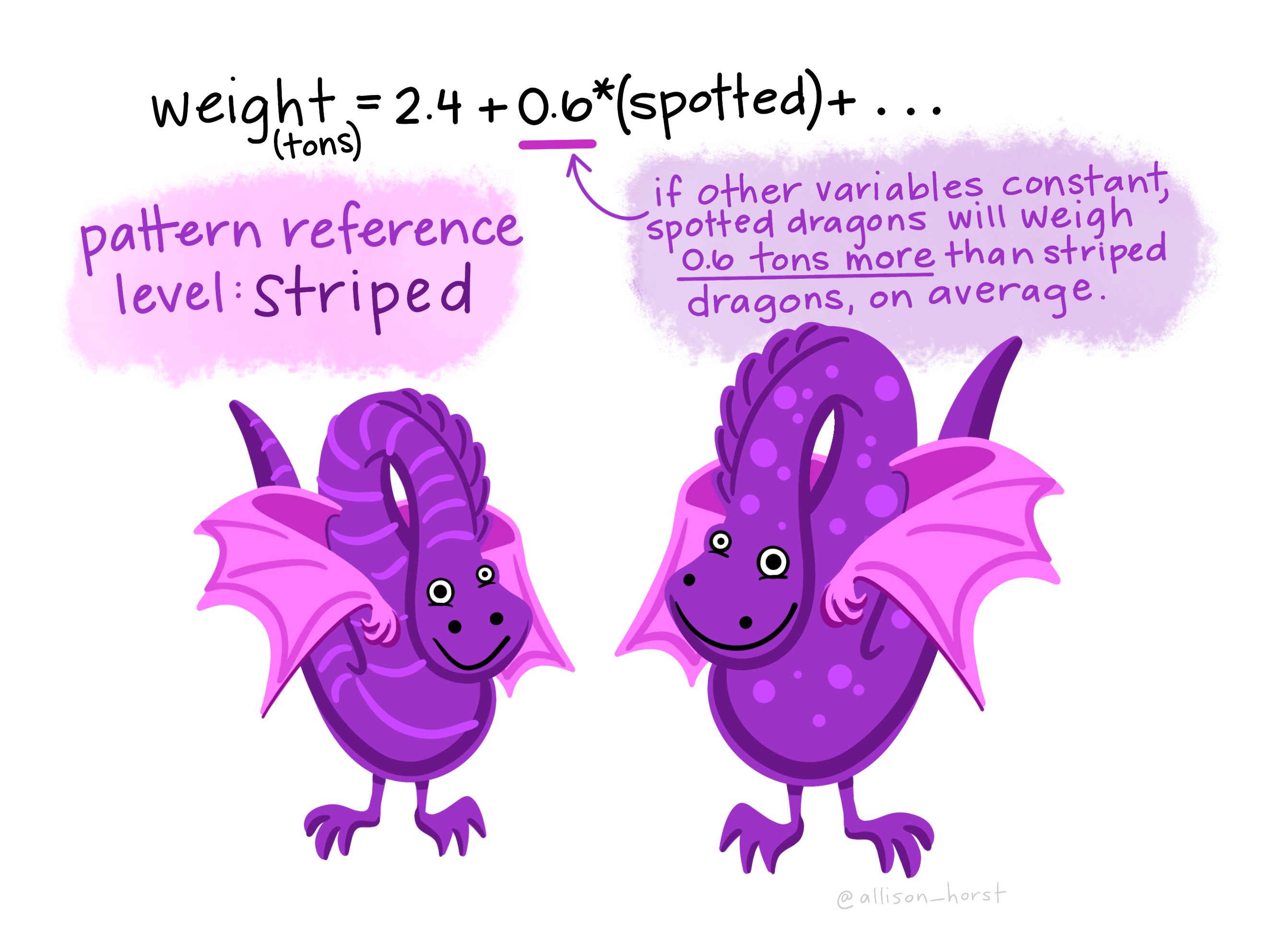
But we could also have a continuous predictor variable …here a 1 foot taller dragon would have an addtional 0.3 tonnes on average, as the equation would be 2.4 + 0.3(1)…
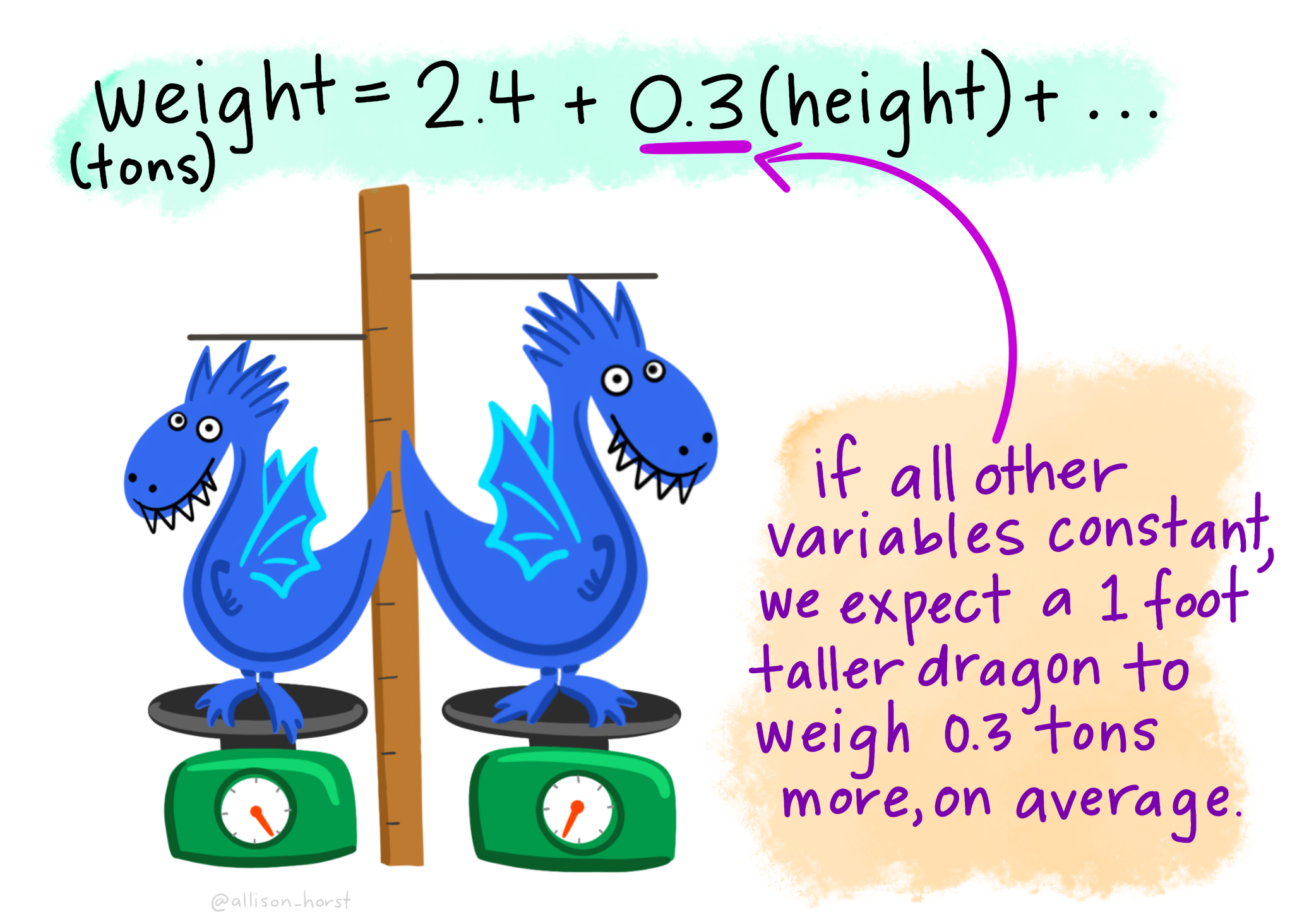
We can use these equations to make predicitons about a new dragon…here the dragon is striped, so spotted equals 0, and it’s height is 5.1. So that gives us 2.4 + (0.3*5.1) which equals 3.9 tonnes.
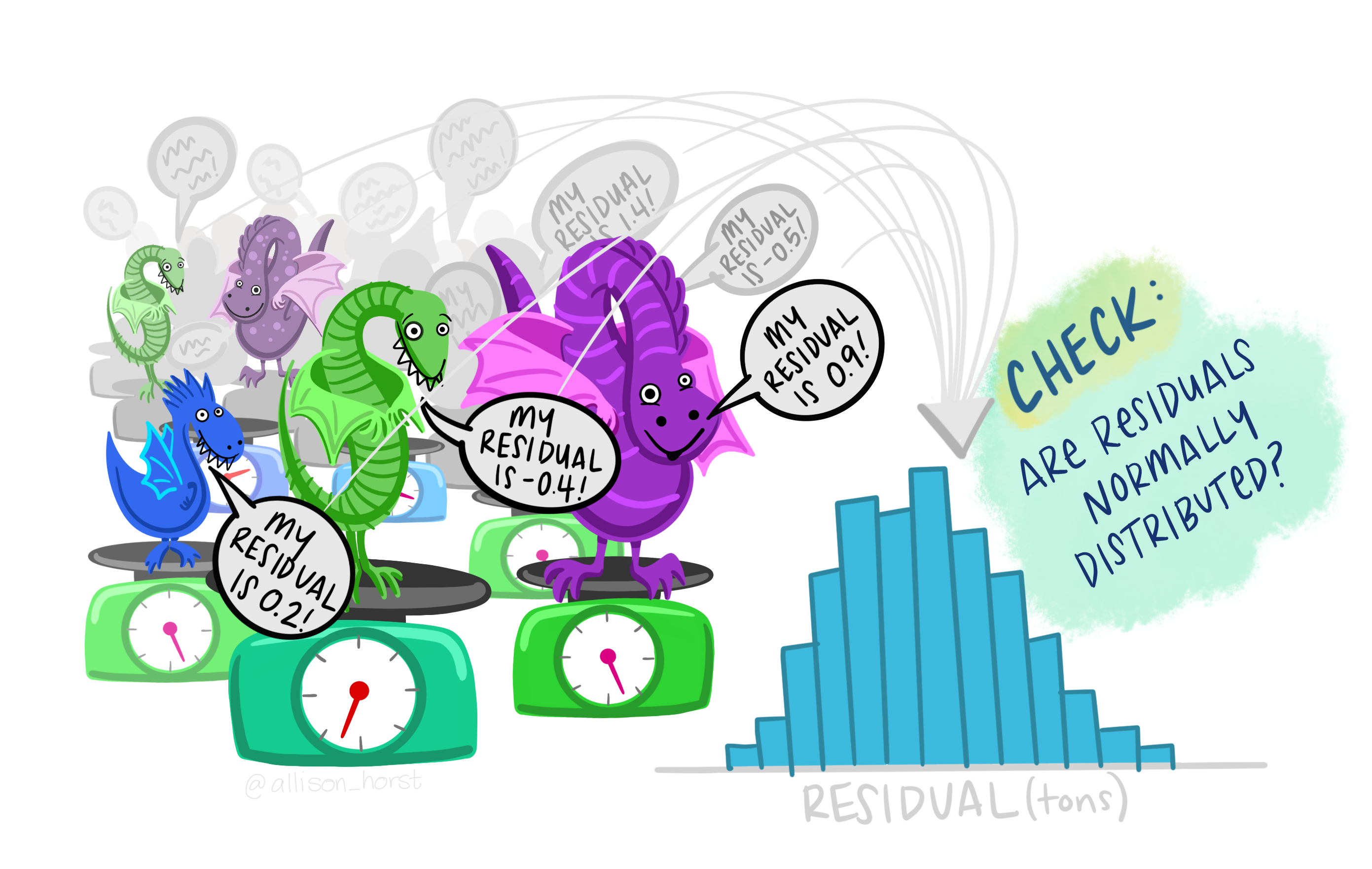
However, we need to check the residuals — difference between the predicted weight and acutal weight…here it’s 0.3 tonnes as the actual weight of the dragon was 4.2 tonnes.
Then for all the dragons we need to make sure these resisuals are normally distributed, but you should also check all the other assumptions (1-5) shown within this practical and give brief evdience in reports that they are all valid.
9.5.8.1 Variance Inflation Factor (VIF)
Another way that we can check for Multicolinearity is to examine the VIF for the model. If we have VIF values for any variable exceeding 10, then we may need to worry and perhaps remove that variable from the analysis:
vif(model2)## unauthorised_absence_in_all_schools_percent_2013
## 1.105044
## log(median_house_price_2014)
## 1.105044Both the correlation plots and examination of VIF indicate that our multiple regression model meets the assumptions around multicollinearity and so we can proceed further.
If we wanted to add more variables into our model, it would be useful to check for multicollinearity amongst every variable we want to include, we can do this by computing a correlation matrix for the whole dataset or checking the VIF after running the model:
position <- c(10:74)
Correlation_all<- LonWardProfiles %>%
st_drop_geometry()%>%
dplyr::select(position)%>%
correlate()
rplot(Correlation_all)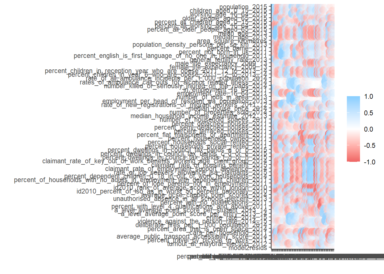
9.5.9 Assumption 4 - Homoscedasticity
Homoscedasticity means that the errors/residuals in the model exhibit constant / homogenous variance, if they don’t, then we would say that there is hetroscedasticity present. Why does this matter? Andy Field does a much better job of explaining this than I could ever do here - https://www.discoveringstatistics.com/tag/homoscedasticity/ - but essentially, if your errors do not have constant variance, then your parameter estimates could be wrong, as could the estimates of their significance.
The best way to check for homo/hetroscedasticity is to plot the residuals in the model against the predicted values. We are looking for a cloud of points with no apparent patterning to them.
#print some model diagnositcs.
par(mfrow=c(2,2)) #plot to 2 by 2 array
plot(model2)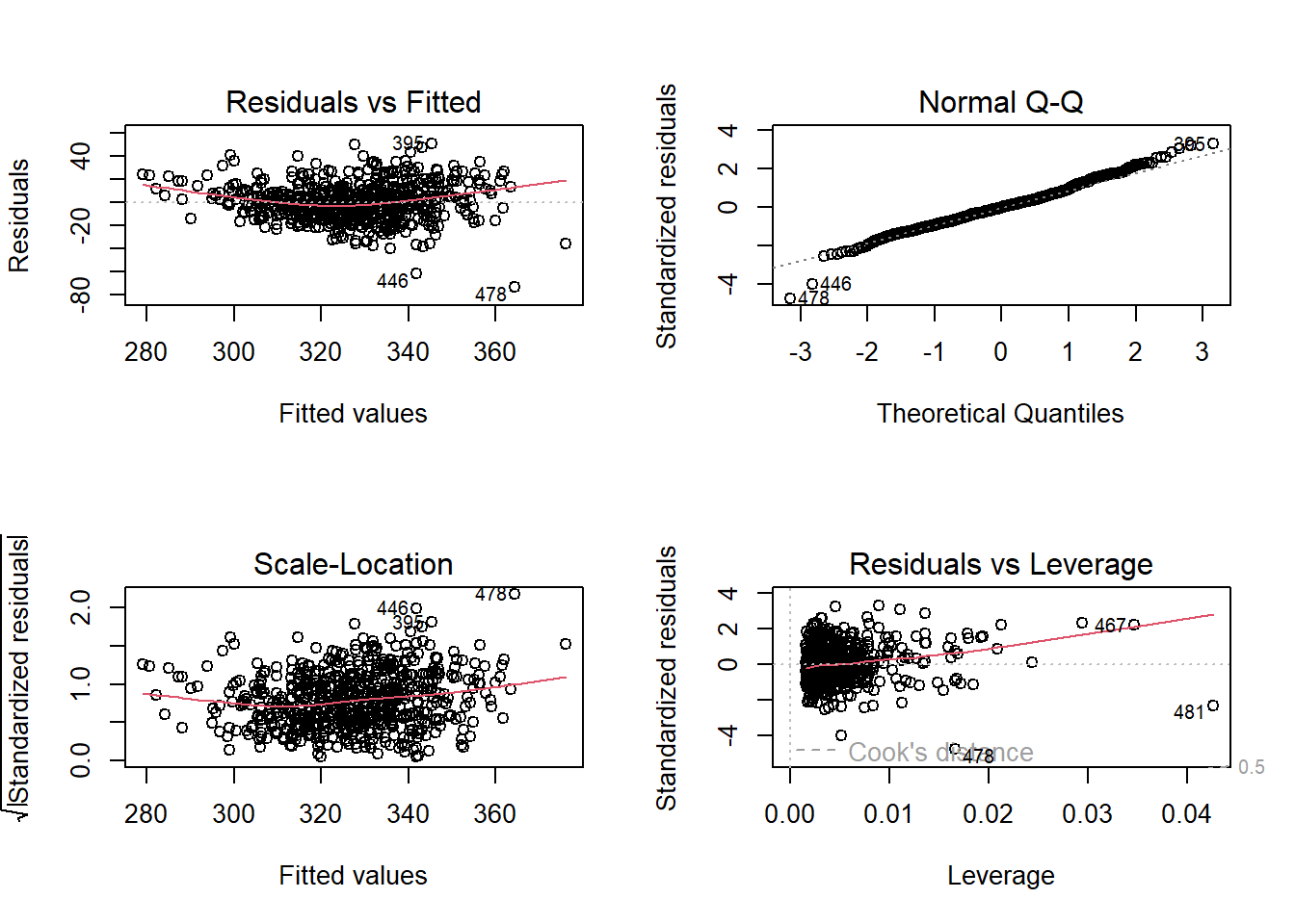
In the series of plots above, the first plot (residuals vs fitted), we would hope to find a random cloud of points with a straight horizontal red line. Looking at the plot, the curved red line would suggest some hetroscedasticity, but the cloud looks quite random. Similarly we are looking for a random cloud of points with no apparent patterning or shape in the third plot of standardised residuals vs fitted values. Here, the cloud of points also looks fairly random, with perhaps some shaping indicated by the red line.
9.5.10 Assumption 5 - Independence of Errors
This assumption simply states that the residual values (errors) in your model must not be correlated in any way. If they are, then they exhibit autocorrelation which suggests that something might be going on in the background that we have not sufficiently accounted for in our model.
9.5.10.1 Standard Autocorrelation
If you are running a regression model on data that do not have explicit space or time dimensions, then the standard test for autocorrelation would be the Durbin-Watson test.
This tests whether residuals are correlated and produces a summary statistic that ranges between 0 and 4, with 2 signifiying no autocorrelation. A value greater than 2 suggesting negative autocorrelation and and value of less than 2 indicating postitve autocorrelation.
In his excellent text book, Andy Field suggests that you should be concerned with Durbin-Watson test statistics <1 or >3. So let’s see:
#run durbin-watson test
DW <- durbinWatsonTest(model2)
tidy(DW)## # A tibble: 1 × 5
## statistic p.value autocorrelation method alternative
## <dbl> <dbl> <dbl> <chr> <chr>
## 1 1.61 0 0.193 Durbin-Watson Test two.sidedAs you can see, the DW statistics for our model is 1.61, so some indication of autocorrelation, but perhaps nothing to worry about.
HOWEVER
We are using spatially referenced data and as such we should check for spatial-autocorrelation.
The first test we should carry out is to map the residuals to see if there are any apparent obvious patterns:
#now plot the residuals
tmap_mode("view")
#qtm(LonWardProfiles, fill = "model1_resids")
tm_shape(LonWardProfiles) +
tm_polygons("model2resids",
palette = "RdYlBu") +
tm_shape(lond_sec_schools_sf) + tm_dots(col = "TYPE")Looking at the map above, there look to be some blue areas next to other blue areas and some red/orange areas next to other red/orange areas. This suggests that there could well be some spatial autocorrelation biasing our model, but can we test for spatial autocorrelation more systematically?
Yes - and some of you will remember this from the practical two weeks ago. We can calculate a number of different statistics to check for spatial autocorrelation - the most common of these being Moran’s I.
Let’s do that now.
#calculate the centroids of all Wards in London
coordsW <- LonWardProfiles%>%
st_centroid()%>%
st_geometry()## Warning in st_centroid.sf(.): st_centroid assumes attributes are constant over
## geometries of xplot(coordsW)
#Now we need to generate a spatial weights matrix (remember from the lecture a couple of weeks ago). We'll start with a simple binary matrix of queen's case neighbours
LWard_nb <- LonWardProfiles %>%
poly2nb(., queen=T)
#or nearest neighbours
knn_wards <-coordsW %>%
knearneigh(., k=4)## Warning in knearneigh(., k = 4): knearneigh: identical points found## Warning in knearneigh(., k = 4): knearneigh: kd_tree not available for identical
## pointsLWard_knn <- knn_wards %>%
knn2nb()
#plot them
plot(LWard_nb, st_geometry(coordsW), col="red")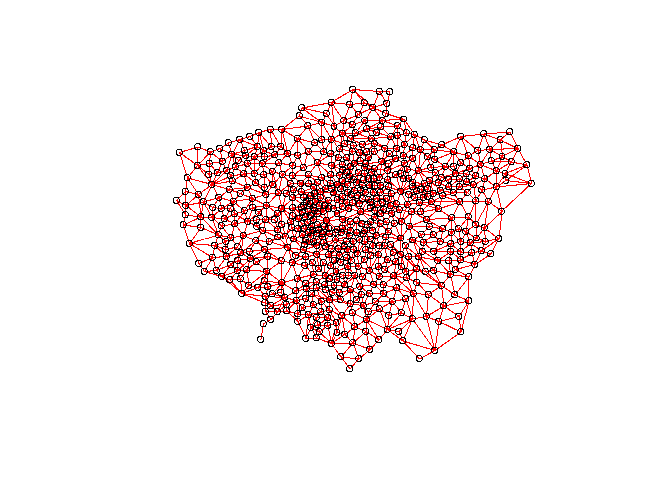
plot(LWard_knn, st_geometry(coordsW), col="blue")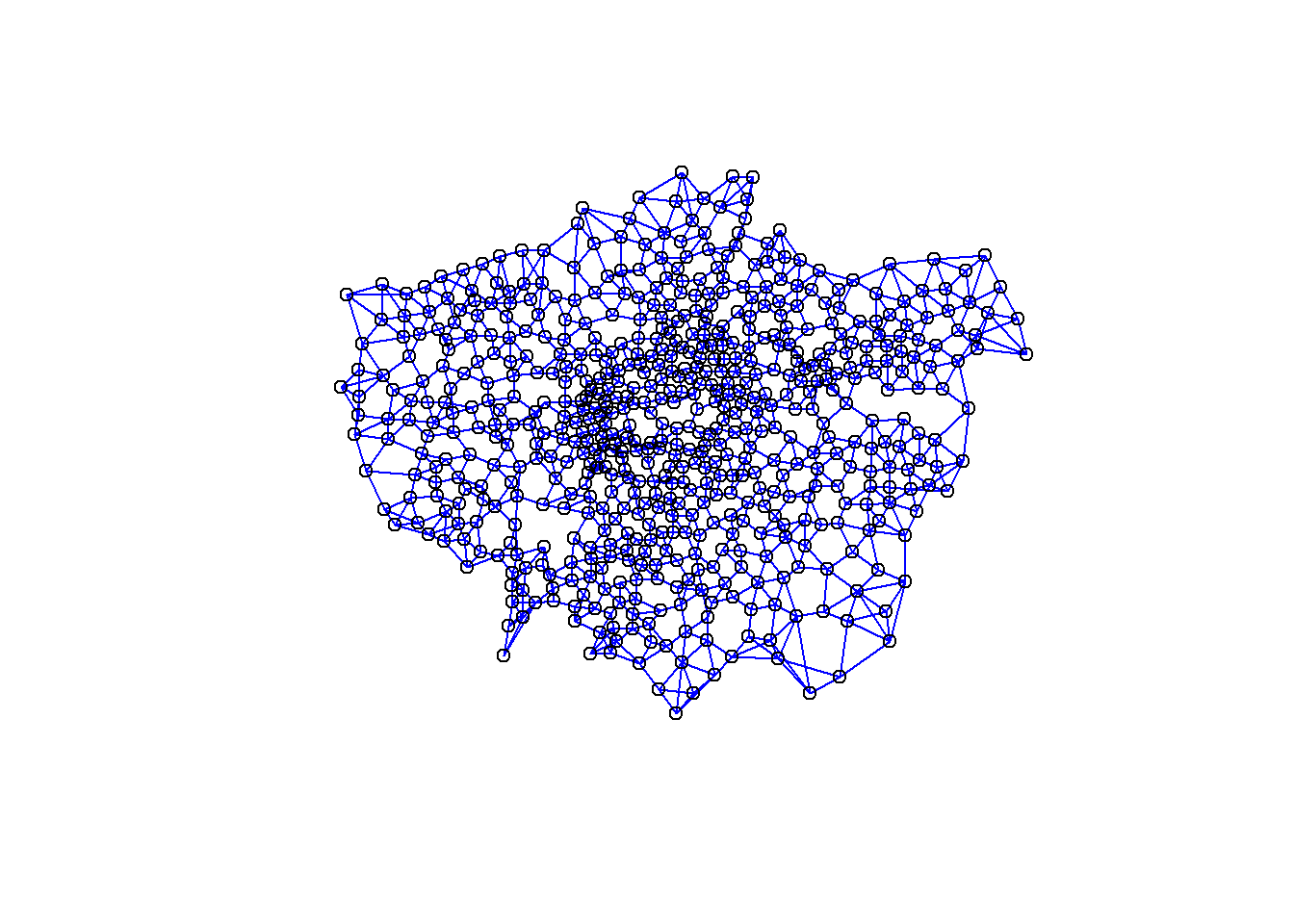
#add a map underneath
plot(LonWardProfiles)## Warning: plotting the first 9 out of 74 attributes; use max.plot = 74 to plot
## all
#create a spatial weights matrix object from these weights
Lward.queens_weight <- LWard_nb %>%
nb2listw(., style="C")
Lward.knn_4_weight <- LWard_knn %>%
nb2listw(., style="C")Now run a moran’s I test on the residuals, first using queens neighbours
Queen <- LonWardProfiles %>%
st_drop_geometry()%>%
dplyr::select(model2resids)%>%
pull()%>%
moran.test(., Lward.queens_weight)%>%
tidy()Then nearest k-nearest neighbours
Nearest_neighbour <- LonWardProfiles %>%
st_drop_geometry()%>%
dplyr::select(model2resids)%>%
pull()%>%
moran.test(., Lward.knn_4_weight)%>%
tidy()
Queen## # A tibble: 1 × 7
## estimate1 estimate2 estimate3 statistic p.value method alternative
## <dbl> <dbl> <dbl> <dbl> <dbl> <chr> <chr>
## 1 0.268 -0.0016 0.000533 11.7 9.29e-32 Moran I test und… greaterNearest_neighbour## # A tibble: 1 × 7
## estimate1 estimate2 estimate3 statistic p.value method alternative
## <dbl> <dbl> <dbl> <dbl> <dbl> <chr> <chr>
## 1 0.292 -0.0016 0.000718 10.9 3.78e-28 Moran I test und… greaterObserving the Moran’s I statistic for both Queen’s case neighbours and k-nearest neighbours of 4, we can see that the Moran’s I statistic is somewhere between 0.27 and 0.29. Remembering that Moran’s I ranges from between -1 and +1 (0 indicating no spatial autocorrelation) we can conclude that there is some weak to moderate spatial autocorrelation in our residuals.
This means that despite passing most of the assumptions of linear regression, we could have a situation here where the presence of some spatial autocorrelation could be leading to biased estimates of our parameters and significance values.
9.6 Spatial Regression Models
9.6.2 Spatial regression model in R
We will now read in some extra data which we will use shortly
extradata <- read_csv("https://www.dropbox.com/s/qay9q1jwpffxcqj/LondonAdditionalDataFixed.csv?raw=1")
#add the extra data too
LonWardProfiles <- LonWardProfiles%>%
left_join(.,
extradata,
by = c("gss_code" = "Wardcode"))%>%
clean_names()
#print some of the column names
LonWardProfiles%>%
names()%>%
tail(., n=10)## [1] "ward_code" "pct_shared_ownership2011"
## [3] "pct_rent_free2011" "candidate"
## [5] "inner_outer" "x"
## [7] "y" "avg_gcse2011"
## [9] "unauth_absence_schools11" "geometry"9.6.3 Extending your regression model - Dummy Variables
What if instead of fitting one line to our cloud of points, we could fit several depending on whether the Wards we were analysing fell into some or other group. What if the relationship between attending school and achieving good exam results varied between inner and outer London, for example. Could we test for that? Well yes we can - quite easily in fact.
If we colour the points representing Wards for Inner and Outer London differently, we can start to see that there might be something interesting going on. Using 2011 data (as there are not the rounding errors that there are in the more recent data), there seems to be a stronger relationship between absence and GCSE scores in Outer London than Inner London. We can test for this in a standard linear regression model.
p <- ggplot(LonWardProfiles,
aes(x=unauth_absence_schools11,
y=average_gcse_capped_point_scores_2014))
p + geom_point(aes(colour = inner_outer)) 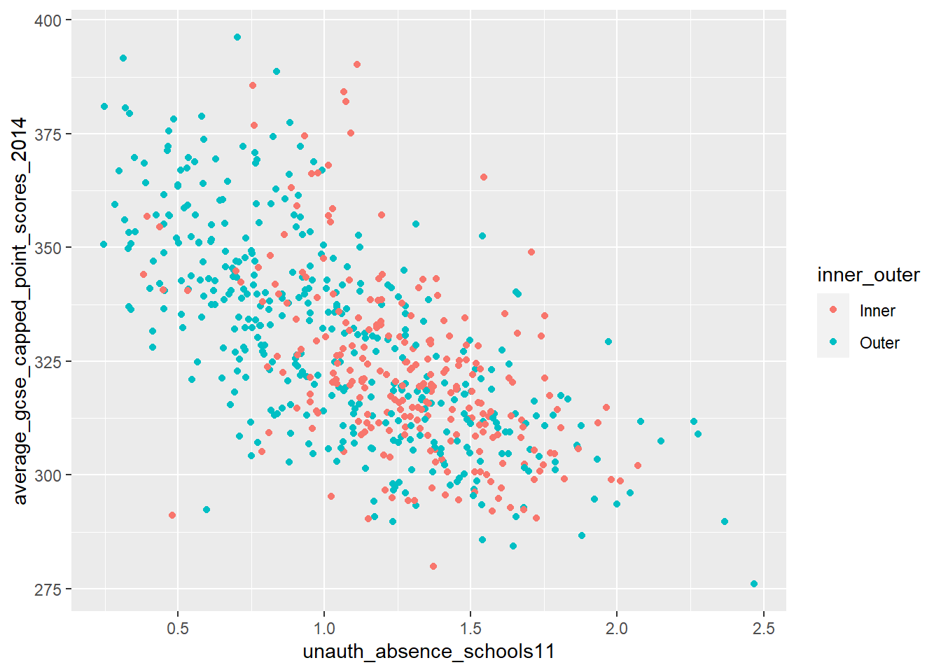
Dummy variables are always categorical data (inner or outer London, or red / blue etc.). When we incorporate them into a regression model, they serve the purpose of splitting our analysis into groups. In the graph above, it would mean, effectively, having a separate regression line for the red points and a separate line for the blue points.
Let’s try it!
#first, let's make sure R is reading our InnerOuter variable as a factor
#see what it is at the moment...
isitfactor <- LonWardProfiles %>%
dplyr::select(inner_outer)%>%
summarise_all(class)
isitfactor## Simple feature collection with 2 features and 1 field
## Geometry type: POLYGON
## Dimension: XY
## Bounding box: xmin: 503568.2 ymin: 155850.8 xmax: 561957.5 ymax: 200933.9
## Projected CRS: OSGB 1936 / British National Grid
## inner_outer geometry
## 1 character POLYGON ((528100.9 160037.3...
## 2 character POLYGON ((528100.9 160037.3...# change to factor
LonWardProfiles<- LonWardProfiles %>%
mutate(inner_outer=as.factor(inner_outer))
#now run the model
model3 <- lm(average_gcse_capped_point_scores_2014 ~ unauthorised_absence_in_all_schools_percent_2013 +
log(median_house_price_2014) +
inner_outer,
data = LonWardProfiles)
tidy(model3)## # A tibble: 4 × 5
## term estimate std.error statistic p.value
## <chr> <dbl> <dbl> <dbl> <dbl>
## 1 (Intercept) 97.6 24.1 4.06 5.62e- 5
## 2 unauthorised_absence_in_all_schools_per… -30.1 2.03 -14.8 7.02e-43
## 3 log(median_house_price_2014) 19.8 1.74 11.4 2.09e-27
## 4 inner_outerOuter 10.9 1.51 7.24 1.30e-12So how can we interpret this?
Well, the dummy variable is statistically significant and the coefficient tells us the difference between the two groups (Inner and Outer London) we are comparing. In this case, it is telling us that living in a Ward in outer London will improve your average GCSE score by 10.93 points, on average, compared to if you lived in Inner London. The R-squared has increased slightly, but not by much.
You will notice that despite there being two values in our dummy variable (Inner and Outer), we only get one coefficient. This is because with dummy variables, one value is always considered to be the control (comparison/reference) group. In this case we are comparing Outer London to Inner London. If our dummy variable had more than 2 levels we would have more coefficients, but always one as the reference.
The order in which the dummy comparisons are made is determined by what is known as a ‘contrast matrix’. This determines the treatment group (1) and the control (reference) group (0). We can view the contrast matrix using the contrasts() function:
contrasts(LonWardProfiles$inner_outer)## Outer
## Inner 0
## Outer 1If we want to change the reference group, there are various ways of doing this. We can use the contrasts() function, or we can use the relevel() function. Let’s try it:
LonWardProfiles <- LonWardProfiles %>%
mutate(inner_outer = relevel(inner_outer,
ref="Outer"))
model3 <- lm(average_gcse_capped_point_scores_2014 ~ unauthorised_absence_in_all_schools_percent_2013 +
log(median_house_price_2014) +
inner_outer,
data = LonWardProfiles)
tidy(model3)## # A tibble: 4 × 5
## term estimate std.error statistic p.value
## <chr> <dbl> <dbl> <dbl> <dbl>
## 1 (Intercept) 109. 23.2 4.68 3.53e- 6
## 2 unauthorised_absence_in_all_schools_per… -30.1 2.03 -14.8 7.02e-43
## 3 log(median_house_price_2014) 19.8 1.74 11.4 2.09e-27
## 4 inner_outerInner -10.9 1.51 -7.24 1.30e-12You will notice that the only thing that has changed in the model is that the coefficient for the inner_outer variable now relates to Inner London and is now negative (meaning that living in Inner London is likely to reduce your average GCSE score by 10.93 points compared to Outer London). The rest of the model is exactly the same.
9.6.4 TASK: Investigating Further - Adding More Explanatory Variables into a multiple regression model
Now it’s your turn. You have been shown how you could begin to model average GCSE scores across London, but the models we have built so far have been fairly simple in terms of explanatory variables.
You should try and build the optimum model of GCSE performance from your data in your LondonWards dataset. Experiment with adding different variables - when building a regression model in this way, you are trying to hit a sweet spot between increasing your R-squared value as much as possible, but with as few explanatory variables as possible.
9.6.4.1 A few things to watch out for…
You should never just throw variables at a model without a good theoretical reason for why they might have an influence. Choose your variables carefully!
Be prepared to take variables out of your model either if a new variable confounds (becomes more important than) earlier variables or turns out not to be significant.
For example, let’s try adding the rate of drugs related crime (logged as it is a positively skewed variable, where as the log is normal) and the number of cars per household… are these variables significant? What happens to the spatial errors in your models?
9.7 Task 3 - Spatial Non-stationarity and Geographically Weighted Regression Models (GWR)
Here’s my final model from the last section:
#select some variables from the data file
myvars <- LonWardProfiles %>%
dplyr::select(average_gcse_capped_point_scores_2014,
unauthorised_absence_in_all_schools_percent_2013,
median_house_price_2014,
rate_of_job_seekers_allowance_jsa_claimants_2015,
percent_with_level_4_qualifications_and_above_2011,
inner_outer)
#check their correlations are OK
Correlation_myvars <- myvars %>%
st_drop_geometry()%>%
dplyr::select(-inner_outer)%>%
correlate()
#run a final OLS model
model_final <- lm(average_gcse_capped_point_scores_2014 ~ unauthorised_absence_in_all_schools_percent_2013 +
log(median_house_price_2014) +
inner_outer +
rate_of_job_seekers_allowance_jsa_claimants_2015 +
percent_with_level_4_qualifications_and_above_2011,
data = myvars)
tidy(model_final)## # A tibble: 6 × 5
## term estimate std.error statistic p.value
## <chr> <dbl> <dbl> <dbl> <dbl>
## 1 (Intercept) 240. 27.9 8.59 7.02e-17
## 2 unauthorised_absence_in_all_schools_per… -23.6 2.16 -10.9 1.53e-25
## 3 log(median_house_price_2014) 8.41 2.26 3.72 2.18e- 4
## 4 inner_outerInner -10.4 1.65 -6.30 5.71e-10
## 5 rate_of_job_seekers_allowance_jsa_claim… -2.81 0.635 -4.43 1.12e- 5
## 6 percent_with_level_4_qualifications_and… 0.413 0.0784 5.27 1.91e- 7LonWardProfiles <- LonWardProfiles %>%
mutate(model_final_res = residuals(model_final))
par(mfrow=c(2,2))
plot(model_final)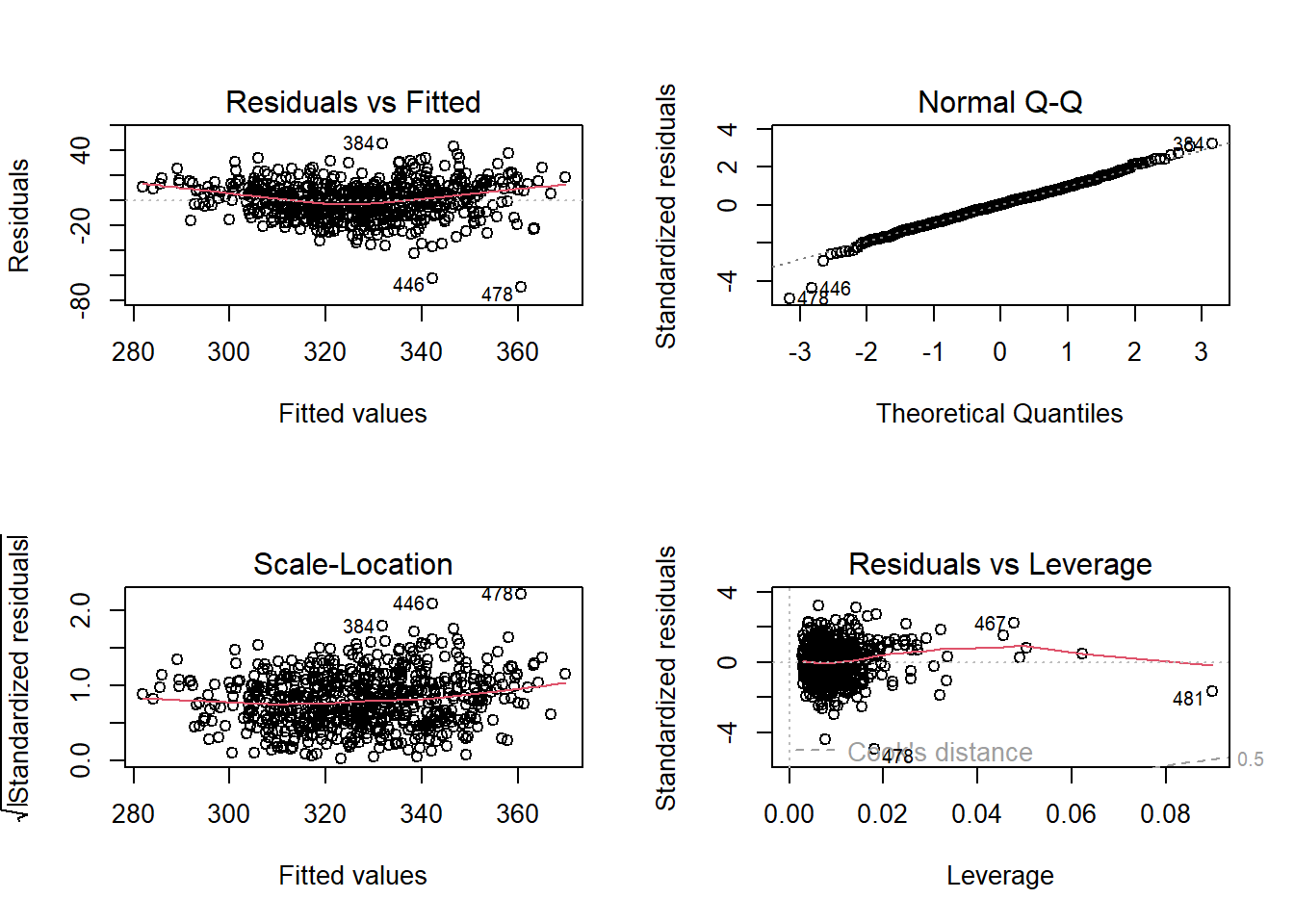
qtm(LonWardProfiles, fill = "model_final_res")final_model_Moran <- LonWardProfiles %>%
st_drop_geometry()%>%
dplyr::select(model_final_res)%>%
pull()%>%
moran.test(., Lward.knn_4_weight)%>%
tidy()
final_model_Moran## # A tibble: 1 × 7
## estimate1 estimate2 estimate3 statistic p.value method alternative
## <dbl> <dbl> <dbl> <dbl> <dbl> <chr> <chr>
## 1 0.224 -0.0016 0.000718 8.42 1.91e-17 Moran I test und… greaterNow, we probably could stop at running a spatial error model at this point, but it could be that rather than spatial autocorrelation causing problems with our model, it might be that a “global” regression model does not capture the full story. In some parts of our study area, the relationships between the dependent and independent variable may not exhibit the same slope coefficient. While, for example, increases in unauthorised absence usually are negatively correlated with GCSE score (students missing school results in lower exam scores), in some parts of the city, they could be positively correlated (in affluent parts of the city, rich parents may enrol their children for just part of the year and then live elsewhere in the world for another part of the year, leading to inflated unauthorised absence figures. Ski holidays are cheaper during the school term, but the pupils will still have all of the other advantages of living in a well off household that will benefit their exam scores.
If this occurs, then we have ‘non-stationarity’ - this is when the global model does not represent the relationships between variables that might vary locally.
This part of the practical will only skirt the edges of GWR, for much more detail you should visit the GWR website which is produced and maintained by Prof Chris Brunsdon and Dr Martin Charlton who originally developed the technique - http://gwr.nuim.ie/
There are various packages which will carry out GWR in R, for this pracical we we use spgwr (mainly because it was the first one I came across), although you could also use GWmodel or gwrr.
I should also acknowledge the guide on GWR produced by the University of Bristol, which was a great help when producing this exercise. However, to use spgwr we need to convert our data from sf to sp format, this is simply done using as(data, "Spatial")…
!!!HERE!!!
library(spgwr)
st_crs(LonWardProfiles) = 27700## Warning: st_crs<- : replacing crs does not reproject data; use st_transform for
## thatLonWardProfilesSP <- LonWardProfiles %>%
as(., "Spatial")
st_crs(coordsW) = 27700## Warning: st_crs<- : replacing crs does not reproject data; use st_transform for
## thatcoordsWSP <- coordsW %>%
as(., "Spatial")
coordsWSP## class : SpatialPoints
## features : 626
## extent : 505215.1, 557696.2, 157877.7, 199314 (xmin, xmax, ymin, ymax)
## crs : +proj=tmerc +lat_0=49 +lon_0=-2 +k=0.9996012717 +x_0=400000 +y_0=-100000 +ellps=airy +units=m +no_defs#calculate kernel bandwidth
GWRbandwidth <- gwr.sel(average_gcse_capped_point_scores_2014 ~ unauthorised_absence_in_all_schools_percent_2013 +
log(median_house_price_2014) +
inner_outer +
rate_of_job_seekers_allowance_jsa_claimants_2015 +
percent_with_level_4_qualifications_and_above_2011,
data = LonWardProfilesSP,
coords=coordsWSP,
adapt=T)## Warning in gwr.sel(average_gcse_capped_point_scores_2014 ~
## unauthorised_absence_in_all_schools_percent_2013 + : data is Spatial* object,
## ignoring coords argument## Adaptive q: 0.381966 CV score: 124832.2
## Adaptive q: 0.618034 CV score: 126396.1
## Adaptive q: 0.236068 CV score: 122752.4
## Adaptive q: 0.145898 CV score: 119960.5
## Adaptive q: 0.09016994 CV score: 116484.6
## Adaptive q: 0.05572809 CV score: 112628.7
## Adaptive q: 0.03444185 CV score: 109427.7
## Adaptive q: 0.02128624 CV score: 107562.9
## Adaptive q: 0.01315562 CV score: 108373.2
## Adaptive q: 0.02161461 CV score: 107576.6
## Adaptive q: 0.0202037 CV score: 107505.1
## Adaptive q: 0.01751157 CV score: 107333
## Adaptive q: 0.01584775 CV score: 107175.5
## Adaptive q: 0.01481944 CV score: 107564.8
## Adaptive q: 0.01648327 CV score: 107187.9
## Adaptive q: 0.01603246 CV score: 107143.9
## Adaptive q: 0.01614248 CV score: 107153.1
## Adaptive q: 0.01607315 CV score: 107147.2
## Adaptive q: 0.01596191 CV score: 107143
## Adaptive q: 0.01592122 CV score: 107154.4
## Adaptive q: 0.01596191 CV score: 107143#run the gwr model
gwr.model = gwr(average_gcse_capped_point_scores_2014 ~ unauthorised_absence_in_all_schools_percent_2013 +
log(median_house_price_2014) +
inner_outer +
rate_of_job_seekers_allowance_jsa_claimants_2015 +
percent_with_level_4_qualifications_and_above_2011,
data = LonWardProfilesSP,
coords=coordsWSP,
adapt=GWRbandwidth,
hatmatrix=TRUE,
se.fit=TRUE)## Warning in gwr(average_gcse_capped_point_scores_2014 ~
## unauthorised_absence_in_all_schools_percent_2013 + : data is Spatial* object,
## ignoring coords argument## Warning in proj4string(data): CRS object has comment, which is lost in output; in tests, see
## https://cran.r-project.org/web/packages/sp/vignettes/CRS_warnings.html## Warning in sqrt(betase): NaNs produced
## Warning in sqrt(betase): NaNs produced## Warning in showSRID(uprojargs, format = "PROJ", multiline = "NO", prefer_proj
## = prefer_proj): Discarded datum Unknown based on Airy 1830 ellipsoid in Proj4
## definition#print the results of the model
gwr.model## Call:
## gwr(formula = average_gcse_capped_point_scores_2014 ~ unauthorised_absence_in_all_schools_percent_2013 +
## log(median_house_price_2014) + inner_outer + rate_of_job_seekers_allowance_jsa_claimants_2015 +
## percent_with_level_4_qualifications_and_above_2011, data = LonWardProfilesSP,
## coords = coordsWSP, adapt = GWRbandwidth, hatmatrix = TRUE,
## se.fit = TRUE)
## Kernel function: gwr.Gauss
## Adaptive quantile: 0.01596191 (about 9 of 626 data points)
## Summary of GWR coefficient estimates at data points:## Warning in print.gwr(x): NAs in coefficients dropped## Min. 1st Qu.
## X.Intercept. -345.01649 -14.73075
## unauthorised_absence_in_all_schools_percent_2013 -47.06120 -31.08397
## log.median_house_price_2014. -0.55994 11.18979
## inner_outerInner -24.36827 -10.44459
## rate_of_job_seekers_allowance_jsa_claimants_2015 1.43895 10.72734
## percent_with_level_4_qualifications_and_above_2011 -0.06701 0.49946
## Median 3rd Qu.
## X.Intercept. 81.81663 179.15965
## unauthorised_absence_in_all_schools_percent_2013 -14.04901 -5.00033
## log.median_house_price_2014. 18.00032 22.78750
## inner_outerInner -6.58838 -3.33210
## rate_of_job_seekers_allowance_jsa_claimants_2015 16.11748 26.08932
## percent_with_level_4_qualifications_and_above_2011 0.72555 1.07515
## Max. Global
## X.Intercept. 318.94967 239.9383
## unauthorised_absence_in_all_schools_percent_2013 6.79870 -23.6167
## log.median_house_price_2014. 44.78874 8.4136
## inner_outerInner 3.98708 -10.3690
## rate_of_job_seekers_allowance_jsa_claimants_2015 52.82565 -2.8135
## percent_with_level_4_qualifications_and_above_2011 3.04231 0.4127
## Number of data points: 626
## Effective number of parameters (residual: 2traceS - traceS'S): 160.9269
## Effective degrees of freedom (residual: 2traceS - traceS'S): 465.0731
## Sigma (residual: 2traceS - traceS'S): 12.35905
## Effective number of parameters (model: traceS): 116.0071
## Effective degrees of freedom (model: traceS): 509.9929
## Sigma (model: traceS): 11.80222
## Sigma (ML): 10.65267
## AICc (GWR p. 61, eq 2.33; p. 96, eq. 4.21): 5026.882
## AIC (GWR p. 96, eq. 4.22): 4854.513
## Residual sum of squares: 71038.1
## Quasi-global R2: 0.7557128The output from the GWR model reveals how the coefficients vary across the 625 Wards in our London Study region. You will see how the global coefficients are exactly the same as the coefficients in the earlier lm model. In this particular model (yours will look a little different if you have used different explanatory variables), if we take unauthorised absence from school, we can see that the coefficients range from a minimum value of -47.06 (1 unit change in unauthorised absence resulting in a drop in average GCSE score of -47.06) to +6.8 (1 unit change in unauthorised absence resulting in an increase in average GCSE score of +6.8). For half of the wards in the dataset, as unauthorised absence rises by 1 point, GCSE scores will decrease between -30.80 and -14.34 points (the inter-quartile range between the 1st Qu and the 3rd Qu).
You will notice that the R-Squared value has improved - this is not uncommon for GWR models, but it doesn’t necessarily mean they are definitely better than global models. The small number of cases under the kernel means that GW models have been criticised for lacking statistical robustness.
Coefficient ranges can also be seen for the other variables and they suggest some interesting spatial patterning. To explore this we can plot the GWR coefficients for different variables. Firstly we can attach the coefficients to our original dataframe - this can be achieved simply as the coefficients for each ward appear in the same order in our spatial points dataframe as they do in the original dataframe.
results <- as.data.frame(gwr.model$SDF)
names(results)## [1] "sum.w"
## [2] "X.Intercept."
## [3] "unauthorised_absence_in_all_schools_percent_2013"
## [4] "log.median_house_price_2014."
## [5] "inner_outerInner"
## [6] "rate_of_job_seekers_allowance_jsa_claimants_2015"
## [7] "percent_with_level_4_qualifications_and_above_2011"
## [8] "X.Intercept._se"
## [9] "unauthorised_absence_in_all_schools_percent_2013_se"
## [10] "log.median_house_price_2014._se"
## [11] "inner_outerInner_se"
## [12] "rate_of_job_seekers_allowance_jsa_claimants_2015_se"
## [13] "percent_with_level_4_qualifications_and_above_2011_se"
## [14] "gwr.e"
## [15] "pred"
## [16] "pred.se"
## [17] "localR2"
## [18] "rate_of_job_seekers_allowance_jsa_claimants_2015_EDF"
## [19] "X.Intercept._se_EDF"
## [20] "unauthorised_absence_in_all_schools_percent_2013_se_EDF"
## [21] "log.median_house_price_2014._se_EDF"
## [22] "inner_outerInner_se_EDF"
## [23] "rate_of_job_seekers_allowance_jsa_claimants_2015_se_EDF"
## [24] "percent_with_level_4_qualifications_and_above_2011_se_EDF"
## [25] "pred.se.1"#attach coefficients to original SF
LonWardProfiles2 <- LonWardProfiles %>%
mutate(coefUnauthAbs = results$unauthorised_absence_in_all_schools_percent_2013,
coefHousePrice = results$log.median_house_price_2014.,
coefJSA = rate_of_job_seekers_allowance_jsa_claimants_2015,
coefLev4Qual = percent_with_level_4_qualifications_and_above_2011)tm_shape(LonWardProfiles2) +
tm_polygons(col = "coefUnauthAbs",
palette = "RdBu",
alpha = 0.5)Now how would you plot the House price coeffeicent, Job seekers allowance and level 4 qualification coefficient?
Taking the first plot, which is for the unauthorised absence coefficients, we can see that for the majority of boroughs in London, there is the negative relationship we would expect - i.e. as unauthorised absence goes up, exam scores go down. For three boroughs (Westminster, Kensington & Chelsea and Hammersmith and Fulham, as well as an area near Bexleyheath in South East London - some of the richest in London), however, the relationship is positive - as unauthorised school absence increases, so does average GCSE score. This is a very interesting pattern and counterintuitive pattern, but may partly be explained the multiple homes owned by many living in these boroughs (students living in different parts of the country and indeed the world for significant periods of the year), foreign holidays and the over representation of private schooling of those living in these areas. If this is not the case and unauthorised absence from school is reflecting the unauthorised absence of poorer students attending local, inner city schools, then high GCSE grades may also reflect the achievements of those who are sent away to expensive fee-paying schools elsewhere in the country and who return to their parental homes later in the year. Either way, these factors could explain these results. Of course, these results may not be statistically significant across the whole of London. Roughly speaking, if a coefficient estimate is more than 2 standard errors away from zero, then it is “statistically significant”.
To calculate standard errors, for each variable you can use a formula similar to this:
#run the significance test
sigTest = abs(gwr.model$SDF$"log.median_house_price_2014.")-2 * gwr.model$SDF$"log.median_house_price_2014._se"
#store significance results
LonWardProfiles2 <- LonWardProfiles2 %>%
mutate(GWRUnauthSig = sigTest)If this is greater than zero (i.e. the estimate is more than two standard errors away from zero), it is very unlikely that the true value is zero, i.e. it is statistically significant (at nearly the 95% confidence level)
You should now calculate these for each variable in your GWR model and See if you can plot them on a map, for example:
tm_shape(LonWardProfiles2) +
tm_polygons(col = "GWRUnauthSig",
palette = "RdYlBu")From the results of your GWR exercise, what are you able to conclude about the geographical variation in your explanatory variables when predicting your dependent variable?
9.8 Feedback
Was anything that we explained unclear this week or was something really clear…let us know using the feedback form. It’s anonymous and we’ll use the responses to clear any issues up in the future / adapt the material.