//--------------------------Vector data---------------------------
var dataset = ee.FeatureCollection("FAO/GAUL/2015/level1");
var dataset_style = dataset.style({
color: '1e90ff',
width: 2,
fillColor: '00000000', // with alpha set for partial transparency
// lineType: 'dotted',
// pointSize: 10,
// pointShape: 'circle'
});
Map.addLayer(dataset, {}, 'Second Level Administrative Units_1');
var Beijing = dataset.filter('ADM1_CODE == 899');
Map.addLayer(Beijing, {}, 'Beijing');8 Temperature
8.1 Resources
This week
Wilson, B., 2020. Urban Heat Management and the Legacy of Redlining. Journal of the American Planning Association 86, 443–457
Klinenberg, E., 1999. Denaturalizing Disaster: A Social Autopsy of the 1995 Chicago Heat Wave. Theory and Society 28, 239–295.
Li, D., Newman, G.D., Wilson, B., Zhang, Y., Brown, R.D., 2022. Modeling the relationships between historical redlining, urban heat, and heat-related emergency department visits: An examination of 11 Texas cities. Environment and Planning B: Urban Analytics and City Science 49, 933–952.
Nowak, D.J., Ellis, A., Greenfield, E.J., 2022. The disparity in tree cover and ecosystem service values among redlining classes in the United States. Landscape and Urban Planning 221, 104370.
-
Cloud-Based Remote Sensing with Google Earth Engine (accessed 1.5.23).
- Chapter A1.5 Heat Islands
MacLachlan, A., Biggs, E., Roberts, G., Boruff, B., 2021. Sustainable City Planning: A Data-Driven Approach for Mitigating Urban Heat. Frontiers in Built Environment 6.
Within this practical we are going to explore temperature across urban areas using two different data products: Landsat and MODIS. We’ll then look at which admin areas are hottest over time.
The first stage of this practical is to load up a level 2 admin area to extract temperature for….
8.2 Vector data
8.3 Landsat
Next, the Landsat data…note below that i have set a month range as i want to consider the summer and not the whole year…
//--------------------------Landsat data---------------------------
function applyScaleFactors(image) {
var opticalBands = image.select('SR_B.').multiply(0.0000275).add(-0.2);
var thermalBands = image.select('ST_B.*').multiply(0.00341802).add(149.0);
return image.addBands(opticalBands, null, true)
.addBands(thermalBands, null, true);
}
var landsat = ee.ImageCollection('LANDSAT/LC08/C02/T1_L2')
.filterDate('2022-01-01', '2022-10-10')
.filter(ee.Filter.calendarRange(5, 9,'month'))
.filterBounds(Beijing) // Intersecting ROI
.filter(ee.Filter.lt("CLOUD_COVER", 1))
.map(applyScaleFactors);
print(landsat)The temperature band in Landsat is B10, however it comes in Kelvin and not Celsius, to cover we just subtract 273.1. But i want to do this per image…at the moment .subtract won’t work over an image collection so we can subtract the value from each individual image in a collection…we also want to mask any pixels that have a below 0 value (e.g. probably no data ones). I’ve done this within this function as well..
var subtracted = landsat.select('ST_B10').map(function (image) {
var subtract = image.subtract(273.1); // subtract
var mask = subtract.gt(0); //set mask up
var mask_0 = subtract.updateMask(mask); //Apply this in a mask
return mask_0
}) If we were to plot this now, we would still show all of the images we have in the collection, but, we can take the mean (“reduce”) and clip to our study area…
var subtracted_mean = subtracted.reduce(ee.Reducer.mean())
.clip(Beijing)Then finally plot the data…
// set up some of the visualisation paramters
// the palette is taken from the MODIS example (which we will see later on)
var vis_params = {
min: 20,
max: 55,
palette: [
'040274', '040281', '0502a3', '0502b8', '0502ce', '0502e6',
'0602ff', '235cb1', '307ef3', '269db1', '30c8e2', '32d3ef',
'3be285', '3ff38f', '86e26f', '3ae237', 'b5e22e', 'd6e21f',
'fff705', 'ffd611', 'ffb613', 'ff8b13', 'ff6e08', 'ff500d',
'ff0000', 'de0101', 'c21301', 'a71001', '911003'
]
};
Map.addLayer(subtracted_mean, vis_params, 'Landsat Temp');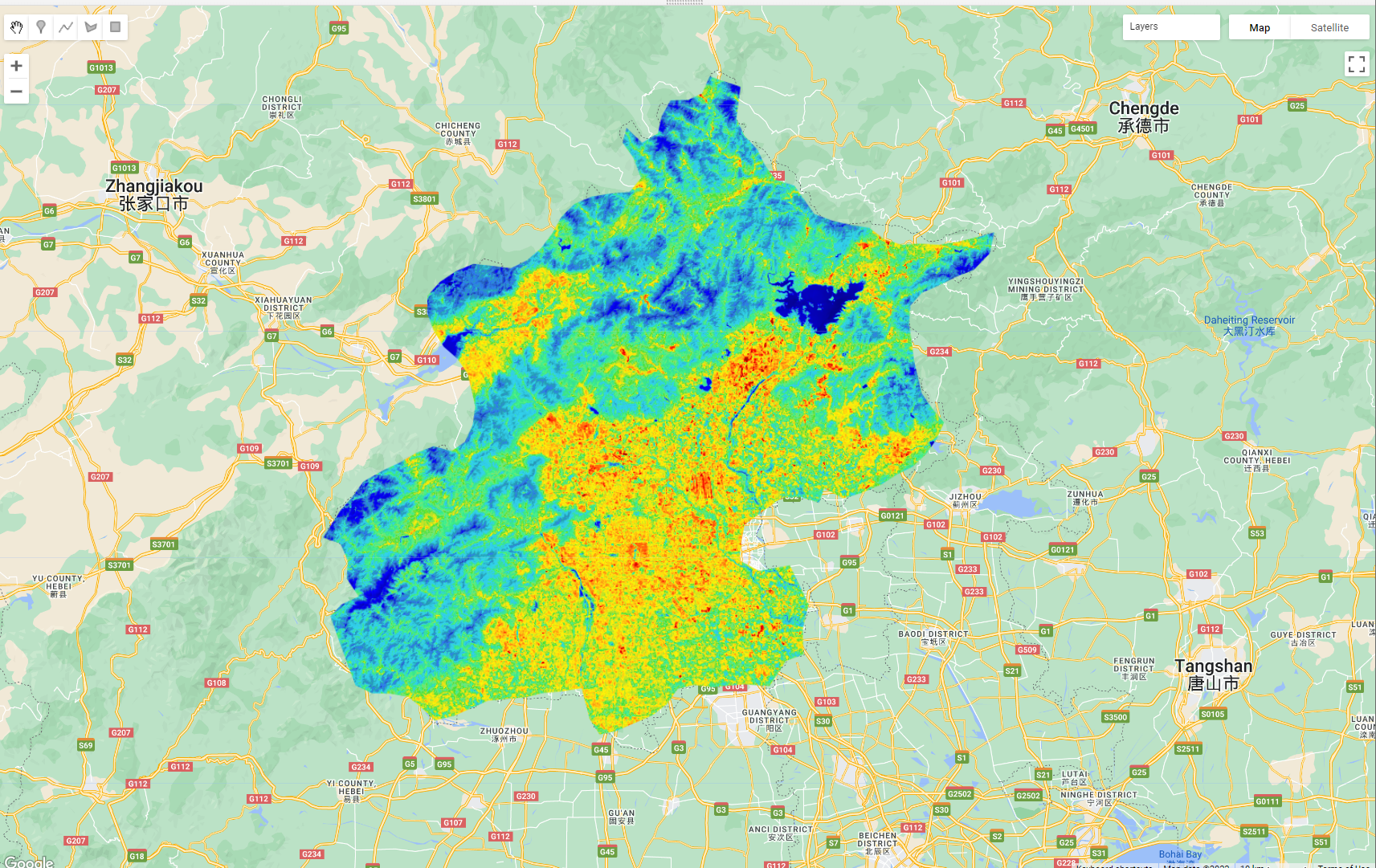
8.4 MODIS
Now, we can also do the same process with the Moderate Resolution Imaging Spectroradiometer (MODIS), MODIS is an instrument aboard both the Terra and Aqua satellites. Terra crosses the equator from N to S in the morning and Aqua S to N in the afternoon meaning the entire earth is sampled every 1-2 days, with most places getting 2 images a day.
8.4.1 Aqua
var MODIS_Aqua_day = ee.ImageCollection('MODIS/061/MYD11A1')
.filterDate('2022-01-01', '2022-10-10')
.filter(ee.Filter.calendarRange(5, 9,'month'))
.filterBounds(Beijing) // Intersecting ROI;
.select('LST_Day_1km')
print(MODIS_Aqua_day, "MODIS_AQUA") 8.4.2 Terra
var MODIS_Terra_day = ee.ImageCollection('MODIS/061/MOD11A1')
.filterDate('2022-01-01', '2022-10-10')
.filter(ee.Filter.calendarRange(5, 9,'month'))
.filterBounds(Beijing) // Intersecting ROI;
.select('LST_Day_1km')
print(MODIS_Terra_day, "MODIS_Terra") 8.4.3 Scaling
For the Landsat data in this period we had 5 images, compared to 108 for Aqua and 107 for Terra!But! MODIS data is at 1km resolution…and if you look at the values (through adding one of the collections to the map) we haven’t addressed the scaling….
Like Landsat data MODIS data needs to have the scale factor applied, looking at the GEE documentation or the MODIS documentation we can see that the value is 0.02 and the values are in Kelvin, when we want Celcius….
function MODISscale(image) {
var temp = image.select('LST_.*').multiply(0.02).subtract(273.1);
return image.addBands(temp, null, true)
}
var MODIS_Aqua_day = ee.ImageCollection('MODIS/061/MYD11A1')
.filterDate('2022-01-01', '2022-10-10')
.filter(ee.Filter.calendarRange(5, 9,'month'))
.select('LST_Day_1km')
.map(MODISscale)
.filterBounds(Beijing); // Intersecting ROI;
print(MODIS_Aqua_day, "MODIS_AQUA")
var MODIS_Terra_day = ee.ImageCollection('MODIS/061/MOD11A1')
.filterDate('2022-01-01', '2022-10-10')
.filter(ee.Filter.calendarRange(5, 9,'month'))
.filterBounds(Beijing) // Intersecting ROI;
.select('LST_Day_1km')
.map(MODISscale);8.4.4 Collection merge
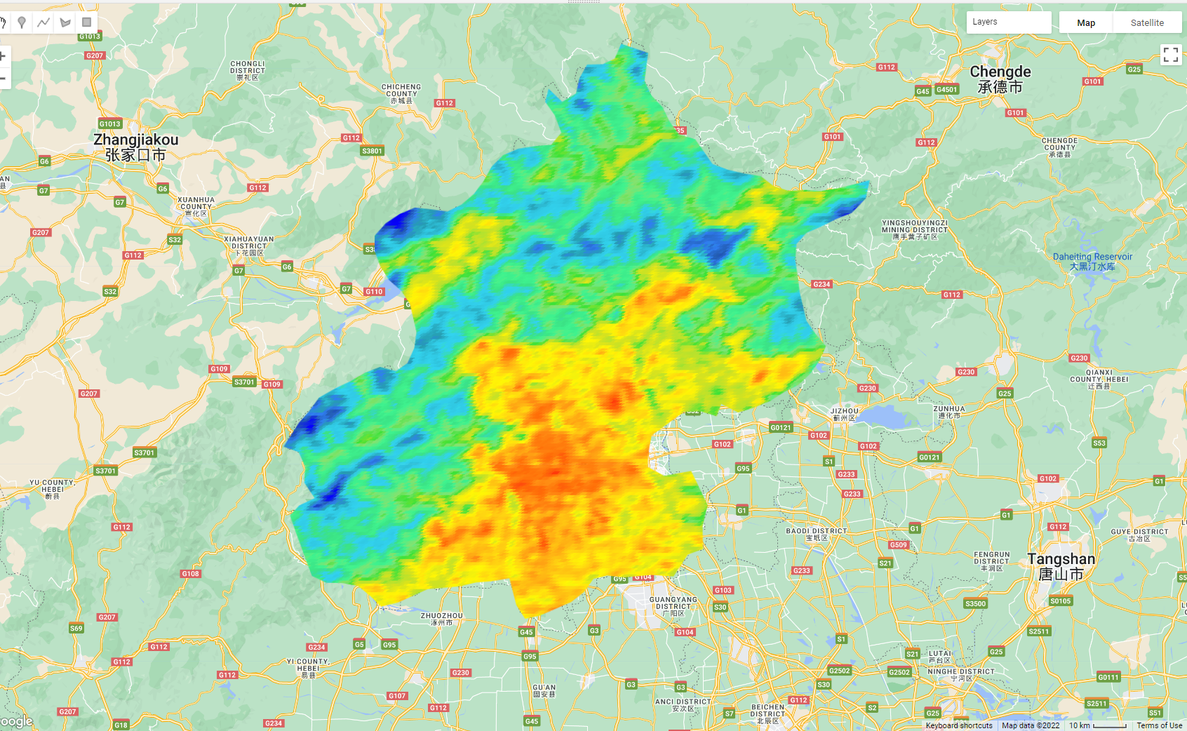
Merge the collections and plot a mean summer temperature image…
var mean_aqua_terra = MODIS_Aqua_day.merge(MODIS_Terra_day)
.reduce(ee.Reducer.mean())
.clip(Beijing)
Map.addLayer(mean_aqua_terra, landSurfaceTemperatureVis,
'MODIS Land Surface Temperature');8.4.5 Display the results
var landSurfaceTemperatureVis = {
min: 15,
max: 45,
palette: [
'040274', '040281', '0502a3', '0502b8', '0502ce', '0502e6',
'0602ff', '235cb1', '307ef3', '269db1', '30c8e2', '32d3ef',
'3be285', '3ff38f', '86e26f', '3ae237', 'b5e22e', 'd6e21f',
'fff705', 'ffd611', 'ffb613', 'ff8b13', 'ff6e08', 'ff500d',
'ff0000', 'de0101', 'c21301', 'a71001', '911003'
],
};
Map.addLayer(mean_aqua_terra, landSurfaceTemperatureVis,
'MODIS Land Surface Temperature');What do you see ?
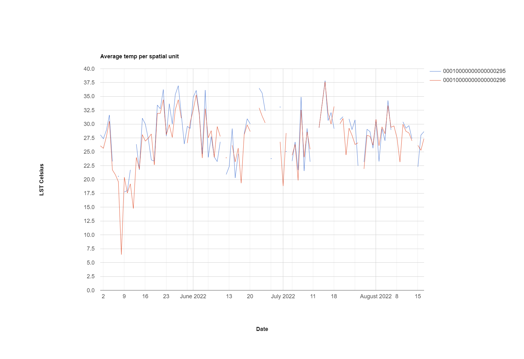
8.5 Timeseries
So the real benefit of MODIS data is that we can plot the time series…however in doing so we lose the spatial element…
var aqua_terra = MODIS_Aqua_day.merge(MODIS_Terra_day) //merge the two collections
var timeseries = ui.Chart.image.series({
imageCollection: aqua_terra,
region: Beijing,
reducer: ee.Reducer.mean(),
scale: 1000,
xProperty: 'system:time_start'})
.setOptions({
title: 'Temperature time series',
vAxis: {title: 'LST Celsius'}});
print(timeseries);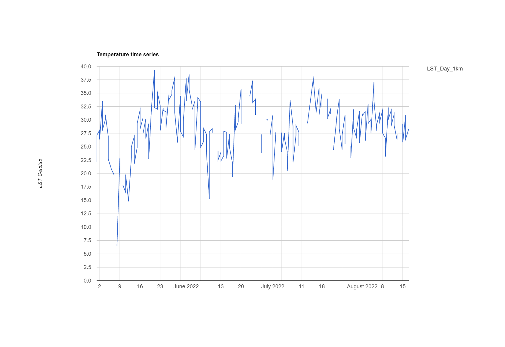
Times series modelling….https://developers.google.com/earth-engine/tutorials/community/time-series-modeling
8.6 Statistics per spatial unit
8.6.1 Landsat
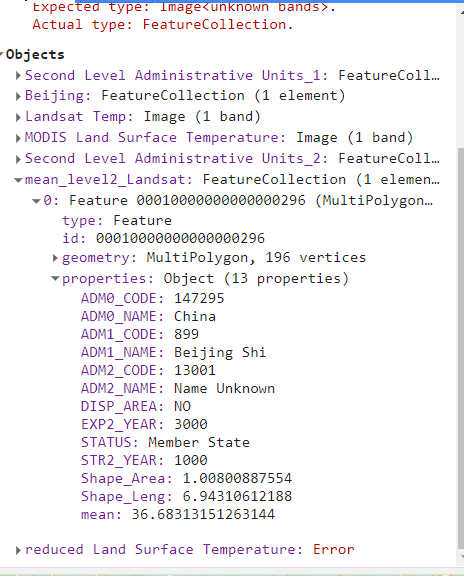
To start with let’s just explore the average temperature per GAUL level 2 area within the Beijing level 1 area….we can do this using the reduceRegions function….
//--------------------------Statistics per level 2---------------------------.
var GAUL_2 = ee.FeatureCollection("FAO/GAUL/2015/level2");
var Beijing_level2 = GAUL_2.filter('ADM1_CODE == 899');
Map.addLayer(Beijing_level2, {}, 'Second Level Administrative Units_2');
print(subtracted_mean)
var mean_Landsat_level2 = subtracted_mean.reduceRegions({
collection: Beijing_level2,
reducer: ee.Reducer.mean(),
scale: 30,
});
Map.addLayer(mean_Landsat_level2, {}, 'mean_Landsat_level2');When we inspect the new vector file we can see that a mean column has been added to the attribute table….
Notes of the reduce regions:
- There is a reduce percentile function…
reducer: ee.Reducer.percentile([10, 20, 30, 40, 50, 60, 70, 80, 90])that might also be useful. This takes all the pixels in each polygon and lists the value of the percentiles specified in the attribute table.
8.6.1.1 Export
To export a feature collection like this…
// Export the FeatureCollection to a SHP file.
Export.table.toDrive({
collection: mean_Landsat_level2,
description:'mean_Landsat_level2',
fileFormat: 'SHP'
});We can then open it in QGIS to see our average tempearture per spatial untit.
8.6.2 MODIS
To get the time series data per spatial unit in MODIS we can use the similar code as before, but this time we:
- use the function
ui.Chart.image.seriesByRegion - set our
regionsargument to the lower level spatial data….
var chart = ui.Chart.image.seriesByRegion({
imageCollection: MODIS_Aqua_day,
regions: Beijing_level2, //this is the difference
reducer: ee.Reducer.mean()
})
print(chart)We could make the plot a bit fancier in GEE…here, i have adapted the code from the documentation…
var timeseries_per_unit = ui.Chart.image.seriesByRegion({
imageCollection: aqua_terra,
//band: 'NDVI',
regions: Beijing_level2,
reducer: ee.Reducer.mean(),
scale: 1000,
//seriesProperty: 'label',
xProperty: 'system:time_start'
})
.setOptions({
title: 'Average temp per spatial unit',
hAxis: {title: 'Date', titleTextStyle: {italic: false, bold: true}},
vAxis: {
title: 'LST Celsius',
titleTextStyle: {italic: false, bold: true}
},
lineWidth: 1
// colors: ['0f8755', '808080'],
});
8.6.2.1 Export
We could then export the data to run some time series analysis for the spatial units (e.g. in R), this might be interesting if we know characteristics of land cover or development change over time…..
// Collect block, image, value triplets.
var triplets = aqua_terra.map(function(image) {
return image.select('LST_Day_1km').reduceRegions({
collection: Beijing_level2.select(['ADM2_CODE']),
reducer: ee.Reducer.mean(),
scale: 30
}).filter(ee.Filter.neq('mean', null))
.map(function(f) {
return f.set('imageId', image.id());
});
}).flatten();
print(triplets.first(), "trip")
Export.table.toDrive({
collection: triplets,
description: triplets,
fileNamePrefix: triplets,
fileFormat: 'CSV'
});You can also change how the data is exported, although I would now just do some wrangling in R. See the:
8.7 Trend analysis
To extended our analysis we could explore statistics that will establish if we have a significant increasing or decreasing trend within our data. For example…the Mann-Kendall trend test. Once we have identified these pixels or areas we could then investigate them further with Landsat surface temperature data and landcover data.
8.8 Heat index
In the next part of the practical we are going to replicate a heat index produced by the BBC. Here it says…
A statistical method published by academics was used to standardise land surface temperatures for each postcode area, which involved combining satellite images for different dates over the past three years.
Further…
Using satellite data from 4 Earth Intelligence, the BBC mapped how vulnerable postcode areas were to extreme heat in England, Wales and Scotland during periods of hot weather over the past three summers - shown with a heat hazard score.
The temperature was from….
The potential heat hazard score for each postcode area was calculated by 4EI, who measured the average land surface temperature over a sample of days in the past three summers across Britain.
The score was calculated ….
Index 1 = 40th percentile and lower, if you lined up all the postcodes by heat hazard score, your postcode is in the coolest 40%.
Index 2 = 40th - 70th percentile, your postcode is in the mid-range. 40% of postcodes have a lower heat hazard than yours but 30% have a higher one.
Index 3 is the 70-90th, 4 is the 90-99th and 5 is the 99th.
However, feel free to change these assumptions, for example, as noted earlier is it more appropriate to use the percentile within each spatial unit than compare then across the entire study area?
To calculate the percentile rank of the mean temperature per spatial unit, in my first attempt at this I downloaded my data from GEE and ran it in R….I then consulted Ollie Ballinger who helped me re-create the case_when() that you see below from R…First the R attempt…
8.8.0.1 R
First make a quick map of our mean temperature per spatial unit, in my case wards…
library(tidyverse)
library(sf)
library(tmap)
temp <- st_read(here::here("prac_8",
"mean_Landsat_ward.shp"))Reading layer `mean_Landsat_ward' from data source
`C:\Users\Andy\OneDrive - University College London\Teaching\CASA0023\CASA0023-book\prac_8\mean_Landsat_ward.shp'
using driver `ESRI Shapefile'
Simple feature collection with 622 features and 8 fields
Geometry type: POLYGON
Dimension: XY
Bounding box: xmin: -0.5103773 ymin: 51.28676 xmax: 0.3340128 ymax: 51.69187
Geodetic CRS: WGS 84tmap_mode("plot")
# plot each map
tm1 <- tm_shape(temp) +
tm_polygons("mean",
# breaks=breaks,
palette="Reds")+
tm_legend(show=TRUE)+
tm_layout(frame=FALSE)
tm1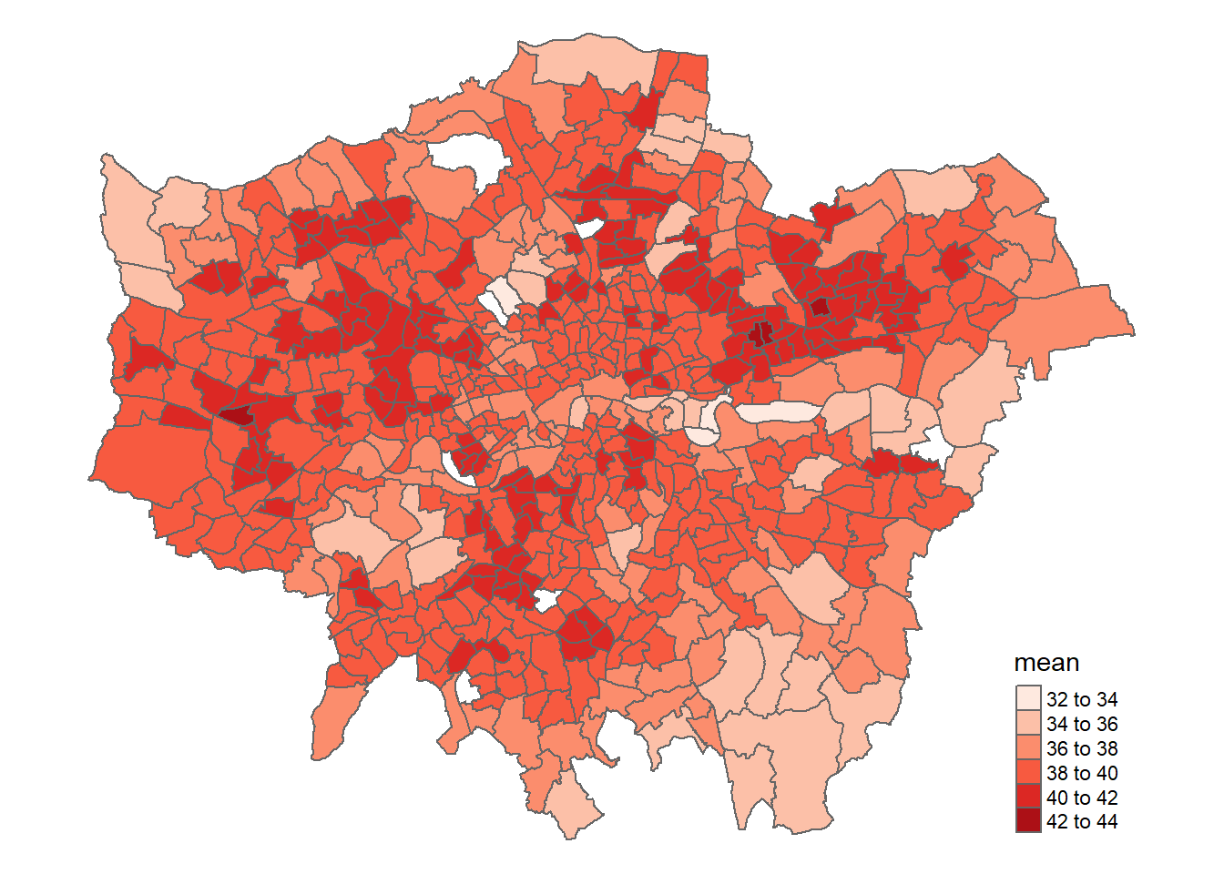
Then for percentile rank…the percentile code is from stackexchange
Note, that percentile rank is “percentage of scores within a norm group that is lower than the score you have”….if you are in the 25% then 25% of values are below that value and it is the 25 rank…
Now assign the classes…
perc.rank <- function(x) trunc(rank(x))/length(x)
percentile <- temp %>%
mutate(percentile1 = (perc.rank(mean))*100)%>%
mutate(Level = case_when(between(percentile1, 0, 39.99)~ "1",
between(percentile1, 40, 69.99)~ "2",
between(percentile1, 70, 89.99)~ "3",
between(percentile1, 90, 98.99)~ "4",
between(percentile1, 99, 100)~ "5"))To understand this a bit further check out the percentiles of the breaks we set…a percentile is..” > a statistical measure that indicates the value below which a percentage of data falls, Rbloggers
Run the code below then open your percentile data above, you should see that the ranks correspond to the percentiles set…
39.999% 69.999% 89.99% 98.999% 100%
38.76971 39.87305 40.75850 41.60319 42.37533 In my case a temperature of 39.87138 is set to level 2, whilst a temperature of 39.87861 is set to level 3…
Map the heat index….
# plot each map
tm1 <- tm_shape(percentile) +
tm_polygons("Level",
# breaks=breaks,
palette="Reds")+
tm_legend(show=TRUE)+
tm_layout(frame=FALSE)
tm1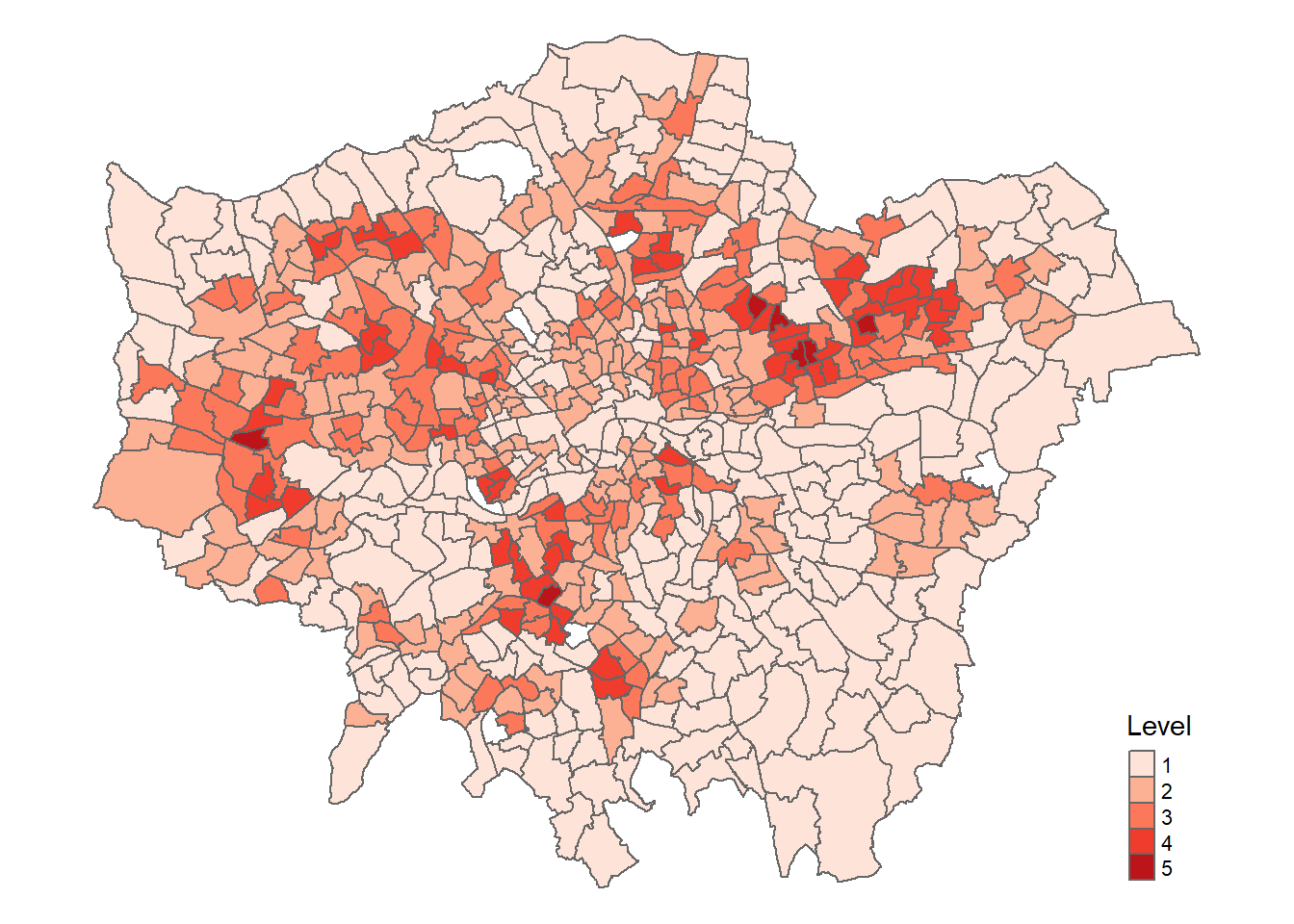
Interactive…
library(terra)
temp_rast <- rast("prac_8/subtracted_mean_HI.tif")
tmap_mode("view")
interactive <- tm_shape(temp_rast) +
tm_raster("subtracted_mean_HI.tif",
palette = "Reds") +
tm_shape(percentile) +
tm_polygons("Level",
# breaks=breaks,
palette="Reds",
fillOpacity = 0.7,
)+
tm_legend(show=TRUE)+
tm_layout(frame=FALSE)
interactive8.8.0.2 GEE
This is very similar (but slightly different) in GEE….
First of all we need to get the percentiles of the mean column…
var percentiles = mean_Landsat_ward.reduceColumns({
reducer: ee.Reducer.percentile([10, 20, 30, 40, 50, 60, 70, 80, 90, 99, 100]),
selectors: ['mean']
});
print(percentiles, "percentile") ///gives the overall percentile then need to mapNext, pull out these values are numbers….
var p40 = ee.Number(percentiles.get('p40'))
var p70 = ee.Number(percentiles.get('p70'))
var p90 = ee.Number(percentiles.get('p90'))
var p99 = ee.Number(percentiles.get('p99'))
var p100 = ee.Number(percentiles.get('p100'))
print(p40, "p40")// check oneNow, do the case_when() equivalent ….it’s a lot of code!
var resub= mean_Landsat_ward.map(function(feat){
return ee.Algorithms.If(ee.Number(feat.get('mean')).lt(p40).and(ee.Number(feat.get('mean')).gt(0)),
feat.set({'percentile_cat': 1}),
ee.Algorithms.If(ee.Number(feat.get('mean')).gt(p40).and(ee.Number(feat.get('mean')).lt(p70)),
feat.set({'percentile_cat': 2}),
ee.Algorithms.If(ee.Number(feat.get('mean')).gt(p70).and(ee.Number(feat.get('mean')).lt(p90)),
feat.set({'percentile_cat': 3}),
ee.Algorithms.If(ee.Number(feat.get('mean')).gt(p90).and(ee.Number(feat.get('mean')).lt(p99)),
feat.set({'percentile_cat': 4}),
ee.Algorithms.If(ee.Number(feat.get('mean')).gt(p99).and(ee.Number(feat.get('mean')).lte(p100)),
feat.set({'percentile_cat': 5}),
feat.set({'percentile_cat': 0}))
))))})Next up is setting some visualization parameters, i got the CSS colour codes (HEX codes) from colorBrewer
var visParams_vec = {
'palette': ['#fee5d9', '#fcae91', '#fb6a4a', '#de2d26', '#a50f15'],
'min': 0.0,
'max': 5,
'opacity': 0.8,
}Now, we make an image from out our column in the vector data….
var image = ee.Image().float().paint(resub, 'percentile_cat')Finally, we map it….
Map.addLayer(image, visParams_vec, 'Percentile_cat')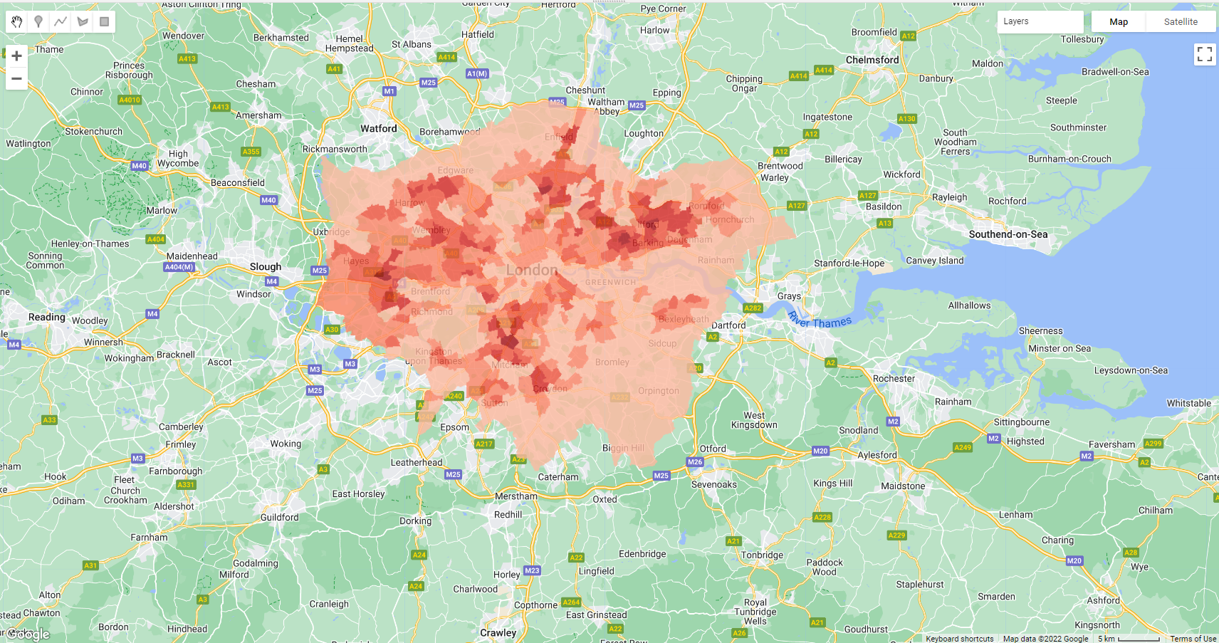
As as side note here, it we want to add columns in GEE like we would in R using mutate() or a field calculator in GIS software we use something like this…
//example of field calculator or mutate in R...
var collectionWithCount = mean_Landsat_ward.map(function (feature) {
///make a new column
return feature.set('percentage',
// take the mean column and * 100
feature.getNumber('mean').multiply(100));
});Now we have the temperature per ward (or the index), we could explore factors of the built environment that might contribute to that temperature….such as…buildings, lack of vegetation, lack of water areas and so on. This could include some more analysis in GEE such as NDVI, building area per spatial unit or other data from local authorities…
8.9 Considerations
Google Earth Engine: Analyzing Land Surface Temperature Data
Following the lecture, could red lined areas experience higher temperatures?
Could a similar analysis be done for other variables? Such as pollution
Could we make a pollution index similar to the heat index
Could we make a flood index or explore flooding over time in cities / determine areas that need remediation
8.10 Learning diary
Consult the assignment requirements document and complete your learning diary entry in your Quarto learning diary.
8.11 Feedback
Was anything that we explained unclear this week or was something really clear…let us know using the feedback form. It’s anonymous and we’ll use the responses to clear any issues up in the future / adapt the material.