Chapter 5 Map making
5.1 Learning outcomes
By the end of this practical you should be able to:
- List and explain basic mapping concepts across QGIS and R
- Interpret and manipulate data from multiple sources
- Create near publishable static and interactive mapped outputs
- Evaluate and critique mapping approaches between QGIS and R
5.2 Homework
Outside of our scheduled sessions you should be doing around 12 hours of extra study per week. Feel free to follow your own GIS interests, but good places to start include the following:
Exam
Each week we will provide a short task to test your knowledge, these should be used to guide your study for the final exam.
The task this week is to:
- Fork the repository below you from the spreadsheet last week
- Run the code, editing it if required
- Create a map (you can use additional data if you wish)
- submit a pull request to the original person
Reading
This week:
- Chapter 8 “Making maps with R” from Geocomputation with R by Lovelace, Nowosad and Muenchow (2020)
Watching
Remember this is just a starting point, explore the reading list, practical and lecture for more ideas.
5.3 Recommended listening 🎧
Some of these practicals are long, take regular breaks and have a listen to some of our fav tunes each week.
Andy. Mumford & Sons, unique sound classed as British folk rock apparently. Enjoy!
Adam Your ears are in for an absolute treat this week. Hospital Records have only gone and put out a mind-blowing mini compilation album which completely smashes it. It’s NHS400 - get your ears around this!
5.4 Introduction
In this practical we’re going to focus on creating mapped outputs using QGIS, ArcMap and R. For fun we’re going to use data from OpenStreetMap (OSM) and Airbnb.
5.4.1 OSM
OpenStreetMap is collaborative project that has created a free editable map of the World. As users can create their own content it is classed as Volunteered geographic Information (VGI). There is a lot of academic literature on VGI, it’s advnatages and disadvantages. For an overview of VGI checkout this article by Goodchild (2007).
If you are interested in exploring the power of VGI and OSM further checkout missing maps. They aim to map missing places, often in less developed countires, using OSM so that when natural disasters occur first responders can make data informed decisions. They run events all over the world and it’s worth going to meet other spatial professionals, gain some experience with OSM and contribute to a good cause.
5.5 Data
It’s possible to download OSM data straight from the website, although the interface can be a little unreliable (it works better for small areas). There are, however, a number of websites that allow OSM data to be downloaded more easily and are directly linked to from the ‘Export’ option in OSM. Geofabrik (one of these websites) allows you to download frequently updated shapefiles for various global subdivisions.
5.5.1 OSM
Go to the Geofabrik download server website
Navigate to: Europe > GreatBritain > England > Greater London
Download greater-london-latest-free.shp.zip
Unzip the data and save it to your current folder
5.5.2 London boroughs
We’ll use our London boroughs layer again, either load it from week 1 or download it:
To get the data go to the London data store
Search for Statistical GIS Boundary Files for London
Download the statistical-gis-boundaries-london.zip
Unzip the data and save it to your current folder
5.5.3 World cities
We will use World cities to provide some context to our maps.
- Download them from the ArcGIS HUB > Download > Shapefile.
5.5.4 Airbnb
- Download the
listings.csvfrom the inside airbnb website for London.
In the lecture we discussed how when producing maps there should be some sort of common denominator as opposed to mapping raw counts. Go and source a suitable common denominator then using the skills from previous weeks normalise your data. Hint there is a table on the Office for National Statistics NOMIS website called number of bedrooms which would let you normalise the airbnb and hotel data based on the number of bedrooms in each ward.
5.6 QGIS
Ok, now we’re going to reproduce our map in QIGS.
5.6.1 Load data
Load QGIS, Open and Save a new project (Project > New)
Right click on
GeoPackageand create a new database to store our data in.gpkgLoad our data layers: London boroughs and OSM data (OSM data should be the
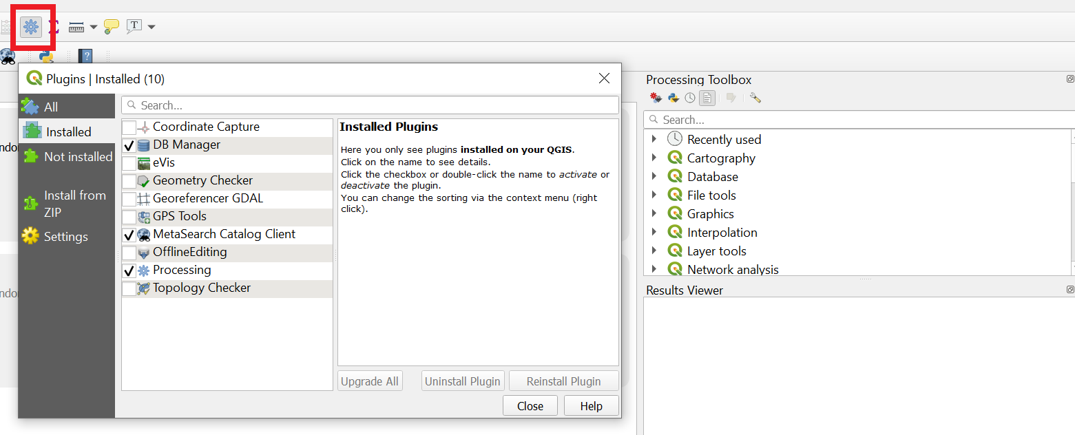
gis_osm_pois_a_free_1 polygon layer).Make sure the processing toolbox is active…go Plugins > Manage and Install Plugins > Installed (left side of the box that opens), Processing should be ticked….then select the cog that is in the toolbar — within the sqaure box in the image below.
You can then search for tools in the Processing Toolbox that appears on the right of QGIS.
5.6.2 Manipulate data
If you recall from practical 1, QGIS sets the map document CRS to that of the first layer loaded. Our London boroughs layer is in British National Grid (EPSG: 27700) where as are OSM layers are in WGS 1984 (EPSG: 4326).
The OSM data will load and QGIS is pretty clever here as it will project ‘on the fly’ which means it can display the data stored in one projection as if it were in another, but the actual data is not altered. This is both good and bad. Good as it let’s us visualise our data quickly, but bad because if we have data with different projections you will run into problems during processing. My advice is to load the data and pick a projection to do all processing in.
- Reproject the OSM data. If you scroll right in the dialogue box you’ll be able to save it into your
GeoPackage. You might need to refresh the browers to see the layer.
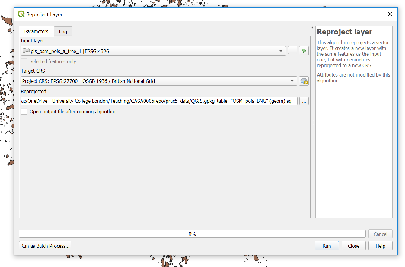
While we are working with projections…check the CRS of your map (bottom right)…mine is EPSG 4326 (WGS 1984) and we want it to be in British National Grid (which is ESPG: 27700), click on it, change it and apply.
For completness also drag and drop your London boroughs
.shpfrom the Layers window (bottom left) into yourGeoPacakge. Remove the old one from the Layers window. Double click on the newLondon boroughslayer in theGeoPackageand it will openTo get only the hotels out of our OSM data we can use
extract by attrbitue…this is my tool dialogue box. You can find extract by attribute by clicking the toolbox cog, then searching for extract by attribute.
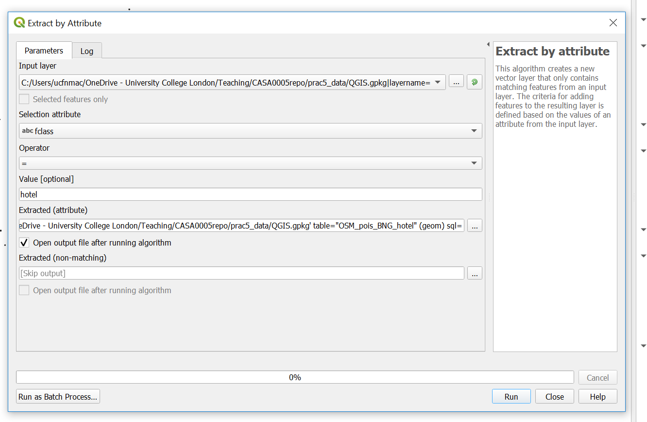
Refresh the browser —you have to do this everytime. Double click the layer to load it.
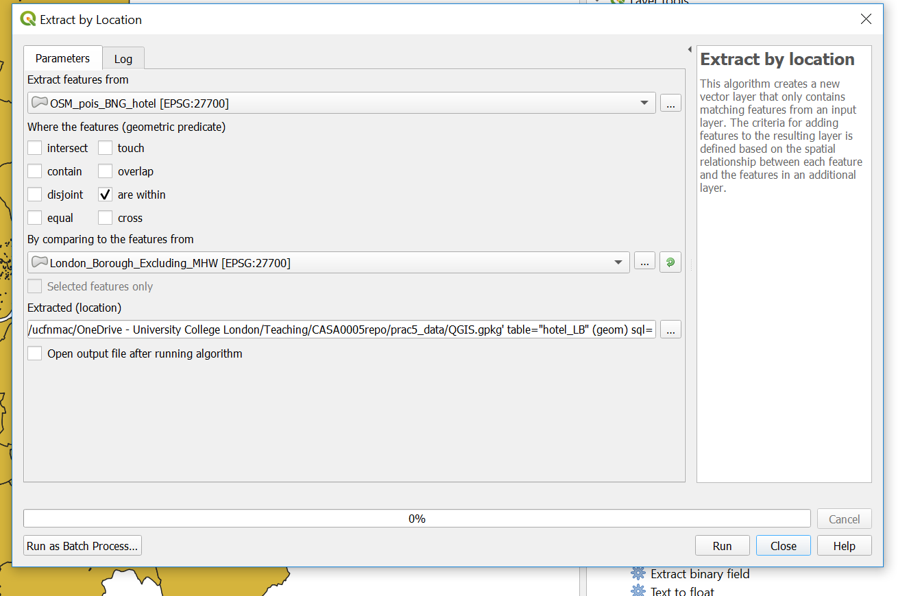
Now
extract by location usingthe file you just created and the London boroughs (so hotels within the London boroughs). Note that i selected that the hotels are within the Lonon boroughs
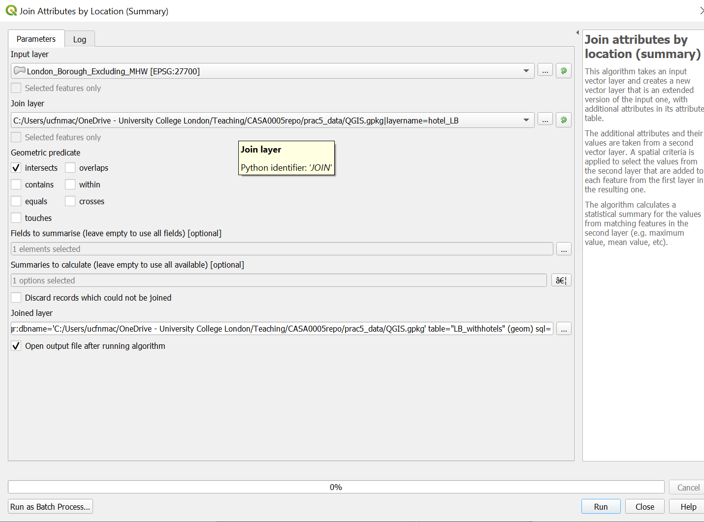
- Let’s now count our hotels per London borough using
Join Attributes by Location (Summary). Note i selected theosm_idfield to summarise using count in summaries to calcualte….
- Next up is the Air b n b data, i’ll show you how to load it then you need to produce a count of rentals per London borough using the same rules as before (entire place/apartment and available all year). To load the data click Data Source Manager > Delimited Text:
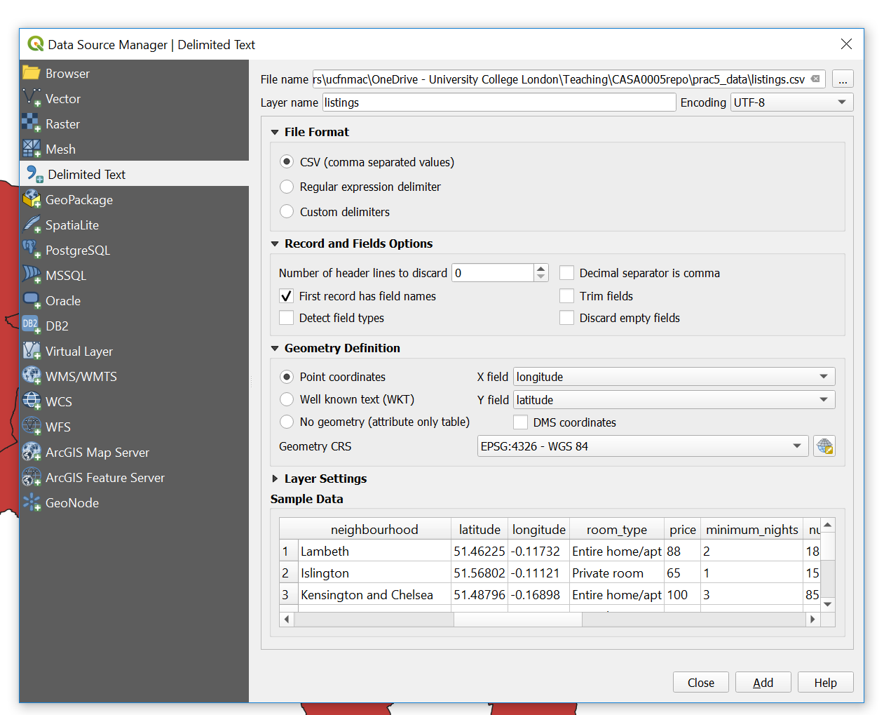
You need to:
Sort the projection out and save into your
.gpkgSelect by attibute (entire place and 365 days)
Select by location (within London boroughs)
Join the output to a new (or original) London borough polygon layer
Note You can filter by multiple attributes using extract by expression…here we would use the expression
("room_type" ILIKE '%Entire home/apt%') AND ("availability_365" ILIKE '%365%')to filter based on entire home/apt and available 365 days of the year.
5.6.3 Map data
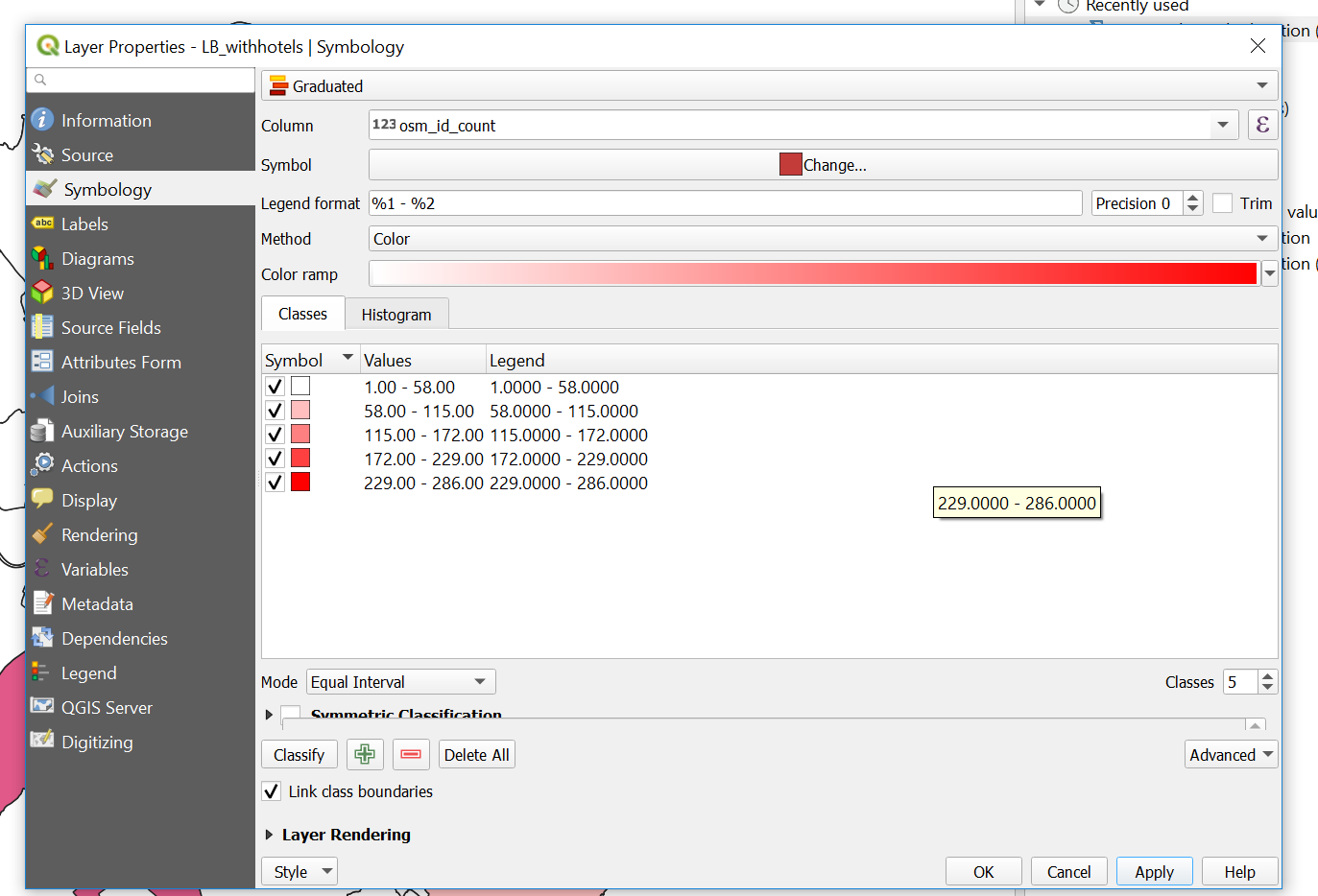
- So now you should have two London borough layers one with a count of all the hotels and the other with a count of all the air b n b properties…To make a thematic map right click on the hotel layer > Symbology (tab) select Graduated and your count coloumn as the coloumn, mode as natural breaks and then classify…
Now save the style so we can use it on our other layer….Style > Save Style > select in Database and provide a name
Go to the symbology of the other layer > select Graduated, select the correct count coloumn, then Style > Load Style, from database and your saved style should be listed.
To create a new map document in QGIS go: Project > New Print Layout. The layout works by adding a new map which is a snapshop of the main QGIS document….
In the main QGIS document only select your airbnb layer, right click and zoom to it. GO back to the Print Layout > Add Item > Add Map..draw a sqaure…the layer should appear…In the window at the bottom right under Item Properties select to Lock layers…so now if you were to unselect that layer it would still remain on in the Print Layout
Go back to your main QGIS document, now only select the hotels layer…repeat the Add Map steps and lock the layers
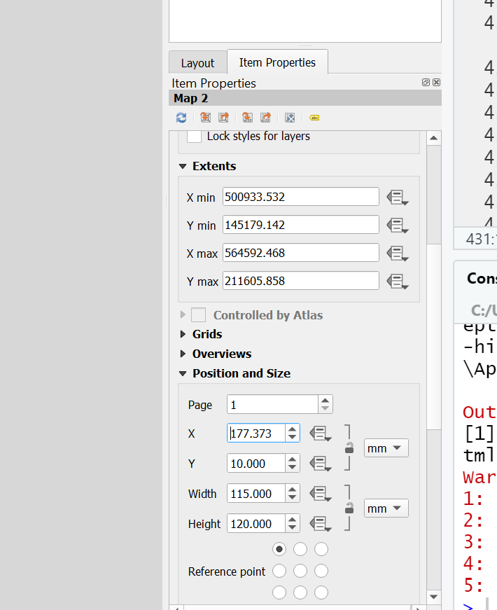
Make sure you give the same size to both Maps…to do so click on a Map > Item Properties (bottom right) scroll down, expand Position and Size, give the same width and height values
Add some guides to line everything up go: View > Manage Guides. The guides panel will appear in the bottom right hand corner, click the + to add a guide at a distance you specify. You can then drag your maps to snap to the guides.
Add a scale bar: Add Item > Add Scale Bar. To adjust it, right click > Item Properties…alter some of the properties to make it look appropraite.
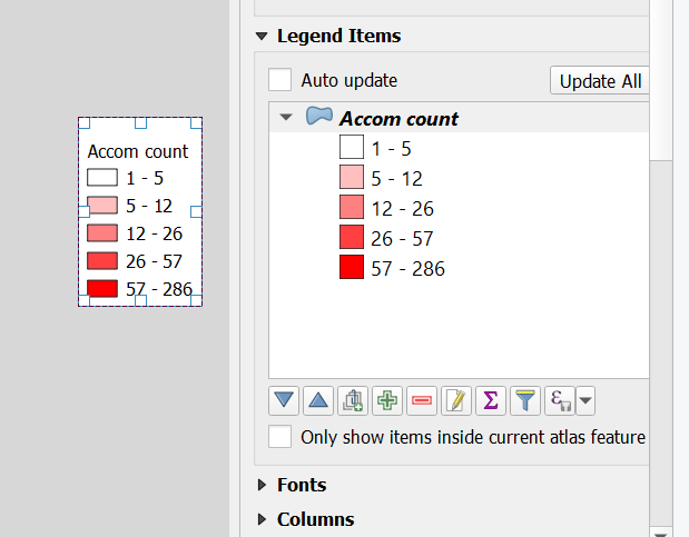
Add a legend: Add Item > Add Legend and draw a sqaure. Same process to adjust it. Untick Auto update then you can use the
+and-icons to remove items along with the edit icon to change the text…this is what mine looks like…
Add an arrow: Add Item > Add Arrow, left click to start (twice) and right click to finish.
Add text: In the left hand tool bar click add text box and draw a square
Let’s add our extent map, load the UK
.shp, reproject it and save it into your.gpkg. Do the same for your city points but be sure to load them into your.gpkgbefore you run any tool (just drag and drop them). When reprojecting you might see a lot of errors for certain points in the processing box…don’t worryBritish National Gridonly covers the UK — these errors will be for points outside of the UK which we will removeNow replicate our ArcMap inset map by opening the Layer Properties of the new cities layer > Labels > Single Labels with city name, alter any of the text styles as you wish. Also play around with the symbology..
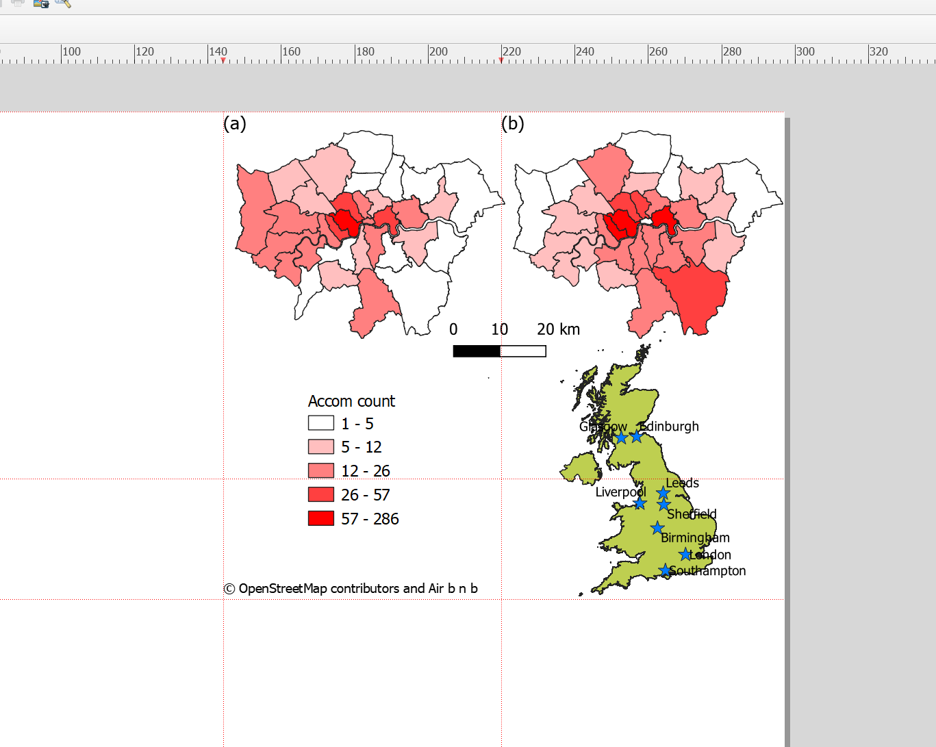
Add the new map into your map layout and move the items to appropraite locations…
This is what i came up with in my map layout
5.6.4 Export map
To export your map to a file go: Layout > Export as Image and select crop to content…and here is my map…
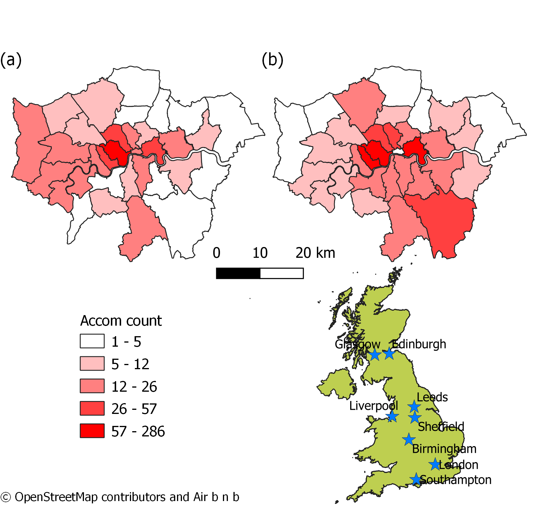
Note there are a few problems with my map that could be improved: (1) If you look closely at the vector layer for London you will see that one of the boroughs is missing from map (b) — this is most likely because it has no data but could easily be fixed (2) Whilst this time i’ve displayed all the city names the colour scheme needs work…for ideas on this check out colour brewer.
5.6.5 Graphical modeler
As in ArcMap we can automate the methodological process in QGIS using the graphical modeler..again i’ll provide a short example here
- Go: Processing > Graphical Modeler
Graphical modeler is a bit different to model builder in ArcMap, here you drag inputs and algorthims from the inputs box (bottom left) into the model, you don’t need to specify the inputs here. When you click the run buttom (play on the top toolbar) you’ll be asked to provide the layers for the inputs. The options will be limited to those you currently have open in your map…check out the model i made to automate reprojecting cities and the UK outline, then extracting the cities within the UK outline…
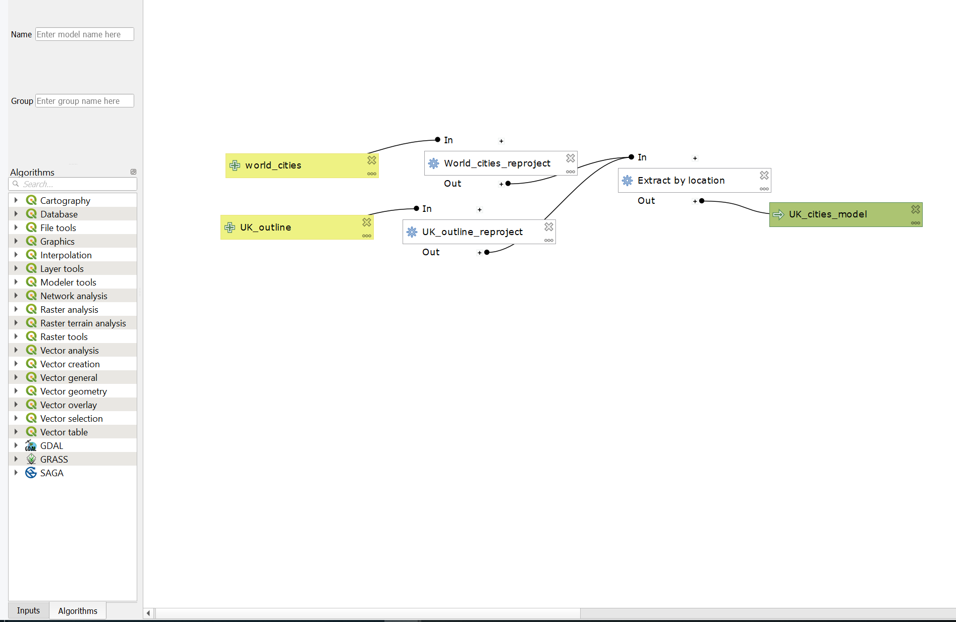
Make sure you save your model from the top tool bar either as a standalone model or within your project
5.7 R
Your R and geographical skills are certainly improving by now, so i’m just going to provide you with the R code i used to do this analysis…
5.7.1 Static map
##Load all our data
library(sf)
library(tmap)
library(tmaptools)
library(tidyverse)
library(here)
# read in all the spatial data and
# reproject it
OSM <- st_read(here::here("prac5_data",
"greater-london-latest-free.shp",
"gis_osm_pois_a_free_1.shp")) %>%
st_transform(., 27700) %>%
#select hotels only
filter(fclass == 'hotel')## Reading layer `gis_osm_pois_a_free_1' from data source
## `C:\Users\Andy\OneDrive - University College London\Teaching\CASA0005\2021_2022\CASA0005repo\prac5_data\greater-london-latest-free.shp\gis_osm_pois_a_free_1.shp'
## using driver `ESRI Shapefile'
## Simple feature collection with 35197 features and 4 fields
## Geometry type: MULTIPOLYGON
## Dimension: XY
## Bounding box: xmin: -0.5108706 ymin: 51.28117 xmax: 0.322123 ymax: 51.68948
## Geodetic CRS: WGS 84Worldcities <- st_read(here::here("prac5_data",
"World_Cities",
"World_Cities.shp")) %>%
st_transform(., 27700)## Reading layer `World_Cities' from data source
## `C:\Users\Andy\OneDrive - University College London\Teaching\CASA0005\2021_2022\CASA0005repo\prac5_data\World_Cities\World_Cities.shp'
## using driver `ESRI Shapefile'
## Simple feature collection with 2540 features and 13 fields
## Geometry type: POINT
## Dimension: XY
## Bounding box: xmin: -176.1516 ymin: -54.792 xmax: 179.2219 ymax: 78.2
## Geodetic CRS: WGS 84UK_outline <- st_read(here::here("prac5_data",
"gadm36_GBR_shp",
"gadm36_GBR_0.shp")) %>%
st_transform(., 27700)## Reading layer `gadm36_GBR_0' from data source
## `C:\Users\Andy\OneDrive - University College London\Teaching\CASA0005\2021_2022\CASA0005repo\prac5_data\gadm36_GBR_shp\gadm36_GBR_0.shp'
## using driver `ESRI Shapefile'
## Simple feature collection with 1 feature and 2 fields
## Geometry type: MULTIPOLYGON
## Dimension: XY
## Bounding box: xmin: -13.69139 ymin: 49.86542 xmax: 1.764168 ymax: 61.52708
## Geodetic CRS: WGS 84#London Borough data is already in 277000
Londonborough <- st_read(here::here("Prac1_data",
"statistical-gis-boundaries-london",
"ESRI",
"London_Borough_Excluding_MHW.shp"))%>%
st_transform(., 27700)## Reading layer `London_Borough_Excluding_MHW' from data source
## `C:\Users\Andy\OneDrive - University College London\Teaching\CASA0005\2021_2022\CASA0005repo\prac1_data\statistical-gis-boundaries-london\ESRI\London_Borough_Excluding_MHW.shp'
## using driver `ESRI Shapefile'
## Simple feature collection with 33 features and 7 fields
## Geometry type: MULTIPOLYGON
## Dimension: XY
## Bounding box: xmin: 503568.2 ymin: 155850.8 xmax: 561957.5 ymax: 200933.9
## Projected CRS: OSGB 1936 / British National Grid# read in the .csv
# and make it into spatial data
Airbnb <- read_csv("prac5_data/listings.csv") %>%
st_as_sf(., coords = c("longitude", "latitude"),
crs = 4326) %>%
st_transform(., 27700)%>%
#select entire places that are available all year
filter(room_type == 'Entire home/apt' & availability_365 =='365')
# make a function for the join
# functions are covered in practical 7
# but see if you can work out what is going on
# hint all you have to do is replace data1 and data2
# with the data you want to use
Joinfun <- function(data1, data2){
output<- data1%>%
st_join(Londonborough,.)%>%
add_count(GSS_CODE, name="hotels_in_borough")
return(output)
}
# use the function for hotels
Hotels <- Joinfun(OSM, Londonborough)
# then for airbnb
Airbnb <- Joinfun(Airbnb, Londonborough)
Worldcities2 <- Worldcities %>%
filter(CNTRY_NAME=='United Kingdom'&
Worldcities$CITY_NAME=='Birmingham'|
Worldcities$CITY_NAME=='London'|
Worldcities$CITY_NAME=='Edinburgh')
newbb <- c(xmin=-296000, ymin=5408, xmax=655696, ymax=1000000)
UK_outlinecrop <- UK_outline$geometry %>%
st_crop(., newbb)
Hotels <- Hotels %>%
#at the moment each hotel is a row for the borough
#we just one one row that has number of airbnbs
group_by(., GSS_CODE, NAME)%>%
summarise(`Accomodation count` = unique(hotels_in_borough))
Airbnb <- Airbnb %>%
group_by(., GSS_CODE, NAME)%>%
summarise(`Accomodation count` = unique(hotels_in_borough))Make the map
tmap_mode("plot")
# set the breaks
# for our mapped data
breaks = c(0, 5, 12, 26, 57, 286)
# plot each map
tm1 <- tm_shape(Hotels) +
tm_polygons("Accomodation count",
breaks=breaks,
palette="PuBu")+
tm_legend(show=FALSE)+
tm_layout(frame=FALSE)+
tm_credits("(a)", position=c(0,0.85), size=1.5)
tm2 <- tm_shape(Airbnb) +
tm_polygons("Accomodation count",
breaks=breaks,
palette="PuBu") +
tm_legend(show=FALSE)+
tm_layout(frame=FALSE)+
tm_credits("(b)", position=c(0,0.85), size=1.5)
tm3 <- tm_shape(UK_outlinecrop)+
tm_polygons(col="darkslategray1")+
tm_layout(frame=FALSE)+
tm_shape(Worldcities2) +
tm_symbols(col = "red", scale = .5)+
tm_text("CITY_NAME", xmod=-1, ymod=-0.5)
legend <- tm_shape(Hotels) +
tm_polygons("Accomodation count",
palette="PuBu") +
tm_scale_bar(position=c(0.2,0.04), text.size=0.6)+
tm_compass(north=0, position=c(0.65,0.6))+
tm_layout(legend.only = TRUE, legend.position=c(0.2,0.25),asp=0.1)+
tm_credits("(c) OpenStreetMap contrbutors and Air b n b", position=c(0.0,0.0))
t=tmap_arrange(tm1, tm2, tm3, legend, ncol=2)
t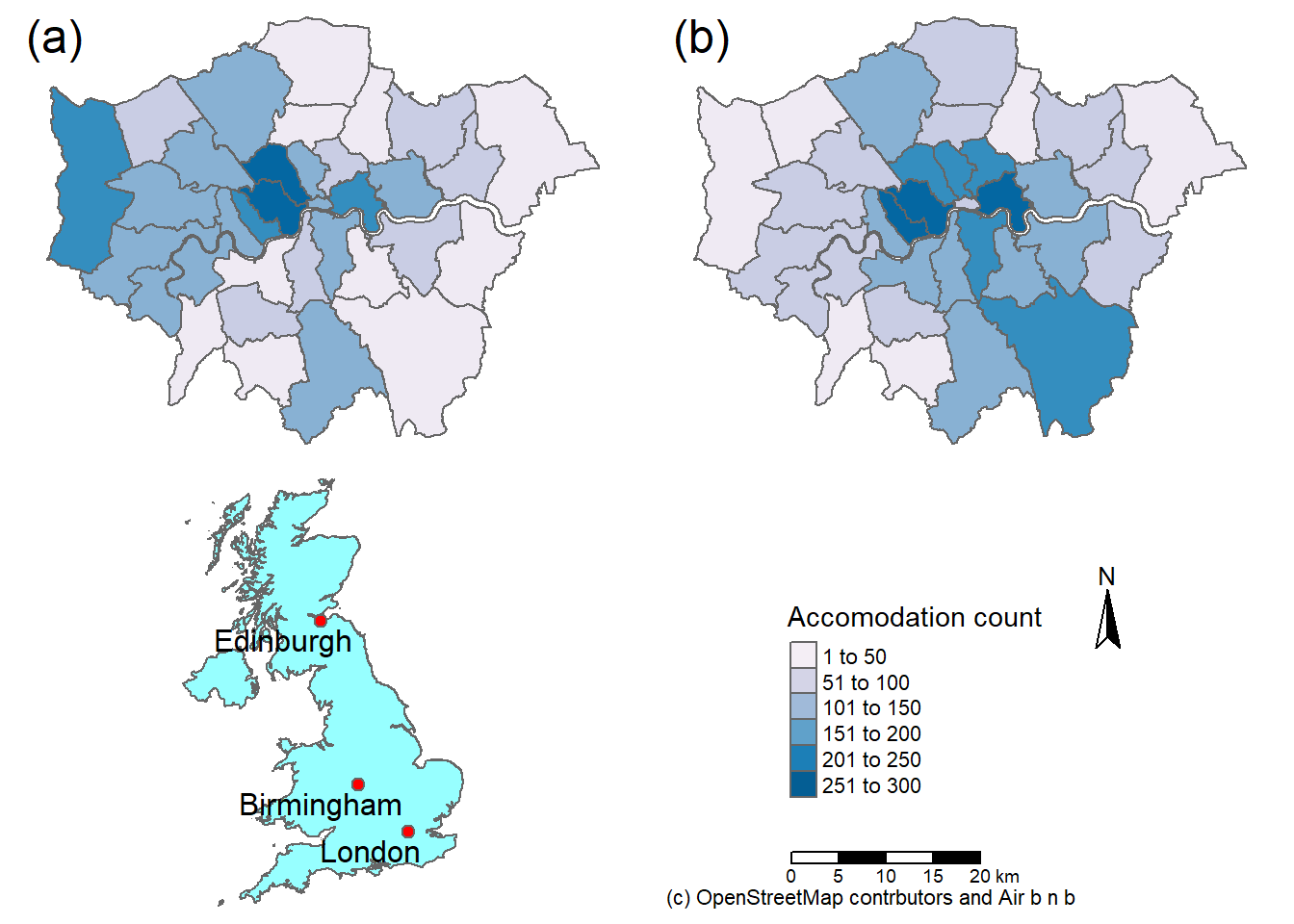
We can also arrage our maps using the grid package…
library(grid)
grid.newpage()
pushViewport(viewport(layout=grid.layout(2,2)))
print(tm1, vp=viewport(layout.pos.col=1, layout.pos.row=1, height=5))
print(tm2, vp=viewport(layout.pos.col=2, layout.pos.row=1, height=5))
print(tm3, vp=viewport(layout.pos.col=1, layout.pos.row=2, height=5))
print(legend, vp=viewport(layout.pos.col=2, layout.pos.row=2, height=5))
5.7.2 Inset map
Londonbb = st_bbox(Airbnb,
crs = st_crs(Airbnb)) %>%
st_as_sfc()main <- tm_shape(Airbnb, bbbox = Londonbb) +
tm_polygons("Accomodation count",
breaks=breaks,
palette="PuBu")+
tm_scale_bar(position = c("left", "bottom"), text.size = .75)+
tm_layout(legend.position = c("right","top"),
legend.text.size=.75,
legend.title.size = 1.1,
frame=FALSE)+
tm_credits("(c) OpenStreetMap contrbutors and Air b n b", position=c(0.0,0.0))+
#tm_text(text = "NAME", size = .5, along.lines =T, remove.overlap=T, auto.placement=F)+
tm_compass(type = "8star", position = c(0.06, 0.1)) +
#bottom left top right
tm_layout(inner.margin=c(0.02,0.02,0.02,0.2))inset = tm_shape(UK_outlinecrop) + tm_polygons() +
tm_shape(Londonbb)+
tm_borders(col = "grey40", lwd = 3)+
tm_layout(frame=FALSE,
bg.color = "transparent")+
tm_shape(Worldcities2) +
tm_symbols(col = "red", scale = .5)+
tm_text("CITY_NAME", xmod=-1.5, ymod=-0.5)library(grid)
main
print(inset, vp = viewport(0.86, 0.29, width = 0.5, height = 0.55))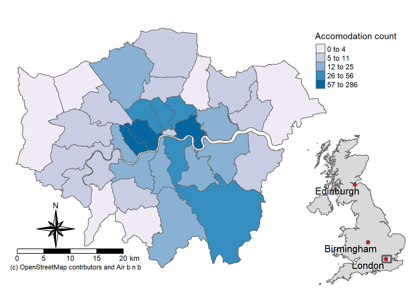
5.7.3 Export
So how do we output our map then…
tmap_save(t, 'hotelsandairbnbR.png')
library(grid)
tmap_save(main,insets_tm = inset,insets_vp=viewport(x=0.86, y=0.29, width=.5, height=.55), filename="test.pdf", dpi=600)5.7.4 Basic interactive map
But could we not also make an interactive map like we did in practical 2?
tmap_mode("view")
tm_shape(Airbnb) +
tm_polygons("Accomodation count", breaks=breaks) 5.7.5 Advanced interactive map
But let’s take it a bit further so we can select our layers on an interactive map..
# library for pop up boxes
library(leafpop)
library(leaflet)
#join data
Joined <- Airbnb%>%
st_join(., Hotels, join = st_equals)%>%
dplyr::select(GSS_CODE.x, NAME.x, `Accomodation count.x`, `Accomodation count.y`)%>%
dplyr::rename(`GSS code` =`GSS_CODE.x`,
`Borough` = `NAME.x`,
`Airbnb count` = `Accomodation count.x`,
`Hotel count`= `Accomodation count.y`)%>%
st_transform(., 4326)
#remove the geometry for our pop up boxes to avoid
popupairbnb <-Joined %>%
st_drop_geometry()%>%
dplyr::select(`Airbnb count`, Borough)%>%
popupTable()
popuphotel <-Joined %>%
st_drop_geometry()%>%
dplyr::select(`Hotel count`, Borough)%>%
popupTable()
tmap_mode("view")
# set the colour palettes using our previously defined breaks
pal1 <- Joined %>%
colorBin(palette = "YlOrRd", domain=.$`Airbnb count`, bins=breaks)
pal1 <-colorBin(palette = "YlOrRd", domain=Joined$`Airbnb count`, bins=breaks)
pal2 <- Joined %>%
colorBin(palette = "YlOrRd", domain=.$`Hotel count`, bins=breaks)
map<- leaflet(Joined) %>%
# add basemap options
addTiles(group = "OSM (default)") %>%
addProviderTiles(providers$Stamen.Toner, group = "Toner") %>%
addProviderTiles(providers$Stamen.TonerLite, group = "Toner Lite") %>%
addProviderTiles(providers$CartoDB.Positron, group = "CartoDB")%>%
#add our polygons, linking to the tables we just made
addPolygons(color="white",
weight = 2,
opacity = 1,
dashArray = "3",
popup = popupairbnb,
fillOpacity = 0.7,
fillColor = ~pal2(`Airbnb count`),
group = "Airbnb")%>%
addPolygons(fillColor = ~pal2(`Hotel count`),
weight = 2,
opacity = 1,
color = "white",
dashArray = "3",
popup = popupairbnb,
fillOpacity = 0.7,group = "Hotels")%>%
# add a legend
addLegend(pal = pal2, values = ~`Hotel count`, group = c("Airbnb","Hotel"),
position ="bottomleft", title = "Accomodation count") %>%
# specify layers control
addLayersControl(
baseGroups = c("OSM (default)", "Toner", "Toner Lite", "CartoDB"),
overlayGroups = c("Airbnb", "Hotels"),
options = layersControlOptions(collapsed = FALSE)
)
# plot the map
mapThe legend on this map doesn’t update when you select a different layer. I could have enabled this by chaning the group argument to just Airbnb or Hotel, then calling a second addLegend() function for the other group. However, when displaying maps such as these, it’s often useful to have a consistent scale in the legend so they are directly comparable.
If you want to explore Leaflet more have a look at the leaflet for R Guide
To see other basemap options (there are loads!) have a look here at leaflet extras
5.8 Bad maps
What makes a bad map then… and what should you avoid:
- Poor labeling — don’t present something as an output with the file name (e.g. layer_1_osm) in the legend — name your layers properly, it’s really easy to do and makes a big difference to the quality of the map.
- No legend
- Screenshot of the map — export it properly, we’ve been doing this a while and can tell
- Change the values in the legend … what is aesthetically more pleasing 31.99999 or 32?. Make it as easy as possible to interpret your map.
- Too much data presented on one map — be selective or plot multiple maps
- Presented data is too small or too big — be critical about what you produce, it should be easy to read and understand
- A map or figure without enough detail — A reader should be able to understand a map or figure using the graphic in the figure/map and the caption alone! A long caption is fine assuming it’s all relevant information.
For more cartography ideas/advice have a look at Katie Jolly’s blog post on urban heat islands, consult axis map catography guide and check out the data is beautiful reddit.
Another decent resource is the Fundamentals of Data Visualization book
5.9 Feedback
Was anything that we explained unclear this week or was something really clear…let us know using the feedback form. It’s anonymous and we’ll use the responses to clear any issues up in the future / adapt the material.